student instructions: congratulations! you’ve got a job! your job is to design a poster to...
TRANSCRIPT
VISUAL IMAGE
NCEA INTERNAL 1.7
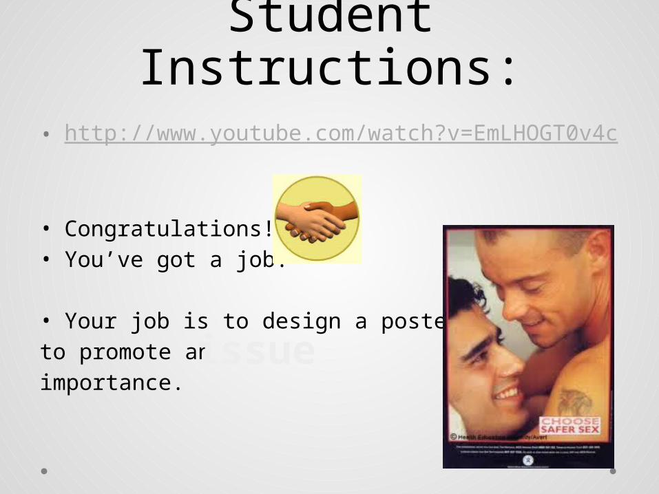
Student Instructions:• http://www.youtube.com/watch?v=EmLHOGT0v4c
• Congratulations! • You’ve got a job!
• Your job is to design a poster to promote an of major importance.
issue
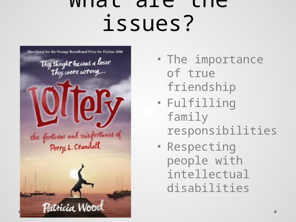
What are the issues?• The importance of
true friendship • Fulfilling family
responsibilities• Respecting people
with intellectual disabilities
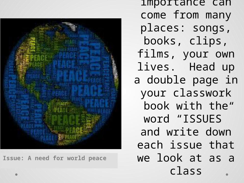
Issue: A need for world peace
Ideas for an issue of major importance
can come from many places: songs, books,
clips, films, your own lives. Head up a double page in your classwork
book with the word “ISSUES” and write down
each issue that we look at as a class
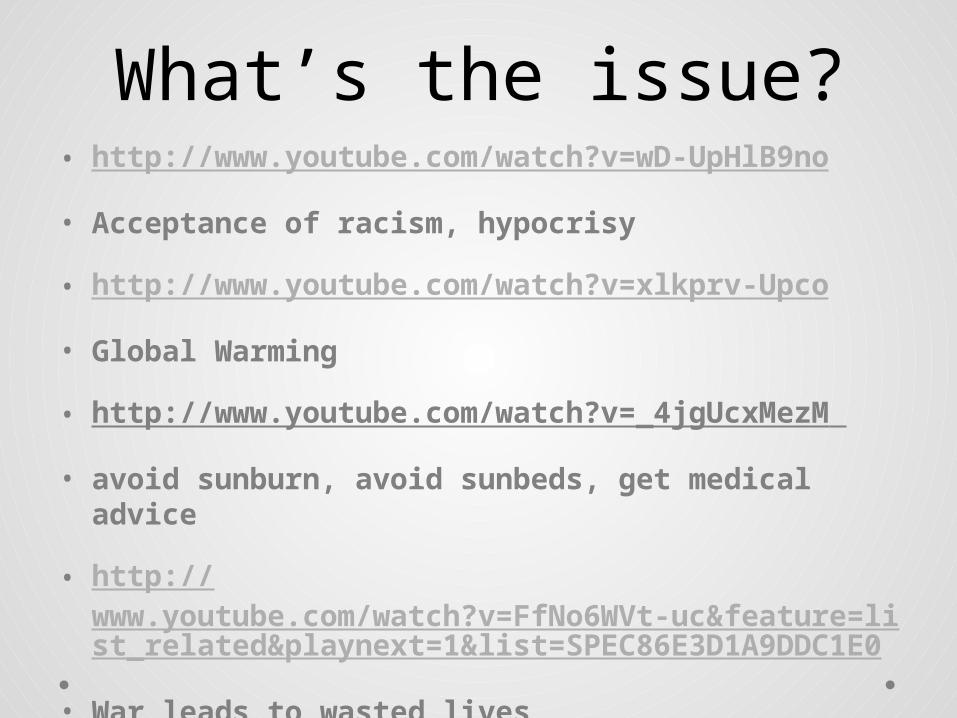
What’s the issue?• http://www.youtube.com/watch?v=wD-UpHlB9no
• Acceptance of racism, hypocrisy
• http://www.youtube.com/watch?v=xlkprv-Upco
• Global Warming
• http://www.youtube.com/watch?v=_4jgUcxMezM
• avoid sunburn, avoid sunbeds, get medical advice
• http://www.youtube.com/watch?v=FfNo6WVt-uc&feature=list_related&playnext=1&list=SPEC86E3D1A9DDC1E0
• War leads to wasted lives
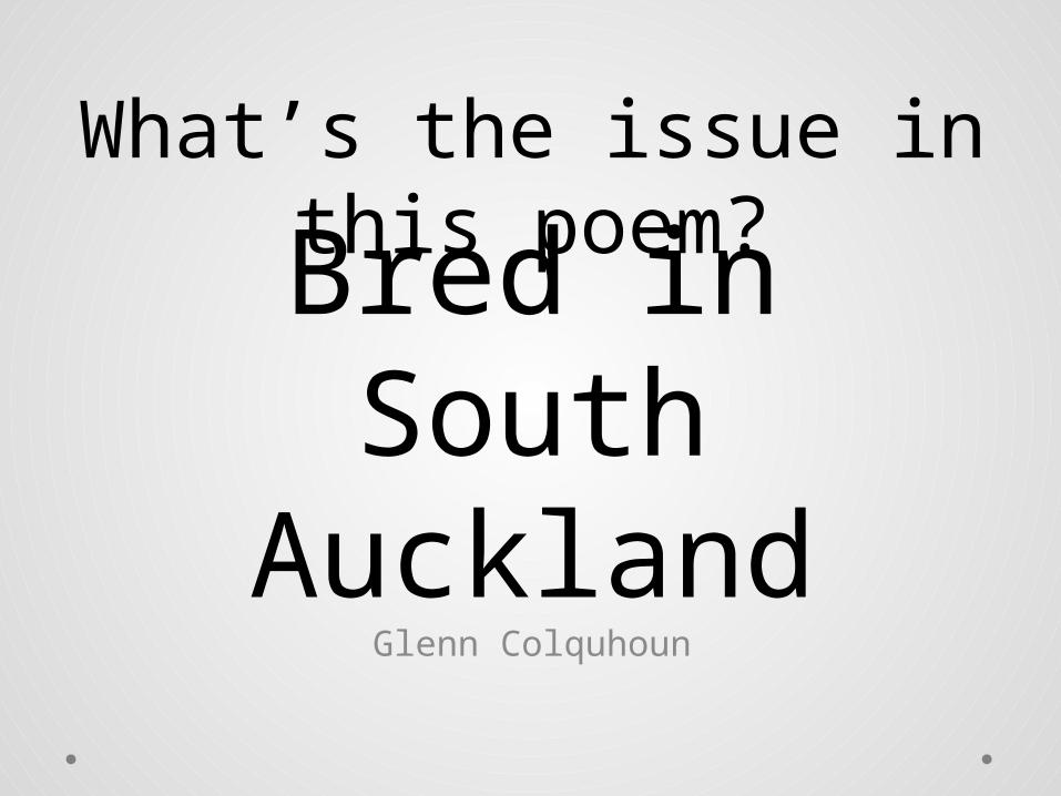
Bred in South Auckland
Glenn Colquhoun
What’s the issue in this poem?
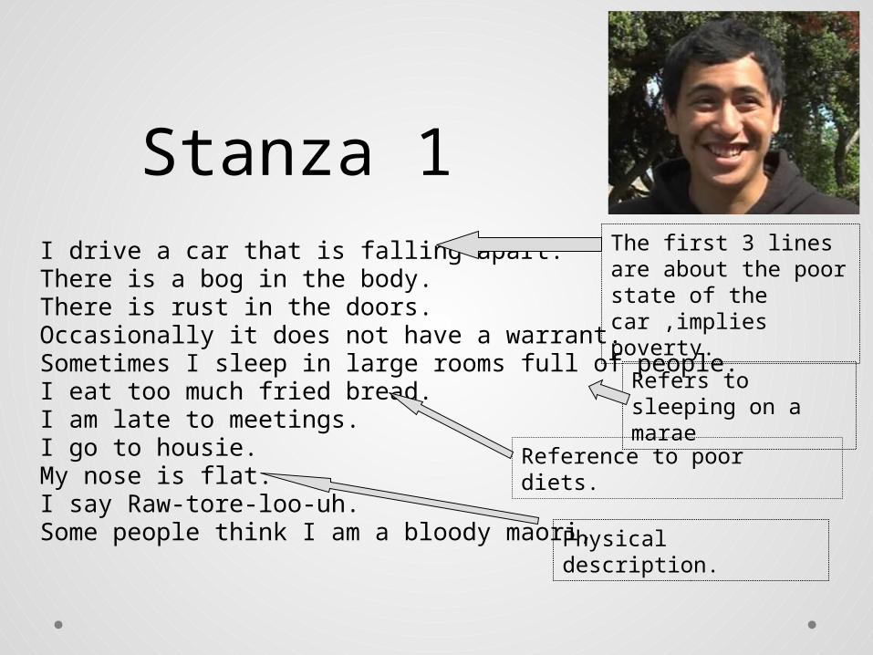
Stanza 1I drive a car that is falling apart.There is a bog in the body.There is rust in the doors.Occasionally it does not have a warrant.Sometimes I sleep in large rooms full of people.I eat too much fried bread.I am late to meetings.I go to housie.My nose is flat.I say Raw-tore-loo-uh.Some people think I am a bloody maori,
The first 3 lines are about the poor state of the car ,implies poverty.
Refers to sleeping on a marae
Reference to poor diets.
Physical description.
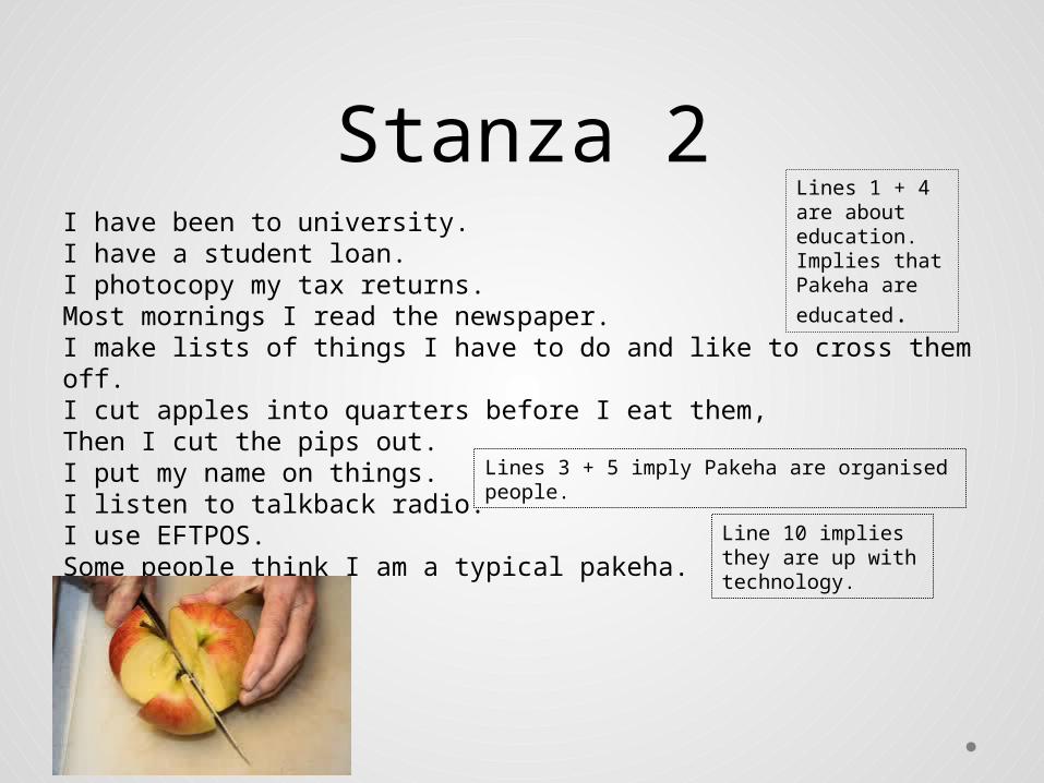
Stanza 2 I have been to university.I have a student loan.I photocopy my tax returns.Most mornings I read the newspaper.I make lists of things I have to do and like to cross them off.I cut apples into quarters before I eat them,Then I cut the pips out.I put my name on things.I listen to talkback radio.I use EFTPOS.Some people think I am a typical pakeha.
Lines 1 + 4 are about education. Implies that Pakeha are
educated.
Lines 3 + 5 imply Pakeha are organised people.
Line 10 implies they are up with technology.
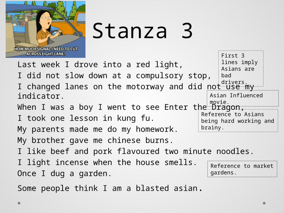
Stanza 3Last week I drove into a red light,I did not slow down at a compulsory stop,I changed lanes on the motorway and did not use my indicator.When I was a boy I went to see Enter the Dragon,I took one lesson in kung fu.My parents made me do my homework.My brother gave me chinese burns.I like beef and pork flavoured two minute noodles.I light incense when the house smells.Once I dug a garden.
Some people think I am a blasted asian.
First 3 lines imply Asians are bad drivers.
Asian Influenced movie.
Reference to Asians being hard working and brainy.
Reference to market gardens.
Stanza 4
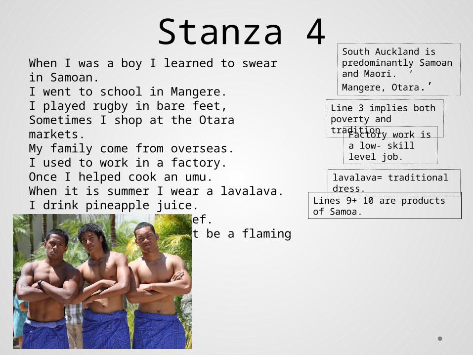
When I was a boy I learned to swear in Samoan.I went to school in Mangere.I played rugby in bare feet,Sometimes I shop at the Otara markets.My family come from overseas.I used to work in a factory.Once I helped cook an umu.When it is summer I wear a lavalava.I drink pineapple juice.I like to eat corned beef.Some people think I must be a flaming coconut.
South Auckland is predominantly Samoan and Maori. ‘ Mangere,
Otara.’
Line 3 implies both poverty and tradition.
Factory work is a low- skill level job.
lavalava= traditional dress.
Lines 9+ 10 are products of Samoa.

I think I am the luckiest mongrel I
know.
• Each stanza = stereotypes. • The poet is a mongrel or mixed breed. Not one
specific race. Being a mongrel means he gets the best bits of each culture.
Stanza 5 (one line)
Don’t judge people based on stereotypes
Value the multicultural nature of NZ society.
So what’s the issue in this poem?
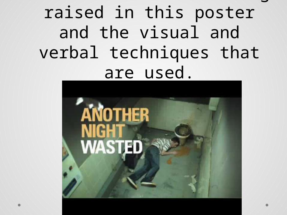
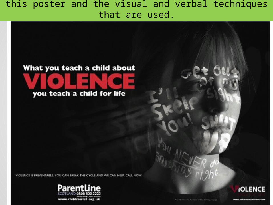
As a class, let’s work
out the issue being
raised in this poster
and the visual and
verbal techniques
that are used.

How to make notes about each poster
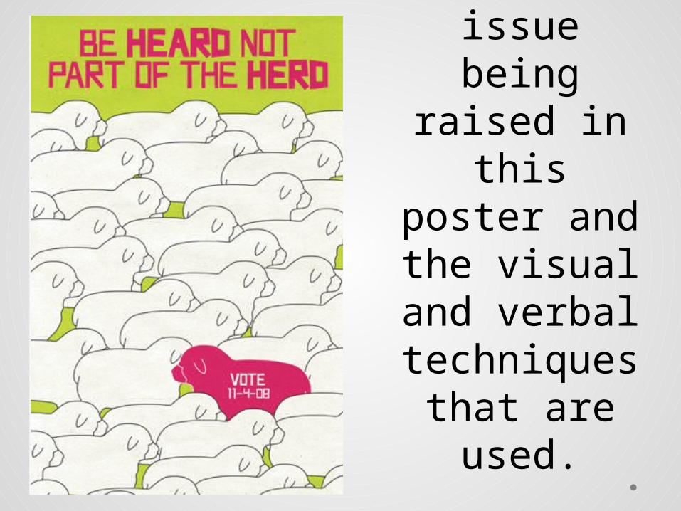
• Briefly describe the image on the poster e.g sheep
• Write down the headline: Be heard, not part of the herd.
• Write down visual and verbal techniques used.
DI: SheepHeadline: Be heard not part of the herdIssue: the need to voteVisual = contrast – pink against white, reverse print, repetition Verbal = pun, imperative, font (caps = important)

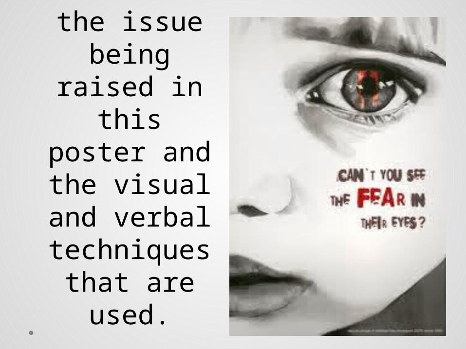
As a class, let’s work
out the issue being
raised in this poster
and the visual and
verbal techniques
that are used.
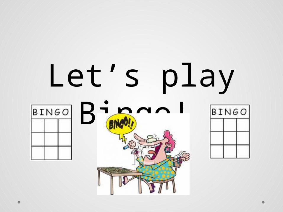
Let’s play Bingo!

Bingo Make a 3x3 bingo card in your
book.
Static Image Terms/Components
Visual Techniques Verbal Techniques Layout Techniques
Target audienceMessagePurposeOverall ImpactHeadlineBody CopyLogoSlogan
Bingo
Bold LinesColourContrastLettering/FontsReverse PrintPicturesSymbols
AlliterationClicheEmotive LanguageSuperlativeHyperboleImperativeNeologismPersonal PronounsPunRepetitionRhetorical QuestionStatistics
BalanceBordersDominant Visual ImageEmpty spacePerspectiveProportion
Choose NINE words from the lists below and enter them on your Bingo card. You must have at least ONE from each list.

Ready? Got something like this?
TargetAudience
colour pun
contrast White space alliteration
hyperbole headline Dominant Image
Need to see the list again? Next slide.

Bingo Make a 3x3 bingo card in your
book.
Static Image Terms/Components
Visual Techniques Verbal Techniques Layout Techniques
Target audienceMessagePurposeOverall ImpactHeadlineBody CopyLogoSlogan
Let’s play
Bold LinesColourContrastLettering/FontsReverse PrintPicturesSymbols
Bingo!
AlliterationClicheEmotive LanguageSuperlativeHyperboleImperativeNeologismPersonal PronounsPunRepetitionRhetorical QuestionStatistics
BalanceBordersDominant Visual ImageEmpty spacePerspectiveProportion
Choose NINE words from the lists below and enter them on your Bingo card. You must have at least ONE from each list.

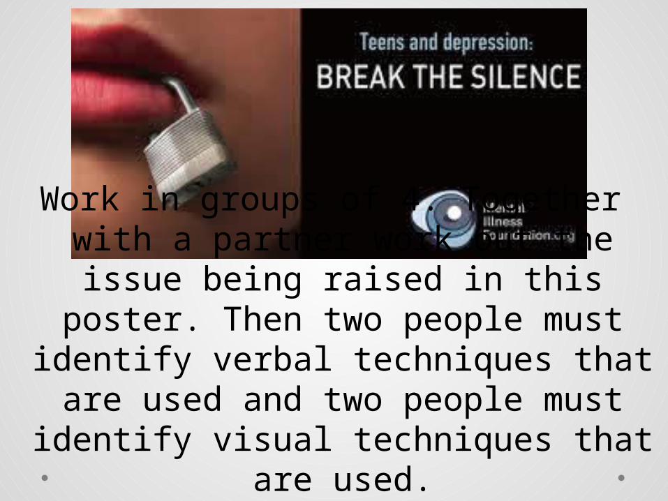
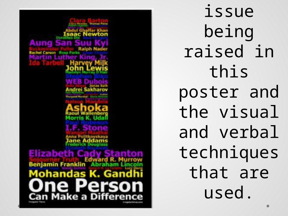
Work in groups of 4. Together with a partner work out the issue
being raised in this poster. Then two people must identify verbal techniques that
are used and two people must identify visual
techniques that are used.
Work in groups of 4. Together with a partner work out the issue being raised in this poster. Then two
people must identify verbal techniques that are used and two
people must identify visual techniques that are used.
Work in groups of 4. Together with a partner work out the issue
being raised in this poster. Then two people must identify verbal techniques that
are used and two people must
identify visual techniques that
are used.
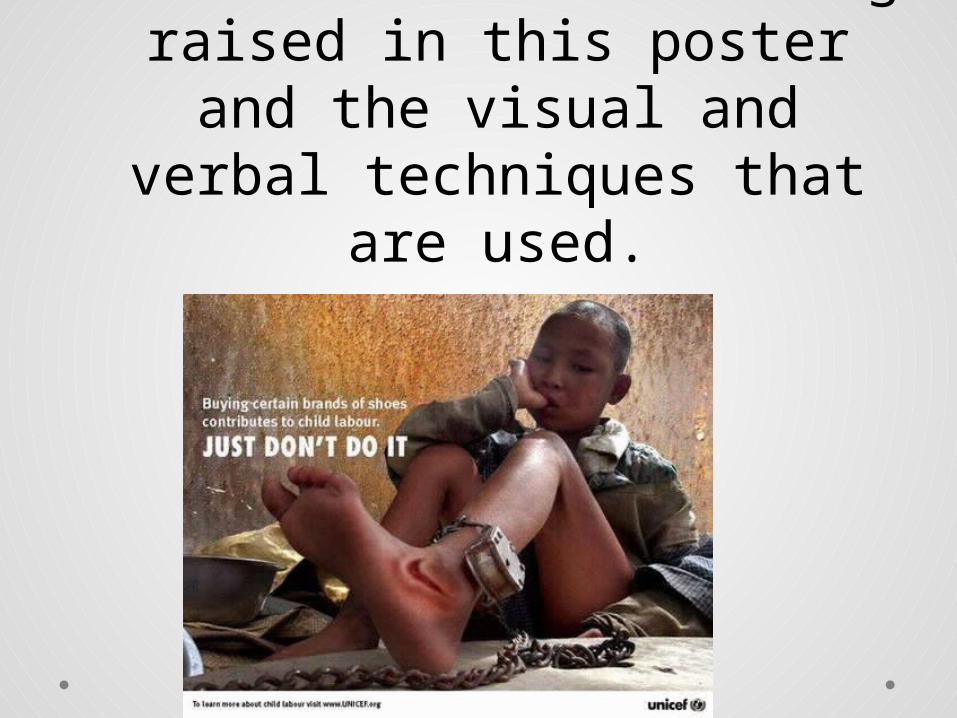
Together with a partner work out the issue being raised in
this poster and the visual and verbal techniques that
are used.
Together with a partner work out the issue being raised in
this poster and the visual and verbal techniques that
are used.

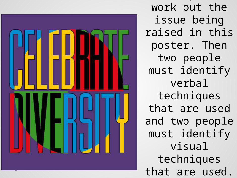
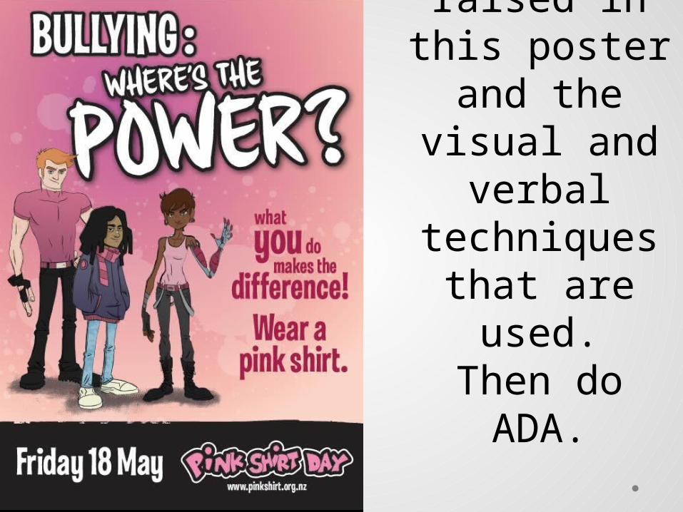
Together with a partner
work out the issue being
raised in this poster
and the visual and
verbal techniques
that are used.
Together with a
partner work out the issue
being raised in
this poster and the
visual and verbal
techniques that are
used.
On your own, work out the issue
being raised in this
poster and the visual and verbal techniques
that are used.

As a class, look at this poster:
Identify the issue. Identify visual
& verbal techs
How does this poster get our attention and keep our interest? What desire is it creating in the viewer? What action does the designer of the poster want us to take?
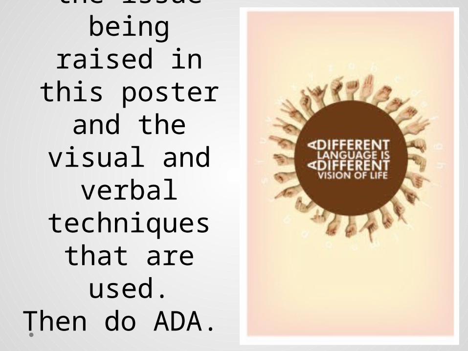
Together with a partner
work out the issue being
raised in this poster and the visual and verbal techniques
that are used.
Then do ADA.
Together with a partner
work out the issue being
raised in this poster and the visual and verbal techniques
that are used.
Then do ADA.
On your own, work out the issue being raised in this poster and the visual and verbal techniques that are
used.
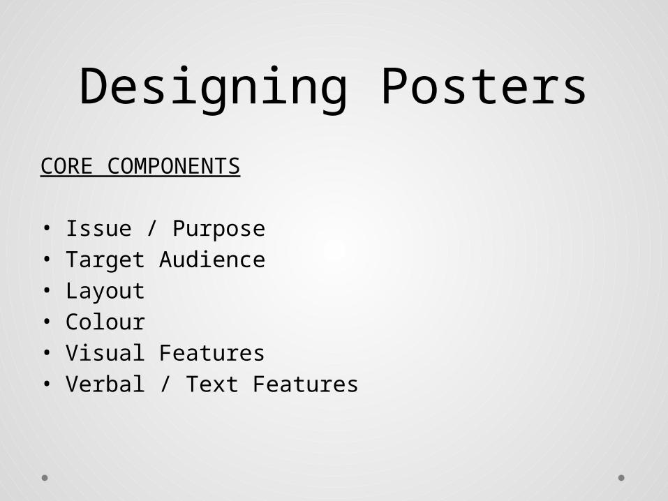
Designing PostersCORE COMPONENTS
• Issue / Purpose• Target Audience• Layout• Colour• Visual Features• Verbal / Text Features

Poster Layout:• Use headings and body copy. • Keep it balanced and simple. • Decide where to use graphics,
photographs, etc. • Not too much detail. Less is more. • Information should flow – think of the
poster dividing into thirds, halves

Poster Design - Colour• Choose colours that complement each other.
Certain colours, like certain yellows, etc., are difficult to see and read. Text and background colours should complement each other. Colour can also be used symbolically to represent the issues or ideas presented in your image.
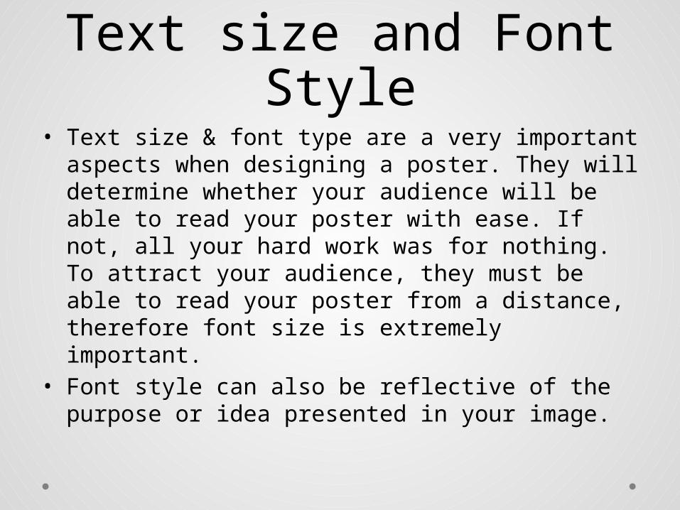
Text size and Font Style
• Text size & font type are a very important aspects when designing a poster. They will determine whether your audience will be able to read your poster with ease. If not, all your hard work was for nothing. To attract your audience, they must be able to read your poster from a distance, therefore font size is extremely important.
• Font style can also be reflective of the purpose or idea presented in your image.

Illustrations/Images• Photographs OR a good quality scan;
o take the photograph with a digital camera and work with a digital image instead of scanned pictures.
• Diagrams / Graphics Design• Paint• Collage• Hand drawn images• Sketches• Silhouettes• Magazine cuttings• Paint/photoshop – design programmes
• DO NOT COPY AND PASTE! YOUR IMAGE MUST SHOW EVIDENCE OF CONSTRUCTION BY YOU!
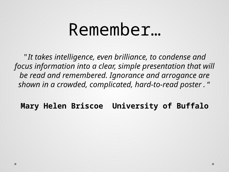
Remember…"It takes intelligence, even brilliance, to condense
and focus information into a clear, simple presentation that will be read and remembered.
Ignorance and arrogance are shown in a crowded, complicated, hard-to-read poster.“
Mary Helen Briscoe University of Buffalo
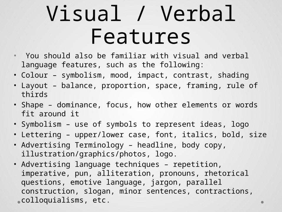
Visual / Verbal Features
• You should also be familiar with visual and verbal language features, such as the following:
• Colour – symbolism, mood, impact, contrast, shading• Layout – balance, proportion, space, framing, rule of thirds• Shape – dominance, focus, how other elements or words
fit around it• Symbolism – use of symbols to represent ideas, logo• Lettering – upper/lower case, font, italics, bold, size• Advertising Terminology – headline, body copy,
illustration/graphics/photos, logo.• Advertising language techniques – repetition, imperative,
pun, alliteration, pronouns, rhetorical questions, emotive language, jargon, parallel construction, slogan, minor sentences, contractions, colloquialisms, etc.
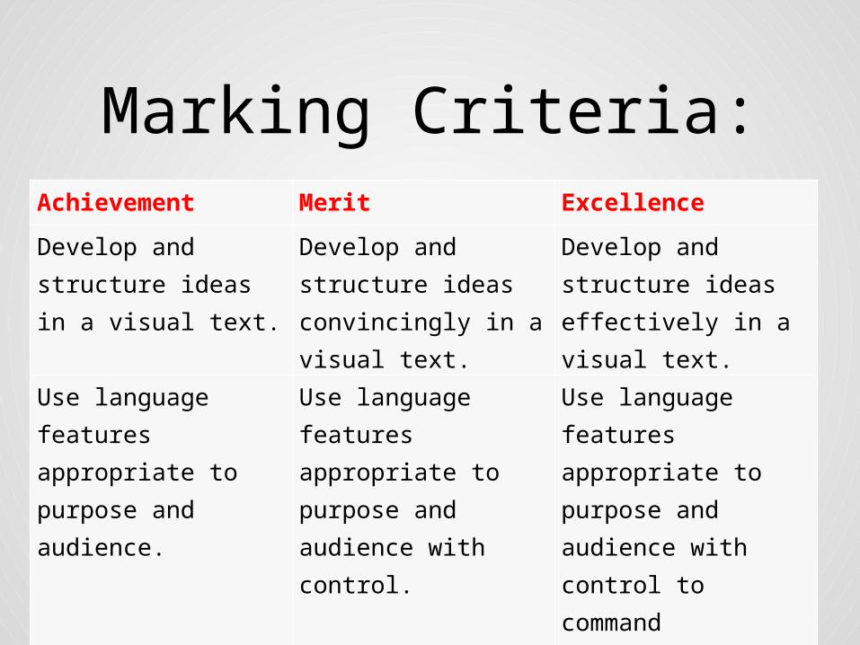
Marking Criteria:Achievement Merit Excellence
Develop and structure ideas in a visual text.
Develop and structure ideas convincingly in a visual text.
Develop and structure ideas effectively in a visual text.
Use language features appropriate to purpose and audience.
Use language features appropriate to purpose and audience with control.
Use language features appropriate to purpose and audience with control to command attention.

• Before you begin your design you will look at a range of posters by students who have previously completed this assessment (some more successful than others!). You will examine the components of the posters and the techniques designers have used to make them appealing and effective. Your own poster should use the design principles you have identified as effective and suitable for your issue.

Low Excellence• Ideas are developed and structured
effectively. There are compelling and well-organised connections using symbols and found images to present ideas on:
• • stopping domestic violence • • fear and isolation of domestic
violence • • finding a way out of domestic
violence
• The idea of finding a way out of domestic violence is not quite as developed as the reasons why it must stop.
• Language features appropriate to purpose and audience are used with control to command attention. The found images contrast the fear of domestic abuse with hope for change shown as the figure moves towards the light at the end of the tunnel. The word ‘STOP’ integrates the fist symbolically and is further reinforced with the words ‘Domestic Violence’ underneath. The reverse text uses questions well and offers a solution to the audience with an 0800 number.
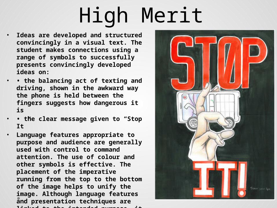
High Merit• Ideas are developed and structured
convincingly in a visual text. The student makes connections using a range of symbols to successfully presents convincingly developed ideas on:
• • the balancing act of texting and driving, shown in the awkward way the phone is held between the fingers suggests how dangerous it is
• • the clear message given to “Stop It”
• Language features appropriate to purpose and audience are generally used with control to command attention. The use of colour and other symbols is effective. The placement of the imperative running from the top to the bottom of the image helps to unify the image. Although language features and presentation techniques are linked to the intended purpose, it is unclear why ‘IT!’ is white, outlined in red. This holds the poster back from commanding attention - required for Excellence.
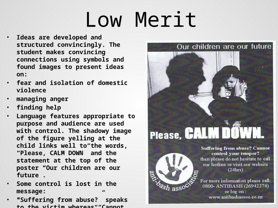
Low Merit• Ideas are developed and
structured convincingly. The student makes convincing connections using symbols and found images to present ideas on:
• fear and isolation of domestic violence
• managing anger • finding help • Language features appropriate to
purpose and audience are used with control. The shadowy image of the figure yelling at the child links well to the words, “Please, CALM DOWN” and the statement at the top of the poster “Our children are our future”.
• Some control is lost in the message:
• “Suffering from abuse?” speaks to the victim whereas “Cannot control your temper?” speaks to the abuser, it becomes confusing to understand who the hotline is helping victim or abuser?

Low Achieved• Ideas are developed and structured in a
visual text. The student makes connections using a range of symbols to present developed ideas on:
• • the growth of money in a child specific savings account
• • the guaranteed monetary growth as compared to a child’s growth
• The connections made to the growth of money compared to the growth of children is not convincing as required for Merit, because children grow at different rates, whereas a 5% rate is emphasised in the statement at the bottom of the poster, “Kidsaver has a 5% interest rate so money grows just as fast as your child”.
• Language features appropriate to purpose and audience are used with control as required for Merit. The childlike writing and found image of the child measuring herself links to the intended purpose and audience:
• • attracting young savers • • reinforcing the idea of monetary growth for
the child as they grow •

Not Achieved • The student has insufficiently developed
and structured ideas. The poster as presented eludes to the taste of ‘V’ and to the energy giving qualities of ‘V’.
• Language features appropriate to purpose and audience are not used. Although the image is sophisticated, it isn’t clear how ‘V’ connects with:
• • the figures thoughts, “I can’t do my homework”, “My mum won’t let me go to my friends party”, and “Exams are coming up”.
• • the language feature “V the best drink for you”.
• The connection between ‘V’ and taste and ‘V’ and energy is not clear enough, for this reason the poster does not meet the standard for Achievement..
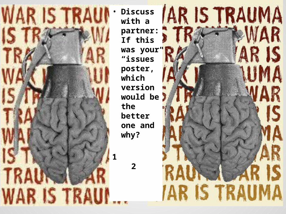
• Discuss with a partner: If this was your “issues” poster, which version would be the better one and why?
1 2
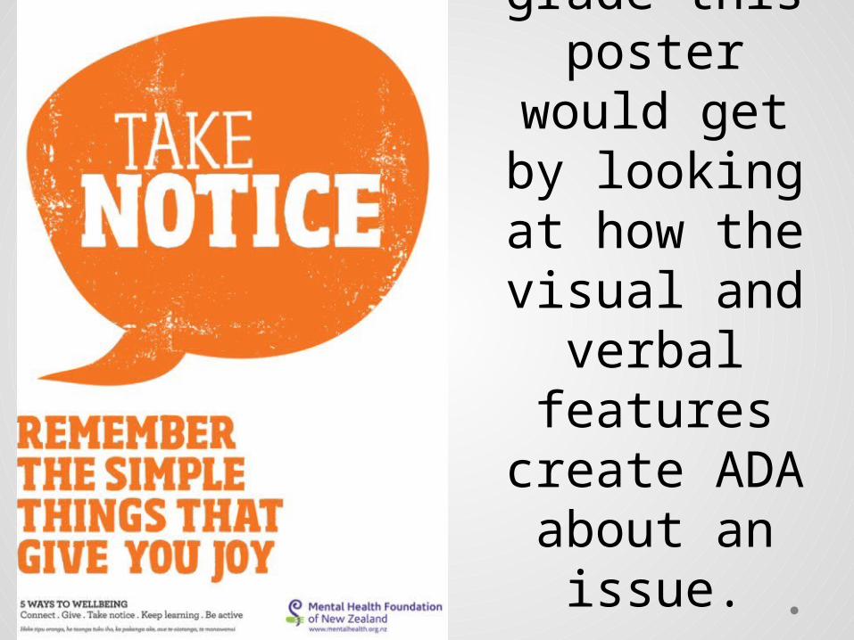
As a class, let’s work out what
grade this poster would
get by looking at how the
visual and verbal
features create ADA
about an issue.
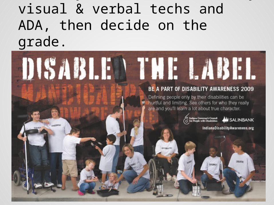
In pairs, look at the poster: Identify the issue. Identify visual & verbal techs and ADA, then decide on the grade.

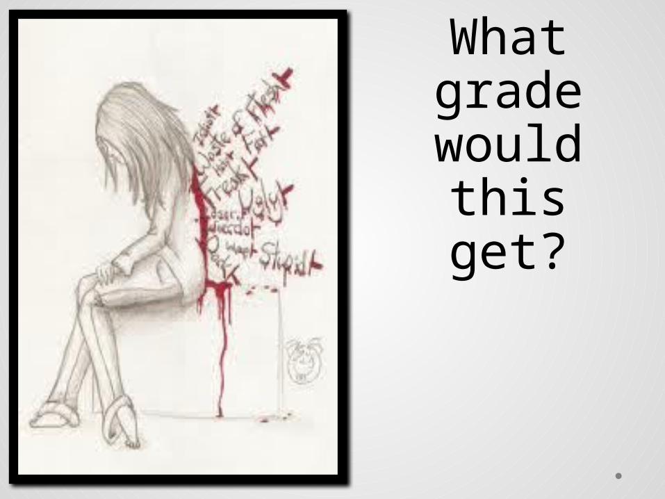
What grade
would this get?

What grade would this get?
What grade would
this get?
Assessment:• You will be assessed on: • how well you communicate ideas to your target audience.• the appropriateness and effectiveness of your verbal and
visual techniques. • the overall impact of your poster• Make sure that the poster you submit for assessment: • develops and structures your ideas effectively.• is appropriate to your chosen target audience. • uses visual and verbal language features that are appropriate
to advertising, such as: colour, typefaces, layout, symbolism, repetition, imperatives, rhetorical questions, puns, alliteration, jargon, endorsement, etc.
• uses visual and verbal language features with control to command attention.
Creating Awareness of an Issue in a Text
• 7- 8 periods in class to produce.• Write up a commentary explaining the choices made in
constructing the image or hand in preparatory table.• Students will be provided with A3 paper to produce their final
poster• All other materials must be provided by the student • This assessment may also be completed using various ICT
software applications such as Publisher, Photoshop, Paint, etc. • STUDENTS WILL NEED TO HAVE THOUGHT ABOUT THE
COMPONENTS THEY WISH TO USE BEFOREHAND AND BRING THEM INTO THE DRAFTING PERIODS.
• THEY CANNOT PRODUCE THE ENTIRE POSTER ELECTRONICALLY, BUT THEY ARE ALLOWED TO DOWNLOAD SOME IMAGES FOR THEIR POSTER AND USE A WORD PROCESSOR TO PRODUCE SLOGANS AND OTHER VERBAL MATERIAL PROVIDED THE CONTENT IS ORIGINAL

Why would this poster
get N?