suburbanization of poverty in metro atlanta: an update
TRANSCRIPT
Atlanta Regional Commission
For more information, contact:
Suburbanization of Poverty in Metro Atlanta:
An Update

National Poverty Picture
Source: U.S. Census; Brookings Institution
Metro Atlanta ranks 40th out of the 100 largest metros in the percent of population in poverty. 40th
+ 7.2% Increase in the suburban poverty rate between 2000 and 2013 in metro Atlanta. This is the largest change among the 25 largest metro areas.
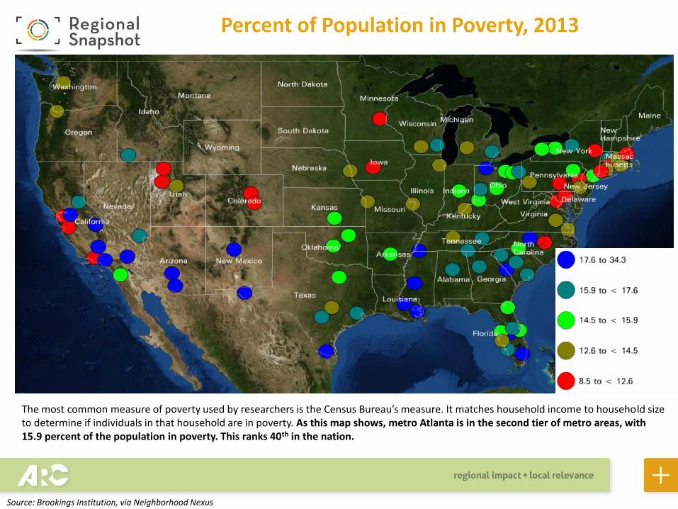
Percent of Population in Poverty, 2013
The most common measure of poverty used by researchers is the Census Bureau’s measure. It matches household income to household size to determine if individuals in that household are in poverty. As this map shows, metro Atlanta is in the second tier of metro areas, with 15.9 percent of the population in poverty. This ranks 40th in the nation.
Source: Brookings Institution, via Neighborhood Nexus
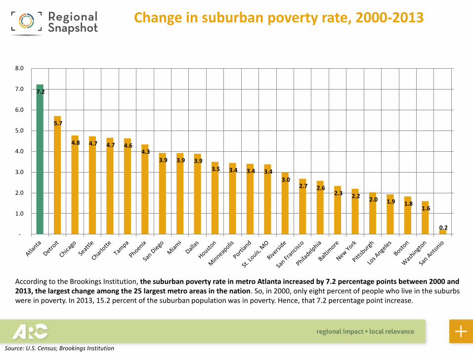
Change in suburban poverty rate, 2000-2013
According to the Brookings Institution, the suburban poverty rate in metro Atlanta increased by 7.2 percentage points between 2000 and 2013, the largest change among the 25 largest metro areas in the nation. So, in 2000, only eight percent of people who live in the suburbs were in poverty. In 2013, 15.2 percent of the suburban population was in poverty. Hence, that 7.2 percentage point increase.
0.2
1.6 1.8 1.9 2.0
2.2 2.3 2.6 2.7
3.0 3.4 3.4 3.4 3.5
3.9 3.9 3.9
4.3 4.6 4.7 4.7 4.8
5.7
7.2
-
1.0
2.0
3.0
4.0
5.0
6.0
7.0
8.0
Source: U.S. Census; Brookings Institution

County-Level Picture
Source: U.S. Census
113% increase
Every county in the region experienced increases in poverty (measured by food stamp usage)
between 2007 and 2014.
3.6% decrease
Every county in the region, except DeKalb, experienced
decreases in poverty (measured by food stamp usage) over the
past year.

Food Stamp Usage Down in Most Jurisdictions, 2013-2014
Number of Recipients Change in Food Stamp Recipients
County
Food Stamp Recipients,
2007
Food Stamp Recipients,
2010
Food Stamp Recipients,
2011
Food Stamp Recipients,
2012
Food Stamp Recipients,
2013
Food Stamp Recipients,
2014
Change, 2007-2014
% Change, 2007-2014
Change, 2013-2014
% Change, 2013-2014
Barrow 3,479 7,423 8,559 8,851 8,705 7,776 4,297 123.5% (929) -10.7%
Bartow 6,274 11,839 12,827 13,507 12,984 10,751 4,477 71.4% (2,233) -17.2%
Carroll 9,376 14,936 16,582 17,392 17,588 15,007 5,631 60.1% (2,581) -14.7%
Cherokee 2,637 7,247 8,741 9,237 8,882 8,224 5,587 211.9% (658) -7.4%
Clayton 26,102 51,514 58,263 62,856 63,252 62,466 36,364 139.3% (786) -1.2%
Cobb 19,344 41,430 47,939 52,637 54,594 50,110 30,766 159.0% (4,484) -8.2%
Coweta 6,293 10,949 11,694 12,054 12,209 10,893 4,600 73.1% (1,316) -10.8% DeKalb 57,176 101,111 114,665 126,213 123,217 126,434 69,258 121.1% 3,217 2.6%
Douglas 8,357 14,954 16,838 17,716 17,637 17,004 8,647 103.5% (633) -3.6%
Fayette 1,724 3,513 4,006 4,349 3,844 3,778 2,054 119.1% (66) -1.7%
Forsyth 1,305 4,231 4,786 5,029 4,964 4,468 3,163 242.4% (496) -10.0%
Fulton 86,429 130,072 143,934 152,256 146,911 146,456 60,027 69.5% (455) -0.3%
Gwinnett 18,029 54,266 61,528 67,102 70,743 66,654 48,625 269.7% (4,089) -5.8%
Hall 8,680 17,936 19,544 20,994 20,999 18,482 9,802 112.9% (2,517) -12.0%
Henry 6,054 12,173 13,918 14,272 14,842 14,820 8,766 144.8% (22) -0.1%
Newton 8,093 13,320 15,408 17,213 16,889 15,734 7,641 94.4% (1,155) -6.8%
Paulding 3,565 7,796 9,268 10,124 10,177 9,351 5,786 162.3% (826) -8.1%
Rockdale 6,180 10,831 12,360 12,600 12,237 11,962 5,782 93.6% (275) -2.2%
Spalding 8,772 13,489 14,522 15,433 15,651 13,514 4,742 54.1% (2,137) -13.7%
Walton 5,017 9,456 10,355 11,453 11,510 10,534 5,517 110.0% (976) -8.5%
20-County Total 292,886 538,486 605,737 651,288 647,835 624,418 331,532 113.2% (23,417) -3.6%
The poverty measure reported by the Census Bureau is the most used, but it isn’t the most up-to-date measure of poverty, and it is based on a sample survey, so the Census measure is associated with margins of error. Therefore, since food stamp benefits (AKA SNAP) are based on the poverty rate, we look at food stamp usage to provide a more recent look at the spread of poverty. All jurisdictions experienced dramatic increases since 2007, but almost all have seen decreases in food stamp usage over the past year. DeKalb County is the lone exception.
Source: Neighborhood Nexus (originally from the GA Dept. of Human Resources)
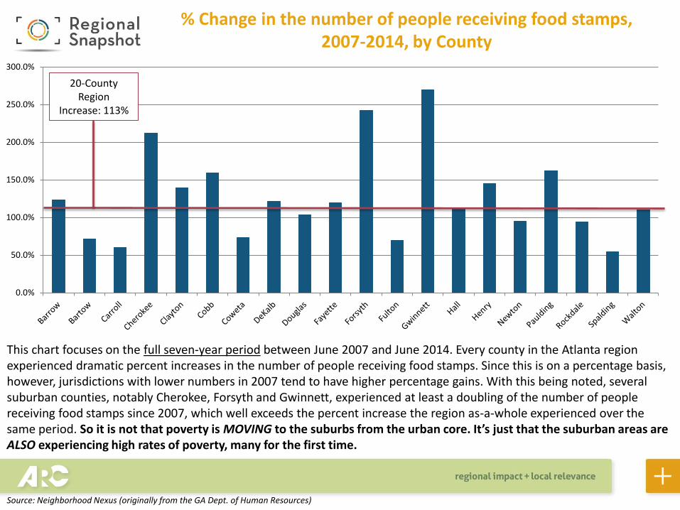
% Change in the number of people receiving food stamps, 2007-2014, by County
This chart focuses on the full seven-year period between June 2007 and June 2014. Every county in the Atlanta region experienced dramatic percent increases in the number of people receiving food stamps. Since this is on a percentage basis, however, jurisdictions with lower numbers in 2007 tend to have higher percentage gains. With this being noted, several suburban counties, notably Cherokee, Forsyth and Gwinnett, experienced at least a doubling of the number of people receiving food stamps since 2007, which well exceeds the percent increase the region as-a-whole experienced over the same period. So it is not that poverty is MOVING to the suburbs from the urban core. It’s just that the suburban areas are ALSO experiencing high rates of poverty, many for the first time.
0.0%
50.0%
100.0%
150.0%
200.0%
250.0%
300.0%
20-County Region
Increase: 113%
Source: Neighborhood Nexus (originally from the GA Dept. of Human Resources)

-20.0%
-15.0%
-10.0%
-5.0%
0.0%
5.0%
This chart focuses on just the last year, June 2013 to June 2014. Every county in the Atlanta region experienced percent decreases in the number of people receiving food stamps, except DeKalb County. Several of the counties that experienced the largest percent increases from 2007-2014 had the largest percent decreases over the past year, a sign of the economy improving in these areas that have historically been more affluent. You can see, however, that the areas with historically high rates of poverty – Clayton, DeKalb and Fulton – experienced the lowest decreases in food stamp recipients in the region. This speaks to the generational nature of poverty in some of the urban core neighborhoods.
20-County Region
Decrease: 3.6%
Change in the number of people receiving food stamps, 2013-2014, by County
Source: Neighborhood Nexus (originally from the GA Dept. of Human Resources)
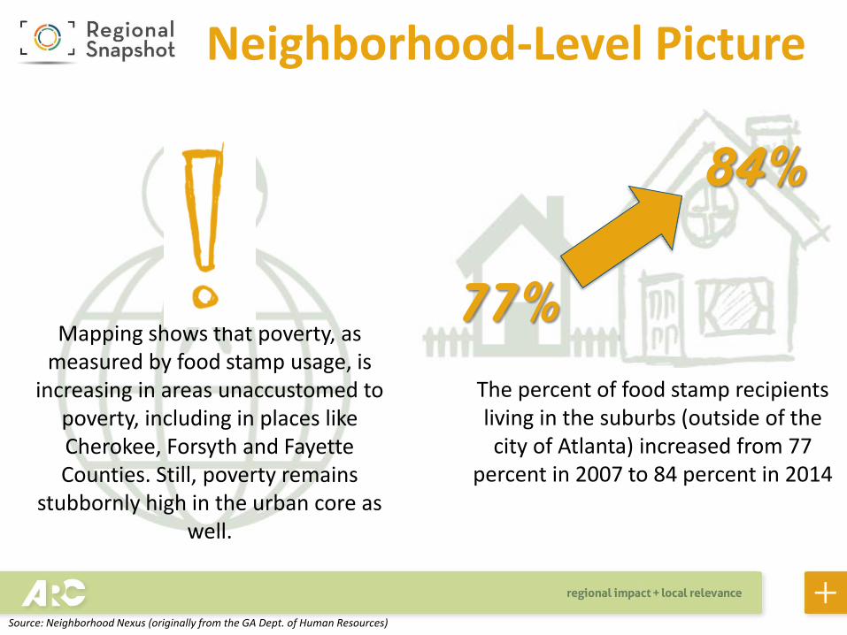
Neighborhood-Level Picture
77% The percent of food stamp recipients living in the suburbs (outside of the city of Atlanta) increased from 77
percent in 2007 to 84 percent in 2014
84%
Mapping shows that poverty, as measured by food stamp usage, is
increasing in areas unaccustomed to poverty, including in places like Cherokee, Forsyth and Fayette Counties. Still, poverty remains
stubbornly high in the urban core as well.
Source: Neighborhood Nexus (originally from the GA Dept. of Human Resources)

Food Stamp Usage Growing Faster Outside Atlanta
83.7% 84.0% 83.6% 83.2% 82.8%
77.4%
50.0%
55.0%
60.0%
65.0%
70.0%
75.0%
80.0%
85.0%
90.0%
201420132012201120102007
% of Food Stamp Recipients Living in “Suburbs”
The Brookings Institution, which has an entire program focused on the suburbanization of poverty, defines the suburbs as any area not in a city of at least 100,000 people. For metro Atlanta, that means all areas except the city of Atlanta. So we looked at all census tracts within the city of Atlanta and compared the number of food stamp recipients living there to the rest of the 20-county region. As you can see, the percentage of food stamp recipients living outside the city of Atlanta increased from 77 percent in 2007 to 83.7 percent in 2014, which represents a slight decline from the last year, something that warrants more attention in upcoming years.
Source: Neighborhood Nexus (originally from the GA Dept. of Human Resources)
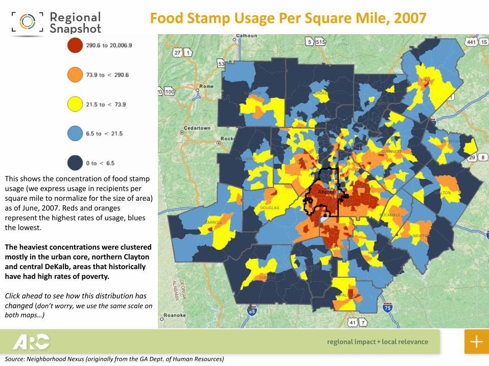
Food Stamp Usage Per Square Mile, 2007
This shows the concentration of food stamp usage (we express usage in recipients per square mile to normalize for the size of area) as of June, 2007. Reds and oranges represent the highest rates of usage, blues the lowest. The heaviest concentrations were clustered mostly in the urban core, northern Clayton and central DeKalb, areas that historically have had high rates of poverty. Click ahead to see how this distribution has changed (don’t worry, we use the same scale on both maps…)
Source: Neighborhood Nexus (originally from the GA Dept. of Human Resources)
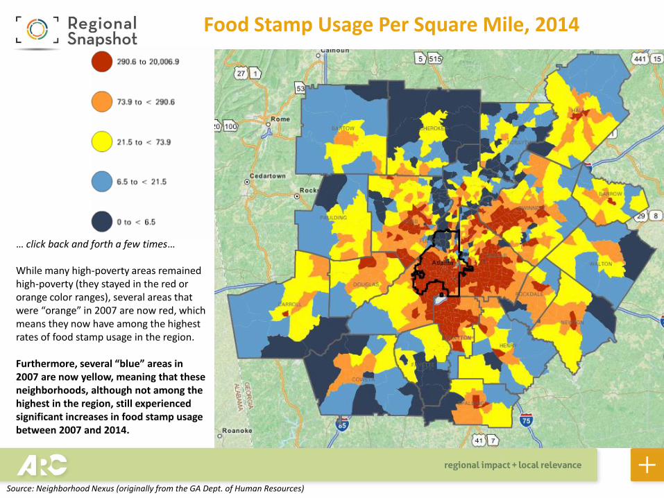
Food Stamp Usage Per Square Mile, 2014
… click back and forth a few times… While many high-poverty areas remained high-poverty (they stayed in the red or orange color ranges), several areas that were “orange” in 2007 are now red, which means they now have among the highest rates of food stamp usage in the region. Furthermore, several “blue” areas in 2007 are now yellow, meaning that these neighborhoods, although not among the highest in the region, still experienced significant increases in food stamp usage between 2007 and 2014.
Source: Neighborhood Nexus (originally from the GA Dept. of Human Resources)

Change in Food Stamp Usage Per Square Mile, 2007-2014
Between June 2007 to June 2014, roughly 330,000 more people received food stamps in the region. This map shows where the greatest changes occurred. Again, reds and oranges represent the greatest increases, while the blues represent the smallest increases (or decreases, in some cases). While the urban core did see significant increases, the suburban areas of Gwinnett – around the Norcross area – saw some of the largest increases. The Clarkston area in DeKalb also saw dramatic increases in food stamp usage.
Source: Neighborhood Nexus (originally from the GA Dept. of Human Resources)
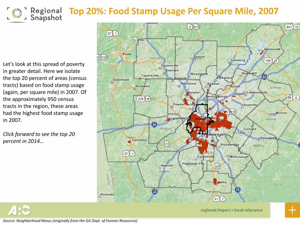
Top 20%: Food Stamp Usage Per Square Mile, 2007
Let’s look at this spread of poverty in greater detail. Here we isolate the top 20 percent of areas (census tracts) based on food stamp usage (again, per square mile) in 2007. Of the approximately 950 census tracts in the region, these areas had the highest food stamp usage in 2007. Click forward to see the top 20 percent in 2014…
Source: Neighborhood Nexus (originally from the GA Dept. of Human Resources)
Top 20%: Food Stamp Usage Per Square Mile, 2014
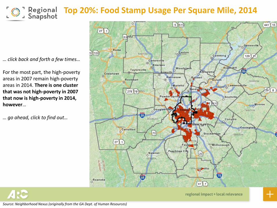
… click back and forth a few times… For the most part, the high-poverty areas in 2007 remain high-poverty areas in 2014. There is one cluster that was not high-poverty in 2007 that now is high-poverty in 2014, however… … go ahead, click to find out…
Source: Neighborhood Nexus (originally from the GA Dept. of Human Resources)
Top 20%: Food Stamp Usage Per Square Mile, 2014
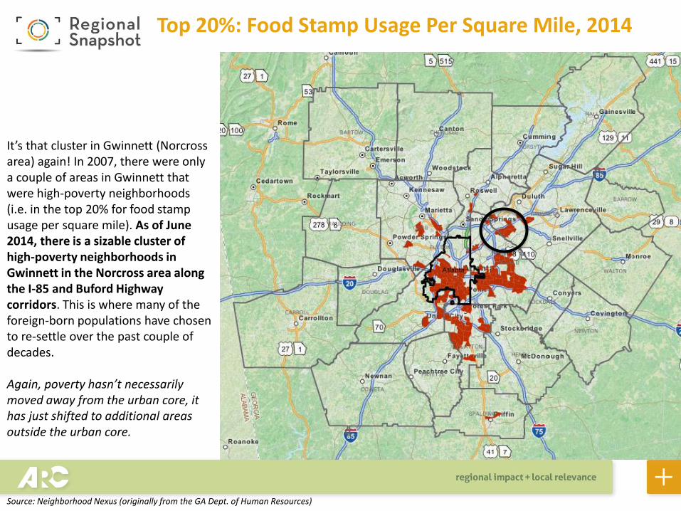
It’s that cluster in Gwinnett (Norcross area) again! In 2007, there were only a couple of areas in Gwinnett that were high-poverty neighborhoods (i.e. in the top 20% for food stamp usage per square mile). As of June 2014, there is a sizable cluster of high-poverty neighborhoods in Gwinnett in the Norcross area along the I-85 and Buford Highway corridors. This is where many of the foreign-born populations have chosen to re-settle over the past couple of decades. Again, poverty hasn’t necessarily moved away from the urban core, it has just shifted to additional areas outside the urban core.
Source: Neighborhood Nexus (originally from the GA Dept. of Human Resources)
The Circled Area: A Quintupling of Food Stamp Recipients
Source: Neighborhood Nexus (originally from the GA Dept. of Human Resources)
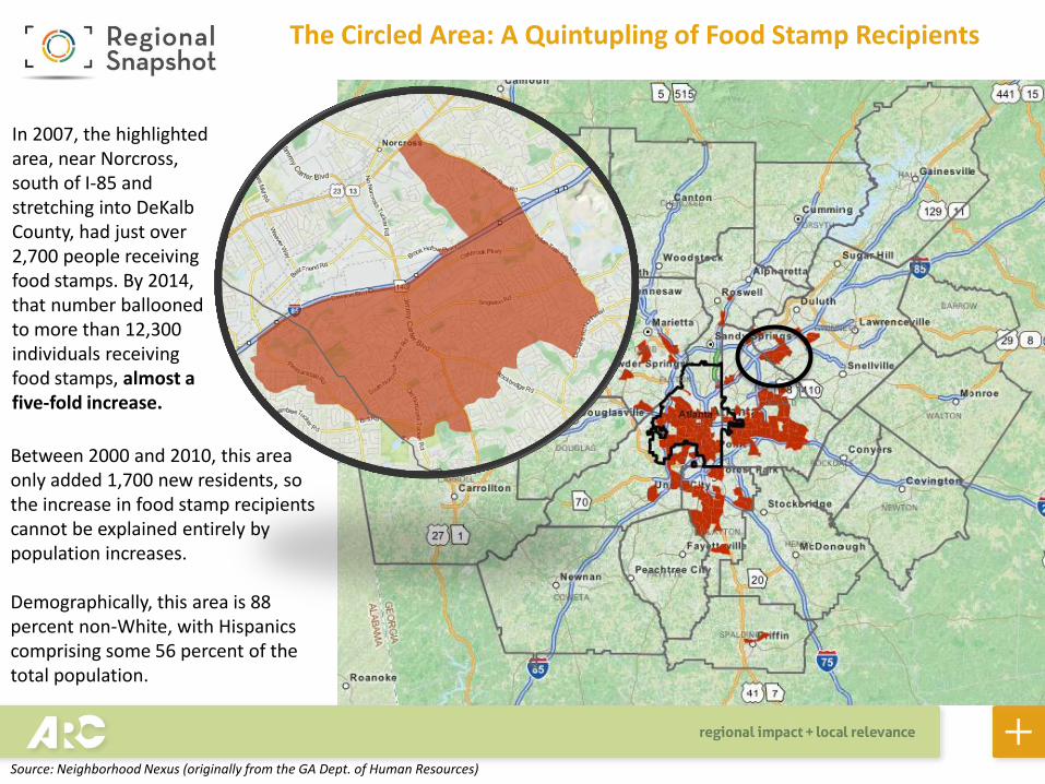
In 2007, the highlighted area, near Norcross, south of I-85 and stretching into DeKalb County, had just over 2,700 people receiving food stamps. By 2014, that number ballooned to more than 12,300 individuals receiving food stamps, almost a five-fold increase.
Between 2000 and 2010, this area only added 1,700 new residents, so the increase in food stamp recipients cannot be explained entirely by population increases. Demographically, this area is 88 percent non-White, with Hispanics comprising some 56 percent of the total population.
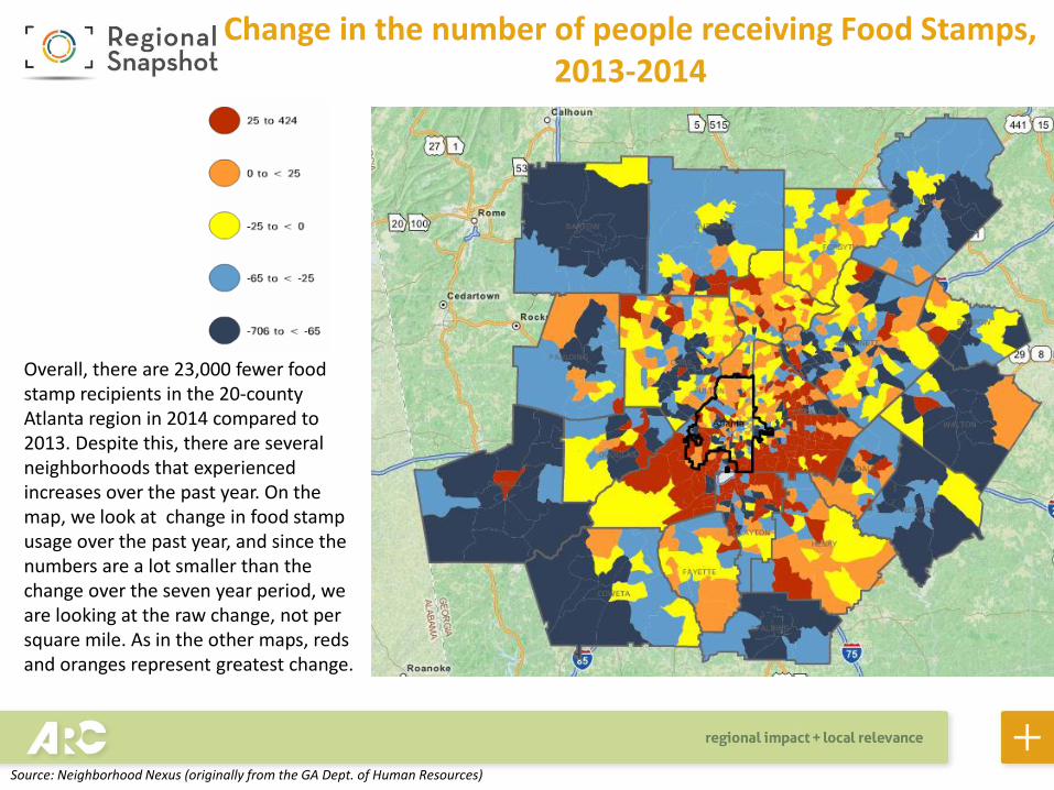
Overall, there are 23,000 fewer food stamp recipients in the 20-county Atlanta region in 2014 compared to 2013. Despite this, there are several neighborhoods that experienced increases over the past year. On the map, we look at change in food stamp usage over the past year, and since the numbers are a lot smaller than the change over the seven year period, we are looking at the raw change, not per square mile. As in the other maps, reds and oranges represent greatest change.
Change in the number of people receiving Food Stamps, 2013-2014
Source: Neighborhood Nexus (originally from the GA Dept. of Human Resources)
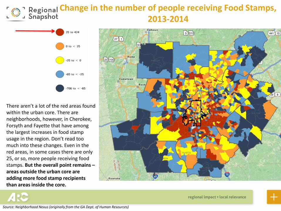
There aren’t a lot of the red areas found within the urban core. There are neighborhoods, however, in Cherokee, Forsyth and Fayette that have among the largest increases in food stamp usage in the region. Don’t read too much into these changes. Even in the red areas, in some cases there are only 25, or so, more people receiving food stamps. But the overall point remains – areas outside the urban core are adding more food stamp recipients than areas inside the core.
Change in the number of people receiving Food Stamps, 2013-2014
Source: Neighborhood Nexus (originally from the GA Dept. of Human Resources)
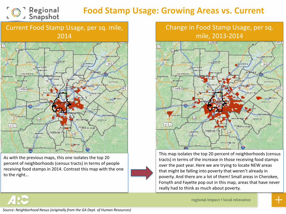
Food Stamp Usage: Growing Areas vs. Current
Change in Food Stamp Usage, per sq. mile, 2013-2014
Current Food Stamp Usage, per sq. mile, 2014
As with the previous maps, this one isolates the top 20 percent of neighborhoods (census tracts) in terms of people receiving food stamps in 2014. Contrast this map with the one to the right…
This map isolates the top 20 percent of neighborhoods (census tracts) in terms of the increase in those receiving food stamps over the past year. Here we are trying to locate NEW areas that might be falling into poverty that weren’t already in poverty. And there are a lot of them! Small areas in Cherokee, Forsyth and Fayette pop out in this map, areas that have never really had to think as much about poverty.
Source: Neighborhood Nexus (originally from the GA Dept. of Human Resources)
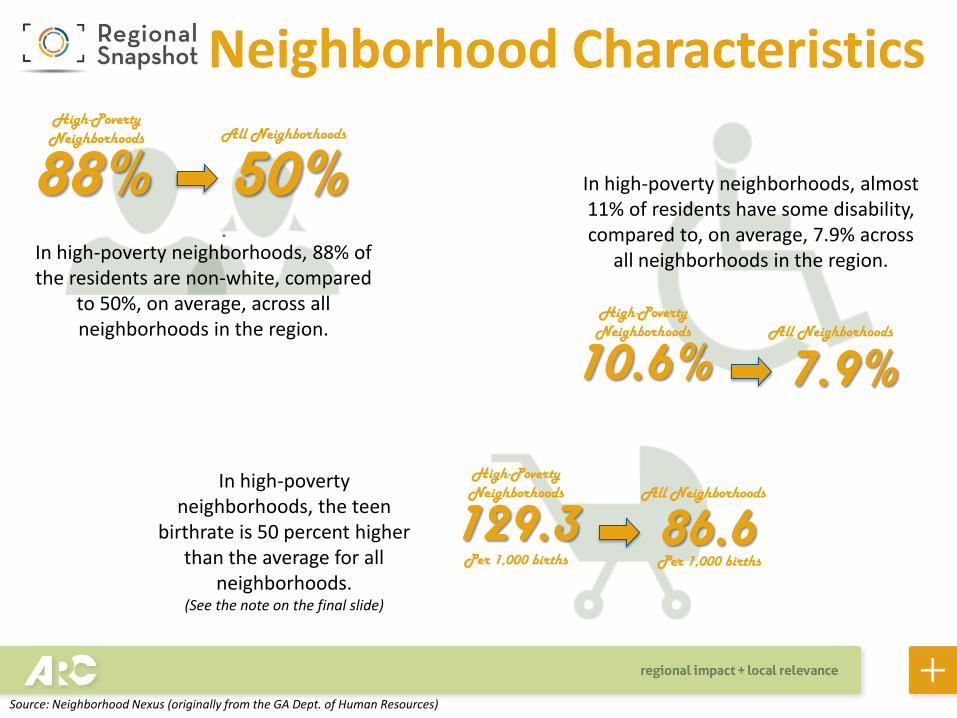
Neighborhood Characteristics
10.6%
In high-poverty neighborhoods, 88% of the residents are non-white, compared
to 50%, on average, across all neighborhoods in the region.
88% 50% High-Poverty Neighborhoods All Neighborhoods
High-Poverty Neighborhoods All Neighborhoods
7.9%
In high-poverty neighborhoods, almost 11% of residents have some disability, compared to, on average, 7.9% across
all neighborhoods in the region.
129.3 High-Poverty Neighborhoods All Neighborhoods
In high-poverty neighborhoods, the teen
birthrate is 50 percent higher than the average for all
neighborhoods. (See the note on the final slide)
86.6 Per 1,000 births Per 1,000 births
Source: Neighborhood Nexus (originally from the GA Dept. of Human Resources)
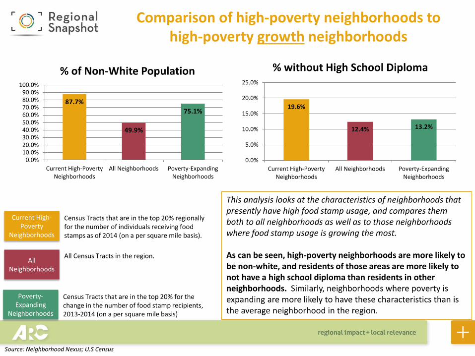
Comparison of high-poverty neighborhoods to high-poverty growth neighborhoods
87.7%
49.9%
75.1%
0.0%10.0%20.0%30.0%40.0%50.0%60.0%70.0%80.0%90.0%
100.0%
Current High-PovertyNeighborhoods
All Neighborhoods Poverty-ExpandingNeighborhoods
% of Non-White Population
19.6%
12.4% 13.2%
0.0%
5.0%
10.0%
15.0%
20.0%
25.0%
Current High-PovertyNeighborhoods
All Neighborhoods Poverty-ExpandingNeighborhoods
% without High School Diploma
Current High-Poverty
Neighborhoods
All Neighborhoods
Poverty-Expanding
Neighborhoods
Census Tracts that are in the top 20% regionally for the number of individuals receiving food stamps as of 2014 (on a per square mile basis).
All Census Tracts in the region.
Census Tracts that are in the top 20% for the change in the number of food stamp recipients, 2013-2014 (on a per square mile basis)
This analysis looks at the characteristics of neighborhoods that presently have high food stamp usage, and compares them both to all neighborhoods as well as to those neighborhoods where food stamp usage is growing the most. As can be seen, high-poverty neighborhoods are more likely to be non-white, and residents of those areas are more likely to not have a high school diploma than residents in other neighborhoods. Similarly, neighborhoods where poverty is expanding are more likely to have these characteristics than is the average neighborhood in the region.
Source: Neighborhood Nexus; U.S Census

Comparison of high-poverty neighborhoods to high-poverty growth neighborhoods
Current High-Poverty
Neighborhoods
All Neighborhoods
Poverty-Expanding
Neighborhoods
Census Tracts that are in the top 20% regionally for the number of individuals receiving food stamps as of 2014 (on a per square mile basis).
All Census Tracts in the region.
Census Tracts that are in the top 20% for the change in the number of food stamp recipients, 2013-2014 (on a per square mile basis)
10.6%
7.9% 9.1%
0.0%
2.0%
4.0%
6.0%
8.0%
10.0%
12.0%
Current High-PovertyNeighborhoods
All Neighborhoods Poverty-ExpandingNeighborhoods
% with Disability
25.4%
12.9%
19.6%
0.0%
5.0%
10.0%
15.0%
20.0%
25.0%
30.0%
Current High-PovertyNeighborhoods
All Neighborhoods Poverty-ExpandingNeighborhoods
% households headed by single mother
This analysis looks at the characteristics of neighborhoods that presently have high food stamp usage, and compares them both to all neighborhoods as well as to those neighborhoods where food stamp usage is growing the most. High poverty neighborhoods are more likely to have: • A higher percentage of residents who are disabled
• A higher percentage of households headed by a single
mother
Source: Neighborhood Nexus; U.S Census
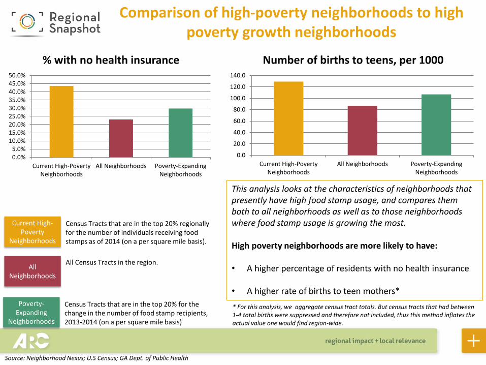
Comparison of high-poverty neighborhoods to high poverty growth neighborhoods
Current High-Poverty
Neighborhoods
All Neighborhoods
Poverty-Expanding
Neighborhoods
Census Tracts that are in the top 20% regionally for the number of individuals receiving food stamps as of 2014 (on a per square mile basis).
All Census Tracts in the region.
Census Tracts that are in the top 20% for the change in the number of food stamp recipients, 2013-2014 (on a per square mile basis)
0.0%5.0%
10.0%15.0%20.0%25.0%30.0%35.0%40.0%45.0%50.0%
Current High-PovertyNeighborhoods
All Neighborhoods Poverty-ExpandingNeighborhoods
% with no health insurance
0.0
20.0
40.0
60.0
80.0
100.0
120.0
140.0
Current High-PovertyNeighborhoods
All Neighborhoods Poverty-ExpandingNeighborhoods
Number of births to teens, per 1000
This analysis looks at the characteristics of neighborhoods that presently have high food stamp usage, and compares them both to all neighborhoods as well as to those neighborhoods where food stamp usage is growing the most. High poverty neighborhoods are more likely to have: • A higher percentage of residents with no health insurance
• A higher rate of births to teen mothers*
* For this analysis, we aggregate census tract totals. But census tracts that had between 1-4 total births were suppressed and therefore not included, thus this method inflates the actual value one would find region-wide.
Source: Neighborhood Nexus; U.S Census; GA Dept. of Public Health