the basic tools of improvement - adhesives, coatings ... and effect diagram also called a...
TRANSCRIPT

The Basic Tools of
Improvement

2
Objectives Upon completion of this session you will
♦ Be able to define problems and apply a structured approach to problem.
♦ Identify work as a process with inputs and outputs.
♦ Know when and how to apply the basic tools of improvement to various problems and analyses
♦ Be able to make more informed decisions based on facts and data
♦ Understand how to determine if a process is in control and capable

3
The Basic Tools and Concepts of Improvement
♦ Developing a Problem Statement and Problem Solving ♦ Brainstorming ♦ Cause and Effect Analysis ♦ Flow Charts ♦ Data Collection ♦ Pareto Diagrams ♦ Scatter Diagrams ♦ Histograms ♦ Process Capability ♦ Control Charts

4
What do We Use to Solve Problems?

5
♦ The systematic investigation of a process to identify the most likely ROOT CAUSE of the gap
♦ Taking corrective action to eliminate the gap
♦ Keeping the problem from occurring in the future
What is Problem Solving?
6
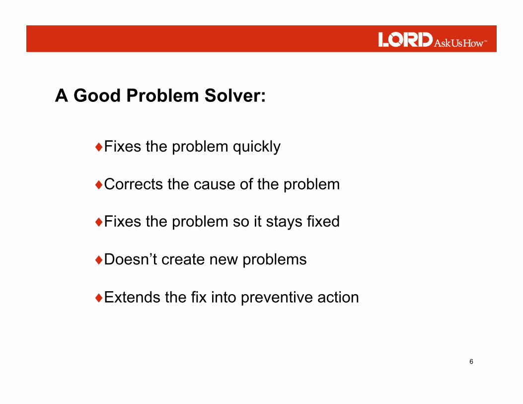
A Good Problem Solver:
♦ Fixes the problem quickly
♦ Corrects the cause of the problem
♦ Fixes the problem so it stays fixed
♦ Doesn’t create new problems
♦ Extends the fix into preventive action
7
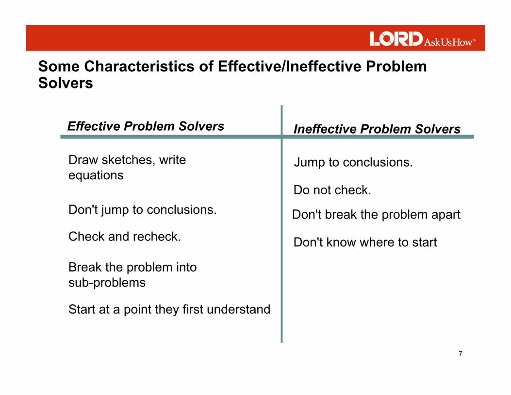
Effective Problem Solvers Ineffective Problem Solvers
Draw sketches, write equations
Don't jump to conclusions.
Jump to conclusions.
Check and recheck.
Do not check.
Break the problem into sub-problems
Don't break the problem apart
Start at a point they first understand
Don't know where to start
Some Characteristics of Effective/Ineffective Problem Solvers

8
Benefits of Good Problem Solving:
♦ Quickly arrive at an answer
♦ Avoid redundant actions
♦ Get to optimum answers
♦ Reduce frustration and stress
♦ Eliminate trial and error
♦ Gain consensus among group
♦ Uncover ideas applied to other problems
♦ Personal satisfaction

9
♦ Significantly clarifies the current situation
♦ Specifically identifies what needs improved
♦ Identifies the level of the problem and where it is occurring
A problem well stated is a problem well on its way to being solved!
A Problem Statement:

10
♦ What is wrong? ♦ Where is the problem appearing? ♦ How big is the problem? ♦ What’s the impact of the problem on the business?
♦ State an opinion about what is wrong ♦ Describe the cause of the problem ♦ Assign blame or responsibility for the problem ♦ Prescribe a solution ♦ Combine several problems into one Problem Statement

11
Problem Statement: Inventory levels are too high and must be reduced!
Good or Bad? Why?
This Problem statement is bad!
♦ Too little information is given ♦ Does not give you the ability to take specific action, enlist support, and obtain information ♦ It includes speculation about the cause and action that will be taken

12
The Old Problem Statement: Inventory levels are too high and must be reduced!
The Improved Problem Statement: Inventory levels at the West Metro inventory storage process in Scottsdale are consuming space, taking up asset management time, and creating clash flow issues. Inventory levels are averaging 31.2 days, with a high of 45 days. These levels have exceeded the target of 25 days 95 percent of the time since January 2005. We would save $250,000 per year if we were at the targeted level.

13
Problem Statement: Inventory levels at the West Metro inventory storage process in Scottsdale are consuming space, taking up asset management time, and creating clash flow issues. Inventory levels are averaging 31.2 days, with a high of 45 days. These levels have exceeded the target of 25 days 95 percent of the time since January 2005. We would save $250,000 per year if we were at the targeted level.
We get more information from the improved problem statement such as:
♦ Where the problem is occurring ♦ How long it has occurred ♦ The magnitude of the problem ♦ How much it is costing

14
• Kepner-Tregoe Method
• Global 8D
• PDCA
• 7-Step Method
• Others?
Some Problem Solving Models

15
1. Problem Statement
2. List Observed & Comparative Facts
3. Identify Differences
4. List Relevant Changes
5. Generate Likely Causes
6. Test Likely Causes
7. Verify Most Likely Cause
KT Problem Solving Steps

16
♦ Significantly clarifies the current situation
♦ Specifically identifies what needs improved
♦ Identifies the level of the problem and where it is occurring
♦ Describes it in clear measurable terms

17
♦ State an opinion about what is wrong
♦ Describe the cause of the problem
♦ Assign blame or responsibility for the problem
♦ Prescribe a solution
♦ Combine several problems into one Problem Statement

18
Brainstorming
♦ An excellent way identify problems that you see on your job
♦ A group problem solving method that helps people identify and solve problems by bringing out a lot of ideas in a short time
♦ A good way to gather many possible explanations for a specific problem
What is Brainstorming?

19
What Do You Need for Brainstorming?
♦ Include everyone who is concerned with the problem ♦ Include those people who can take an active part in solving the problem
A Group Willing to Work Together
♦ Anyone can lead – can be the manager, one of the regular team members, or an outsider ♦ Leader is to provide guidance and keep the group on track ♦ Leader must walk the line between control and participation
A Leader
♦ A place to meet where there are no distractions ♦ The group will need flipcharts, markers, and masking tape to put the charts up on the wall
A Meeting Place and Equipment

20
How Brainstorming Works
1. Choose the subject for brainstorm. 2. Make sure everyone understands what the problem or topic is. 3. Make sure everyone takes a turn and expresses one idea. If somebody
can’t think of anything, he or she says “Pass.” 4. Have a recorder who will write down each idea as it is expressed. 5. Write down all the ideas. 6. Encourage wild ideas. 7. Hold criticism until after the session – the aim of brainstorming is quantity
and creativity. 8. Laughter is fun and healthy – laugh with someone and not at them. 9. Allow a few hours (or days) for further thought – an incubation period allows
the mind to release more creative ideas.
General Rules for a Good Brainstorming Session

21
Troubleshooting a Brainstorming Session
♦ “Piggyback” or build on others ideas The ideas slow down or dry up
♦ Be patient – they may open up later ♦ Encourage the silent member to at least say “Pass” if they do not have an idea ♦ Ask for suggestions but do not put the person on the spot
The silent member
♦ Criticize problems, not people ♦ Do not publicize mistakes
Criticism
♦ Be firm but friendly – discuss the issue in private ♦ When disruption occurs gently direct the conversation back to the topic
The difficult member

22
Cause and Effect Diagram
Variation
Wrong
Design
Inadequate training
Lack of interest
Variation in Coating Thickness
Experience
Speed
Formulation
MATERIAL MACHINE
METHODS PEOPLE
High turnover
Defective
Procedure Target Specs
Control Instruments
Temperature
Variation
Age or Wear
Can’t Control
Humidity
ENVIRONMENT
Organize a Brainstorm List of Causes
Variation in Coating Thickness
Formulation Temperature Target Specs Variation Procedure

23
Cause and Effect Diagram Also called a “Fishbone” or “Ishikawa” Diagram
♦ Organize the ideas of a brainstorming session
♦ Sort ideas into basic categories
♦ Show the relationship between ideas
♦ Helps complete the brainstorming session
♦ Helps the team to keep track of where they are in the problem solving process
Why Use the C and E Diagram?

24
How to Construct the Cause and Effect Diagram
♦ Use big flipchart or large sheets of paper, masking tape, flipchart markers with fairly broad points, and the brainstorm idea list.
Step 1. Gather the Material
♦ The leader and members of the brainstorm group and any outside experts such as engineers or people from sales or quality.
♦ One person is to volunteer to act as a recorder and draw the diagram
Step 2. Call together everyone involved with the problem
25
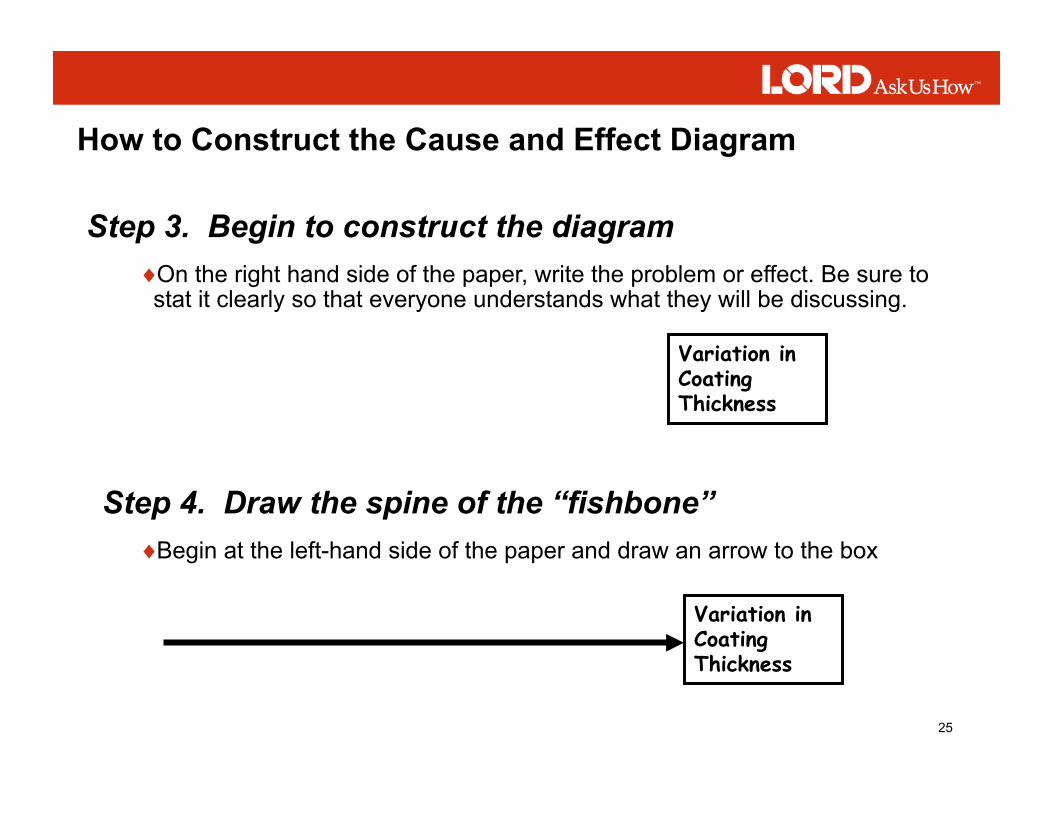
How to Construct the Cause and Effect Diagram
♦ On the right hand side of the paper, write the problem or effect. Be sure to stat it clearly so that everyone understands what they will be discussing.
Step 3. Begin to construct the diagram
Variation in Coating Thickness
♦ Begin at the left-hand side of the paper and draw an arrow to the box
Step 4. Draw the spine of the “fishbone”
Variation in Coating Thickness

26
How to Construct the Cause and Effect Diagram
♦ Material, machine, methods, and people are the four main headings most often used ♦ Your team may decide other categories are appropriate such as money, management, gauges, environment, etc.
Step 5. Add the main causes
Variation in Coating Thickness
MATERIAL MACHINE
PEOPLE METHODS

27
How to Construct the Cause and Effect Diagram
♦ Ideas come from a previous brainstorm sessions or you can suggest ideas as you build the diagram.
Step 6. Add the brainstorm ideas
Variation
Wrong
Design
Inadequate training
Lack of interest
Variation in Coating Thickness
Experience
Speed
Formulation
MATERIAL MACHINE
METHODS PEOPLE
High turnover
Defective
Procedure Target Specs
Control Instruments
Temperature
Variation
Age or Wear
Can’t Control
Humidity
ENVIRONMENT

28
Pareto Analysis
♦ To help you decide which of several chronic problems to attack
♦ To sort out the few really important problems from the more numerous but less important problems
♦ To create a highly visible format that provides the incentive to push for more improvements
Why do a Pareto Analysis?
20% of the sources cause 80% of any problem

29
Pareto Diagram
♦ A special type of bar graph that displays problems in order of frequency ♦ Frequency may mean cost in dollars, number of defects, or how often a failure occurs.
What is a Pareto Diagram

30
How to Construct a Pareto Diagram
♦ Such as reduce the rate of defects Step 1. Specify your goal clearly
♦ Determine if data is already available ♦ There may be many existing reports where you can get the data you need
Step 2. Collect data
31
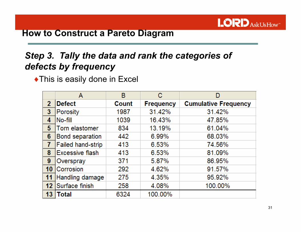
How to Construct a Pareto Diagram
♦ This is easily done in Excel
Step 3. Tally the data and rank the categories of defects by frequency

32
How to Construct a Pareto Diagram
Step 4. Create the Pareto diagram

33
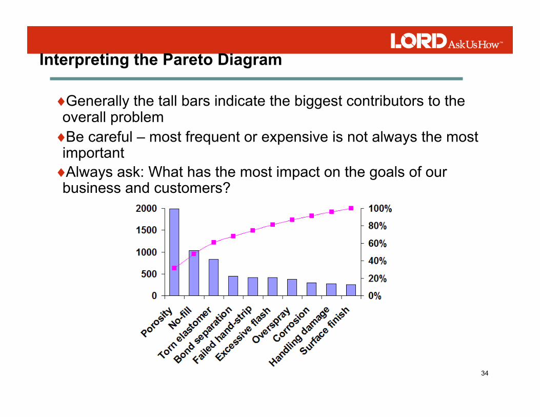
Components of the Pareto Diagram
Frequency
Cumulative Frequency
Percentage
Causes
34
Interpreting the Pareto Diagram
♦ Generally the tall bars indicate the biggest contributors to the overall problem ♦ Be careful – most frequent or expensive is not always the most important ♦ Always ask: What has the most impact on the goals of our business and customers?

35
Flowcharts
♦ A graphic representation of a process
♦ A necessary step toward improving a process
♦ A tool that allows a team to identify the ACTUAL flow or sequence of events in a process
What is a flowchart?

36
Flowcharts
♦ Show unexpected complexity, problem areas, redundancy, unnecessary loops
♦ Show where simplification and standardization may be possible
♦ Allow everyone to come to agreement on the steps of the process
♦ Identify locations where additional data can be collected and investigated
♦ Serve as a training tool to understand the complete process
The purpose of using a flow chart is to:

37
How to Construct a Flowchart
♦ Clearly define where the process begins and ends Agree on the level of detail for the flowchart ♦ Allow everyone to come to agreement on the steps of the process
1. Determine the frame or boundaries of the process
♦ Brainstorm a list of all major activities, inputs, outputs, and decisions ♦ Document brainstorming on a flipchart or whiteboard
2. Determine the steps in the process

38
How to Construct a Flowchart
♦ Arrange the steps in the order they are carried out ♦ Use Post-It notes so you can move them around
3. Sequence the steps
Unless you are flowcharting a new process it is important to first chart how the process actually works.

39
How to Construct a Flowchart
3. Draw the appropriate symbols
Used to show the materials, information, or action (inputs) to start the process or to show the results at the end (output) of a process
Used to show an activity or task in the process
Shows those points in the process where a yes/no question is being asked or a decision is required
A circle with either a letter or number identifies a break in the flowchart and is continued elsewhere on the same page or another page
Arrows show the direction or flow of the process

40
A Basic Flowchart Receive
parts from stock
Move parts into Chem Process area
Barrel load parts
Move to PHOSPHATIZE
Load Parts (rack or barrel)
Degrease
Clean
Pickle
Rinse
Phosphatize
Rinse
Seal
Dry
Unload
Package and deliver to spray
line Rinse
Degrease/Blast
Rinse
Dry and unload
A Phoshpatizing Process

41
A More Detailed Flowchart
Start of the process
Process Steps and Decision Points
Process Steps and Decision Points
Connectors
End of the process

42
Flowcharting Tips
♦ Always flow chart with a team. Rarely does one person have all process knowledge.
♦ Investigate the process by watching it in many different conditions. Watch the process as it happens to see the detail you need.
♦ Walk through the actual process
♦ Brainstorm and list the steps on paper before attempting to use software to construct the chart
♦ Maintain your charts and maps with dates and update them as necessary. Use them as a reference and training tool.

43
Inputs Process
All Work Is a Process - SIPOC Analysis
Outputs
We analyze processes relative to these parameters in order to understand their impact
Information/materials provided by suppliers that are consumed or transformed by the process.
The series of steps that transform and add value to the inputs.
The product or service used by the customer

44
SUPPLIERS INPUTS (Xs)
PROCESSES (Xs)
OUTPUTS (CTQs)
CUSTOMERS
Manufacturer Copier Copies You
Office Supply Company Paper File
Toner
Yourself Original
Power Company Electricity
Making a Photocopy
SIPOC Analysis

45
Put original on glass
Close Lid
Adjust Settings
Press START
Remove original/copies
PROCESS STEPS
SIPOC Analysis Example

46
Workshop – Process Flow
♦ Changing a tire on a passenger car
♦ Recording a television program using a VCR or DVD recorder
♦ Making a fresh pot of coffee
♦ Taking a photograph with a digital camera
♦ Others?
Select anyone of these simple processes (or use one of our own. As a group develop a basic process flow diagram using any of the models we have discussed.

47
Data Collection
♦ To obtain clear, useful, information about problems and their causes in order to make improvements
♦ To describe the extent of a problem
♦ To measure and understand the variation in our processes
♦ To determine if our processes are consistently able to meet specifications
♦ Others reasons?
Why collect data?

48
Data and Information
Data = Facts
Information = Answers to Questions
“Information” Includes “Data”
“Data” does Not Necessarily Include Information
Simply collecting data does not always mean that your team will have useful information.

49
Generating Information
♦ Formulate precisely the question we are trying to answer
♦ Collect the data and facts relating to that question
♦ Analyze the data to determine the factual answer to the question
♦ Present the data in a way that clearly communicates the answer to the question
To generate information we need to:
Accurate, precise data, is useless if it does not clearly address a question that someone cares about

50
Planning for Data Collection
♦ What question do we need to answer? ♦ How will we recognize and communicate the answers to the question? ♦ What data analysis tools (Pareto, histogram, etc.) do we envision using, and how will we communicate the results? ♦ What type of data do we need in order to construct this tool an answer this question? ♦ Where in the process can we get this data? ♦ Who in the process can give us this data? ♦ How can we collect this data from these people with minimum effort and chance of error ♦ What additional information do we need to capture for future analysis?
In order to plan for good data collection, ask these questions:

51
Basic Types of Data
♦ Places data into “discrete” classes ♦ Sometimes simply called “discrete: or “attribute” ♦ Examples include: conforming and nonconforming, on-time and late; excellent, good, fair, and poor; types of defects
Discrete Attribute Data
♦ Actual measurement values ♦ Often simply referred to as continuous data ♦ Examples include tensile, load deflection, length, weight ♦ Have many more uses than simple discrete data ♦ Examples include tensile, load deflection, length, weight
Continuous Variable Data

52
Data Collection Forms
♦ Keep the form simple and easy to use ♦ Minimize the opportunities for errors ♦ Capture data for analysis, reference, and traceability ♦ The form should be self explanatory ♦ The form must look professional
Almost any format can be used but follow these basic rules:

53
Data Collection Checklist
♦ Read the temperature to the nearest degree in the area designated.
♦ Plot the temperature and time on the grid using a dot. ♦ Reading should be taken on the hour (+/- 5 minutes). ♦ Use the “Notes” section to record anything unusual.
Date:
Line#
Inspector:
Questions? Contact Mark Wang at ext. 135

54
Data Recording Checklist
Porosity // /// ////
No-fill //// // //// ////
Overspray /// //// //// //
Torn elastomer /// // //
Excessive Flash //// /// //
There are many different types of checklists – design and use the format that is appropriate for your situation.

55
Data Collection – Samples
♦ Each and every observation or data measure has an equal and likely chance of being chosen ♦ Use a random number generator or table to select the samples
Random Sample
♦ Every nth sample is selected Sequential Sample
♦ A sample is taken from stratified data groups Stratified Sample
Collect data over a sufficient period to be sure the data represents typical results during a typical cycle.

56
Data Collection – Summary
1. Formulate a good question
2. Consider the appropriate data analysis tool
3. Define the sampling method and data collection points
4. Select an unbiased person to collect the data
5. Design a data collection form
6. Prepare the instructions for data collection
7. Train the data collectors
8. Audit the collection process and validate the results
57
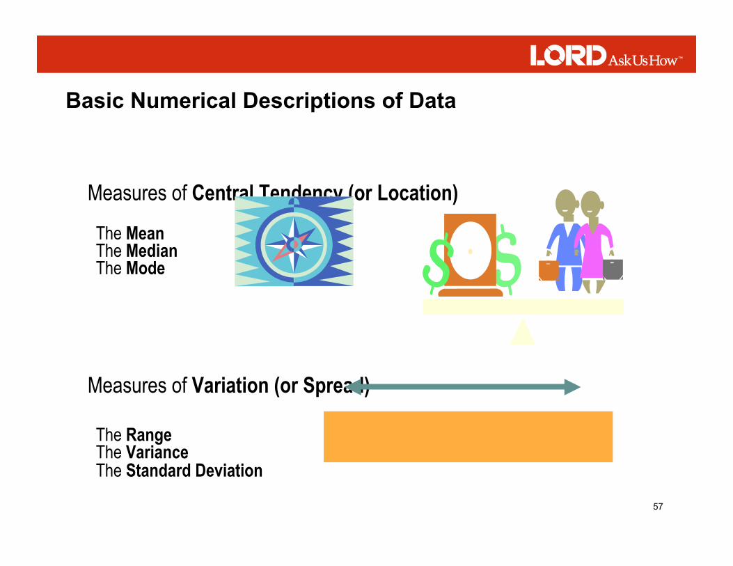
Measures of Central Tendency (or Location)
The Mean The Median The Mode
Measures of Variation (or Spread) The Range The Variance The Standard Deviation
Basic Numerical Descriptions of Data

58
Sample Statistics Approximate Population Parameters

59
Populations and Samples

60
Population and Sample Equations

61
Scatter Diagram
Indicates how two variables may be related

62
Scatter Diagram
Why use it?
What does it do?
♦ To study and identify the possible relationship between the changes observed in two different sets of variables.
♦ Supplies the data to confirm that two variables are related. ♦ Provides a visual and statistical means to test the strength of a potential relationship. ♦ Provides a good follow-up to a Cause & Effect Diagram to find out if there is more than just a consensus connection between the cause and effect
63
How to Construct a Scatter Diagram
1. Determine if the problem is suitable for a scatter diagram
2. Collect the data
♦ Are the points you are going to plot from variable (measurable) data? ♦ Are there two things you can measure (two variables? ♦ Are you trying to see if the two variables affect each other?
♦ 50-100 paired samples of data are normally required, however in some circumstances less data will still work ♦ Record any interesting or peculiar things that happen

64
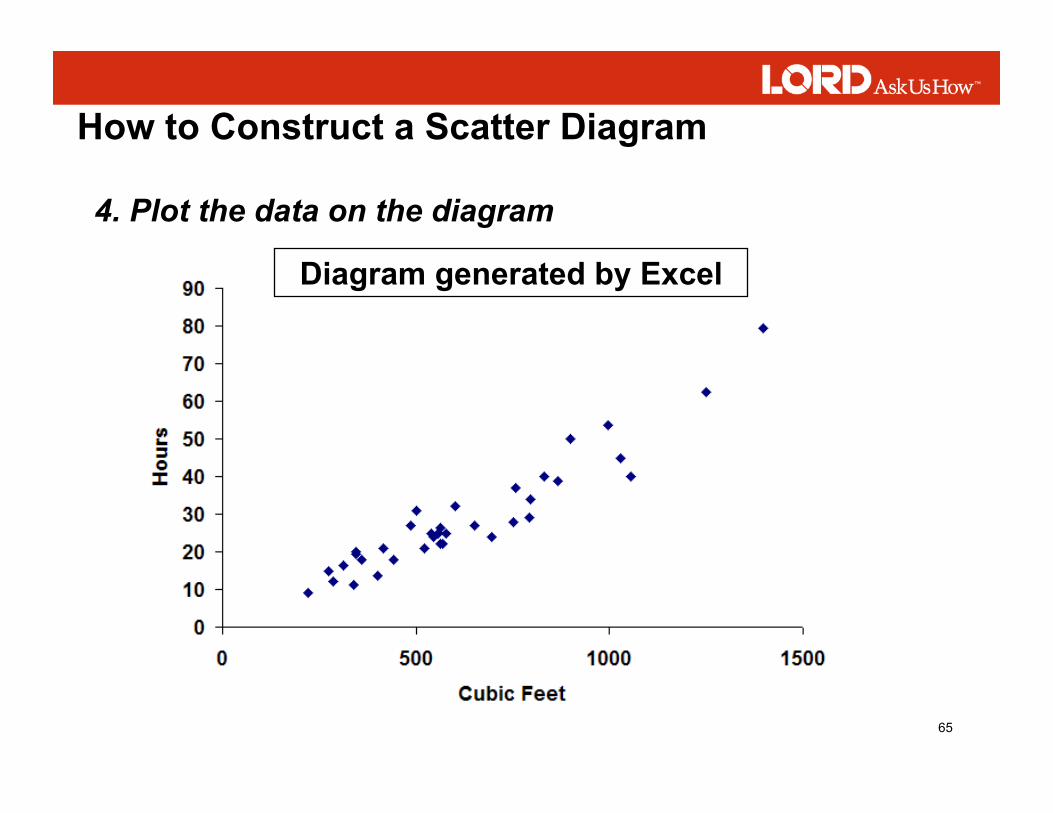
How to Construct a Scatter Diagram
3. Draw the horizontal (x axis) and vertical (y axis) ♦ This is normally done with your software (Excel, Minitab, etc.)
Dependent Variable (“effect”)
Independent Variable (“cause”)
65
How to Construct a Scatter Diagram
4. Plot the data on the diagram
Diagram generated by Excel

66
How to Construct a Scatter Diagram
4. Interpret the diagram ♦ Many different ways to analyze a scatter diagram ♦ In this training we will focus only on the visual interpretation of scatter diagrams

67
Interpreting a Scatter Diagram
Positive Correlation
An increase in y may depend on an increase in x.
Possible Positive Correlation
If x is increased, y may increase somewhat

68
Interpreting a Scatter Diagram
Negative Correlation An increase in y may depend on an increase in x.
No Correlation
There is no demonstrated connection between y and x
69
Interpreting a Scatter Diagram
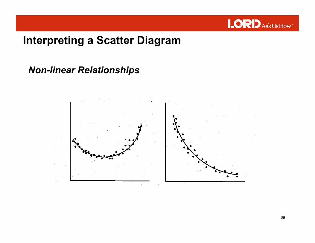
Non-linear Relationships

70
Scatter Diagram Summary
♦ The scatter diagram does not predict cause and effect relationships ♦ The scatter diagram shows the strength of the relationship between two variables ♦ The stronger the relationship, the greater the likelihood that change in one variable will affect change in the other

71
Variation
♦ Variation is the difference in the measured output of a process
♦ Everything has some amount of variation
♦ Over time, variation in the measured output from a process will follow a pattern.
♦ A histogram is one tool that helps us keep track of variation

72
Variation in Data Forms a Pattern
Size
Size
Size
Size

73
Histogram
♦ Display large amounts of data that would be difficult to interpret in a table or other format
♦ Show the frequency of occurrence of various values
A Histogram is used to:
♦ Illustrate the underlying distribution of the data
♦ Provide useful information for predicting future performance
♦ Assist in assessing process capability

74
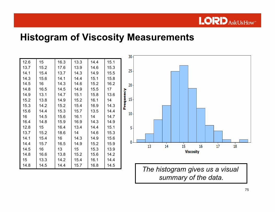
Viscosity Measurements from 120 Batches
12.6 13.7 14.1 14.3 14.5 14.8 14.9 15.2 15.3 15.6 16 16.4 12.8 13.7 14.1 14.4 14.5 14.8 15 14.8
15 15.2 15.4 15.6 16 16.5 13.1 13.8 14.2 14.4 14.5 14.8 15 15.2 15.4 15.7 16 16.6 13.3 14.5
16.3 17.6 13.7 14.1 14.3 14.5 14.7 14.9 15.2 15.3 15.6 15.9 16.4 18.6 16 16.5 13 13.8 14.2 14.4
13.3 13.9 14.3 14.4 14.6 14.9 15.1 15.2 15.4 15.7 16.1 16.9 13.4 14 14.3 14.9 15 15.2 15.4 15.7
14.4 14.6 14.9 15.1 15.2 15.5 15.8 16.1 16.9 13.5 14 14.3 14.4 14.6 14.9 15.2 15.3 15.6 16.1 16.8
15.1 15.3 15.5 15.8 16.2 17 13.6 14 14.3 14.4 14.7 14.9 15.1 15.3 15.6 15.9 13.9 14.2 14.4 14.5
How would you interpret this data?
What can you say about the amount of variation?
What about the pattern of variation?
75
Histogram of Viscosity Measurements
12.6 13.7 14.1 14.3 14.5 14.8 14.9 15.2 15.3 15.6 16 16.4 12.8 13.7 14.1 14.4 14.5 14.8 15 14.8
15 15.2 15.4 15.6 16 16.5 13.1 13.8 14.2 14.4 14.5 14.8 15 15.2 15.4 15.7 16 16.6 13.3 14.5
16.3 17.6 13.7 14.1 14.3 14.5 14.7 14.9 15.2 15.3 15.6 15.9 16.4 18.6 16 16.5 13 13.8 14.2 14.4
13.3 13.9 14.3 14.4 14.6 14.9 15.1 15.2 15.4 15.7 16.1 16.9 13.4 14 14.3 14.9 15 15.2 15.4 15.7
14.4 14.6 14.9 15.1 15.2 15.5 15.8 16.1 16.9 13.5 14 14.3 14.4 14.6 14.9 15.2 15.3 15.6 16.1 16.8
15.1 15.3 15.5 15.8 16.2 17 13.6 14 14.3 14.4 14.7 14.9 15.1 15.3 15.6 15.9 13.9 14.2 14.4 14.5
The histogram gives us a visual summary of the data.

76
Histogram of Viscosity Measurements What does the histogram show us?
Shape of the data
Spread of the data
Center of the data

77
What is Meant by the Center?
The Center of a Process
Center of the data
♦ In process control we refer to the center as the “mean” or “arithmetic average” or “X-bar”

78
What is Meant by the Center? The Center of Specifications ♦ The mid-point between the upper and lower specification limit ♦ Often referred to as specification “nominal”
Nominal = 15

79
What is Meant by the Spread?
The Spread of a Process
♦ In process control we describe the spread by the range or the standard deviation
Spread of the data

80
What is Meant by the Spread?
The Standard Deviation describes the Spread
♦ The larger the standard deviation, the greater the variation

81
What is Meant by the Spread?
The range is the difference between the largest and smallest values.
= Largest Value – Smallest Value

82
Interpreting the Shape of the Histogram
Normal Distribution
♦ Bell shaped
♦ Tapers off evenly on both ends
Viscosity
F r e q u e n
c y
18 17 16 15 14 13
30 25 20 15 10 5 0

83
Interpreting the Shape of the Histogram
♦ Not normal as there are no tapered ends ♦ Parts may have been sorted from both ends ♦ Too few classes (or intervals) may have been chosen
Viscosity
F r e q u e
n c y
18 17 16 15 14 13
30 25 20 15 10 5 0
Truncated Distribution

84
Interpreting the Shape of the Histogram
Missing Center
Viscosity
F r e q u e
n c y
18 17 16 15 14 13
30 25 20 15 10 5 0
♦ The center has been sorted from the rest
♦ This portion may have been delivered to a customer with tighter specifications

85
Interpreting the Shape of the Histogram
Bimodal Distribution ♦ Two combined populations
♦ Two shifts, operators, gages, tools, settings, etc.
Viscosity
F r e q u e
n c y
18 17 16 15 14 13
30 25 20 15 10 5 0

86
Interpreting the Shape of the Histogram
Negatively Skewed ♦ Process centered toward the low end of the tolerance ♦ Parts that fall out on the low side are sorted ♦ The nature of the process prohibits any measurement past a minimum value
Viscosity
F r e q u e
n c y
18 17 16 15 14 13
30 25 20 15 10 5 0

87
Interpreting the Shape of the Histogram
Positively Skewed
♦ Process centered toward the high end of the tolerance ♦ Parts that fall out on the high side are sorted ♦ The nature of the process prohibits any measurement past a minimum value
Viscosity
F r e q u e
n c y
18 17 16 15 14 13
30 25 20 15 10 5 0

88
Histograms in Production Situations
Histogram for the viscosity data where: Lower Specification Limit (LSL) = 10 Upper Specification Limit (USL) = 20
LSL USL

89
Interpreting the Histogram
♦ The amount of variation is so small that all units have been produced inside the specifications ♦ The distribution is symmetrical ♦ The process is centered at midpoint between the specifications
Spread of the data
Center of the data
Shape of the data

90
Too Much Variation – Spread is the Problem ♦ The viscosity measurements of some batches are too low, and others too high ♦ It is already centered within the specification limits ♦ The process is still centered at the mid-point of the specifications
Spread of the data
Center of the data

91
Centering is the Problem
♦ The process center has shifted toward the Upper Specification Limit ♦ Moving the process center to the middle of the specification limits will improve the process
Spread of the data
Center of the data

92
Centering and Spread is the Problem
♦ The process center has shifted toward the Upper Specification Limit ♦ The spread, or the total amount of variation is wider than the specification limits – centering will not help
Spread of the data
Center of the data

93
A procedure that involves bringing the process in statistical control for a period of time and comparing the long term process performance to management or engineering specifications.
Process Capability Analysis
A comparison of process spread vs. specification width
What is Process Capability Analysis?

94
♦ To provide a single number to assess the performance of a process
♦ To provides a scale for comparing processes
♦ To show over time if a process is able to meet specifications
Process Capability Indices
What are the indices used for?
The indices are calculated by software however, you need to know how to interpret them.

95
• Compares the width of the specification to the short-term width of the process
• Only looks at variation and ignores the extent to which the process is on target.
Short Term Capability Index
96
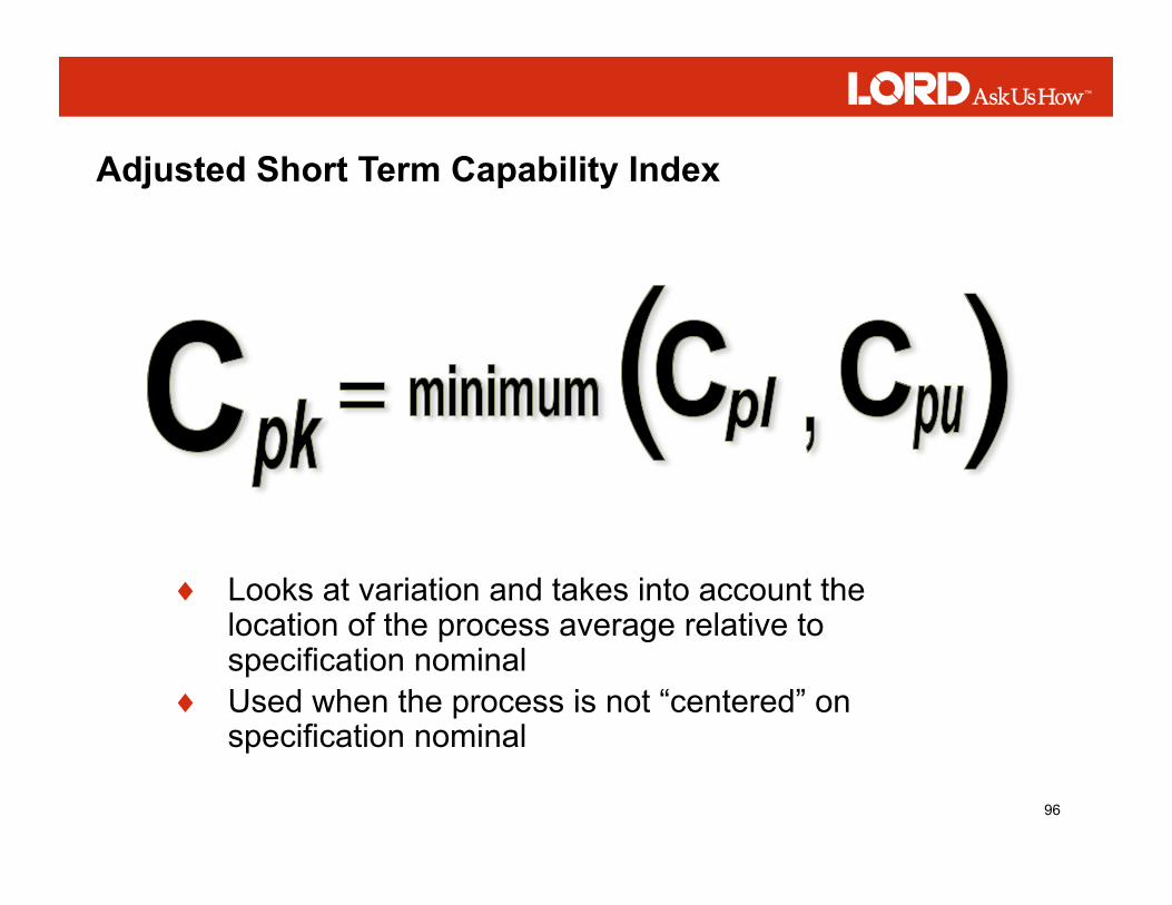
Adjusted Short Term Capability Index
♦ Looks at variation and takes into account the location of the process average relative to specification nominal
♦ Used when the process is not “centered” on specification nominal

97
Adjusted Short Term Capability Index

98
• Compares the width of the specification to the long -term width of the process
• Only looks at variation and ignores the extent to which the process is on target.
Long Term Capability Index

99
♦ Looks at variation and takes into account the location of the process average relative to specification nominal
♦ Used when the process is not “centered” on specification nominal
Adjusted Long Term Capability Index
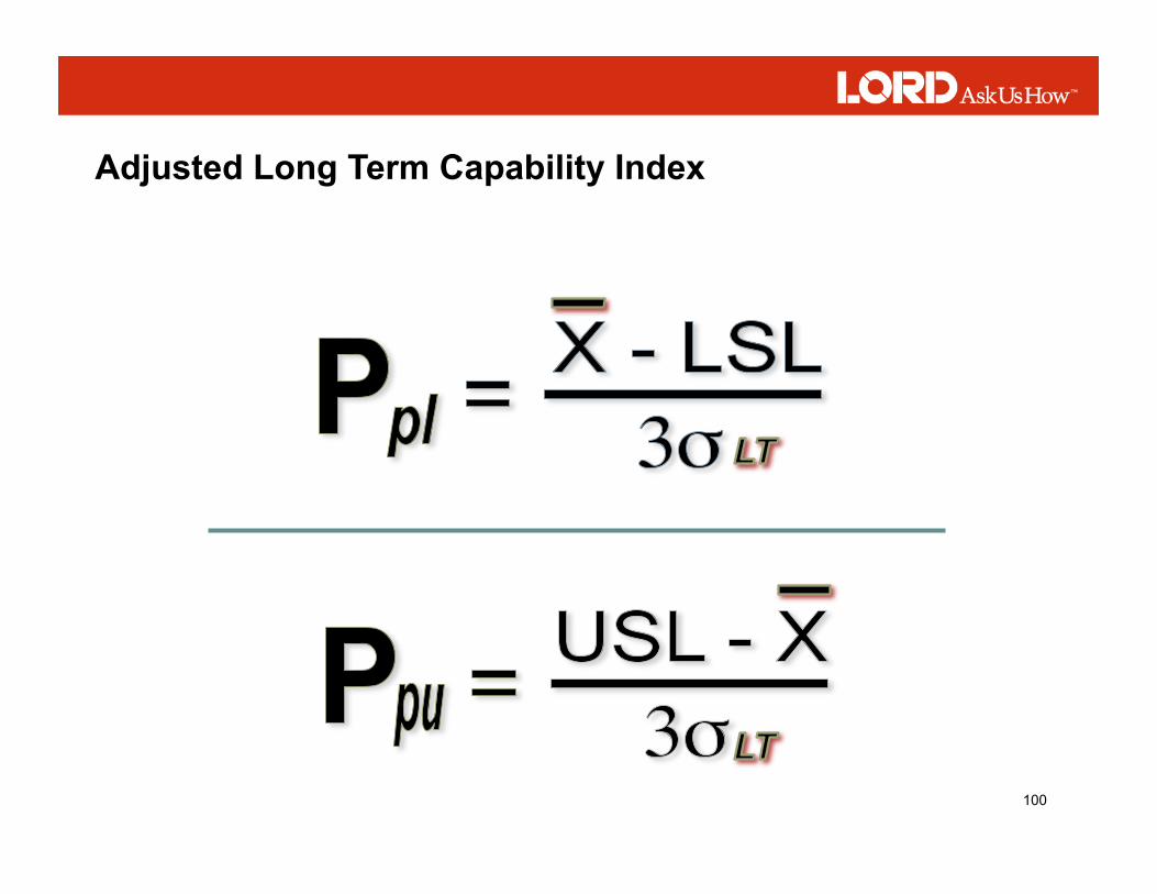
100
Adjusted Long Term Capability Index
101
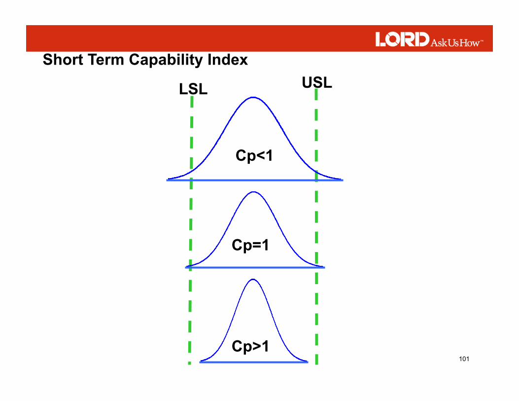
Cp<1
Cp=1
Cp>1
LSL USL Short Term Capability Index

102
Lower Specification
Upper Specification
Defects Defects
Spread is Too Wide

103
3σ 3σ
LSL USL Target
X - LSL USL - X
X
Cpl Cpu
Adjusted Short Term Capability Index
104
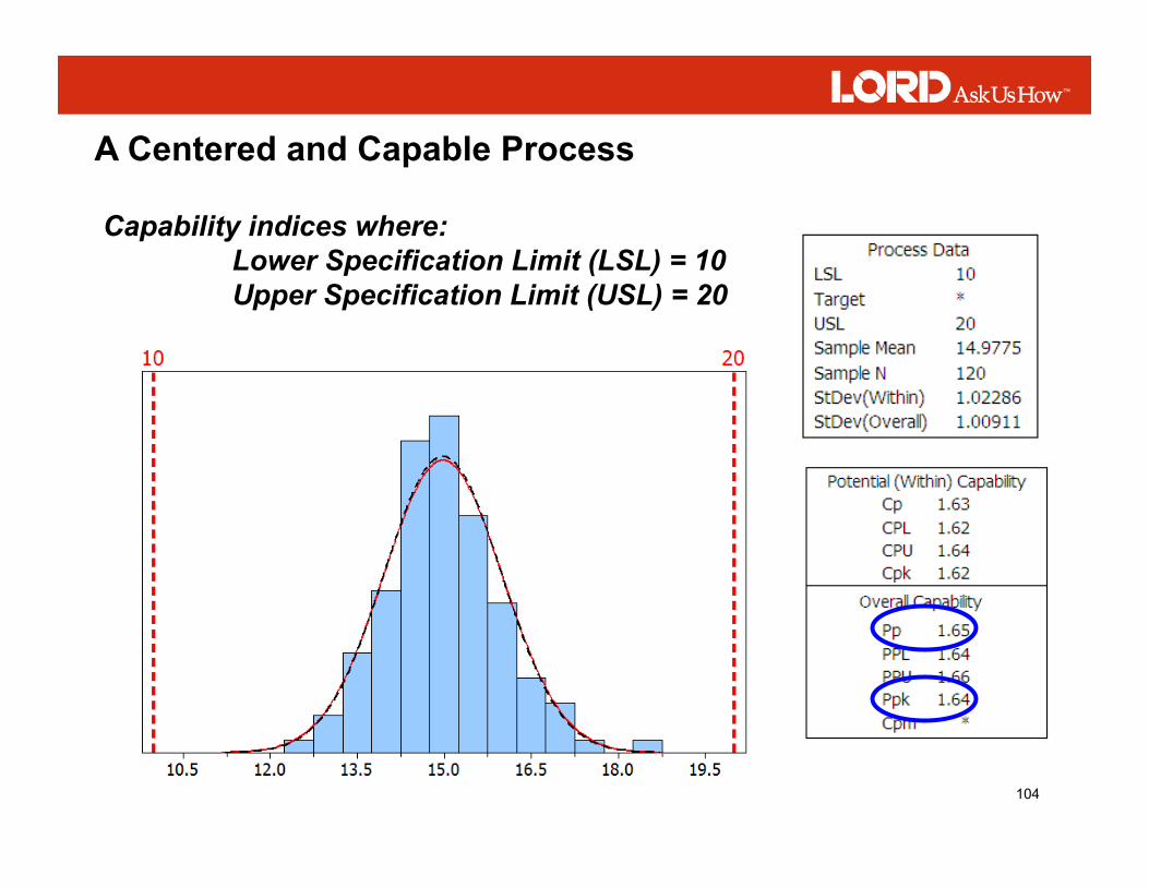
Capability indices where: Lower Specification Limit (LSL) = 10 Upper Specification Limit (USL) = 20
A Centered and Capable Process

105
Capability indices where: Lower Specification Limit (LSL) = 13 Upper Specification Limit (USL) = 17
A Process Centered and Not Capable
17

106
Capability indices where: Lower Specification Limit (LSL) = 8 Upper Specification Limit (USL) = 16
Potentially Capable and Not Centered

107
Capability indices where: Lower Specification Limit (LSL) = 10 Upper Specification Limit (USL) = 15
Not Centered and Not Capable

108
Control Charts
♦ Tools used to analyze the variation in any process – administrative or manufacturing. ♦ A line graph that displays a dynamic picture of process behavior

109
♦ A line graph of a sample statistic ♦ In Time ordered fashion ♦ With Centerline and statistically determined control limits
Control Charts
A Control Chart is:

110
♦ To Distinguish between random and assignable causes of variation
♦ To assist in determining the capability of the process
What are Control Charts Used for?

111
Components of a Control Chart

112
Boundaries set by the process that alert us to process stability and variability
Upper Control Limit
Lower Control Limit
Grand Average
Control Limits

113
Common Types of Control Charts

114
♦ Temperature ♦ Size ♦ Weight ♦ Sales Volume ♦ Shipments
Plot specific measurements of a process characteristic such as:
Control Charts for Variables

115
♦ Number of complaints per order ♦ Number of orders on time ♦ Absenteeism frequency ♦ Number of errors per document
Plots general measurement of the total process such as:
Control Charts for Attributes

116
♦ Only common causes of variation are present
♦ The points fall within the control limits
♦ There are not unnatural patterns
A process is in statistical control when:
Interpretation of Control Charts

117
Time 7:15 .249 .251 .251 .248 .250 7:30 .251 .246 .252 .248 .250 7:45 .250 .250 .246 .250 .251 8:00 .249 .253 .245 .254 .249 8:15 .250 .246 .251 .249 .250 8:30 .250 .250 .251 .251 .251 8:45 .247 .251 .253 .250 .249 9:00 .250 .251 .253 .249 .248 9:15 .246 .250 .248 .250 .251 9:30 .251 .248 .249 .249 .250 9:45 .251 .249 .249 .251 .252 10:00 .251 .255 .248 .247 .249 10:15 .250 .252 .252 .249 .251 10:30 .250 .251 .254 .251 .251 10:45 .252 .251 .248 .252 .251 11:00 .249 .250 .249 .251 .252 11:15 .250 .249 .250 .250 .250 11:30 .248 .250 .249 .251 .251 11:45 .251 .248 .250 .250 .252 12:00 .254 .251 .254 .247 .251
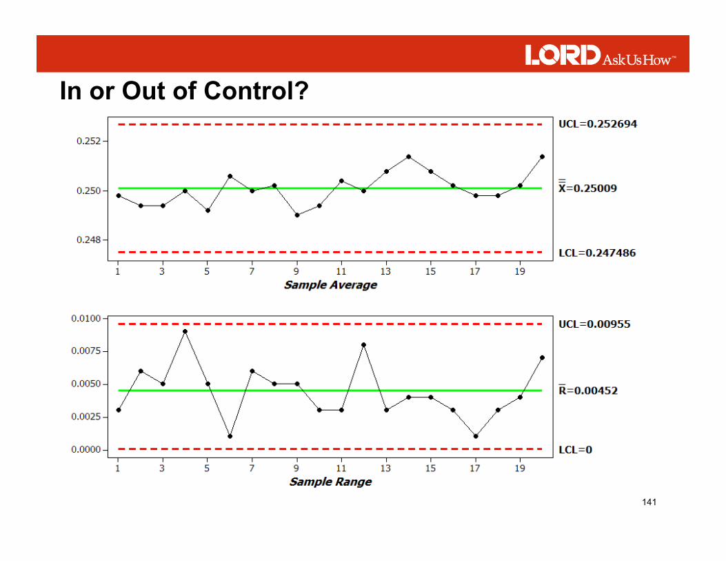
Measurements were obtained from a molded diameter using a micrometer. The specification for the diameter is .250 inch plus or minus .008 (.242/.258). Five pieces in a row were measured every 15 minutes at the times noted in the table.
Process Data – Molded Diameter

118
Average/Range Control Chart – Molded Diameter
119
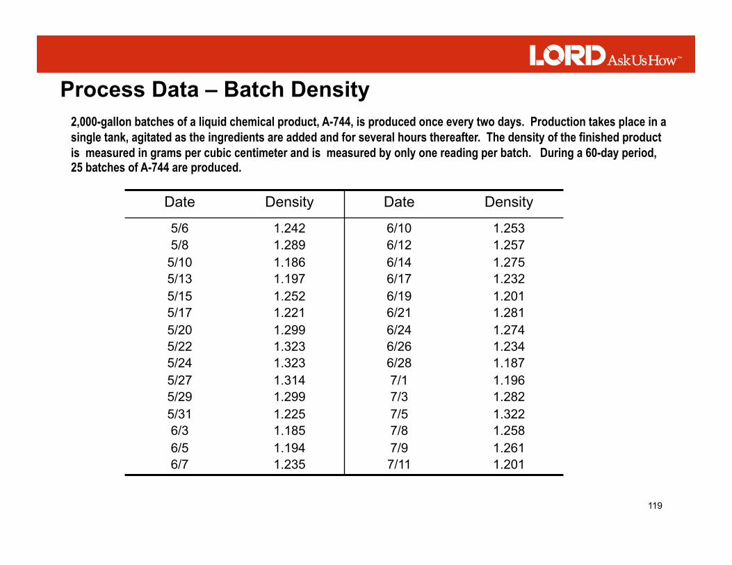
2,000-gallon batches of a liquid chemical product, A-744, is produced once every two days. Production takes place in a single tank, agitated as the ingredients are added and for several hours thereafter. The density of the finished product is measured in grams per cubic centimeter and is measured by only one reading per batch. During a 60-day period, 25 batches of A-744 are produced.
Date Density Date Density
5/6 5/8
5/10 5/13 5/15 5/17 5/20 5/22 5/24 5/27 5/29 5/31 6/3 6/5 6/7
1.242 1.289 1.186 1.197 1.252 1.221 1.299 1.323 1.323 1.314 1.299 1.225 1.185 1.194 1.235
6/10 6/12 6/14 6/17 6/19 6/21 6/24 6/26 6/28 7/1 7/3 7/5 7/8 7/9 7/11
1.253 1.257 1.275 1.232 1.201 1.281 1.274 1.234 1.187 1.196 1.282 1.322 1.258 1.261 1.201
Process Data – Batch Density

120
IX-MR Control Chart for Batch Density

121
♦ Special causes of variation are present in either the average chart or range chart or both
♦ Points are outside the control limits
♦ There are unnatural patterns
A process is out of control when:
Interpretation of Control Charts

122
♦ Specials are any points above the UCL or below the LCL
♦ A run violation is seven or more consecutive points above or below the centerline
♦ A 1-in-20 violation is more than one point in twenty consecutive points close to the control limits
♦ A trend violation is any upward or downward movement of 5 or more consecutive points or drifts of 7 or more points
Basic Control Chart Interpretation Rules

123
A Few Points Near the Control Limits.
Most Points Near the Centerline.
No Points Beyond the Control Limits
Interpretation of Control Charts

124
One Point Outside Control Limits

125
Shift in the Process Average

126
Cycles

127
Gradual Trend

128
Hugging the Centerline

129
Hugging the Control Limits

130
Instability

131
Downward Trend in the Range

132
Smaller Variation in the Average

133
Workshop
Interpretation of Control Charts

134
♦ Out of Control ♦ Steady trend moving toward control limit ♦ Measured value seems to be getting gradually smaller
In or Out of Control?

135
♦ Out of Control ♦ Points do not fall randomly above and below the centerline ♦ Measured value seems to have shifted abruptly
In or Out of Control?
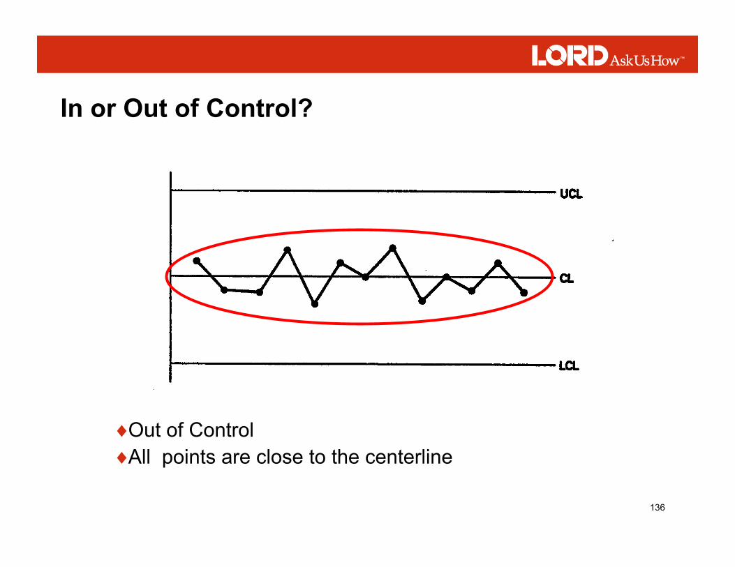
136
♦ Out of Control ♦ All points are close to the centerline
In or Out of Control?

137
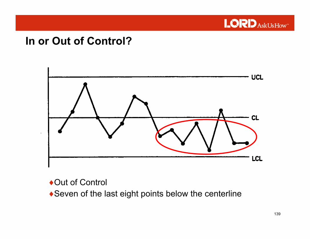
In or Out of Control?

138
♦ Out of Control ♦ Point beyond the control limit
In or Out of Control?
139
♦ Out of Control ♦ Seven of the last eight points below the centerline
In or Out of Control?
140
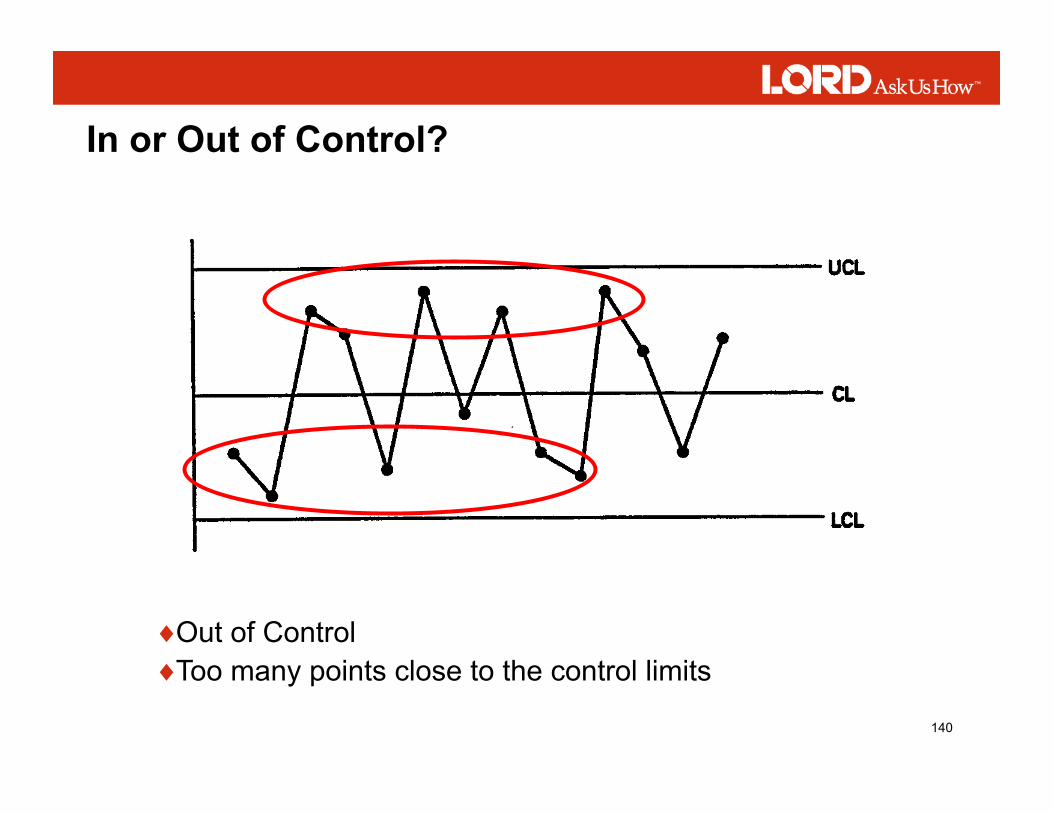
♦ Out of Control ♦ Too many points close to the control limits
In or Out of Control?
141
In or Out of Control?