title: exploring historical letterforms to design unique
TRANSCRIPT
Typography Day 2019 1
Experimental Typography http://www.typoday.in
Title: Exploring historical letterforms to design unique
Assamese typeface for digital devices: Experimenting
possibilities.
Abhijit Padun, Central Institute of Technology Kokrajhar, Assam, India, [email protected]
Prof. Amarendra Kumar Das, Indian Institute of Technology Guwahati, India, [email protected]
Abstract: Assamese script has a long history of evolution. In its path to modernization from the
early printing era to current digital era, a considerable numbers of typefaces were developed. But
all these typefaces have their root from Bengali typeface design due to its similarity in structure
and availability of resources for Bengali typeface. However historical evidences claimed that both
Assamese and Bengali scripts possess differences in writing styles which is still unexplored.
This article discusses about designing a typeface for Assamese script which could show a clear
connection with historical Assamese writing style. An experimentation has been carried out to study
the possibility of this connection by taking a medieval Assamese writing style called “Garhgaya” as
reference. As Garhgaya style was initiated and extensively implemented by Ahom dynasty who
ruled Assam for six hundred years, hence this style has been considered for reference apart from
having characteristics like simplicity, legibility and symmetry in letter formation.
The objective of doing this experiment is to design a typeface which could be recognized as a
unique Assamese typeface created for digital devices, that has a trace from historical Assamese
writing style.
Key words: Experimental typeface design, Assamese digital typeface, Assamese typeface for
digital devices, Assamese script, Assamese letterform design.
Typography Day 2019 2
1. Introduction
Assam is a state located in the northeast part of India and situated south of the eastern
Himalayas along the Brahmaputra and Barak River valleys. The state is bordered by
neighboring countries Bhutan and Bangladesh. It is surrounded by the six states of north
east India comprises of Arunachal Pradesh, Nagaland, Manipur, Meghalaya, Tripura and
Mizoram along with West Bengal to the west that connects the state to the rest of India.
Assamese is the official language of Assam, out of 23 official languages recognized by the
Republic of India. The Assam Secretariat functions in Assamese language. Assamese
language is often used by its neighboring states as connecting language with a little
altered version.
Assamese script is the writing system of Assamese language. The script has a rich history
which evolved from 5th century to recent times. The evolution went through many phases
from rock inscription to hand written manuscript to letterpress printing to offset
technology to modern day digital publication.
The origin of the script can be traced to the ancient Brahmi script and had strong
influence from Gupta and Siddham script along the way of its continuous developments.
The script developed manifolds in its journey from its origin from Kamrupi script (also
known as Eastern Nagari script) to medieval Assamese script to machine printing script
era. During Vaishnavite era in Assam till 16th century under the influence of Madhav
Kandali, Srimanta Sankardeva and few other pioneering personalities, the script went
through its best phase of development with amended writing styles from ancient Kamrupi
form. From 16th to early 19th century under the Ahom dynasty, Assamese script was
adopted to write chronicles as well as other official declarations. This made the script into
mass acceptability as well developed a style of writing called “Garhgaya” used by the
writers or calligraphers employed by Ahom dynasty. During British regime many Baptist
missionaries came for preaching Christianity in the region. For that purpose they also
brought printing tools and machines to print religious articles to spread Christianity in the
region. Atmaram Sharma an Assamese scholar was associated with the Baptist missionaries
to develop Assamese script for printing machine. Henceforth Atmaram Shamra created the
first modern Assamese script which was adopted to use in printing machines to publish
religious articles in the early 19 century. Later on after the publication of first Assamese
journal “Arunodoi” in 1846 the Assamese script entered into the modern era of machine
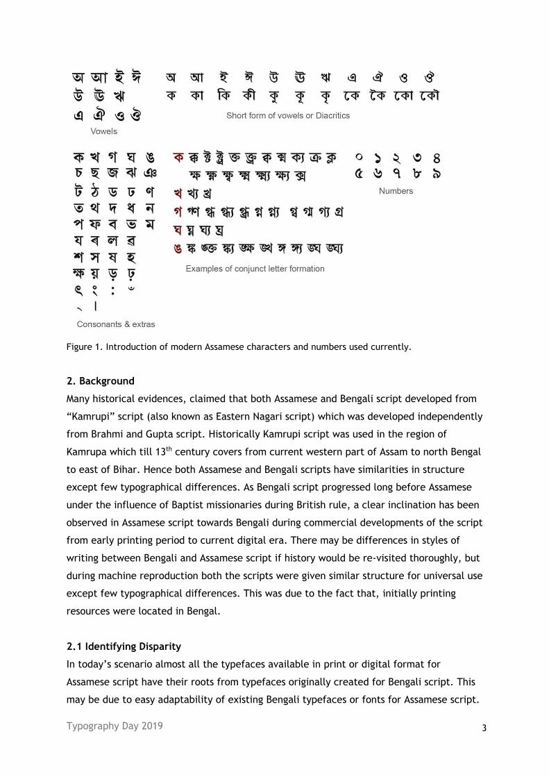
printing. Shown below (ref. Figure 1) are the modern Assamese characters.
Typography Day 2019 3
Figure 1. Introduction of modern Assamese characters and numbers used currently.
2. Background
Many historical evidences, claimed that both Assamese and Bengali script developed from
“Kamrupi” script (also known as Eastern Nagari script) which was developed independently
from Brahmi and Gupta script. Historically Kamrupi script was used in the region of
Kamrupa which till 13th century covers from current western part of Assam to north Bengal
to east of Bihar. Hence both Assamese and Bengali scripts have similarities in structure
except few typographical differences. As Bengali script progressed long before Assamese
under the influence of Baptist missionaries during British rule, a clear inclination has been
observed in Assamese script towards Bengali during commercial developments of the script
from early printing period to current digital era. There may be differences in styles of
writing between Bengali and Assamese script if history would be re-visited thoroughly, but
during machine reproduction both the scripts were given similar structure for universal use
except few typographical differences. This was due to the fact that, initially printing
resources were located in Bengal.
2.1 Identifying Disparity
In today’s scenario almost all the typefaces available in print or digital format for
Assamese script have their roots from typefaces originally created for Bengali script. This
may be due to easy adaptability of existing Bengali typefaces or fonts for Assamese script.
Typography Day 2019 4
However the area of type design and development specifically for Assamese script still has
many scopes to explore if we look into historical evidences. But to achieve that, it is
essential to study and analyze the original Assamese script or letterforms used in the
region of Assam in pre-printing press era. Many of the historical articles are still available
in museums such as copper plate inscriptions, rock inscriptions, Xaansi (pronounced as
Saanchi) tree bark manuscripts and coins.
This study tried to explore the unexplored area of Assamese script and writing styles found
in the historical articles to explore letterforms and its structures which in turn may be
useful for creating unique Assamese typeface.
3. Literature Review
To classify the evolution of Assamese script, it can be divided into three stages as follows:
1. Ancient Assamese script or Kamrupi script which was existed from 5th to around 13th
century A.D.
2. Medieval Assamese script existed from beginning of 14th century to early 19th
century A.D. before the entry of printing press.
3. Modern Assamese script which starts from the first publication of Assamese journal
“Arunodoi” in printing machine in the year 1846 to till date.
As the medieval Assamese script was extensively used in the region of Assam before the
entry of printing press hence the literature study has been focused on this phase of script
to bring out the uniqueness existed in Assamese script.
Medieval Assamese script was extensively used for writing manuscripts, royal chronicles,
declarations, rituals, books etc. This stage of script was further categorized under three
different writing styles found in that time period. These are (a) Garhgaya style, (b)
Bamuniya style and (c) Kaitheli style.
3.1 Garhgaya style of writing
This style was initiated and primarily followed by the people appointed by Ahom dynasty
to write chronicles, various official documents and public declarations. The name
Garhgaya came from the capital of Ahom dynasty Gargaon which was also the center of
Ahom culture and located in the current eastern part of Assam. The writing style followed
by the people appointed by Ahom rulers eventually developed a unique style known as
Garhgaya style.
Typography Day 2019 5
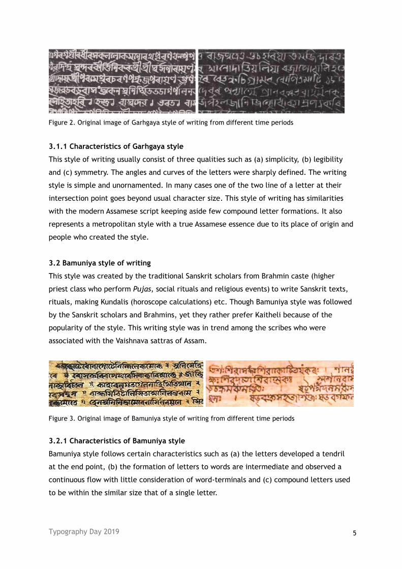
Figure 2. Original image of Garhgaya style of writing from different time periods
3.1.1 Characteristics of Garhgaya style
This style of writing usually consist of three qualities such as (a) simplicity, (b) legibility
and (c) symmetry. The angles and curves of the letters were sharply defined. The writing
style is simple and unornamented. In many cases one of the two line of a letter at their
intersection point goes beyond usual character size. This style of writing has similarities
with the modern Assamese script keeping aside few compound letter formations. It also
represents a metropolitan style with a true Assamese essence due to its place of origin and
people who created the style.
3.2 Bamuniya style of writing
This style was created by the traditional Sanskrit scholars from Brahmin caste (higher
priest class who perform Pujas, social rituals and religious events) to write Sanskrit texts,
rituals, making Kundalis (horoscope calculations) etc. Though Bamuniya style was followed
by the Sanskrit scholars and Brahmins, yet they rather prefer Kaitheli because of the
popularity of the style. This writing style was in trend among the scribes who were
associated with the Vaishnava sattras of Assam.
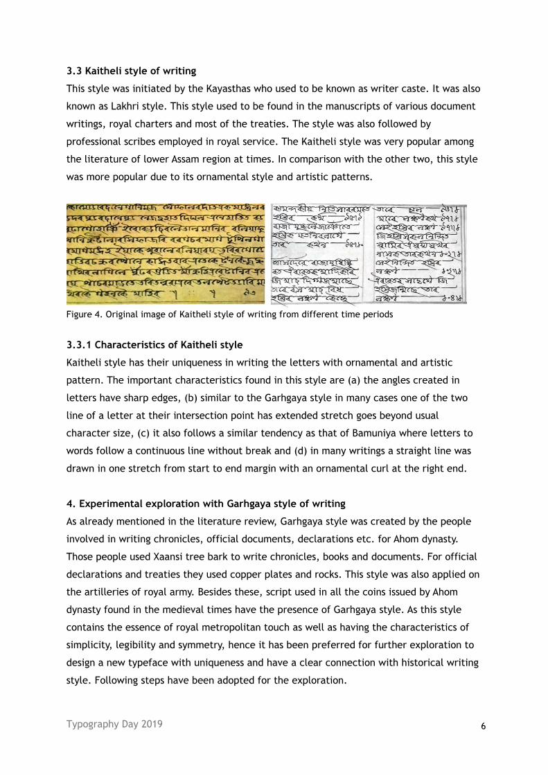
Figure 3. Original image of Bamuniya style of writing from different time periods
3.2.1 Characteristics of Bamuniya style
Bamuniya style follows certain characteristics such as (a) the letters developed a tendril
at the end point, (b) the formation of letters to words are intermediate and observed a
continuous flow with little consideration of word-terminals and (c) compound letters used
to be within the similar size that of a single letter.
Typography Day 2019 6
3.3 Kaitheli style of writing
This style was initiated by the Kayasthas who used to be known as writer caste. It was also
known as Lakhri style. This style used to be found in the manuscripts of various document
writings, royal charters and most of the treaties. The style was also followed by
professional scribes employed in royal service. The Kaitheli style was very popular among
the literature of lower Assam region at times. In comparison with the other two, this style
was more popular due to its ornamental style and artistic patterns.
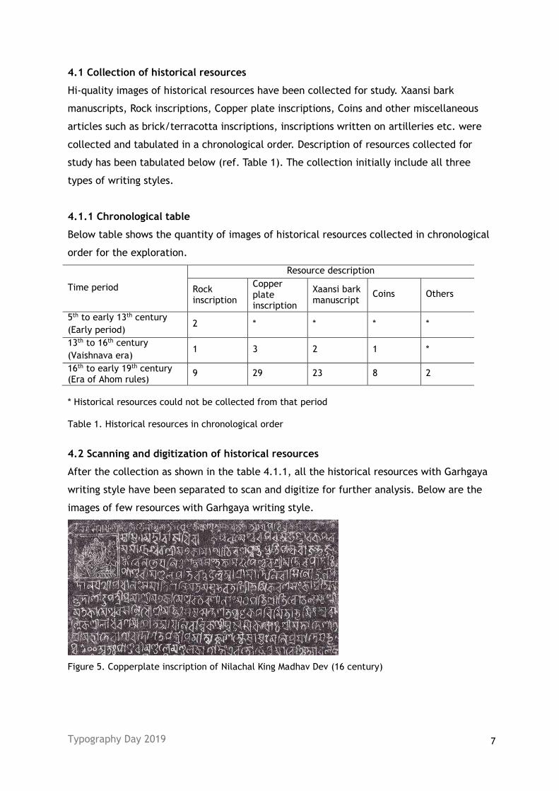
Figure 4. Original image of Kaitheli style of writing from different time periods
3.3.1 Characteristics of Kaitheli style
Kaitheli style has their uniqueness in writing the letters with ornamental and artistic
pattern. The important characteristics found in this style are (a) the angles created in
letters have sharp edges, (b) similar to the Garhgaya style in many cases one of the two
line of a letter at their intersection point has extended stretch goes beyond usual
character size, (c) it also follows a similar tendency as that of Bamuniya where letters to
words follow a continuous line without break and (d) in many writings a straight line was
drawn in one stretch from start to end margin with an ornamental curl at the right end.
4. Experimental exploration with Garhgaya style of writing
As already mentioned in the literature review, Garhgaya style was created by the people
involved in writing chronicles, official documents, declarations etc. for Ahom dynasty.
Those people used Xaansi tree bark to write chronicles, books and documents. For official
declarations and treaties they used copper plates and rocks. This style was also applied on
the artilleries of royal army. Besides these, script used in all the coins issued by Ahom
dynasty found in the medieval times have the presence of Garhgaya style. As this style
contains the essence of royal metropolitan touch as well as having the characteristics of
simplicity, legibility and symmetry, hence it has been preferred for further exploration to
design a new typeface with uniqueness and have a clear connection with historical writing
style. Following steps have been adopted for the exploration.
Typography Day 2019 7
4.1 Collection of historical resources
Hi-quality images of historical resources have been collected for study. Xaansi bark
manuscripts, Rock inscriptions, Copper plate inscriptions, Coins and other miscellaneous
articles such as brick/terracotta inscriptions, inscriptions written on artilleries etc. were
collected and tabulated in a chronological order. Description of resources collected for
study has been tabulated below (ref. Table 1). The collection initially include all three
types of writing styles.
4.1.1 Chronological table
Below table shows the quantity of images of historical resources collected in chronological
order for the exploration.
Time period
Resource description
Rock inscription
Copper plate inscription
Xaansi bark manuscript
Coins Others
5th to early 13th century
(Early period) 2 * * * *
13th to 16th century
(Vaishnava era) 1 3 2 1 *
16th to early 19th century (Era of Ahom rules)
9 29 23 8 2
* Historical resources could not be collected from that period
Table 1. Historical resources in chronological order
4.2 Scanning and digitization of historical resources
After the collection as shown in the table 4.1.1, all the historical resources with Garhgaya
writing style have been separated to scan and digitize for further analysis. Below are the
images of few resources with Garhgaya writing style.
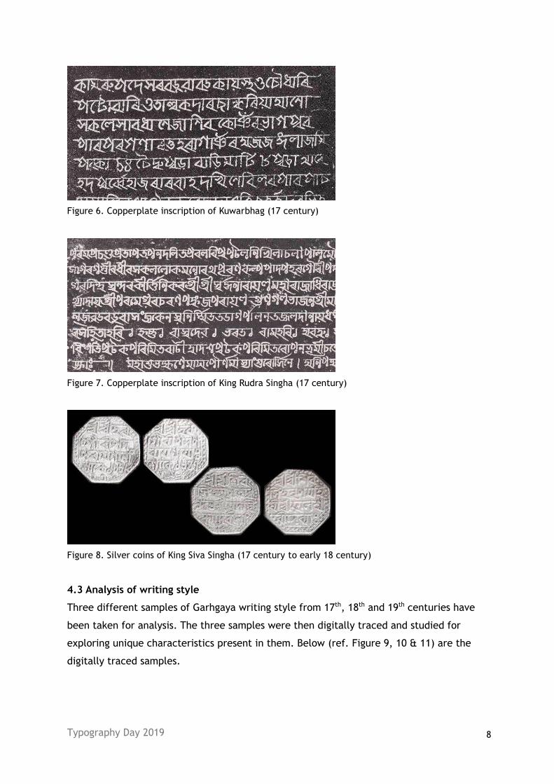
Figure 5. Copperplate inscription of Nilachal King Madhav Dev (16 century)
Typography Day 2019 8
Figure 6. Copperplate inscription of Kuwarbhag (17 century)
Figure 7. Copperplate inscription of King Rudra Singha (17 century)
Figure 8. Silver coins of King Siva Singha (17 century to early 18 century)
4.3 Analysis of writing style
Three different samples of Garhgaya writing style from 17th, 18th and 19th centuries have
been taken for analysis. The three samples were then digitally traced and studied for
exploring unique characteristics present in them. Below (ref. Figure 9, 10 & 11) are the
digitally traced samples.
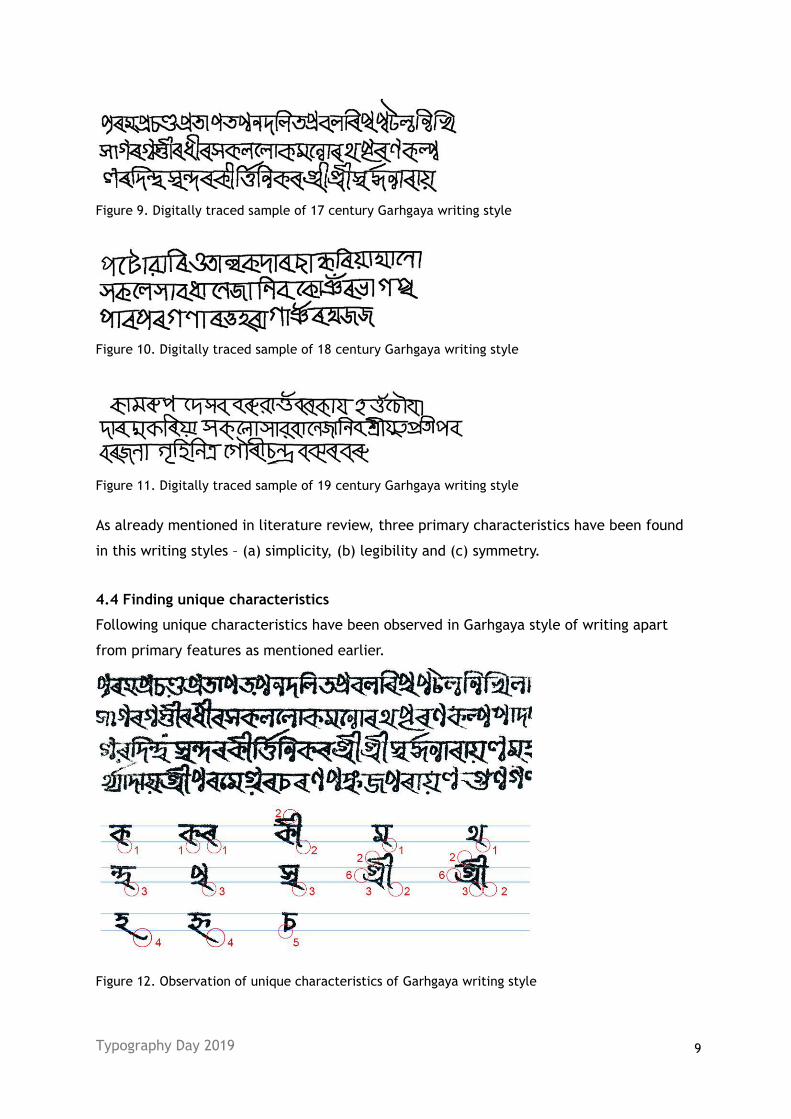
Typography Day 2019 9
Figure 9. Digitally traced sample of 17 century Garhgaya writing style
Figure 10. Digitally traced sample of 18 century Garhgaya writing style
Figure 11. Digitally traced sample of 19 century Garhgaya writing style
As already mentioned in literature review, three primary characteristics have been found
in this writing styles – (a) simplicity, (b) legibility and (c) symmetry.
4.4 Finding unique characteristics
Following unique characteristics have been observed in Garhgaya style of writing apart
from primary features as mentioned earlier.
Figure 12. Observation of unique characteristics of Garhgaya writing style
Typography Day 2019 10
4.4.1 Observation table
Sl. No. Unique Characteristics observed Marking Time period
1 Letters have a sharp and long stretch at the end
where two strokes intersect.
1 Observed from 17th
centuries onwards
2 The vowel diacritics have a decorative contour at the
top and forms a tendril at the bottom.
2 Observed from middle
of 17th centuries
3 In the formation of conjunct characters where bottom
letters used to be “BA” (ব), “KA” (ক) etc., ends with sharp and long stretch as in marking 1.
3 Observed from middle
of 17th centuries
4 Letters “HA” (ঽ), “E” (ই) and “EE” (ঈ) used to have a stretched ending at the bottom.
4 Observed from 17th
centuries onwards
5 Letters “CHA” (চ), “CCHA” (ছ) “TA” (ট) and “DHA”
(ঢ) develope a sharp angle at the bottom. 5
Observed from 17th
centuries onwards
6 Letters “AI” (এ), “OI” (ঐ) and conjunct of “RA” (ৰ) have a curvy flow at the end.
6 Observed from 17th
centuries onwards
Table 2. Description of unique characteristics observed
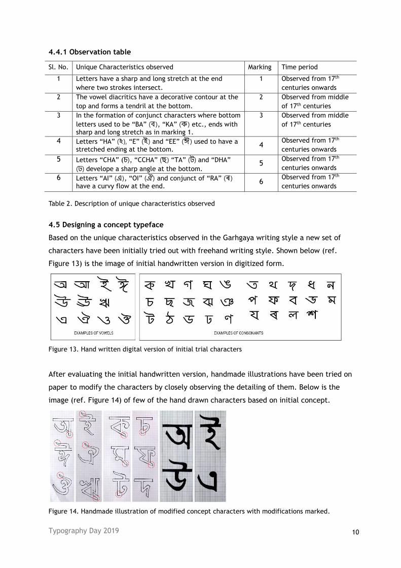
4.5 Designing a concept typeface
Based on the unique characteristics observed in the Garhgaya writing style a new set of
characters have been initially tried out with freehand writing style. Shown below (ref.
Figure 13) is the image of initial handwritten version in digitized form.
Figure 13. Hand written digital version of initial trial characters
After evaluating the initial handwritten version, handmade illustrations have been tried on
paper to modify the characters by closely observing the detailing of them. Below is the
image (ref. Figure 14) of few of the hand drawn characters based on initial concept.
Figure 14. Handmade illustration of modified concept characters with modifications marked.
Typography Day 2019 11
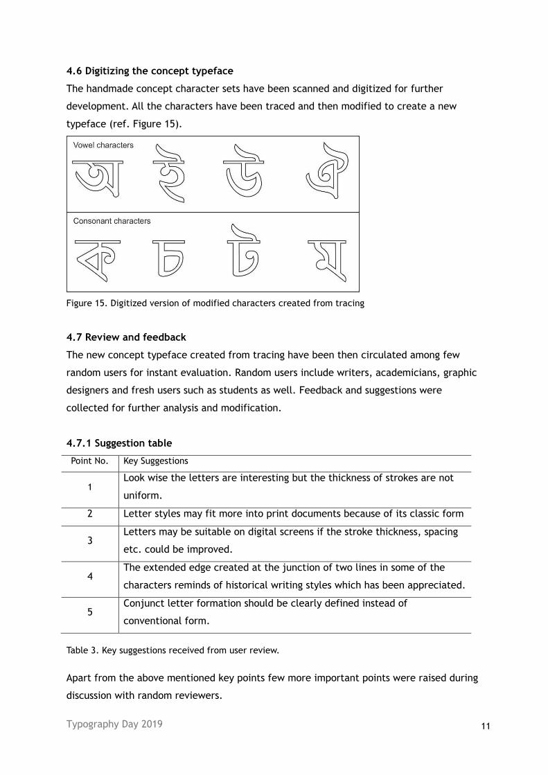
4.6 Digitizing the concept typeface
The handmade concept character sets have been scanned and digitized for further
development. All the characters have been traced and then modified to create a new
typeface (ref. Figure 15).
Figure 15. Digitized version of modified characters created from tracing
4.7 Review and feedback
The new concept typeface created from tracing have been then circulated among few
random users for instant evaluation. Random users include writers, academicians, graphic
designers and fresh users such as students as well. Feedback and suggestions were
collected for further analysis and modification.
4.7.1 Suggestion table
Point No. Key Suggestions
1 Look wise the letters are interesting but the thickness of strokes are not
uniform.
2 Letter styles may fit more into print documents because of its classic form
3 Letters may be suitable on digital screens if the stroke thickness, spacing
etc. could be improved.
4 The extended edge created at the junction of two lines in some of the
characters reminds of historical writing styles which has been appreciated.
5 Conjunct letter formation should be clearly defined instead of
conventional form.
Table 3. Key suggestions received from user review.
Apart from the above mentioned key points few more important points were raised during
discussion with random reviewers.
Typography Day 2019 12
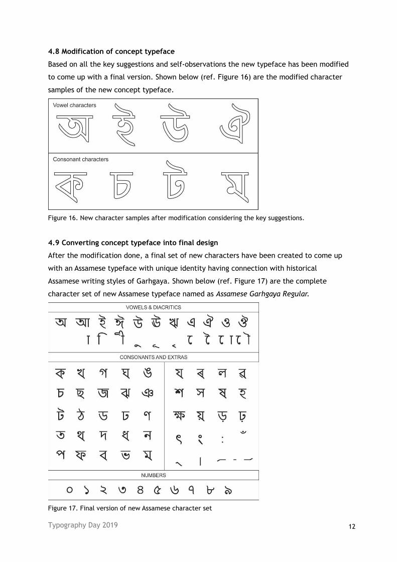
4.8 Modification of concept typeface
Based on all the key suggestions and self-observations the new typeface has been modified
to come up with a final version. Shown below (ref. Figure 16) are the modified character
samples of the new concept typeface.
Figure 16. New character samples after modification considering the key suggestions.
4.9 Converting concept typeface into final design
After the modification done, a final set of new characters have been created to come up
with an Assamese typeface with unique identity having connection with historical
Assamese writing styles of Garhgaya. Shown below (ref. Figure 17) are the complete
character set of new Assamese typeface named as Assamese Garhgaya Regular.
Figure 17. Final version of new Assamese character set
Typography Day 2019 13
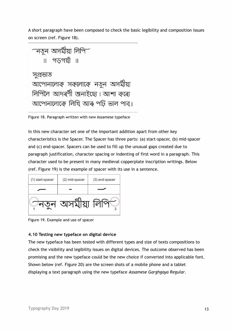
A short paragraph have been composed to check the basic legibility and composition issues
on screen (ref. Figure 18).
Figure 18. Paragraph written with new Assamese typeface
In this new character set one of the important addition apart from other key
characteristics is the Spacer. The Spacer has three parts: (a) start-spacer, (b) mid-spacer
and (c) end-spacer. Spacers can be used to fill up the unusual gaps created due to
paragraph justification, character spacing or indenting of first word in a paragraph. This
character used to be present in many medieval copperplate inscription writings. Below
(ref. Figure 19) is the example of spacer with its use in a sentence.
Figure 19. Example and use of spacer
4.10 Testing new typeface on digital device
The new typeface has been tested with different types and size of texts compositions to
check the visibility and legibility issues on digital devices. The outcome observed has been
promising and the new typeface could be the new choice if converted into applicable font.
Shown below (ref. Figure 20) are the screen shots of a mobile phone and a tablet
displaying a text paragraph using the new typeface Assamese Garghgaya Regular.
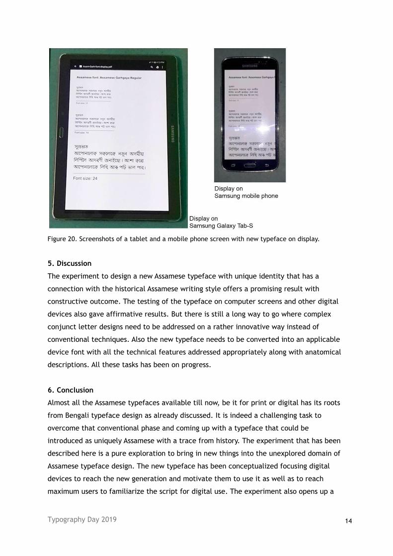
Typography Day 2019 14
Figure 20. Screenshots of a tablet and a mobile phone screen with new typeface on display.
5. Discussion
The experiment to design a new Assamese typeface with unique identity that has a
connection with the historical Assamese writing style offers a promising result with
constructive outcome. The testing of the typeface on computer screens and other digital
devices also gave affirmative results. But there is still a long way to go where complex
conjunct letter designs need to be addressed on a rather innovative way instead of
conventional techniques. Also the new typeface needs to be converted into an applicable
device font with all the technical features addressed appropriately along with anatomical
descriptions. All these tasks has been on progress.
6. Conclusion
Almost all the Assamese typefaces available till now, be it for print or digital has its roots
from Bengali typeface design as already discussed. It is indeed a challenging task to
overcome that conventional phase and coming up with a typeface that could be
introduced as uniquely Assamese with a trace from history. The experiment that has been
described here is a pure exploration to bring in new things into the unexplored domain of
Assamese typeface design. The new typeface has been conceptualized focusing digital
devices to reach the new generation and motivate them to use it as well as to reach
maximum users to familiarize the script for digital use. The experiment also opens up a
Typography Day 2019 15
new direction to explore into the field of typeface design for Assamese script. Also use of
the typeface in digital media may create commercial demand for type designers as well.
7. References
Neog, Dr. Maheshwar, (1974) Prachya-Sasanavali, Publisher: Publication Board, Assam, Edition-1.
Bhattacharyya, Dr. S.C., (2013) Asamiya Lipitattva Adhyayan, 1st edition. Chandra Prakash
Publishing, Panbazar, Guwahati, Assam.
Kataki, Sarbeswar, (2003) Asamia Prachin Lipi, 3rd edition. Banalata Publisher, Dibrugarh -1, Assam
(on behalf of Assam Sahitya Sabha).
Nath, Bhabakanta, (2013) Sindhu Upatyakar Lipi aru Sabhyatat Ebhumukhi (Translated from “The
Indus-Valley Script and Civilisation”), 1st edition. Bani Mandir, M.M.C. Bhawan, Hedayetpur,
Guwahati-3, Assam.
Goswami, Dr. Upendranath, (2014) Asamiya Lipi (The Assamese Script), 9th edition. Assam
Publication Board, Guwahati, Assam.
Assamese alphabet. Available from: https://en.wikipedia.org/wiki/Assamese_alphabet
[Accessed on 12 September 2016]
Bengali alphabet. Available from: https://en.wikipedia.org/wiki/Bengali_alphabet
[Accessed on 15 September 2016]
Choudhury, Dr. Pratap Chandra, (1976) Hastividyarnava, Publisher: Publication Board, Assam.
Choudhury, R.D., Kalita, Naren, (2001) Manuscript Paintings from Kamrupa Anusandhan Samiti,
Publisher: Secretary, Kamrupa Anusandhan Samiti, Guwahati – 781001, Assam.
Assam Sate Museum, Aambari, Guwahati – 781001, Assam.
Assam. Available from: https://en.wikipedia.org/wiki/Assam
[Accessed on 15 September 2018]