user guide - usna · output viewer user guide 2 table of contents disclaimer ... to help you make...
TRANSCRIPT

user guide

Disclaimer
1
Disclaimer The information in this guide is provided by ProModel Corporation to document Output Viewer. The contents of this manual are subject to change without notice and do not represent a commitment on the part of ProModel Corporation. The software described in this guide is supplied under a license agreement and may be copied only under the terms of the license agreement. No part of this guide may be reproduced, transmitted, or distributed by any means, electronic or mechanical, for purposes other than the owner’s personal use without express written permission from ProModel Corporation. Copyright Information © 2002-2010 ProModel Corporation All rights reserved Printed in the United States of America Microsoft is a registered trademark and Windows, Windows Explorer, and Excel are trademarks of Microsoft Corporation.
10/25/2010

Output Viewer User Guide
2
Table of Contents Disclaimer .......................................................................................................................... 1 Table of Contents .............................................................................................................. 2 Introduction: Output Viewer ............................................................................................. 5 Using the Output Viewer Ribbon ..................................................................................... 7 Using the Report View ...................................................................................................... 9
Adding New Reports ........................................................................................................ 9 Deleting Reports ............................................................................................................ 10 Accessing Reports ......................................................................................................... 10 Naming Reports ............................................................................................................. 10 Maximizing Charts (Full Screen Mode) ......................................................................... 11 Removing Charts from a Report View ........................................................................... 11 Moving Charts within a Report View ............................................................................. 12 Moving Charts into a Different Report View .................................................................. 14 Right-click Menu ............................................................................................................ 15
Legend ....................................................................................................................... 16 Data Table ................................................................................................................. 17 Data Labels ................................................................................................................ 18 Data Markers ............................................................................................................. 20 Gridlines ..................................................................................................................... 21 Axis Titles ................................................................................................................... 22 Hover Over Series in Charts ...................................................................................... 23
Using Filter Options ........................................................................................................ 25
Minimize and Expand Filter Options .............................................................................. 25 Search Filter .................................................................................................................. 26 Scenarios ....................................................................................................................... 27
Replication ................................................................................................................. 27 Period ......................................................................................................................... 28
Data Display .................................................................................................................. 29 Items .............................................................................................................................. 31 Columns ........................................................................................................................ 32 Statistics ........................................................................................................................ 32
Histogram Statistics ................................................................................................... 32 Time Plot Statistics .................................................................................................... 33 Entity Count Statistics ................................................................................................ 35
Options .......................................................................................................................... 36 Histograms ................................................................................................................. 37
States ............................................................................................................................. 38 Output Viewer Main Ribbon Tabs .................................................................................. 39
File ................................................................................................................................. 39 How to Open and Save Output Viewer Files ............................................................. 40 How to Add Data Sources to an Existing Output Viewer File .................................... 41 How to Remove Data Sources .................................................................................. 43 About .......................................................................................................................... 43

Table of Contents
3
Exit Output Viewer ..................................................................................................... 44 Charts......................................................................................................................... 45
Tables ..................................................................................................................... 46 Replication and Period Columns ........................................................................ 47 Entity Summary Table ........................................................................................ 48 Entity States Table.............................................................................................. 49 Entity Costs Table ............................................................................................... 50 Entity Failed Arrivals Table ................................................................................. 51 Location Summary Table .................................................................................... 52 Location Single Capacity States Table ............................................................... 53 Location Multi-Capacity States Table ................................................................. 54 Location Setup Table .......................................................................................... 55 Location Costs Table .......................................................................................... 56 Resource Summary Table .................................................................................. 57 Resource States Table ....................................................................................... 58 Resource Costs Table ........................................................................................ 59 Variable Summary Table .................................................................................... 60 Simulation Information Table .............................................................................. 61 Logs .................................................................................................................... 62 Node Entries ....................................................................................................... 63 Scoreboard ......................................................................................................... 64
Column Charts ....................................................................................................... 65 Entity Summary Column Chart ........................................................................... 66 Entity State Column Chart .................................................................................. 67 Entity Costs Column Chart ................................................................................. 68 Entity Failed Arrivals Column Chart .................................................................... 69 Location Summary Column Chart ...................................................................... 70 Location Single Capacity Column Chart ............................................................. 71 Location Multi-Capacity States Column Chart .................................................... 72 Location Setup Column Chart ............................................................................ 73 Location Costs Column Chart ............................................................................. 74 Resource Summary Column Chart ..................................................................... 75 Resource States Column Chart .......................................................................... 76 Resource Costs Column Chart ........................................................................... 77 Variable Summary Column Chart ....................................................................... 78 Logs Column Chart ............................................................................................. 79 Node Entries Column Chart ................................................................................ 80
Utilization ................................................................................................................... 81 Location Utilization Chart ....................................................................................... 82 Resource Utilization Chart ..................................................................................... 83
State ........................................................................................................................... 84 Entity State Charts ................................................................................................. 85 Location Single Capacity State Chart .................................................................... 86 Location Multi-Capacity State Chart ....................................................................... 87 Resource State Chart ............................................................................................. 88 State Pie Charts ..................................................................................................... 89
Entity State Pie Chart ......................................................................................... 90 Location Single Capacity State Pie Chart .......................................................... 92 Location Multi-Capacity State Pie Chart ............................................................. 93 Resource State Pie Chart ................................................................................... 94
Time Series ................................................................................................................ 95

Output Viewer User Guide
4
Time Plot ................................................................................................................ 95 Histogram ............................................................................................................... 96 Entity Count ............................................................................................................ 97 Location State (over time) ...................................................................................... 98
Export ............................................................................................................................ 99 Clipboard ....................................................................................................................... 99
Chart Data .................................................................................................................. 99 Picture ........................................................................................................................ 99
Excel ............................................................................................................................ 101 Chart Data ................................................................................................................ 101 Summary Data ......................................................................................................... 102
Output Viewer Context-Sensitive Tabs ....................................................................... 105
Design.......................................................................................................................... 105 Adaptive ................................................................................................................... 106
Layout .......................................................................................................................... 107 Zoom ........................................................................................................................ 108
Scroll .................................................................................................................... 109 Stripe .................................................................................................................... 110 Map....................................................................................................................... 112
Labels....................................................................................................................... 114 Axis Titles ............................................................................................................. 115 Legend ................................................................................................................. 116 Data Labels .......................................................................................................... 117
Data Table ............................................................................................................... 119 Grid .......................................................................................................................... 120
Gridlines ............................................................................................................... 120 Striping ................................................................................................................. 121
Display ..................................................................................................................... 122 Annotations .............................................................................................................. 123
Format (Charts) ........................................................................................................... 126 Selected Item ........................................................................................................... 127 Font .......................................................................................................................... 128 Text .......................................................................................................................... 129 Range....................................................................................................................... 131 Decimal Precision .................................................................................................... 133 Outline ...................................................................................................................... 135
Format (Tables) ........................................................................................................... 136 Decimal Precision .................................................................................................... 136
Allow Grouping ..................................................................................................... 137 Allow Filtering ....................................................................................................... 138
Index ............................................................................................................................... 141

Introduction: Output Viewer
5
Introduction: Output Viewer Once you have defined a process and built a model, you are ready to begin making important decisions based upon the resulting simulation data. To help you make the most of the data collected during your simulation, ProModel tools come with a powerful easy to use Output Viewer. The Output Viewer allows you to view your data numerically in spreadsheet format or graphically through a variety of charts. Output Viewer comes with the following ProModel applications:
• Process Simulator • ProModel • MedModel • ServiceModel
When your simulation is completed, you are prompted to view the output results with the following message.
Click Yes to view your simulation results from the ProModel Output Viewer. If you select Yes, Output Viewer automatically launches itself and organizes and displays the data gathered during simulation. The first view of Output Viewer provides a predefined set of four charts and the Scoreboard.

Output Viewer User Guide
6

Using the Output Viewer Ribbon
7
Using the Output Viewer Ribbon When the Output Viewer is launched, the following ribbon appears.
Click on the ribbon tabs: File, Charts, Export, Design, Layout, or Format to access the features and functionality offered in Output Viewer. Then click on the desired icon or component in the various ribbons to create charts, modify chart options, export data to Excel, take screen shots, or modify your chart's appearance. The basic application interface consists of the Output Viewer Ribbon, Filter Options panel, and Report View.

Output Viewer User Guide
8
There are three main tabs and three context-sensitive tabs in the Output Viewer. Main ribbon tabs:
• File on page 39 - Accesses Output Viewer files and data sources • Charts on page 45 - Accesses all tables and charts • Export on page 99 - Provides the ability to export charts in various formats
Context-sensitive ribbon tabs:
• Design on page 105- Offers different color palette options for your charts • Layout on page 107 - Offers options for changing the layout and appearance of your charts • Format (Charts) on page 126 - Offers options for formatting the text of your chart
Different context-sensitive ribbon tab options are available based upon the chart that is selected as the active report.
Note: If there are no charts selected as the active report, the context-sensitive ribbon tabs (Design, Layout, and Format) will not appear in the ribbon.

Using the Report View
9
Using the Report View When you first access the Output Viewer both the Filter Options panel and Report View space are empty (unless it was launched after a simulation, or a Report View file – PMOV – was loaded). Click on a chart in the Charts ribbon and it will automatically be added to the active report, if empty, or to a new Report View. To add a chart next to an existing chart (or set of charts) in a report, click on a chart in the Charts ribbon and drag the chart into the Report View of the existing chart.
Adding New Reports To add a new report to the Report View space, click on the [+] to the right of the last report tab and a new empty report appears. Then click on a chart icon in the Charts ribbon that corresponds to a chart you would like to appear in the empty report.
You can also click on a chart in the Charts ribbon and a new report is automatically generated with that chart in a new Report View.

Output Viewer User Guide
10
Deleting Reports To delete a Report View, click on the [x] located on the Report View tab.
Accessing Reports To access an existing report, click on that report’s tab. You can also click on the down arrow [▼] located at the top right in the Report View space and a list of all reports will appear. Select a report.
Naming Reports Double-click on a report name in a Report View tab to select the text. Then type the desired name for your report.

Using the Report View
11
You can also cut, copy and paste the report name. Double-click on the tab, then right-click and the following context menu is available.
Maximizing Charts (Full Screen Mode) Click the maximize button, located on the top right of the chart window title bar, or double-click the chart window title bar to expand the chart to full screen. To exit full screen mode, click the [x], double-click the chart window title bar, or press [ESC].
Note: If the chart is not maximized, clicking the [x] will remove the chart from the Report View.
Removing Charts from a Report View To remove a chart from a report, click the [x] located on the top right of the chart window title bar.
Output Viewer User Guide
12
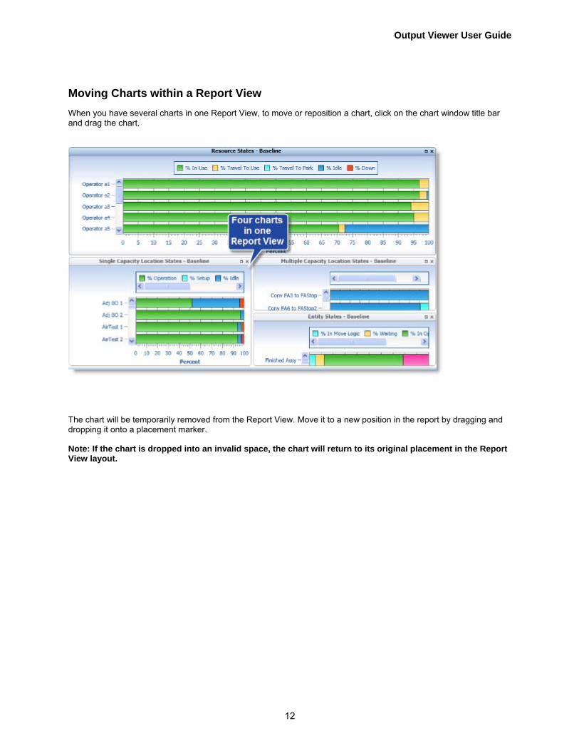
Moving Charts within a Report View When you have several charts in one Report View, to move or reposition a chart, click on the chart window title bar and drag the chart.
The chart will be temporarily removed from the Report View. Move it to a new position in the report by dragging and dropping it onto a placement marker.
Note: If the chart is dropped into an invalid space, the chart will return to its original placement in the Report View layout.

Using the Report View
13

Output Viewer User Guide
14
Moving Charts into a Different Report View To move a chart from one Report View into another Report View, click on the chart window title bar and drag the chart.
The chart is temporarily removed from the Report View. Now drag the chart icon over the desired Report View tab. Hover over the tab until the Report View becomes active, continue to drag the chart icon into the new Report View and drop it on a placement marker.

Using the Report View
15
Note: If the chart is dropped into an invalid space, the chart will return to its original placement in its original Report View.
Right-click Menu After a chart has been created, you may make layout and formatting changes to the chart. Right-click anywhere on the chart and the following menu appears.
Note: Not every chart will offer every right-click option shown here, some may be disabled or not included in the menu.
The following options are available via the right-click menu. • Legend on page 16 • Data Table on page 17 • Data Labels on page 18 • Data Markers on page 20 • Gridlines on page 21 • Axis Titles on page 22

Output Viewer User Guide
16
Legend
Right-click in any chart and select Legend1 from the context menu and the following submenu appears.
Select the position where you would like your legend to appear; choices are none, top, right, bottom, and left. Below are examples of the legend location for top, right, bottom and left.
1 An explanation that identifies the patterns or colors that are assigned to the data series or categories in a chart.

Using the Report View
17
Data Table
Right-click in any chart and select Data Table2. from the context menu.
The associated data table appears in the chart view. Unselect data table to remove it from the chart view.
2 A data table is a visual representation of labeled columns and rows of the data. Data tables generally present numerical data inside of a grid format.

Output Viewer User Guide
18
Data Labels
Right-click in any chart and select Data Labels3 from the context menu. A submenu will appear. The submenu will vary based upon the chart you are modifying.
Select the chart location where you would like your labels to appear; choices are none, center, inside end, inside base, outside end.
Data label options vary from chart type to chart type, additional chart data label options are as follows:
3 Data labels are lables that further explain or clarify the data in a chart.

Using the Report View
19
Select the chart location where you would like your labels to appear; choices are none, above, right, below, and left.

Output Viewer User Guide
20
Data Markers
Right-click in any chart and select Data Markers4 from the context menu.
Select data markers and the associated data markers appear for all series in the chart. Unselect data markers to remove them from the chart. In the example below data markers are selected and visible.
4 Data Markers indicate the data points of the chart.

Using the Report View
21
Gridlines
Right-click in any chart and select Gridlines from the context menu. The following submenu appears.
From the submenu, select Y Axis and Y axis grid lines will appear in your chart. Select X Axis and X axis grid lines will appear. Unselect them to remove grid lines from the chart. In the example below, both X and Y axis grid lines are selected and visible.
Output Viewer User Guide
22
Axis Titles
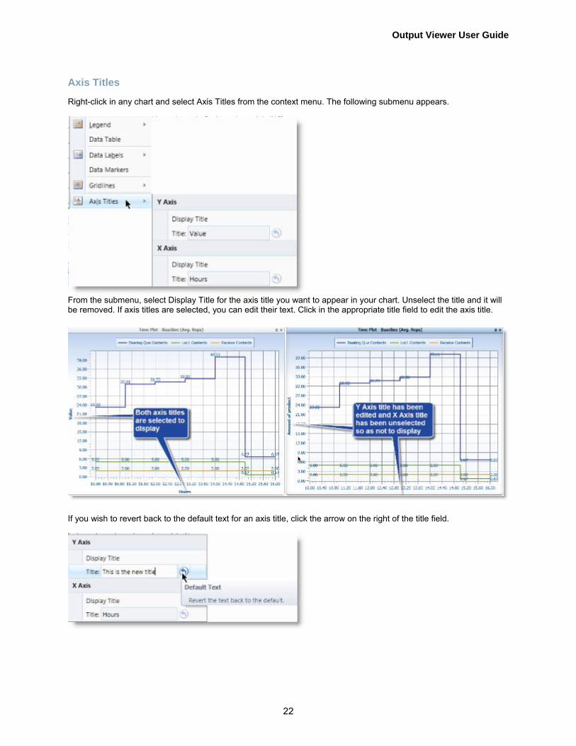
Right-click in any chart and select Axis Titles from the context menu. The following submenu appears.
From the submenu, select Display Title for the axis title you want to appear in your chart. Unselect the title and it will be removed. If axis titles are selected, you can edit their text. Click in the appropriate title field to edit the axis title.
If you wish to revert back to the default text for an axis title, click the arrow on the right of the title field.

Using the Report View
23
Hover Over Series in Charts
Hover over a series in a bar, line, Gantt, or pie chart and details associated with the series display in a tooltip. Two examples are shown below.

Output Viewer User Guide
24

Using Filter Options
25
Using Filter Options For every chart generated there are specific associated filter options. These filter options automatically appear in the Filter Options panel on the left side of the Output Viewer once a chart is selected. The example below shows some of the filter options available.
All of the other chart filter options available from Output Viewer are listed below. Not all filter options are available for every chart type. Click each filter option for more information.
• Scenarios on page 27 • Data Display on page 29 • Items on page 31 • Columns on page 32 • Statistics on page 32 • Options on page 36 • States on page 38
Minimize and Expand Filter Options
You can minimize the Filter Options panel to provide more room for your Report View. Click [<<] to minimize.
Click [>>] to expand.

Output Viewer User Guide
26
You can also drag the edge of the Filter Options panel to decrease or increase the panel size.
Search Filter For some filter options, a search filter appears at the bottom. This allows you to quickly find a specific scenario or variable name, or reduce the list of items if it is too large. To filter what is listed, type characters and numbers or complete or partial words, which are contained in the item name. The list will show only those items containing that text.
Click on the funnel icon to limit the list to only those items that are selected.

Using Filter Options
27
Scenarios All of the scenarios with simulated output for a given model are listed. If data sources from other models have been added, their scenarios will also be added to this list (see Adding Data Sources for more information). The first scenario listed (Baseline) is selected by default when creating a new chart in a Report View. Check the box next to those scenarios you would like to appear in the chart. Uncheck those scenarios that you would like to remove from the chart.
When multiple replications and periods are run in your simulation, the Replication and Period options shown above will be available in your Filter Options panel.
Replication
Select which replication you would like to appear, or if you would like an Average of the replications or All replications to appear in your chart.

Output Viewer User Guide
28
Period
Select which period you would like to appear, or if you would like an Average of the periods or All periods to appear in your chart.

Using Filter Options
29
Data Display The Data Display filter option only displays for Time Plot and Entity Count Time Series charts. The specific options the data display filter shows depends upon the chart selected and how the simulation was run (i.e. time only based, weekly time based, or calendar data based). For Time Plots, you can group the data by periodic average which allows you to define a specific period of time over which the values logged within that period will be averaged and reported. For Entity Counts, you can group the data by periodic sum which allows you to define a specific period of time over which the values logged within that period will be summed and then averaged across replications. A simulation that runs for eight hours with a period defined as two hours, will result in four averaged data points.
Note: When multiple replications are run, the replication with the fewest number of periods reported will determine how many periods to compare across replications and display in the chart.
Click the Grouping drop-down and select Periodic Average (or Periodic Sum for Entity Count charts) or None. Selecting None will display the actual data as it was written during the simulation.
Note: Depending upon the number of data points written, selecting None could cause the Output Viewer to take a long time to display or possibly fail to display some series.
You can also select the time interval for the chart data. Click the Interval drop-down and select from Hourly, Daily, Weekly, or Custom.
Note: Monthly, quarterly, and yearly are available as interval options for calendar based simulations.
If you select the custom interval, another drop-down appears in which you may specify a time interval not found in the interval options.

Output Viewer User Guide
30
Additional Data Display features are available for histograms.
You can set the bar width for the bars in your chart. Select Auto and Output Viewer will set the appropriate bar width. Select Custom and you can define the bar width you desire.

Using Filter Options
31
Items Items are the locations, resources, entities, variables, etc. available for displaying within a selected chart. Click the check box next to an item in the list and it will be added to the chart. Unselect a check box to remove an item from the chart.
Note: Pressing the Shift key while clicking on a box will check or uncheck all boxes in the list.
When you access a column chart an additional Statistics option becomes available under Items on the Filter Options panel.
Column charts can only display one statistic at a time, Use the Statistic drop-down in the Filter Options panel to select which statistics to display in the column chart selected. In this example, Total Exits is the default and Average Time Waiting is another option you can select.

Output Viewer User Guide
32
Columns When you select a table all of the corresponding columns for the table appear. Click the check box next to a column and it will appear in the table. Unselect a check box to remove an item from the table.
Statistics For Table, or Entity Count Histogram, a Statistics option appears in the Filter Options panel.
Histogram Statistics
A histogram is a bar chart showing values that fall into specific ranges. Histograms for time-weighted data (the contents of a location) show the ranges as a percentage of the total simulation time. Histograms for observation based data (cycle times) show the ranges as a percentage of total observations. Select from the Statistics options to indicate on the histogram the following information. Maximum: The maximum value found in the time series data across all replications. Mean: Time-weighted: The sum of the values, multiplied by the time at that value, divided by the overall simulation length. Mean: Observation based: The sum of the values divided by the total number of observations. Median: The numeric value separating the upper half of the data distribution from the lower half. Minimum:The minimum value found in the time series data across all replications. Mode: The range of values that occurs most frequently.

Using Filter Options
33
Percentile 75%: The 75th percentile is the value (or score) below which 75 percent of the data distribution can be found during the simulation. Percentile 25%: The 25th percentile is the value (or score) below which 25 percent of the data distribution can be found.
Click the check box next to the statistic you would like to see in your chart. Click in the Percentile check box and specify a percentile you would like to see in your chart. Unselect check boxes to remove statistics from the chart.
Time Plot Statistics
Time plots show performance values as they occur over time. This allows you to see trends and spikes in activity as the simulation progresses. Time plots can only be displayed, if the user has selected Time series as the statistics type for elements of model.
Note: can only be viewed for series with multiple replications.
Average: The sum of the average values, for each interval, divided by the number of replications. Minimum: The minimum of the replication average values for each interval Maximum: The maximum of the replication average values for each interval Confidence Intervals: Depending on the degree of precision required in the output, you may want to determine a confidence interval for the output. A confidence interval is a range within which you can have a certain level of confidence that the true mean will fall. For example, if the 90% confidence level for the average contents of a location is calculated to be between 75.5 and 80.8, we would then be able to say that there is a .90 probability that the true mean contents of the modeled location (not of the actual location) falls between 75.5 and 80.8.

Output Viewer User Guide
34
Click the check box for the statistic you would like to see in your chart.
Fortunately, ProModel provides convenient facilities for conducting experiments, running multiple replications and automatically calculating confidence intervals. You must still decide, however, what types of experimentation are appropriate.

Using Filter Options
35
Entity Count Statistics
Entity Count charts show entity throughput (exits) as it occurs over time. This allows you to see trends and spikes in activity as the simulation progresses.
Note: Filter Option Statistics can only be viewed for series with multiple replications.
Average: The sum of exits in each periodic interval over all replications, divided by the number of replications.
Minimum: The minimum number of exits, comparing replications, in each periodic interval.
Maximum: The maximum number of exits, comparing replications, in each periodic interval.
Confidence Interval: Shows the confidence level for each periodic interval. A confidence interval is a range within which you can have a certain level of confidence that the true mean will fall. For example, if the 90% confidence level for the average throughput in a periodic interval is calculated to be between 4.12 and 6.68, we would then be able to say that there is a .90 probability that the true mean throughput of the modeled entity (not of the actual entity) falls between 4.12 and 6.68.
Click the check box for the statistic you would like to see in your chart.

Output Viewer User Guide
36
Options For table and column charts, you can select a time unit in which to view your data. By default, time values are shown in the time unit the simulation was run in, but you may choose to have your data shown in seconds, minutes, hours, days, weeks, months or years. For charts that display Scheduled Time, an additional time unit option is available.
Click the Time Units drop-down and select from; seconds, minutes, hours, days, weeks, months, or years.
Note: Output Viewer will approximate months and years. One month is equal to 30.43685 days, while one year is equal to 365.2422 days.

Using Filter Options
37
Histograms
Histograms also provide the option to show discrete labels or not.
Select the Discrete Labels check box to see discrete labels. or unselect the check box to show regular labels.

Output Viewer User Guide
38
States Location State Time Series chart will include a States filter option containing all of the applicable states. You can unselect the check boxes for those states you do not want to appear in your chart.

Output Viewer Main Ribbon Tabs
39
Output Viewer Main Ribbon Tabs
The Output Viewer main ribbon tabs are:
• File on page 39 - Accesses Output Viewer files and data sources • Charts on page 45 - Accesses all tables and charts • Export on page 99 - Provides the ability to export charts in various formats
File Click the File tab for file related options. Your Output Viewer must be associated with one or more data sources in order to provide charts and reports for you to view. The File tab allows you to start a new Output Viewer file (.pmov), open an existing one, or save Output Viewer files which contain charts and Report Views you create. It also provides access to loading additional output data source files into Output Viewer. If you have opened the viewer from a simulated model to view model results, any data sources associated with the model are automatically loaded into the Output Viewer. If you have previously saved an Output Viewer file for your model, the file will be automatically loaded at the conclusion of your simulated run. If you open Output Viewer by itself and not from another ProModel application, no data sources will be loaded. Follow these steps to load a data source. If you open Output Viewer from ProModel or another ProModel application it is available with, before running a simulation, the following window appears.
From this window you can open Output Viewer files or add data sources to a new Output Viewer file.

Output Viewer User Guide
40
How to Open and Save Output Viewer Files
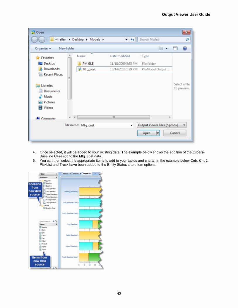
1. Select File > Open and an Open File dialog appears. Browse to a valid pmov file.
2. Click Open to open an output viewer file or Cancel.

Output Viewer Main Ribbon Tabs
41
3. After you have created some charts and reports, you can choose FIle > Save As to save your reports in an Output Viewer file (.pmov).
How to Add Data Sources to an Existing Output Viewer File
A user might want to add more data sources to an existing file to compare two different models' results or to compare results from several different iterations of a particular model. Different models are useful when different scenarios require changes beyond simple scenario parameter values.
1. Click Add Data Source.
2. The standard Windows file Open dialog appears. 3. Select the RDB file you would like to add as your new data source.
Output Viewer User Guide
42
4. Once selected, it will be added to your existing data. The example below shows the addition of the Orders-Baseline Case.rdb to the Mfg. cost data.
5. You can then select the appropriate items to add to your tables and charts. In the example below Cntr, Cntr2, PickList and Truck have been added to the Entity States chart item options.

Output Viewer Main Ribbon Tabs
43
How to Remove Data Sources
Hover over a loaded data source and a red [X] appears.
Click the red [X] to remove the data source from the Output Viewer.
About
Click About and the following information about Output Viewer displays, including the version number.
Click OK to close this window.

Output Viewer User Guide
44
Exit Output Viewer
Select Exit Output Viewer and the Report Viewing application closes.

Output Viewer Main Ribbon Tabs
45
Charts
When you access Output Viewer directly from another ProModel application, the Charts tab is the first thing you will see. After you run your simulation, Output Viewer automatically generates a default Report View of charts. You can create additional reports from the charts available via the Charts ribbon shown below.
Click on any chart in the ribbon and the chart and its associated filter options appear in the Report View.
• Summary • Tables on page 46 - more options provided • Column Charts on page 65- more options provided
• Utilization • Location Utilization Chart on page 82 • Resource Utilization Chart on page 83
• State • Entity State Pie Chart on page 90 • Location Single Capacity State Chart on page 86 • Location Multi-Capacity State Chart on page 87 • Resource State Chart on page 88 • State Pie Charts on page 89- more options provided
• Time Series
• Time Plot on page 95 • Histogram on page 96 • Entity Count on page 97 • Location State (over time) on page 98

Output Viewer User Guide
46
Tables
The tables in Output Viewer provide a spreadsheet-like chart of a model's summary or basic statistics. Tables enable you to view many statistics across multiple scenarios all at once. Click Tables and the following drop-down menu of available tables will appear.
Click on any of the tables listed and that table and its associated filter options appear in the Report View. Click on each table listed below for more information.
• Entity • Entity Summary Table on page 48 • Entity States Table on page 49 • Entity Costs Table on page 50 • Entity Failed Arrivals Table on page 51
• Location • Location Summary Table on page 52 • Location Single Capacity States Table on page 53 • Location Multi-Capacity States Table on page 54 • Location Setup Table on page 55 • Location Costs Table on page 56
• Resource • Resource Summary Table on page 57 • Resource States Table on page 58 • Resource Costs Table on page 59
• Variable • Variable Summary Table on page 60
• Other • Simulation Information Table on page 61 • Logs on page 62 • Node Entries on page 63 • Scoreboard on page 64
Output Viewer Main Ribbon Tabs
47
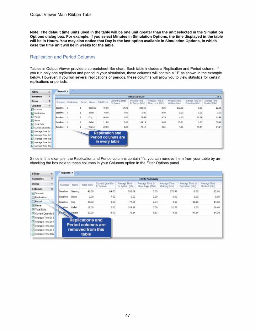
Note: The default time units used in the table will be one unit greater than the unit selected in the Simulation Options dialog box. For example, if you select Minutes in Simulation Options, the time displayed in the table will be in Hours. You may also notice that Day is the last option available in Simulation Options, in which case the time unit will be in weeks for the table.
Replication and Period Columns
Tables in Output Viewer provide a spreadsheet-like chart. Each table includes a Replication and Period column. If you run only one replication and period in your simulation, these columns will contain a "1" as shown in the example below. However, if you run several replications or periods, these columns will allow you to view statistics for certain replications or periods.
Since in this example, the Replication and Period columns contain 1's, you can remove them from your table by un-checking the box next to these columns in your Columns option in the Filter Options panel.
Output Viewer User Guide
48
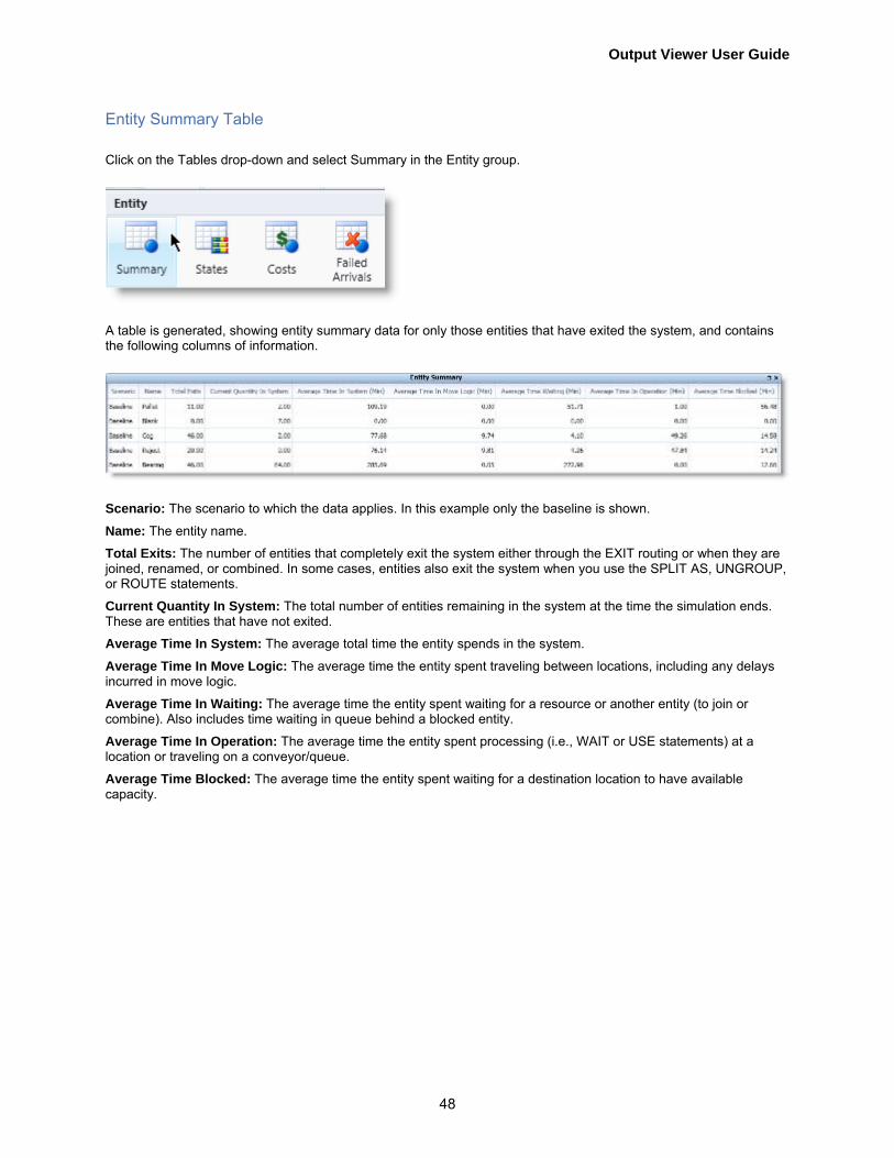
Entity Summary Table
Click on the Tables drop-down and select Summary in the Entity group.
A table is generated, showing entity summary data for only those entities that have exited the system, and contains the following columns of information.
Scenario: The scenario to which the data applies. In this example only the baseline is shown.
Name: The entity name.
Total Exits: The number of entities that completely exit the system either through the EXIT routing or when they are joined, renamed, or combined. In some cases, entities also exit the system when you use the SPLIT AS, UNGROUP, or ROUTE statements.
Current Quantity In System: The total number of entities remaining in the system at the time the simulation ends. These are entities that have not exited.
Average Time In System: The average total time the entity spends in the system.
Average Time In Move Logic: The average time the entity spent traveling between locations, including any delays incurred in move logic.
Average Time In Waiting: The average time the entity spent waiting for a resource or another entity (to join or combine). Also includes time waiting in queue behind a blocked entity.
Average Time In Operation: The average time the entity spent processing (i.e., WAIT or USE statements) at a location or traveling on a conveyor/queue.
Average Time Blocked: The average time the entity spent waiting for a destination location to have available capacity.

Output Viewer Main Ribbon Tabs
49
Entity States Table
Click on the Tables drop-down and select States within the Entity group.
A table is generated, which shows entity conditions for those entities that have exited the system, and contains the following columns of information.
Scenario: The scenario to which the data applies.
Name: The entity name.
% In Move Logic: The percentage of time the entity spent traveling between locations, including any delay time incurred in move logic.
% Waiting: The percentage of time the entity spent waiting for a resource, a WAIT UNTIL condition, another entity to join or combine, or behind other entities. (100% - (minus) Sum of %’s for all other states.)
% In Operation: The percentage of time the entity spent in processing at a location or traveling on a conveyor/queue. If an entity is on a conveyor behind another entity which is blocked because the next location is unavailable, the time the entity spent behind the other entity is considered in Operation.
% Blocked: The percentage of time the entity spent waiting for the next location to become available.

Output Viewer User Guide
50
Entity Costs Table
Click on the Tables drop-down and select Costs within the Entity group.
The following table is generated, which lists cost data for entities in the simulation, and contains the following columns of information.
Scenario: The scenario to which the data applies.
Name: The entity item name.
Explicit Exits: The number of entities that have explicitly exited. Whenever an entity exits the system, it is an explicit exit except in the following cases; when an entity JOINS, permanently LOADS, or COMBINES with another entity, it implicitly exits the system, and is reported as an exit in the Entity Activity report. However, for costing purposes,the entity did not explicitly exit, but its costing information was added to the entity it was JOINED, permanently LOADED, or COMBINED with.When an entity temporarily LOADS onto a base entity or GROUPS with another entity, and the entire LOADED or GROUPED entity exits the system, the original entity implicitly exits the system, and is reported as an exit in the Entity summary table. However, for costing purposes, the original entity did not explicitly exit, but its costing information was added to the entire load or group.
Total Cost:The cumulative entity cost, or the sum of costs incurred at all locations the entity passed through + the sum of all costs incurred by use of resource + initial cost + any IncEntCost
% Total Cost: Refers to the entity’s percentage of the sum of all entity costs.
Output Viewer Main Ribbon Tabs
51
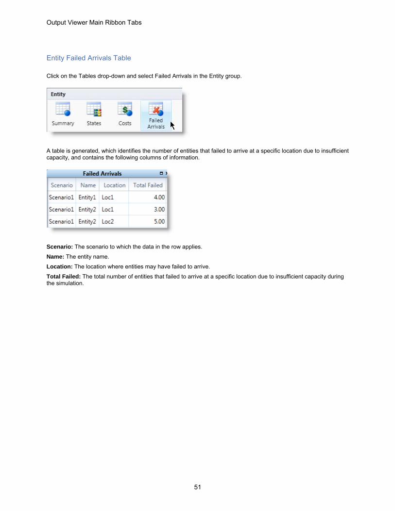
Entity Failed Arrivals Table
Click on the Tables drop-down and select Failed Arrivals in the Entity group.
A table is generated, which identifies the number of entities that failed to arrive at a specific location due to insufficient capacity, and contains the following columns of information.
Scenario: The scenario to which the data in the row applies.
Name: The entity name.
Location: The location where entities may have failed to arrive.
Total Failed: The total number of entities that failed to arrive at a specific location due to insufficient capacity during the simulation.

Output Viewer User Guide
52
Location Summary Table
Click on the Tables drop-down and select Summary in the Location group.
A table is generated, which summarizes statistics gathered during the simulation that apply to all locations, and contains the following columns of information.
Scenario: The scenario to which the data in the row applies.
Name: The location name.
Scheduled Time: The total amount of time the location was scheduled to be available. (Excludes off-shift time, break time, and scheduled downtimes.)
Capacity: The capacity defined for this location in the model.
Total Entries: The total number of entities that entered the location, not including entities arriving to be joined and loaded. Entities split, unloaded, or ungrouped from another entity at a location do not count as additional entries. Arriving entities that have been previously grouped or loaded to form a single entity only count as one entry.
Average Time Per Entry: The average time each entity spent at the location. This time may include partial times from the beginning and end of the actual run time.
Average Contents: The average number of entities at the location.
Maximum Contents: The maximum number of entities which occupied the location over the course of the simulation.
Current Contents: The number of entities remaining at the location when the simulation ended.
% Utilization: The percentage of capacity occupied, on average, during the simulation.
Cumulative Occupancy Time x 100 Capacity x Scheduled Time
Cumulative Occupancy Time refers to the sum of the clock time each entity spends at a location for processing.

Output Viewer Main Ribbon Tabs
53
Location Single Capacity States Table
Click on the Tables drop-down and select Single Cap States in the Location group.
A table is generated, which lists the percentage of time single capacity locations spent in various states during the simulation, and contains the following columns of information.
Scenario: The scenario to which the data in this row applies.
Name: The location name.
Scheduled Time: The total amount of time the location was scheduled to be available. This value is now in decimal format, not truncated. (Excludes off-shift time, break time, and scheduled downtimes.)
% Operation: The percentage of time the location was processing an entity.
% Setup: The percentage of time the location spent in setup in order to process the entities.
% Idle: The percentage of time no entities were at the location, but the location was not down.
% Waiting: The percentage of time the location was waiting for a resource, another entity, or a WAIT UNTIL condition in order to begin processing or move to the next location. Any delays in processing move logic (even WAIT statements) are counted as waiting and include JOIN, LOAD, and MATCH statements.
% Blocked: The percentage of time entities spent waiting for a freed destination.
% Down: The percentage of time the location was down as the result of unscheduled downtimes. This does not exclude the possibility of overlap with any of the previous three states.

Output Viewer User Guide
54
Location Multi-Capacity States Table
Click on the Tables drop-down and select Multi Cap States in the Location group.
A table is generated, which lists the percentage of time multi-capacity locations spent in various states, and contains the following columns of information.
Scenario: The scenario to which the data in the row applies.
Name: The location name.
Scheduled Time: The total amount of time the location was scheduled to be available. This value is now in decimal format, not truncated. (Excludes off-shift time, break time, and scheduled downtimes.)
% Empty: The percentage of time the location had no entities.
% Part Occupied: The percentage of time the location has entities, but was not filled to capacity (100% of time - %Full - %Empty).
% Full: The percentage of time the location was full to capacity with entities.
% Down: The percentage of time the location was down as the result of unscheduled downtimes. This does not exclude the possibility of overlap with any of the previous three states

Output Viewer Main Ribbon Tabs
55
Location Setup Table
Click on the Tables drop-down and select Setup in the Location group.
A table is generated, which lists the percentage of time locations spent in setup, and contains the following columns of information.
Scenario: The scenario to which the data in the row applies.
Name: The name of the location where the setup downtime occurred.
Entity: The item that was setup at a location.
Total Setups:The number of times this location/ entity combination resulted in a setup downtime.
Average Time Per Setup: The average time the location was down for each setup downtime.

Output Viewer User Guide
56
Location Costs Table
Click on the Tables drop-down and select Costs in the Location group.
A table is generated, which lists various costs for each of the model locations, and contains the following columns of information.
Scenario: The scenario to which the data in the row applies.
Name: The location name.
Operation Cost: Operation Cost = (Active Operation Time * Rate) + (Any IncLocCost)
% Operation Cost: Refers to the location’s percentage of the sum of all operation costs.
Resource Cost: Resource Cost = (Utilization * Rate) + (Times Used * Cost per use)
% Resource Cost: Refers to the location’s percentage of the sum of all resource costs.
Total Cost:Total Cost = (Operation Cost + Resource Cost)
% Total Cost: Refers to location’s percentage of the sum of all location costs.

Output Viewer Main Ribbon Tabs
57
Resource Summary Table
Click on the Tables drop-down and select Summary in the Resource group.
A table is generated, which lists various resource summary statistics regarding the model, and contains the following columns of information.
Scenario: The scenario to which the data in the row applies.
Name: The resource name.
Units: The number of units defined in the Resources module for that resource.
Scheduled Time: The total amount of time the resource was scheduled to be available. (Excludes off-shift time, break time, and scheduled downtimes.)
Work Time:The total amount of time the resource was in use.
Number Times Used: The total number of times the resource has been acquired to transport or process an entity or to service locations or other downed resources.
Average Time Per Usage: The average time the resource spent transporting or processing an entity, or servicing a location or other resource. Includes any pickup and drop-off time as well as any blocked time while in use.
Average Time Travel To Use:The average time the resource spent traveling to a location or other resource to transport or process an entity, or to service a location or other resource. Does not include any pickup time, but does include any blocked time. (This information is not available if your model does not have dynamic resources.)
Average Time Travel to Use = Total Time Travel to Use / (divided by) Number of Times Used
Average Time Travel To Park:The average time the resource spent traveling to either a park node or a downtime node. (This information is not available if your model does not have dynamic resources.)
% Blocked: In Travel Blocked In Travel The percentage of time the resource was unable to move to a destination because the next path node along the route of travel was blocked (occupied by another resource). (This information is not available if your model does not have dynamic resources.)
% Utilization: The percentage of time the resource spent traveling to be used, transporting or processing an entity, or servicing a location or other resource.
% Utilization = (Total Travel to Use Time + Total Time In Usage) / (divided by) Total Scheduled Time
Note: ProModel reports resource groups and multi-unit resources both by unit and collectively. The collective unit (aggregate) report for a resource totals the first three fields and averages the last five fields discussed above.

Output Viewer User Guide
58
Resource States Table
Click on the Tables drop-down and select States in the Resource group.
A table is generated, which lists information regarding each resource and how much time it spent in each condition, and contains the following columns of information.
Scenario: The scenario to which the data in the row applies.
Name: The resource name.
Scheduled Time: The total amount of time the resource was scheduled to be available. (Excludes off-shift time, break time, and scheduled downtimes.)
% In Use: The percentage of time the resource spent transporting or processing an entity, or servicing a location or other resource that was down. This also includes deposit time.
% Travel To Use: The percentage of time the resource spent traveling to a location or other resource to transport or process an entity, or to service a location or other resource. This also includes pickup time. (This information is not available, if your model does not have dynamic resources.)
% Travel To Park: The percentage of time the resource spent traveling to a path node to park or traveling to its downtime node. (This information is not available if your model does not have dynamic resources.)
% Idle: The percentage of time the resource was available but not in use.
% Down: The percentage of time the resource was unavailable due to unscheduled downtimes.

Output Viewer Main Ribbon Tabs
59
Resource Costs Table
Click on the Tables drop-down and select Costs in the Resource group.
A table is generated, which provides summary cost statistics for resources, and contains the following columns of information.
Scenario: The scenario to which the row of data applies.
Name: The resource name.
Units: The number of resource units used in the simulation.
NonUse Cost: NonUse Cost = (1-% Utilization) * Scheduled Time * Rate
% NonUse Cost: Refers to the resource’s percentage of the sum of all nonuse costs.
Usage Cost: Usage Cost = (% Utilization * Scheduled Time * Rate) + (Times Used * Cost per use)
% Usage Cost: Refers to the resource’s percentage of the sum of all resource usage costs.
Total Cost: Total Cost = Usage Cost + NonUse Cost
% Total Cost: Refers to the resource’s percentage of the sum of all resource costs.

Output Viewer User Guide
60
Variable Summary Table
Click on the Tables drop-down and select Summary in the Variables group.
A table is generated, which contains summary data for all of the variables collecting statistics in the model, and contains the following columns of information.
Scenario: The scenario to which the data in the row applies.
Name: The variable name.
Total Changes: The total number of times the value of the given variable changed during the simulation.
Average Time Per Change: The average time a given variable remained at any one value.
Minimum Value: The lowest value of the variable during the simulation.
Maximum Value: The highest value of the variable during the simulation.
Current Value: The final value of the variable when the simulation ended.
Average Value: The average value of the variable during the simulation, the calculation varies based on whether the variable is time weighted or observation based.

Output Viewer Main Ribbon Tabs
61
Simulation Information Table
Click on the Tables drop-down and select Simulation Info. in the Other group.
A table is generated, which contains information about warm-up and simulation start, and simulation end times. It also lists scenario parameters and what their values were for the given scenario. Each column represents a different scenario. The table contains the following rows of information.
Run Date: The specific date and time the simulation ran.
Avg. Warmup Duration (Hr): The amount of initial time the simulation spent in a warmup state. No statistics were gathered during this time. The time unit used is one unit longer than defined in the Clock Precision field of the Simulation Options dialog.
Avg. Simulation Duration: The average time in simulation.
Simulation Parameters: All successive rows will list any scenario parameters

Output Viewer User Guide
62
Logs
Click on the Tables drop-down and select Logs in the Other group.
A table is generated, which lists summarized statistics of all log entries as defined by the user, and contains the following columns of information.
Scenario: The scenario to which the row applies.
Name: The name of the log.
Number of Observations: The number of log entries that occurred during the simulation for the given Log.
Minimum Value: The minimum log entry value during the simulation for the given Log.
Maximum Value: The maximum log entry value during the simulation for the given Log.
Average Value: The average value of all log entries during the simulation for the given Log.
Note: Log statistics are set up by the user with a LOG statement to track the time entities spend between any two points in the model.

Output Viewer Main Ribbon Tabs
63
Node Entries
Click on the Tables drop-down and select Node Entries in the Other group.
A table is generated, which lists summary statistics for all entries into the given node on the specified path network, and contains the following columns of information.
Scenario: The scenario to which the row of data applies.
Name: The path network name.
Node: The node name.
Total Entries: The total number of times that a resource entered the path node.
Blocked Entries: The total number of times a resource tried to claim a path node occupied by another resource.
Note: Statistics are only collected and shown for non-passing path networks; other types will not display anything in the table.

Output Viewer User Guide
64
Scoreboard
Click on the Tables drop-down and select Scoreboard in the Other group.
The scoreboard reports basic overall system information and contains the following columns of information.
Scenario: The scenario to which the row of data applies.
Name: The entity name.
Total Exits: The total number of exits.
Average Time In System: The average time a given entity was in the system during the simulation.
Average Time In Operation: The average time a given entity was in operation during the simulation.
Average Cost: The average cost of a given entity during the simulation.

Output Viewer Main Ribbon Tabs
65
Column Charts
Column charts display vertical bar charts for columns of data found in the tables. These charts are an excellent way to visually compare the different items in your tables. They are also helpful for organizing data attractively for presentations. To generate any one of the column charts, select the desired chart from the drop-down.
Click on the chart name listed below for more information about that chart.
• Entity • Entity Summary Column Chart on page 66 • Entity State Column Chart on page 67 • Entity Costs Column Chart on page 68 • Entity Failed Arrivals Column Chart on page 69
• Location • Location Summary Column Chart on page 70 • Location Single Capacity Column Chart on page 71 • Location Multi-Capacity States Column Chart on page 72 • Location Setup Column Chart on page 73 • Location Costs Column Chart on page 74
• Resource • Resource Summary Column Chart on page 75 • Resource States Column Chart on page 76 • Resource Costs Column Chart on page 77
• Variable • Variable Summary Column Chart on page 78
• Other • Logs Column Chart on page 79 • Node Entries Column Chart on page 80

Output Viewer User Guide
66
Entity Summary Column Chart
This bar chart shows entity summary data collected during the simulation. All scenarios can be displayed in the chart, however this example shows only the baseline. Column charts can only display one statistic at a time. This example shows Total Exits. Use the Statistics drop-down in the Filter Options panel to select other statistics.
Total Exits: The number of entities that completely exited the system either through the EXIT routing or when they are joined, renamed, or combined. In some cases, entities also exit the system when you use the SPLIT AS, UNGROUP, or ROUTE statements.
Current Quantity In System: The total number of entities remaining in the system at the time the simulation ended. These are entities that have not exited.
Average Time In System: The average total time the entity spent in the system.
Average Time In Move Logic: The average time the entity spent traveling between locations, including any delays incurred in move logic.
Average Time In Waiting: The average time the entity spent waiting for a resource or another entity (to join or combine). Also includes time waiting in queue behind a blocked entity.
Output Viewer Main Ribbon Tabs
67
Average Time In Operation: The average time the entity spent processing (i.e., WAIT or USE statements) at a location or traveling on a conveyor/queue.
Average Time Blocked: The average time the entity spent waiting for a destination location to have available capacity.
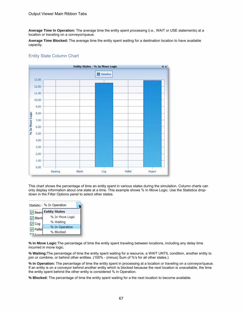
Entity State Column Chart
This chart shows the percentage of time an entity spent in various states during the simulation. Column charts can only display information about one state at a time. This example shows % In Move Logic. Use the Statistics drop-down in the Filter Options panel to select other states.
% In Move Logic:The percentage of time the entity spent traveling between locations, including any delay time incurred in move logic.
% Waiting:The percentage of time the entity spent waiting for a resource, a WAIT UNTIL condition, another entity to join or combine, or behind other entities. (100% - (minus) Sum of %'s for all other states.)
% In Operation: The percentage of time the entity spent in processing at a location or traveling on a conveyor/queue. If an entity is on a conveyor behind another entity which is blocked because the next location is unavailable, the time the entity spent behind the other entity is considered % in Operation.
% Blocked: The percentage of time the entity spent waiting for a the next location to become available.

Output Viewer User Guide
68
Entity Costs Column Chart
This chart shows cost data collected during the simulation. Column charts can only display one statistic at a time. This example shows Explicit Exits. Use the Statistics drop-down in the Filter Options panel to select other statistics.
Explicit Exits: The number of entities that have explicitly exited. Whenever an entity exits the system, it is an explicit exit except in the following cases:When an entity JOINS, permanently LOADS, or COMBINES with another entity, it implicitly exits the system, and is reported as an exit in the Entity Activity report. For costing purposes, the entity did not explicitly exit, but its costing information was added to the entity. When an entity temporarily LOADS onto a base entity or GROUPS with another entity, and the entire LOADED or GROUPED entity exits the system, the original entity implicitly exits the system, and is reported as an exit in the Entity Summary table. For costing purposes, the original entity did not explicitly exit, but its costing information was added to the entire load or group.
Total Cost: The total cost equals cumulative entity cost, or the sum of costs incurred on all locations the entity passed through + the sum of all costs incurred by use of resource + initial cost + any IncEntCost
% Total Cost: This refers to the entity’s percentage of sum of all entity costs.
Output Viewer Main Ribbon Tabs
69
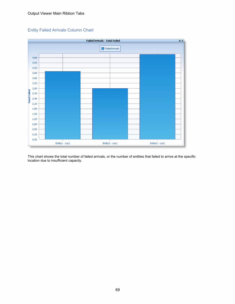
Entity Failed Arrivals Column Chart
This chart shows the total number of failed arrivals, or the number of entities that failed to arrive at the specific location due to insufficient capacity.

Output Viewer User Guide
70
Location Summary Column Chart
This chart shows location summary data collected during the simulation. Column charts can only display one statistic at a time. This example shows % Utilization. Use the Statistics drop-down in the Filter Options panel to select other statistics.
.
Scheduled Time: The total amount of time the location was scheduled to be available. (Excludes off-shift time, break time, and scheduled downtimes.)
Capacity: The capacity defined in the location’s module for this location.
Total Entries: The total number of entities that entered the location, not including entities arriving to be joined and loaded. Entities split, unloaded, or ungrouped from another entity at a location do not count as additional entries. Arriving entities that have been previously grouped or loaded to form a single entity only count as one entry.
Average Time Per Entry: The average time each entity spent at the location. This time may include partial times from the beginning and end of the actual run time.
Average Contents: The average number of entities at the location

Output Viewer Main Ribbon Tabs
71
Maximum Contents: The maximum number of entities which occupied the location over the course of the simulation.
Current Contents: The number of entities remaining at the location when the simulation ended.
% Utilization: The percentage of capacity occupied, on average, during the simulation.
Cumulative Occupancy Time x 100
Capacity x Scheduled Time
Cumulative Occupancy Time refers to the sum of the clock time each entity spends at a location for processing
Location Single Capacity Column Chart
This chart shows the percentage of time single capacity locations spent in various states during the simulation. Column charts can only display one statistic at a time. This example shows % Operation. Use the Statistics drop-down in the Filter Options panel to select other statistics.
Scheduled Time: The total amount of time the location was scheduled to be available. This value is now in decimal format, not truncated. (Excludes off-shift time, break time, and scheduled downtimes.)

Output Viewer User Guide
72
% Operation: The percentage of time the location was processing an entity.
% Setup: The percentage of time the location spent in setup in order to process the entities.
% Idle: The percentage of time no entities were at the location, but the location was not down.
% Waiting: The percentage of time the location was waiting for a resource, another entity, or a WAIT UNTIL condition in order to begin processing or move to the next location. Any delays in processing move logic (even WAIT statements) are counted as waiting and include JOIN, LOAD, and MATCH statements.
% Blocked: The percentage of time entities spent waiting for a freed destination.
% Down: The percentage of time the location was down due to unscheduled downtimes.
Location Multi-Capacity States Column Chart
This chart shows the percentage of time multi- capacity locations spent in various states during the simulation. Column charts can only display one statistic at a time. This example shows % Part Occupied. Use the statistics drop-down in the filter options panel to select other statistics to display.
Scheduled Time:): The total amount of time the location was scheduled to be available. (Excludes off-shift time, break time, and scheduled downtimes.)

Output Viewer Main Ribbon Tabs
73
% Empty: The percentage of time the location had no entities.
% Part Occupied: The percentage of time the location has entities, but was not filled to capacity.
(100% - %Full - %Empty).
% Full: The percentage of time the location was full to capacity with entities.
% Down: The percentage of time the location was down as the result of unscheduled downtimes. This does not exclude the possibility of overlap with any of the previous three states.
Location Setup Column Chart
This chart shows setups data collected during the simulation. Column charts can only display one statistic at a time, this example shows Average Time Per Setup. Use the Statistics drop-down in the Filter Options panel to select other statistics to display.
Total Setups: The number of times this location/ entity combination resulted in a setup downtime.
Average Time Per Setup: The average time the location was down for each setup downtime.

Output Viewer User Guide
74
Location Costs Column Chart
This chart shows location cost data for each location collected during the simulation. Column charts can only display one statistic at a time. This example shows Total Cost. Use the Statistics drop-down in the Filter Options panel to select other statistics to display.
Operation Cost: Operational Cost = (Active Operation Time * Rate) + (Any IncLocCost)
% Operation Cost: Refers to the location’s percentage of the sum of all operation costs
Resource Cost: Resource Cost = (Utilization * Rate) + (Times Used * Cost per use)
% Resource Cost: Refers to the location’s percentage of the sum of all resource costs
Total Cost: Total Cost = (Operation Cost + Resource Cost)
% Total Cost: Refers to location’s percentage of the sum of all location costs
Output Viewer Main Ribbon Tabs
75
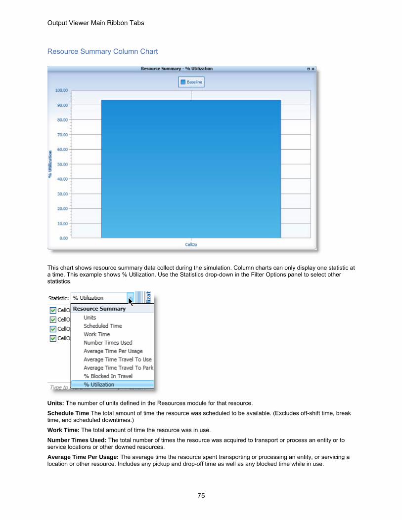
Resource Summary Column Chart
This chart shows resource summary data collect during the simulation. Column charts can only display one statistic at a time. This example shows % Utilization. Use the Statistics drop-down in the Filter Options panel to select other statistics.
Units: The number of units defined in the Resources module for that resource.
Schedule Time The total amount of time the resource was scheduled to be available. (Excludes off-shift time, break time, and scheduled downtimes.)
Work Time: The total amount of time the resource was in use.
Number Times Used: The total number of times the resource was acquired to transport or process an entity or to service locations or other downed resources.
Average Time Per Usage: The average time the resource spent transporting or processing an entity, or servicing a location or other resource. Includes any pickup and drop-off time as well as any blocked time while in use.

Output Viewer User Guide
76
Average Time Travel To Use: The average time the resource spent traveling to a location or other resource to transport or process an entity, or to service a location or other resource. Does not include any pickup time, but does include any blocked time. (This information is not available if your model does not have dynamic resources.)
Average Time Travel to Use = total Time Travel to Use / (divided by) Number of Times Used
Average Time Travel To Park: The average time the resource spent traveling to either a park node or a downtime node. (This information is not available if your model does not have dynamic resources.)
% Blocked In Travel: The percentage of time the resource was unable to move to a destination because the next path node along the route of travel was blocked (occupied by another resource). (This information is not available if your model does not have dynamic resources.)
% Utilization: The percentage of time the resource spent traveling to be used, transporting or processing an entity, or servicing a location or other resource
% Utilization = (Total Travel to Use Time + Total Time In Usage) / (divided by) Total Scheduled Time
Resource States Column Chart
This chart shows the total amount of time each resource and spent in each condition. Column charts can only display one statistic at a time. This example shows % In Use. Use the Statistics drop-down in the Filter Options panel to select other statistics.

Output Viewer Main Ribbon Tabs
77
Scheduled Time: The total amount of time the resource was scheduled to be available. (Excludes off-shift time, break time, and scheduled downtimes.)
% In Use: The percentage of time the resource spent transporting or processing an entity, or servicing a location or other resource that was down. This also includes deposit time.
% Travel To Use: The percentage of time the resource spent traveling to a location or other resource to transport or process an entity, or to service a location or other resource. This also includes pickup time. (This information is not available if your model does not have dynamic resources.)
% Travel To Park: The percentage of time the resource spent traveling to a path node to park or traveling to its downtime node. (This information is not available if your model does not have dynamic resources.)
% Idle: The percentage of time the resource was available but not in use.
% Down: The percentage of time the resource was unavailable due to unscheduled downtimes.
Resource Costs Column Chart
This chart shows cost data for each resource collected during the simulation. Column charts can only display one statistic at a time. This example shows Total Cost. Use the Statistics drop-down in the Filter Options panel to select other statistics.

Output Viewer User Guide
78
Units: The number of resource units.
NonUse Cost: NonUse Cost = (1-% Utilization) * Scheduled Time * Rate
% NonUse Cost: Refers to the resource’s percentage of the sum of all nonuse costs.
Usage Cost: Usage Cost = (% Utilization * Scheduled Time * Rate) + (Times Used * Cost per use)
% Usage Cost: Refers to the resource’s percentage of the sum of all resource usage costs.
Total Cost: Total Cost = Usage Cost + NonUse Cost
% Total Cost: Refers to the resource’s percentage of the sum of all resource costs.
Variable Summary Column Chart
This chart shows summary data for all of the variables collecting statistics in the model during the simulation. Column charts can only display one statistic at a time. This example shows Current Value. Use the Statistics drop-down in the Filter Options panel to select other statistics.

Output Viewer Main Ribbon Tabs
79
Total Changes: The total number of times the value of the given variable changed during the simulation.
Average Time Per Change: The average time a given variable remained at any one value.
Minimum Value: The lowest value of the variable during the simulation.
Maximum Value: The highest value of the variable during the simulation.
Current Value: The final value of the variable when the simulation ended.
Average Value: The average value of the variable during the simulation. Calculation varies depending upon whether the variable is time-weighted or observation based.
Logs Column Chart
This chart shows the summary data for log entries during simulation. Column charts can only display one statistic at a time. This example shows Average Value. Use the Statistics drop-down in the Filter Options panel to select other statistics.

Output Viewer User Guide
80
Number of Observations: The number of log entries that occurred during the simulation for the given Log.
Minimum Value: The minimum log entry value during the simulation for the given Log.
Maximum Value: The maximum log entry value during the simulation for the given Log.
Average Value: The average value of all log entries during the simulation for the given Log.
Node Entries Column Chart
This chart shows summary statistics for all entries into the given node on the specified path network collected during the simulation. Column charts can only display one statistic at a time. This example shows Total Entries. Use the Statistics drop-down in the Filter Options panel to select other statistics.

Output Viewer Main Ribbon Tabs
81
Total Entries: The total number of times that a resource entered the path node.
Block Entries: The total number of times a resource tried to claim a path node occupied by another resource.
Utilization
Two Utilization charts are available from the Output Viewer Charts ribbon:
• Location Utilization Chart on page 82 • Resource Utilization Chart on page 83

Output Viewer User Guide
82
Location Utilization Chart
Click on Location in the Utilization group in the Charts ribbon.
The following chart is generated.
This chart shows the percentage of the overall scheduled time that the capacity of a location was utilized during the simulation.

Output Viewer Main Ribbon Tabs
83
Resource Utilization Chart
Click on Resource in the Utilization group of the Charts ribbon.
The following chart is generated.
This chart shows the percentage of time each resource was used during the simulation.

Output Viewer User Guide
84
State
State Charts show horizontal stacked bar charts and pie charts of location, resource, and entity states. States provide a summary view of the condition of these objects. This is useful for quickly seeing what your locations, resources, and entities spent their time doing over the course of the simulation. Such visualizations can help identify problem areas in your process.There are four state charts available:
• Entity State Charts on page 85 • Location Single Capacity State Chart on page 86 • Location Multi- Capacity on page 1 • Resource Utilization Chart on page 83
There are four See "State Pie Charts" on page 89 available:
• Entity State Pie Chart on page 90 • Location Single Capacity State Chart on page 86 • Location Multi-Capacity State Chart on page 87 • Resource State Chart on page 88

Output Viewer Main Ribbon Tabs
85
Entity State Charts
Click on Entity within the State group of the Charts ribbon.
The following chart is generated.
This chart shows a horizontal stacked bar chart summarizing the states of each entity type during the simulation run. States describe the condition of these objects.
% In Move Logic: The percentage of time the entity was moving from one location to another during the simulation.
% Waiting: The percentage of time the entity was waiting for a resource, another entity or a wait until condition in order to begin processing or move to the next location. Any delays in processing move logic (even WAIT statements) are counted as waiting time included are Join, Load, Match.
% In Operation: The percentage of time the entity spent processing at a location.
% Blocked: The percentage of time the entity spent waiting for an available destination.

Output Viewer User Guide
86
Location Single Capacity State Chart
Click on Location Single Cap within the State group of the Charts ribbon.
The following chart is generated.
This chart shows a horizontal stacked bar chart summarizing the states of each single capacity location during the simulation run. States describe the conditions of these objects.
% In Operation: The percentage of time the location was processing an entity.
% Setup: The percentage of time the location spent in set up downtime during the simulation.
% Idle: The percentage of time a location was available, but not in use.
% Waiting: The percentage of time the location was waiting for a resource, or an entity, including JOIN, LOAD, and MATCH or a WAIT UNTIL condition in order to begin processing
% Blocked: The percentage of time the location spent waiting for a freed destination.
% Down: The percentage of time the location was not unavailable due to unscheduled downtime.

Output Viewer Main Ribbon Tabs
87
Location Multi-Capacity State Chart
Click on Location Multi Cap within the State group of the Charts ribbon.
The following chart is generated.
This chart shows a horizontal stacked bar chart summarizing the states of each multi capacity location during the simulation run. States describe the condition of these objects.
% Empty: The percentage of time a location had no entities.
% Partially Occupied: The percentage of time a location had entities, but was not filled to capacity.
% Full: The percentage of time a location was filled to capacity with entities.

Output Viewer User Guide
88
Resource State Chart
Click on Resource within the State group of the Charts ribbon.
The following chart is generated.
This chart shows a horizontal stacked bar chart summarizing the states of each resource type during the simulation run. States describe the condition of these objects.
% In Use: The percentage of time the resource spent processing an entity or servicing a location or other resource that was down. This also includes downtime.
% Travel to Use: The percentage of time the resource spent traveling to a location or other resource to transport or process an entity, or to service a location or other resource. This includes pick-up time.
% Travel To Park: The percentage of time the resource spent traveling to a path node to park or traveling to its downtime node.

Output Viewer Main Ribbon Tabs
89
% Idle: The percentage of time a resource was available, but not in use.
% Down: The percentage of time a resource was not unavailable due to unscheduled downtime.
State Pie Charts
Click on pie charts drop-down within the state group of the charts ribbon and a list of pie charts is displayed.
• Entity State Pie Chart on page 90 • Location Single Capacity State Pie Chart on page 92 • Location Multi-Capacity State Pie Chart on page 93 • Resource State Pie Chart on page 94

Output Viewer User Guide
90
Entity State Pie Chart
Select Entity from the Pie Charts drop-down within the State group of the Charts ribbon.
The following pie chart is generated.
This pie chart displays each state as a separate section of the pie based upon the percentage of overall simulation time the entity type spent in a state.
% In Move Logic: The percentage of time the item was moving from one location to another during the simulation.
% Waiting: The percentage of time the location was waiting for a resource, another entity or a wait until condition in order to begin processing or move to the next location. Any delays in processing move logic (even WAIT statements) are counted as waiting time included are Join, Load, Match.
% In Operation: The percentage of time the location was actually processing an entity.
% Blocked: The percentage of time entities spent waiting for a freed destination.

Output Viewer Main Ribbon Tabs
91
For all pie charts only one item in a chart can be viewed at a time in full display view. Other item charts will be placed off to the side in your Report View. Click on one of the other views to bring it into full view.

Output Viewer User Guide
92
Location Single Capacity State Pie Chart
Select Location Single Cap from the Pie Charts drop-down within the State group in the Charts ribbon.
The following pie chart is generated.
This pie chart displays each state as a separate section of the pie based upon the percentage of overall simulation time the single capacity location spent in a state.
% In Operation: The percentage of time the location was actually processing an entity.
% Setup: The percentage of time an operation was being set up during the simulation.
% Idle: The percentage of time a resource was available, but not in use.
% Waiting: The percentage of time the location was waiting for a resource, another entity or a wait until condition in order to begin processing or move to the next location. Any delays in processing move logic (even WAIT statements) are counted as waiting time included are Join, Load, Match.
% Blocked: The percentage of time entities spent waiting for a freed destination.
% Down: The percentage of time a resource was not unavailable due to unscheduled downtime.

Output Viewer Main Ribbon Tabs
93
Location Multi-Capacity State Pie Chart
Select Location Multi Cap from the Pie Charts drop-down within the State group of the Charts ribbon.
The following pie chart is generated.
This pie chart displays each state as a separate section of the pie based upon the percentage of overall simulation time the multi capacity location spent in a state.
% Empty: The percentage of time a location had not entities.
% Partially Occupied: The percentage of time a location has entities, but is not filled to capacity.
% Full: The percentage of time a location was filled to capacity with entities.

Output Viewer User Guide
94
Resource State Pie Chart
Select Resource from the Pie Charts drop-down within the State group of the Charts ribbon.
The following pie chart is generated.
This pie chart displays each state as a separate section of the pie based upon the percentage of overall simulation time the resource spent in a state.
% In Use: The percentage of time the resource spent servicing a location or other resource that was down. This also includes downtime.
% Travel to Use: The percentage of time the resource spent traveling to a location or other resource to transport or process an entity, or to service a location or other resource. This includes pick-up time.
% Travel To Park: The percentage of time the resource spent traveling to a path node to park or traveling to its downtime node.
% Idle: The percentage of time a resource was available, but not in use.
% Down: The percentage of time a resource was not unavailable due to unscheduled downtime.

Output Viewer Main Ribbon Tabs
95
Time Series
There are four time series charts available:
• Time Plot on page 95 • Histogram on page 96 • Entity Count on page 97 • Location State (over time) on page 98
Time Plot
Click on Time Plot within the Time Series group of the Charts ribbon.
The following chart is generated.
Time plots show performance values as they occur over time. This allows you to see trends and spikes in activity as the simulation progresses. Time plots can only be displayed, if the user has selected Time Series as the statistics type for elements in the model. The Time Plot: Bearing Que Contents example shown, shows the contents of the

Output Viewer User Guide
96
bearing que from 5 hours to 15 hours. The green line shows the contents when there is one operator. The yellow line illustrates how the que contents are less when there are three operators.
Note: Location contents, variables, and logs can be viewed on a time plot. Time plots are also a bit different depending on whether the item is time-weighted or observation-based.
Histogram
Click on Histogram within the Time Series group in the Charts ribbon.
The following chart is generated.
A histogram is a bar chart that shows the percentage of time that time series data fell within a particular range of values. The Histogram: Bearing Que Contents example shows what percentage of time the contents of the bearing que was between 0-9, 9-18, 18-27, etc. You can see how having two and three operators reduces the amount of entities in the que to less than 18.

Output Viewer Main Ribbon Tabs
97
Entity Count
Click on Entity Count within the Time Series group in the Charts ribbon.
The following chart is generated.
The entity count time series chart provides a summary of when entities exit the system over time. The summary can be grouped so that total exits over a given interval are summed. For example, you may want to see the total exits of a particular entity type over the course of a day, week, or month.

Output Viewer User Guide
98
Location State (over time)
Click on Location State within the Time Series group of the Charts ribbon.
The following chart is generated.
This location state time series chart is a Gantt chart which shows when a location changed state and how long it remained in the state over the course of the simulation. As a Gantt chart, the timeline can be panned and zoomed using your mouse and mouse scroll wheel. Location state time series data is only displayed for individual replications and is not summarized across replications.
% Empty: The percentage of time a location had no entities.
% In Operation: The percentage of time the location was processing an entity.
% Blocked: The percentage of time entities spent waiting for a freed destination.
% Waiting: The percentage of time the location was waiting for a resource, another entity or a wait until condition in order to begin processing or move to the next location. Any delays in processing move logic (even WAIT statements) are counted as waiting time included are Join, Load, Match.
% Down: The percentage of time a resource was not unavailable due to unscheduled downtime.

Output Viewer Main Ribbon Tabs
99
Export You can export the data viewed in Output Viewer as chart screen shots or summarized data to the Windows clipboard or Microsoft Excel, or as the exact simulation-written (scenario, replication, and periodic) data to individual sheets in an Excel workbook. Click on the Export tab and the following ribbon appears.
Clipboard Chart Data
Click Chart Data in the Clipboard group and a copy of the summarized data of the active chart in your Report View is placed on the Windows clipboard. You can paste the data into other applications and documents. Shown below is the data for an Entity Costs chart pasted into a Word document.
Picture
Click Picture in the Clipboard group and a drop-down becomes available.

Output Viewer User Guide
100
Select Chart or Report and an image of the active chart or set of charts in the Report View is placed on the Windows clipboard. You can then paste the image into other applications and documents. Below is an example of a chart pasted into a Word document as an image.

Output Viewer Main Ribbon Tabs
101
Excel Chart Data
Click Chart Data in the Excel group and a drop-down becomes available.
Click Chart, Report, or All and the following Export To dialog appears. If you select All, each Report View you have defined will export as a unique sheet in the Excel workbook.
Select a location to save the Excel file to and the name of the file. When the export is complete the following message appears.

Output Viewer User Guide
102
Click Yes to open your exported file or No. If you click yes, Excel will open the spreadsheet containing your exported data.
Summary Data
Summary Data provides the ability to select the data you would like to summarize in a chart and export.
Click Summary Data and the following dialog appears.

Output Viewer Main Ribbon Tabs
103
The default is for all of the items to be selected. Unselect the check boxes for those items you would like to remove from your exported data, as shown in the example below.
You can also specify where you would like to save your exported data and the time units for the data.
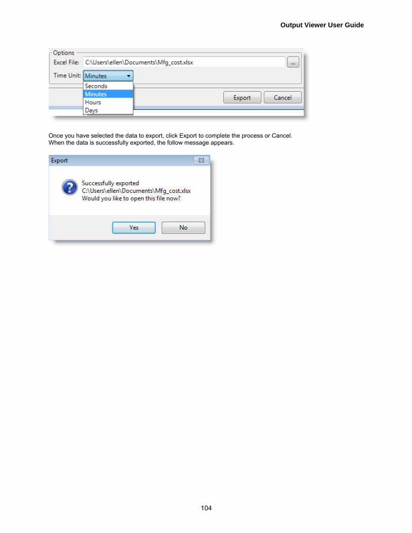
Output Viewer User Guide
104
Once you have selected the data to export, click Export to complete the process or Cancel. When the data is successfully exported, the follow message appears.

Output Viewer Context-Sensitive Tabs
105
Output Viewer Context-Sensitive Tabs
The Output Viewer context-sensitive ribbon tabs are:
• Design on page 105 • Layout on page 107 • Format (Charts) on page 126
Design
Click the Design tab and the following ribbon appears.
Note: This tab will not appear for tables and Gantt charts.
As your mouse hovers over the different Palette options, your active chart will show a live preview of how it will look if that palette is applied. The chart will not actually change to a new palette until you click and apply the palette. If the Share Style button is selected when you apply a new palette, all charts (except Table and Gantt) in all reports will assume that palette style. If you only want to apply a palette to the active chart, unselect the Share Style button. In the example below, the High Contrast Black design has been selected.

Output Viewer User Guide
106
Adaptive
Click on Adaptive and the custom color palette is available. Click on the custom color palette and the following drop-down appears allowing you to pick Theme or Standard colors.
Below are two samples of different custom color palettes selected.

Output Viewer Context-Sensitive Tabs
107
Layout Click the Layout tab and the following ribbon appears.

Output Viewer User Guide
108
You can select options from the following Layout ribbon groups:
• Zoom on page 108 • Labels on page 114 • Grid on page 120 • Display on page 122 • Annotations on page 123
Note: The layout tab does not appear for tables and will have limited options available for Gantt charts.
Zoom
Click on Zoom and a magnifying glass appears.
Next, select a zoom style. There are three zoom styles; Scroll, Stripe, or Map.
• Scroll • Stripe • Map

Output Viewer Context-Sensitive Tabs
109
Scroll
1. Click Scroll. 2. Click and drag the magnifying glass.
3. Scrollbars appear on the axes lines to navigate.

Output Viewer User Guide
110
4. Click 100% to go back to the full view of the chart.
Stripe
1. Click Stripe 2. Click and drag the magnifying glass.
3. It will only zoom on the Y axis. A preview will appear for further navigation.
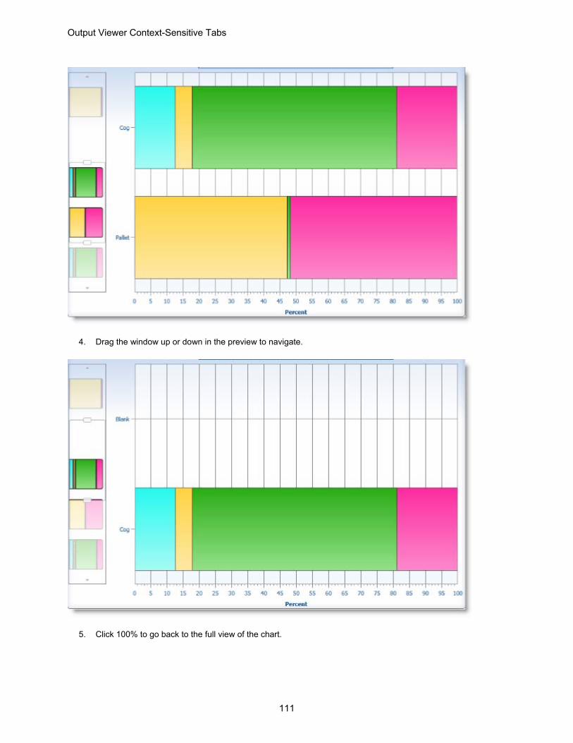
Output Viewer Context-Sensitive Tabs
111
4. Drag the window up or down in the preview to navigate.
5. Click 100% to go back to the full view of the chart.
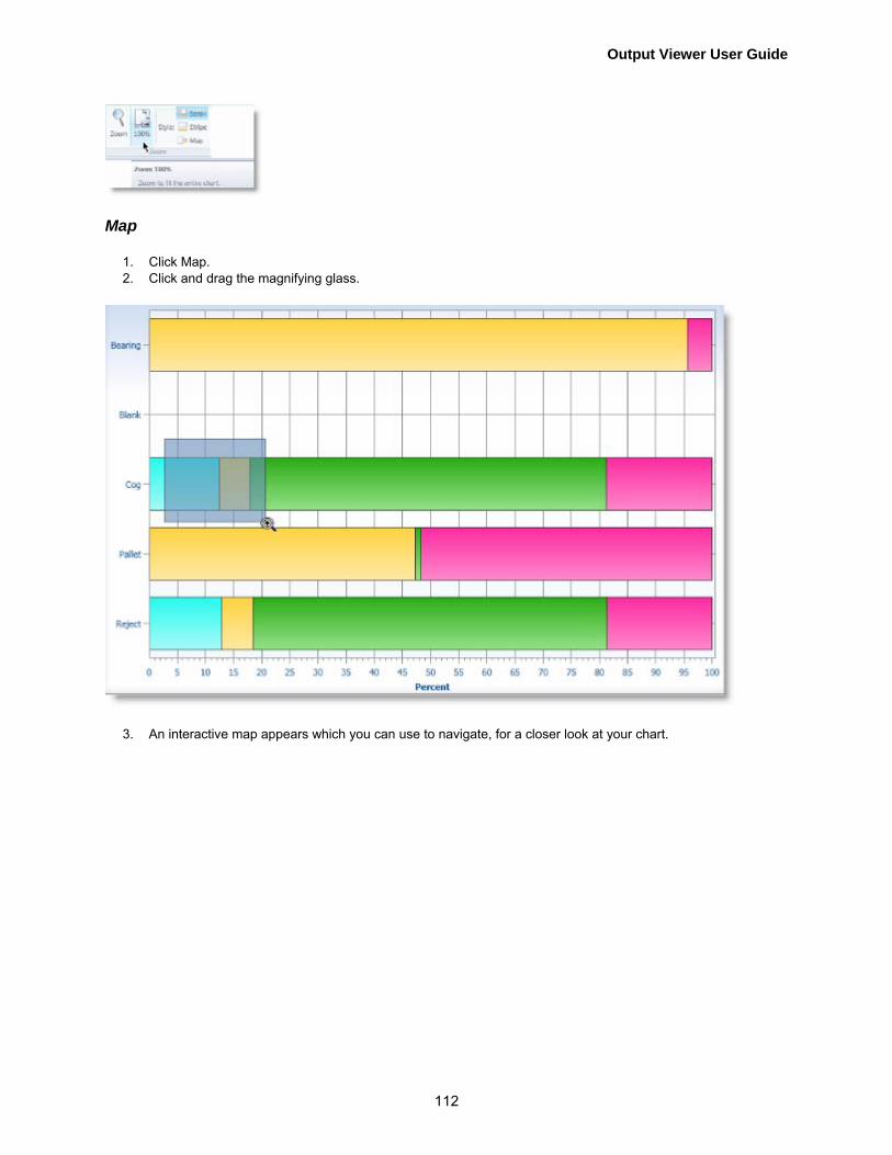
Output Viewer User Guide
112
Map
1. Click Map. 2. Click and drag the magnifying glass.
3. An interactive map appears which you can use to navigate, for a closer look at your chart.
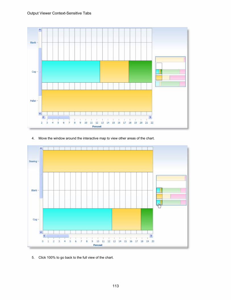
Output Viewer Context-Sensitive Tabs
113
4. Move the window around the interactive map to view other areas of the chart.
5. Click 100% to go back to the full view of the chart.

Output Viewer User Guide
114
Labels
The Labels group in the Layout ribbon provides options for showing and positioning axis titles, a legend, data point values, and a data grid.
• Axis Titles • Legend • Data Labels • Data Table

Output Viewer Context-Sensitive Tabs
115
Axis Titles
From the Labels ribbon, click Axis Titles and the following drop-down appears.
From the drop-down, select which axis titles you would like to show or hide in the chart. The examples below show charts with and without axis titles.
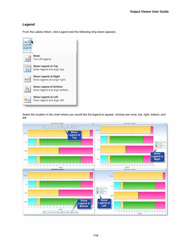
Output Viewer User Guide
116
Legend
From the Labels ribbon, click Legend and the following drop-down appears.
Select the location in the chart where you would like the legend to appear; choices are none, top, right, bottom, and left.
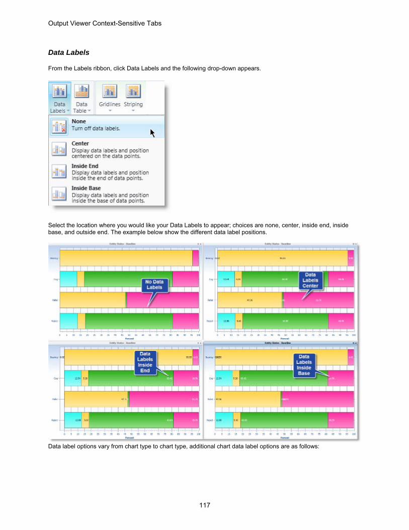
Output Viewer Context-Sensitive Tabs
117
Data Labels
From the Labels ribbon, click Data Labels and the following drop-down appears.
Select the location where you would like your Data Labels to appear; choices are none, center, inside end, inside base, and outside end. The example below show the different data label positions.
Data label options vary from chart type to chart type, additional chart data label options are as follows:

Output Viewer User Guide
118
Select the chart location where you would like your labels to appear; choices are none, above, right, below, and left.

Output Viewer Context-Sensitive Tabs
119
Data Table
From the Labels ribbon, click Data Tables and the following drop-down appears.
Select whether or not to show the data table in your chart view; choices are none or show data table. Below is a chart with Show Data Table selected.
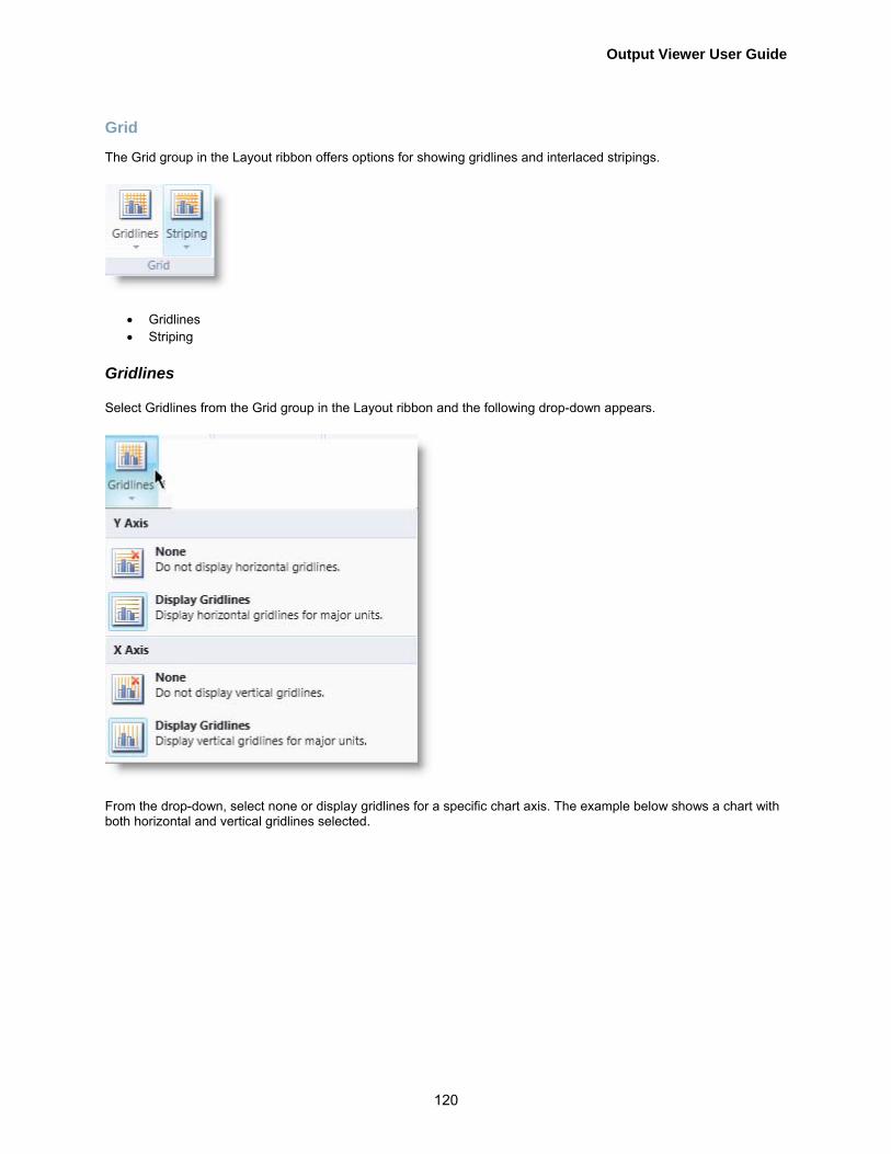
Output Viewer User Guide
120
Grid
The Grid group in the Layout ribbon offers options for showing gridlines and interlaced stripings.
• Gridlines • Striping
Gridlines
Select Gridlines from the Grid group in the Layout ribbon and the following drop-down appears.
From the drop-down, select none or display gridlines for a specific chart axis. The example below shows a chart with both horizontal and vertical gridlines selected.

Output Viewer Context-Sensitive Tabs
121
Striping
Select Striping from the Grid group in the Layout ribbon and the following drop-down appears

Output Viewer User Guide
122
From the drop-down, select none or display striping for a specific axis. The example below shows a chart with horizontal (Y axis) striping selected.
Display
The Display group of the Layout ribbon offers an option to select display markers in your chart which show the specific data points.
Select Data Markers and the following drop-down appears.
From the drop-down, select None or Display Markers. The example below shows a chart with Display Markers selected.

Output Viewer Context-Sensitive Tabs
123
Annotations
Annotations are used to alert you to information about the data displayed in a chart. They will appear as little icons within the charting area. Annotations are not available for all charts in the Output Viewer. They are only available for Time Plot and Entity Count charts.
Click the check box next to an annotation option to activate it for that chart. If an annotation is checked, that annotation will only appear if the data warrants it. If a chart has an annotation, there will be a small circle indicating so. Hover over the circle to view the annotation information.
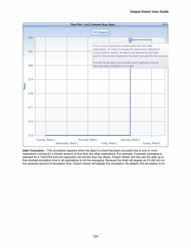
Output Viewer User Guide
124
Data Truncation – This annotation appears when the data in a chart has been truncated due to one or more replications running for a shorter amount of time than the other replications. For example, if periodic averaging is selected for a Time Plot and one replication ran shorter than the others, Output Viewer will only use the data up to that shortest simulation time in all replications to do the averaging. Because the chart will appear as if it did not run the expected amount of simulation time, Output Viewer will display this annotation. By default, this annotation is on.

Output Viewer Context-Sensitive Tabs
125
Non-Full Period – This annotation appears when data in a chart is being averaged across a period and displayed at the start of that period but the data actually started or stopped midway through the period. This situation can only happen for the first and the last periods. For example, if your simulation starts in the middle of a month and you set periodic averaging as Monthly, the data actually only spans part of the month. However, Output Viewer displays the averaged data point at the beginning of the month but averages the data based upon the partial month of time. This makes it appear as if the simulation and data collection began at the start of the month, which is not the case. A similar situation occurs if the simulation ends in the middle of a month. An annotation alerts you to these issues. By default, this annotation is turned off.

Output Viewer User Guide
126
Information – This is a general annotation that is used to alert you to various issues with the data in a chart. For example, if a simulation ran only one replication and then you choose to display the minimum or a confidence interval, an information annotation will appear in the chart informing you that they cannot be displayed because not enough replications were run. This annotation is on by default.
Format (Charts) Click the Format tab and the following ribbon appears.
Note:: This tab does not appear for Gantt charts and for tables it provides different options.
Most charts will have these options in the Format ribbon. The options apply to the active chart and are enabled depending upon which option is selected in the Selected Item group.

Output Viewer Context-Sensitive Tabs
127
Click on the links below for more details about how to complete each step.
1. Selected Item on page 127 2. Font on page 128 3. Text on page 129 4. Range on page 131 5. Decimal Precision on page 133 6. Outline on page 135
Selected Item
Click on the Selected Item drop-down and chose from the list of available text elements to format in the active chart.
The chart below shows what these elements are.
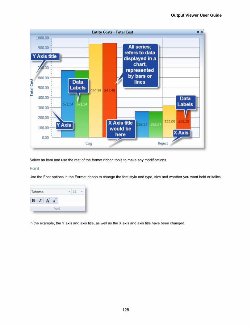
Output Viewer User Guide
128
Select an item and use the rest of the format ribbon tools to make any modifications.
Font
Use the Font options in the Format ribbon to change the font style and type, size and whether you want bold or italics.
In the example, the Y axis and axis title, as well as the X axis and axis title have been changed.

Output Viewer Context-Sensitive Tabs
129
Text
Use the Text options in the Format ribbon to change the text of your axis titles.
In the example below the Y axis title has been changed.

Output Viewer User Guide
130
You can change the title back to the default chart title, Click Use Default.

Output Viewer Context-Sensitive Tabs
131
Range
Use the Range options in the Format ribbon to manually set the range for the axis selected.
Choose either the Y or X axis in the Selected Item list. Automatic is the default range option. Click the checkbox next to Automatic to unselect this option. The Max and Min options will no longer be grayed out.
Click up arrow [▲] in the Max (maximum) range box to increase the maximum axis value displayed in the chart.

Output Viewer User Guide
132
Click down arrow [▼] in the Max range box to decrease the maximum range axis value displayed. Click up arrow [▲] in the Min (minimum) range box to increase the minimum axis value displayed. Click down arrow [▼] in the Min range box to decrease the minimum axis value displayed. You can also click in the box and type the desired value.

Output Viewer Context-Sensitive Tabs
133
When the Automatic range option is selected, Output Viewer will show the minimum range span for each axis that includes all the data for each series in the chart. For several charts this will not include a zero value on one or both axes. Select the Include Zero option, if you determine that you would like to view an axis range that spans from a minimum of zero to the maximum data value.
Decimal Precision
Use the Decimal precision option in the Format ribbon to adjust the precision of the decimal point range for the item selected.
Click on the slider and move it to increase or decrease the decimal precision. You can also click [-] to decrease the decimal precision, and [+] to increase it. The default decimal precision for this Time Plot chart is two decimal places or .00.

Output Viewer User Guide
134
You can change it to none as shown in the example below.

Output Viewer Context-Sensitive Tabs
135
Outline
Use the Outline option in the Format ribbon to adjust the weight of the outline of your chart series elements. All Series must be selected for this options to be available.
Click up arrow [▲] in the Weight range box to increase the weight of the element outline displayed in the chart. Click down arrow [▼] in the Weight range box to decrease the weight of the element outline displayed in the chart. You can also type the desired weight in the Weight range box. In the example below, the outline weight has been increased to 5.

Output Viewer User Guide
136
Format (Tables) If in a table, click the Format tab and the following ribbon appears.
Most charts will have these options in the Format ribbon. The options apply to the active chart and are enabled depending upon which option is selected in the Selected Item group.
Decimal Precision
Use the Decimal precision option in the Format ribbon to adjust the precision of the decimal point range for the information in your table.

Output Viewer Context-Sensitive Tabs
137
Click on the slider and move it to increase or decrease the decimal precision. You can also click [-] to decrease the decimal precision, and [+] to increase it. The default decimal precision for tables is two decimal places or .00. The decimal precision for this table has been changed to five.
Use the Columns option in the Format ribbon to adjust the columns of information in your table. You can group and/or filter the columns.
Allow Grouping
Click the Allow Grouping check box and a message will appear at the top of the table. Unselect the check box to remove the grouping options.

Output Viewer User Guide
138
To remove the grouping click the [x] next to the column name placed at the top of he table.
Allow Filtering
Click the Allow Filtering check box and funnel icons will appear at the top of each column. Unselect the check box to remove the filtering options.

Output Viewer Context-Sensitive Tabs
139
Click on any one of the Funnel icons and the following filter dialog appears.
Click the check box next to the desired item(s) in the column you would like to filter by. The table will only list those item(s). Unselect the check boxes or click the Select All check box to list all items.

Output Viewer User Guide
140
Select from the following filtering criteria and type the desired value in the field.
After you have specified your filtering criteria, click Filter and the table will show only those items that match the defined filter in that column. Then select And or Or and you can specify another filter set.
Click Clear Filter to remove your defined filters.

Index
141
Index
A
about, 41 accessing reports, 10 add data source, 41 add new report to the viewer, 9, 10 adding reports, 9, 10 annotations, 115 average, 31 axes, 21, 107, 108 axis titles, 21, 107, 108
C
chart, 37 chart, hovers, 22 charts, 42 clipboard, 92 column charts, 58 columns, 31 context sensitive tabs, 98 copyright, 1
D
data display, 28 data labels, 17, 109 data markers, 19 data table, 16, 111 decimal precision, 125 deleting reports, 9, 10 deleting reports from the viewer, 10 design, 98 disclaimer, 1 display, 114
E
entities, 30 entity costs column chart, 61 entity costs table, 46 entity count, 89 entity failed arrivals column chart, 62 entity failed arrivals table, 47 entity states chart, 77 entity states column chart, 60 entity states pie chart, 82
entity states table, 45 entity summary column chart, 59 entity summary table, 44 Excel, 93 exit output viewer, 41 export, 37, 91
F
failed arrivals, 47, 62 file, 37, 41 filter options, 7, 24 filter options panel, 7 filtering, 35 filtering options, 35 font, 120 format, 118 format tables, 128 full screen mode, 11
G
grid, 112 gridlines, 20, 112
H
histogram, 31, 32, 88 hover, 22
I
introduction, 5 items, 30
L
labels, 107, 108 layout, 100 legend, 15, 108 location costs column chart, 67 location costs table, 50 location multi capacity, 79 location multi capacity pie chart, 85 location multi capacity states table, 49 location setup column chart, 66 location setup table, 50 location single capacity, 78

Output Viewer User Guide
142
location single capacity column chart, 64 location single capacity pie charts, 84 location single capacity states table, 48 location state, 90 location summary column chart, 63 location summary table, 47 location utilization chart, 74 locations, 30 logs, 56 logs column chart, 72
M
map, 105 maximize filter options panel, 24 maximize report view, 11 maximum, 31, 32 mean, 31, 32 median, 31, 32 minimize filter options panel, 24 minimum, 31, 32 mode, 31, 32 model results, 5 moving charts in report view, 11
N
naming reports, 11 node entries, 56 node entries column chart, 73
O
options, filter, 24 outline, 127 output viewer context sensitive tabs, 98
P
panel, filter options, 7, 24 percentile, 31 period, 27, 44 picture, 92 pie charts, 81
R
range, 123 remove data source, 41
removing charts from report view, 11 replications, 26, 44 report view, 7, 9, 10 reports access, 10 resource, 80 resource costs column chart, 70 resource costs table, 53 resource states column chart, 69 resource states pie chart, 86 resource states table, 52 resource summary column chart, 68 resource summary table, 51 resource utilization chart, 75 resources, 30 ribbon, 7
S
scenarios, 25 scoreboard, 57 scroll, 101 search, 25 search filter, 25 selected item, 119 simulation information table, 55 splash screen, 1 splitter bar, 25 states, 36, 76 statistics, 31, 32 stripe, 103 striping, 114 summary data, 95
T
table of contents, 2 tables, 43 tables, formatting, 128 tabs, 37 text, 121 time plot, 31, 88 time series, 87 title page, 1
U
using report view, 9, 10 utilization, 74

Index
143
V
variable summary column chart, 71 variable summary table, 54 variables, 30 view report, 7
Z
zoom, 101