presentation on pages for slideshare
TRANSCRIPT
Front Cover Research
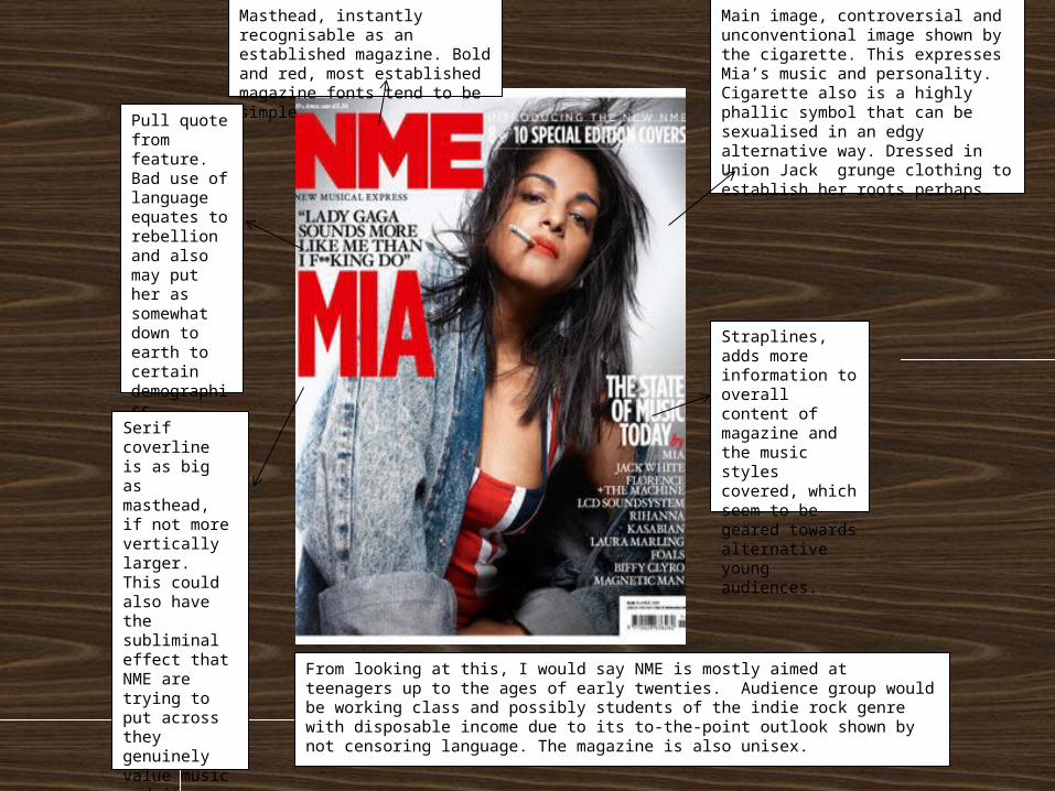
Main image, controversial and unconventional image shown by the cigarette. This expresses Mia’s music and personality. Cigarette also is a highly phallic symbol that can be sexualised in an edgy alternative way. Dressed in Union Jack grunge clothing to establish her roots perhaps.
Masthead, instantly recognisable as an established magazine. Bold and red, most established magazine fonts tend to be simple
Pull quote from feature. Bad use of language equates to rebellion and also may put her as somewhat down to earth to certain demographics.
Serif coverline is as big as masthead, if not more vertically larger. This could also have the subliminal effect that NME are trying to put across they genuinely value music and its artists rather than focusing all their attention on promoting themselves.
Straplines, adds more information to overall content of magazine and the music styles covered, which seem to be geared towards alternative young audiences.
From looking at this, I would say NME is mostly aimed at teenagers up to the ages of early twenties. Audience group would be working class and possibly students of the indie rock genre with disposable income due to its to-the-point outlook shown by not censoring language. The magazine is also unisex.
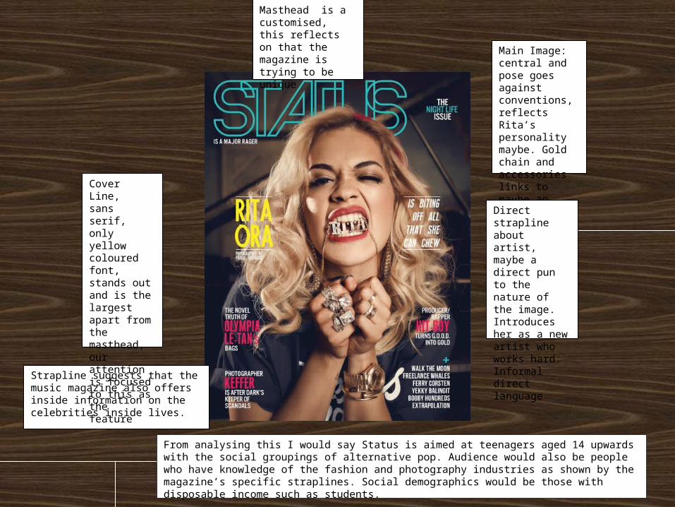
Main Image: central and pose goes against conventions, reflects Rita’s personality maybe. Gold chain and accessories links to maybe an urban influence
Direct strapline about artist, maybe a direct pun to the nature of the image. Introduces her as a new artist who works hard. Informal direct language
Strapline suggests that the music magazine also offers inside information on the celebrities inside lives.
Cover Line, sans serif, only yellow coloured font, stands out and is the largest apart from the masthead, our attention is focused to this as the feature
Masthead is a customised, this reflects on that the magazine is trying to be unique
From analysing this I would say Status is aimed at teenagers aged 14 upwards with the social groupings of alternative pop. Audience would also be people who have knowledge of the fashion and photography industries as shown by the magazine’s specific straplines. Social demographics would be those with disposable income such as students.
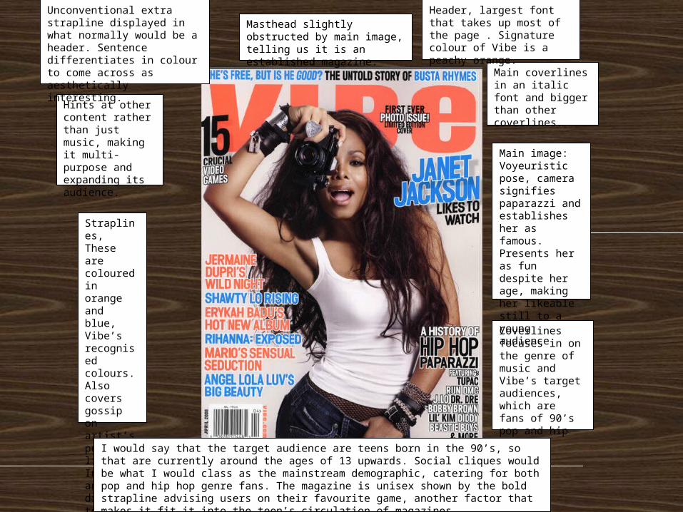
Straplines, These are coloured in orange and blue, Vibe’s recognised colours. Also covers gossip on artist’s personal lives. Informal and direct to target audience
Hints at other content rather than just music, making it multi-purpose and expanding its audience.
Coverlines focuses in on the genre of music and Vibe’s target audiences, which are fans of 90’s pop and hip hop.
Main image: Voyeuristic pose, camera signifies paparazzi and establishes her as famous. Presents her as fun despite her age, making her likeable still to a young audience
Main coverlines in an italic font and bigger than other coverlines.
Masthead slightly obstructed by main image, telling us it is an established magazine.
Header, largest font that takes up most of the page . Signature colour of Vibe is a peachy orange.
Unconventional extra strapline displayed in what normally would be a header. Sentence differentiates in colour to come across as aesthetically interesting.
I would say that the target audience are teens born in the 90’s, so that are currently around the ages of 13 upwards. Social cliques would be what I would class as the mainstream demographic, catering for both pop and hip hop genre fans. The magazine is unisex shown by the bold strapline advising users on their favourite game, another factor that makes it fit it into the teen’s circulation of magazines.
Double Page Research

Expression is almost arrogant refusing to smile, looks directly at reader building an unconscious connection. His expression is reminiscent of the boy band style in the late 80’s and 90’s. Dressed in velvet, velvet has connotations of class and perhaps vintage quirkiness.
Shows readers that the magazine has been successful and is still going strong.
Terry Hall dressed all in red which makes him stand out against the background to draw interest. High angled shot suggests he is a big feature in mag and focused in on.
Name of magazine acting as masthead, enforces the magazine and makes it memorable, underneath is cities that renown for music, promising readers a dedicated and more serious approach to music than a typical pop magazine would for example. Also has connotations of high status and fame.
Colour scheme consists of a muted grey background with gold headings and black writing. This serves as looking minimalistic and modern by not using too many colours and imagery.
Artist names are bolder and bigger, this draws in their fans immediately to read the smaller more detailed text underneath
Pull quote from main article, having this here is an effort to pull the reader into reading the article.
Magazine name is repeated almost everywhere.
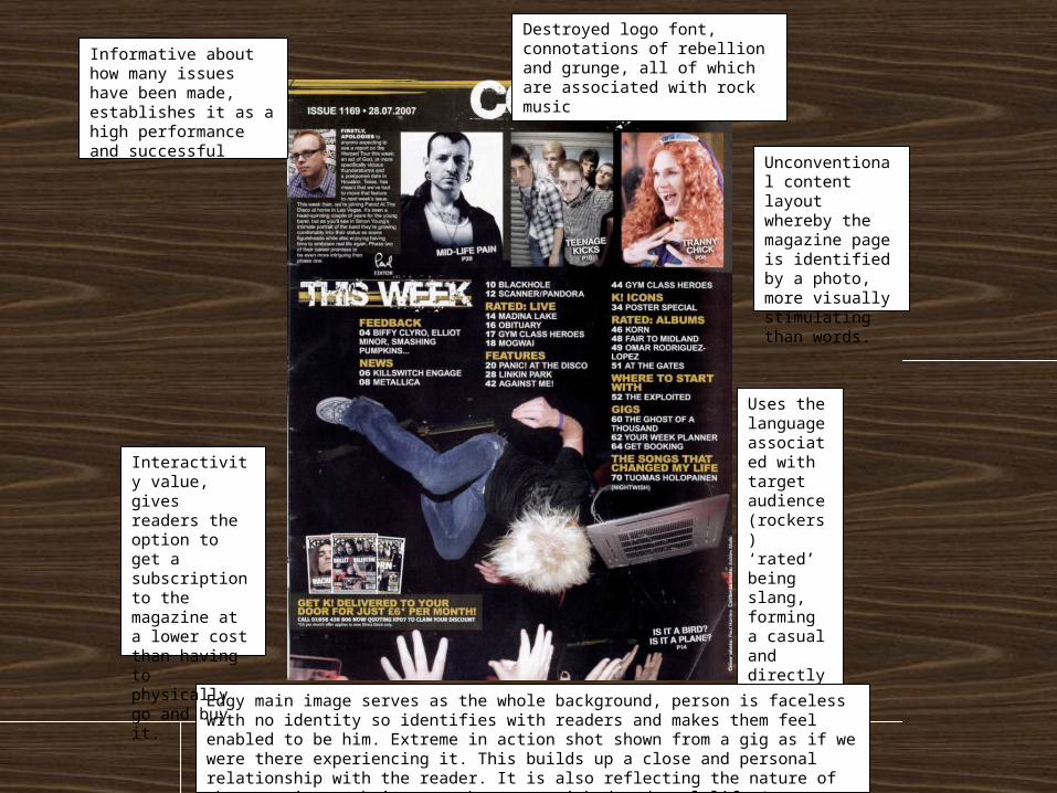
Informative about how many issues have been made, establishes it as a high performance and successful
Destroyed logo font, connotations of rebellion and grunge, all of which are associated with rock music
Unconventional content layout whereby the magazine page is identified by a photo, more visually stimulating than words.
Uses the language associated with target audience (rockers) ‘rated’ being slang, forming a casual and directly informal tone.
Edgy main image serves as the whole background, person is faceless with no identity so identifies with readers and makes them feel enabled to be him. Extreme in action shot shown from a gig as if we were there experiencing it. This builds up a close and personal relationship with the reader. It is also reflecting the nature of the magazine as being somewhat unvarnished and real-life (not airbrushed perfection).
Interactivity value, gives readers the option to get a subscription to the magazine at a lower cost than having to physically go and buy it.
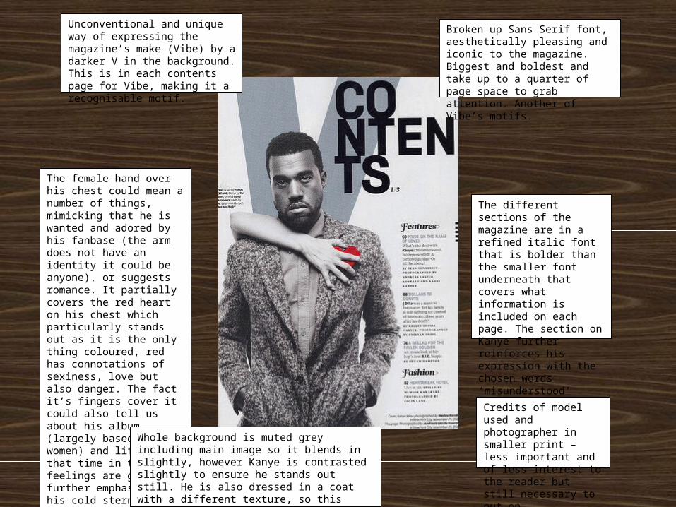
The different sections of the magazine are in a refined italic font that is bolder than the smaller font underneath that covers what information is included on each page. The section on Kanye further reinforces his expression with the chosen words ‘misunderstood’ ‘misinterpreted’
The female hand over his chest could mean a number of things, mimicking that he is wanted and adored by his fanbase (the arm does not have an identity it could be anyone), or suggests romance. It partially covers the red heart on his chest which particularly stands out as it is the only thing coloured, red has connotations of sexiness, love but also danger. The fact it’s fingers cover it could also tell us about his album (largely based around women) and life at that time in that his feelings are guarded, further emphasised by his cold stern expression. His body language with his hands in his pockets show a laidback yet edgy attitude.
Unconventional and unique way of expressing the magazine’s make (Vibe) by a darker V in the background. This is in each contents page for Vibe, making it a recognisable motif.
Broken up Sans Serif font, aesthetically pleasing and iconic to the magazine. Biggest and boldest and take up to a quarter of page space to grab attention. Another of Vibe’s motifs.
Whole background is muted grey including main image so it blends in slightly, however Kanye is contrasted slightly to ensure he stands out still. He is also dressed in a coat with a different texture, so this makes us grab our attention amongst the lack of colour, bringing us up to meet the artist’s face
Credits of model used and photographer in smaller print – less important and of less interest to the reader but still necessary to put on.
Contents Page Research

Main image is separated by 3 other smaller snapshots of the rest of the band whilst producing music. Main image is of the lead singer naturally from a gig, hair covers the face enigmatically. Denim jacket and dark jeans, not ridiculously showy clothes show they are more serious about their music than general appearance.
Uses synergy with the internet to boost their readership and fan base.
Paint flecked logo alternating in red and white on each line. Name of band is also included in the biggest section. Iconic of rock and punk genre. Information on the band’s tracks
Captions for each image because they have been taken from a live experience, makes you want to be at the gig.
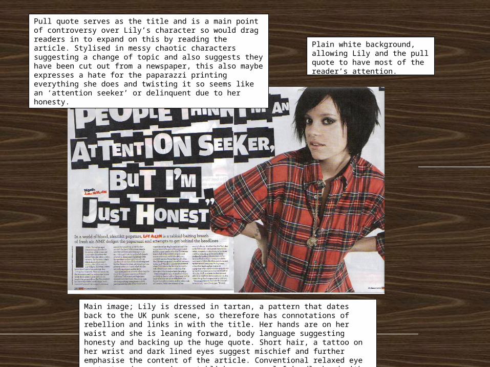
Plain white background, allowing Lily and the pull quote to have most of the reader’s attention.
Main image; Lily is dressed in tartan, a pattern that dates back to the UK punk scene, so therefore has connotations of rebellion and links in with the title. Her hands are on her waist and she is leaning forward, body language suggesting honesty and backing up the huge quote. Short hair, a tattoo on her wrist and dark lined eyes suggest mischief and further emphasise the content of the article. Conventional relaxed eye content and expression establishes a casual friendly bond with the reader.
Pull quote serves as the title and is a main point of controversy over Lily’s character so would drag readers in to expand on this by reading the article. Stylised in messy chaotic characters suggesting a change of topic and also suggests they have been cut out from a newspaper, this also maybe expresses a hate for the paparazzi printing everything she does and twisting it so seems like an ‘attention seeker’ or delinquent due to her honesty.
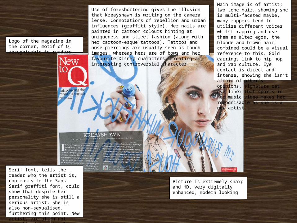
Main image is of artist; two tone hair, showing she is multi-faceted maybe, many rappers tend to utilise different voices whilst rapping and use them as alter egos, the blonde and brown hair combined could be a visual reference to this. Gold earrings link to hip hop and rap culture. Eye contact is direct and intense, showing she isn’t afraid of other’s opinions, signature cat eye liner that sports in her music video makes her recognisable as she is a new artist.
Use of foreshortening gives the illusion that Kreayshawn is writing on the camera lense. Connotations of rebellion and urban influences (graffiti style). Her nails are painted in cartoon colours hinting at uniqueness and street fashion (along with her cartoon-esque tattoos). Tattoos and nose piercings are usually seen as tough images, whereas hers are of bows and her favourite Disney characters, creating an interesting controversial character.
Logo of the magazine in the corner, motif of Q, recognisable to readers.
Serif font, tells the reader who the artist is, contrasts to the Sans Serif graffiti font, could show that despite her personality she is still a serious artist. She is also non-sexualised, furthering this point. New artists are often not sexualised immediately, and are instead projected as fresh faces to gain likability.
Picture is extremely sharp and HD, very digitally enhanced, modern looking