tiago campea graphic design portfolio
DESCRIPTION
Portfolio made to apply for Central Saint Martins College of Art and Design, Uni of Arts London (accepted)TRANSCRIPT


2 Contents

3Contents
About This Portfolio
Graphic DesignPosterAdvertisingIllustrationTypographyPictogramEditorialInteractive
Video/AnimationLevis DrugstoreYesterday MorningFahartiLife
PhotographyReal vs FictionBarcelona
Drawing
Other DesignStickers
About Me
Personal Details
Contents
4
8121420262832
40444850
5456
60
70
72
74
4
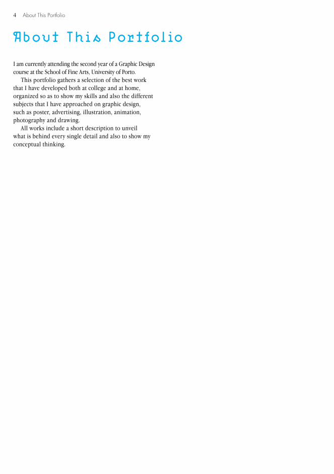
About This Portfolio
About This Portfolio
I am currently attending the second year of a Graphic Design course at the School of Fine Arts, University of Porto.
This portfolio gathers a selection of the best work that I have developed both at college and at home, organized so as to show my skills and also the different subjects that I have approached on graphic design, such as poster, advertising, illustration, animation, photography and drawing.
All works include a short description to unveil what is behind every single detail and also to show my conceptual thinking.

5About This Portfolio

6
7
GRAPHICDESIGN

8 Graphic Design
Poster (2008) Music Around B
ProposalThis first poster was designed for a music concert produced by the Conservatory of Music of Porto, with which I have a strong connection, since I myself attend it and, in particularly, performed in the concert. The name “Music Around B” came up from a teacher’s idea who led it, since all the names of the authors of the musics that would be performed started with the letter B. With this clinch, he wanted me to create something fun and informal as the concept of the music concert was to create something different from the typical concerts: this one was a mixture of performances of contemporary music, from classical, to bossa nova and pop.
IdeaTaking the concept, I started to think what was the best way to create something that would be also different, so I decided to run away from the stereotype music posters (i.e. photos or shapes of musical instruments and staves). As the “B” was the main characteristic of the concert, I decided to “play” with it and consequently with the typography, which is also something that is very stereotyped on music posters (i.e. script typefaces).
The “B” needed to be emphasized somehow. I increased its scale, so every single person that looked for it could note that the poster had something to do with a “B”, even not knowing what it was about. The rest of the typography was prepared in that way as an accentuation of all the “fun and informal” surroundings.
To explain the “B” clinch, I closed the letter’s holes in all the names of the authors and aligned them to the themselves, in a way to increase even more the main characteristic of this concert.
The oblique line of the poster gave it a verticality, which was followed in the program format. The same oblique line helped to organize all the information that the program contained, giving it a fresh appearance.

9Graphic Design
50 x 70 cm
10 Graphic Design
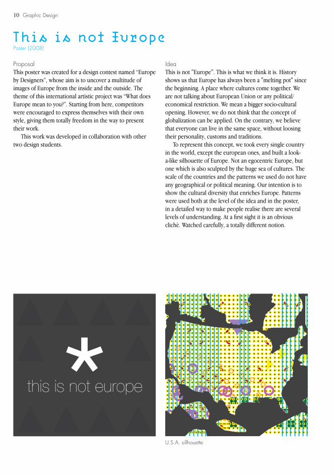
Poster (2008)This is not Europe
ProposalThis poster was created for a design contest named “Europe by Designers”, whose aim is to uncover a multitude of images of Europe from the inside and the outside. The theme of this international artistic project was “What does Europe mean to you?”. Starting from here, competitors were encouraged to express themselves with their own style, giving them totally freedom in the way to present their work.
This work was developed in collaboration with other two design students.
IdeaThis is not "Europe". This is what we think it is. History shows us that Europe has always been a "melting pot" since the beginning. A place where cultures come together. We are not talking about European Union or any political/economical restriction. We mean a bigger socio-cultural opening. However, we do not think that the concept of globalization can be applied. On the contrary, we believe that everyone can live in the same space, without loosing their personality, customs and traditions.
To represent this concept, we took every single country in the world, except the european ones, and built a look-a-like silhouette of Europe. Not an egocentric Europe, but one which is also sculpted by the huge sea of cultures. The scale of the countries and the patterns we used do not have any geographical or political meaning. Our intention is to show the cultural diversity that enriches Europe. Patterns were used both at the level of the idea and in the poster, in a detailed way to make people realise there are several levels of understanding. At a first sight it is an obvious clichè. Watched carefully, a totally different notion.
U.S.A. sillhouette

11Graphic Design
50 x 70 cm
12 Graphic Design
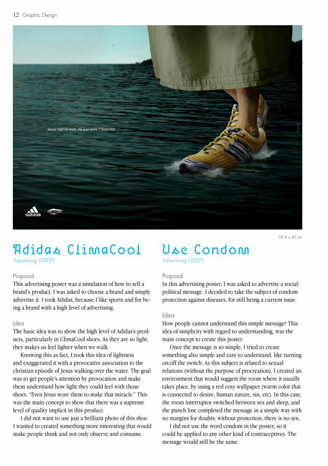
Advertising (2007) Advertising (2007)Adidas ClimaCool Use Condom
ProposalThis advertising poster was a simulation of how to sell a brand’s product. I was asked to choose a brand and simply advertise it. I took Adidas, because I like sports and for be-ing a brand with a high level of advertising.
IdeaThe basic idea was to show the high level of Adidas’s prod-ucts, particularly in ClimaCool shoes. As they are so light, they makes us feel lighter when we walk.
Knowing this as fact, I took this idea of lightness and exaggerated it with a provocative association to the christian episode of Jesus walking over the water. The goal was to get people’s attention by provocation and make them understand how light they could feel with those shoes. “Even Jesus wore them to make that miracle.” This was the main concept to show that there was a supreme level of quality implicit in this product.
I did not want to use just a brilliant photo of this shoe. I wanted to created something more interesting that would make people think and not only observe and consume.
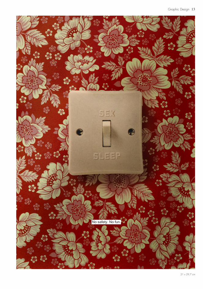
ProposalIn this advertising poster, I was asked to advertise a social/political message. I decided to take the subject of condom protection against diseases, for still being a current issue.
IdeaHow people cannot understand this simple message? This idea of simplicity with regard to understanding, was the main concept to create this poster.
Once the message is so simple, I tried to create something also simple and easy to understand, like turning on/off the switch. As this subject is related to sexual relations (without the purpose of procreation), I created an environment that would suggest the room where it usually takes place, by using a red cosy wallpaper (warm color that is connected to desire, human nature, sin, etc). In this case, the room interruptor switched between sex and sleep, and the punch line completed the message in a simple way with no margins for doubts: without protection, there is no sex.
I did not use the word condom in the poster, so it could be applied to any other kind of contraceptives. The message would still be the same.
Des
ign:
Tia
go C
ampe
ã
Jesus had no trick. He just wore ClimaCool.
59,4 x 42 cm
13Graphic Design
No safety. No fun.
Des
ign:
Tia
go C
ampe
ã
21 x 29,7 cm
14
15
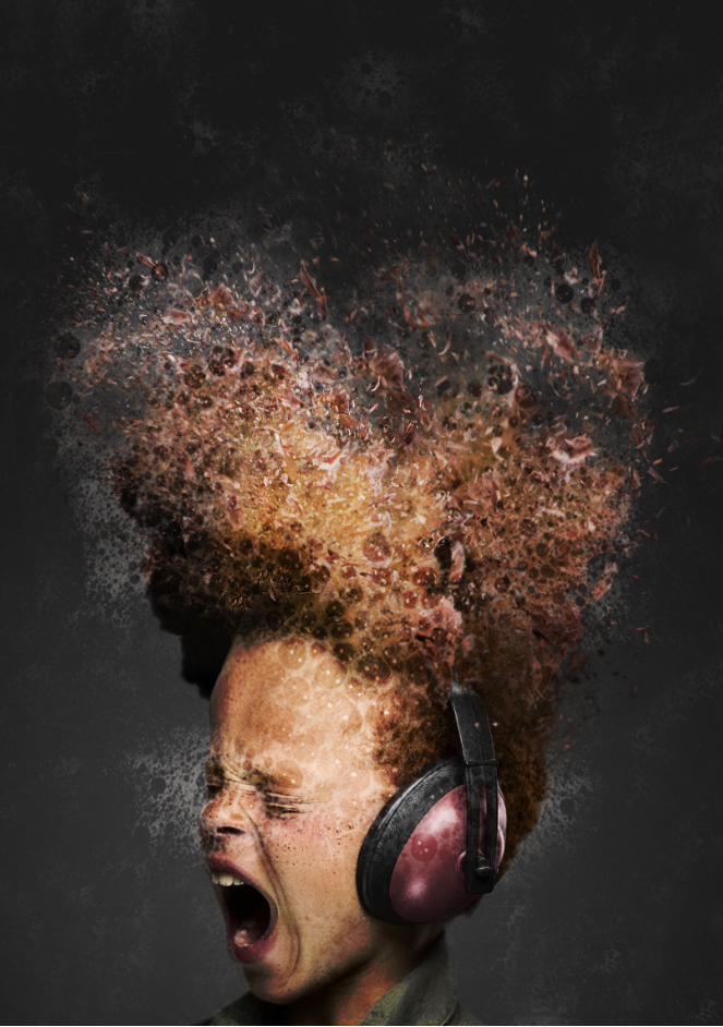
Illustration (2009)Mental Release
Graphic Design
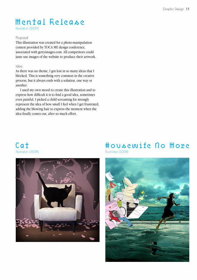
ProposalThis illustration was created for a photo-manipulation contest provided by TOCA ME design conference, associated with gettyimages.com. All competitors could juste use images of the website to produce their artwork.
IdeaAs there was no theme, I got lost in so many ideas that I blocked. This is something very common in the creative process, but it always ends with a solution, one way or another.
I used my own mood to create this illustration and to express how difficult it is to find a good idea, sometimes even painful. I picked a child screaming for strongly represent the idea of how small I feel when I get frustrated, adding the blowing hair to express the moment when the idea finally comes out, after so much effort.
Illustration (2008) Illustration (2008)Cat Housewife No More
16 Graphic Design
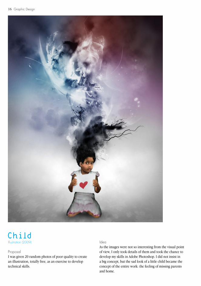
Illustration (2009)Child
ProposalI was given 20 random photos of poor quality to create an illustration, totally free, as an exercise to develop technical skills.
IdeaAs the images were not so interesting from the visual point of view, I only took details of them and took the chance to develop my skills in Adobe Photoshop. I did not insist in a big concept, but the sad look of a little child became the concept of the entire work: the feeling of missing parents and home.

17Graphic Design
ProposalThis is another exercise that is part of the same proposal of the illustration “Child”.
Illustration (2009)Farm
IdeaAs the images were not so interesting from the visual point of view, I only took details of them and took the chance to develop my collage skills. I cut different elements of the 20 photos and built an organic form that had implicit a rural environment, in order to create portrait of a farm’s life.
18 Graphic Design

19
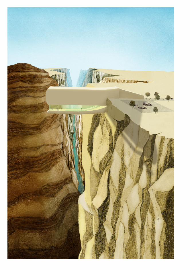
Illustration (2009)Skywalk Plier
Graphic Design
ProposalI was given a task of transforming an object into a public space and represent it through drawing.
IdeaI had this plier and I found its shape interesting to transform into a building or something close to it. I wanted it to stand out in the landscape so after having made my research of public spaces in natural areas, I became with the idea of create a skywalk, inspired on a skywalk placed in the Grand Canyon.
I drew this illustration, not only with traditional processes, but mixing with other techniques, such as digital painting and collage.
Illustration (2008)What a Wonderful World
This illustration pretends to satirize the way societies are developing. We are becoming so dependent of new technologies and machines and while that is happening, we simply stay still, watching and letting it happen as if being dominated by technology was a beautiful scenario.
20 Graphic Design
e férias?
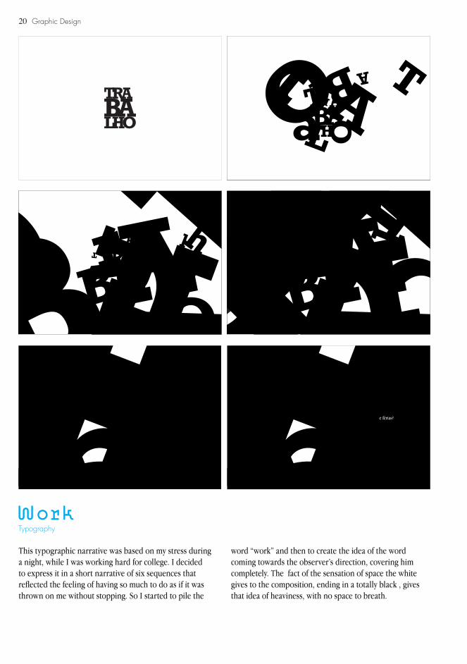
TypographyWork
This typographic narrative was based on my stress during a night, while I was working hard for college. I decided to express it in a short narrative of six sequences that reflected the feeling of having so much to do as if it was thrown on me without stopping. So I started to pile the
word “work” and then to create the idea of the word coming towards the observer’s direction, covering him completely. The fact of the sensation of space the white gives to the composition, ending in a totally black , gives that idea of heaviness, with no space to breath.
21
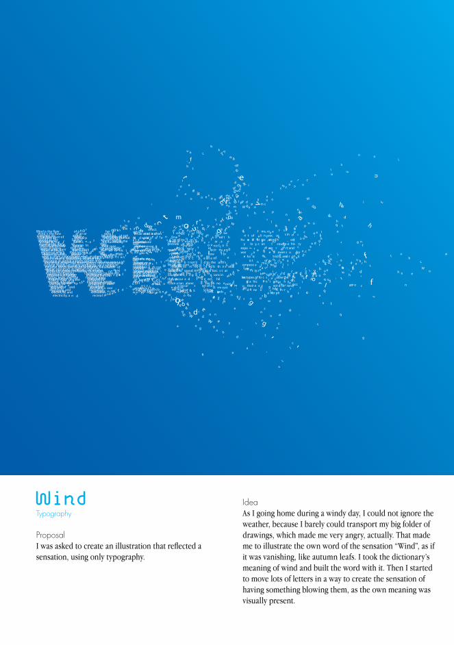
Wind
ProposalI was asked to create an illustration that reflected a sensation, using only typography.
TypographyIdeaAs I going home during a windy day, I could not ignore the weather, because I barely could transport my big folder of drawings, which made me very angry, actually. That made me to illustrate the own word of the sensation “Wind”, as if it was vanishing, like autumn leafs. I took the dictionary’s meaning of wind and built the word with it. Then I started to move lots of letters in a way to create the sensation of having something blowing them, as the own meaning was visually present.
22 Graphic Design
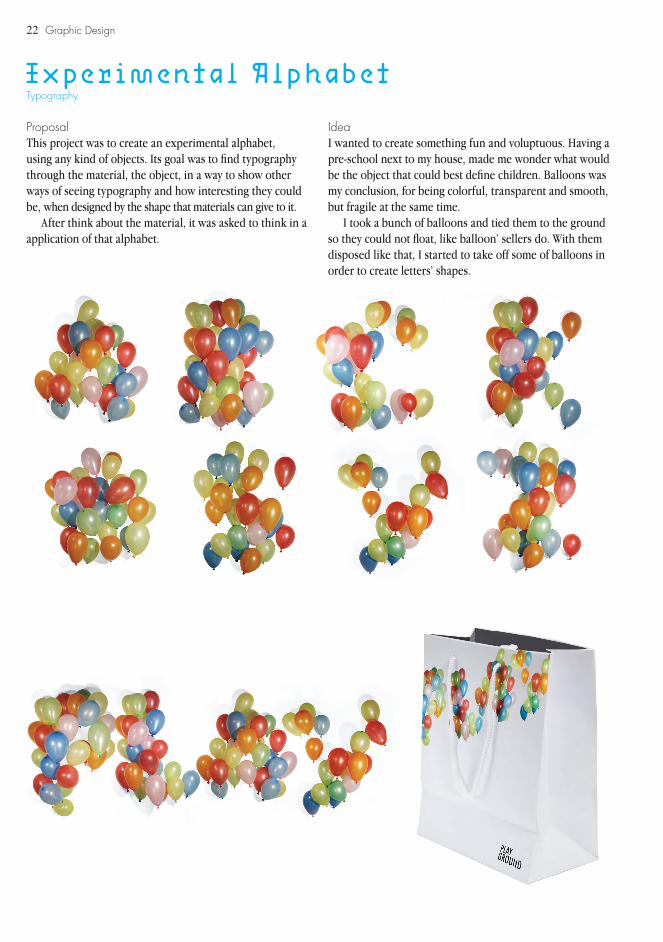
Experimental AlphabetTypography
ProposalThis project was to create an experimental alphabet, using any kind of objects. Its goal was to find typography through the material, the object, in a way to show other ways of seeing typography and how interesting they could be, when designed by the shape that materials can give to it.
After think about the material, it was asked to think in a application of that alphabet.
Idea I wanted to create something fun and voluptuous. Having a pre-school next to my house, made me wonder what would be the object that could best define children. Balloons was my conclusion, for being colorful, transparent and smooth, but fragile at the same time.
I took a bunch of balloons and tied them to the ground so they could not float, like balloon’ sellers do. With them disposed like that, I started to take off some of balloons in order to create letters’ shapes.
23Graphic Design
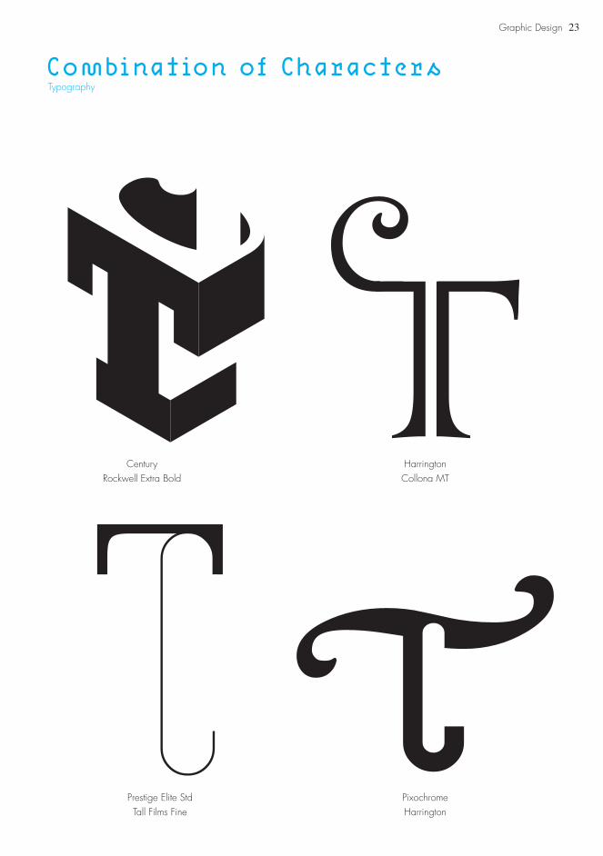
Combination of CharactersTypography
CenturyRockwell Extra Bold
Prestige Elite StdTall Films Fine
PixochromeHarrington
HarringtonCollona MT
24 Graphic Design
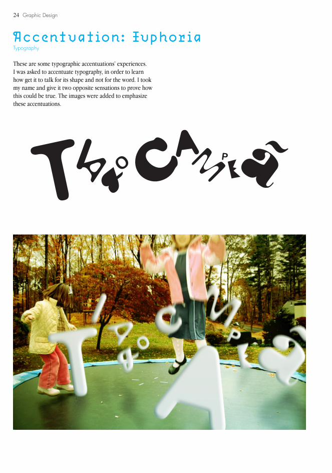
Accentuation: Euphoria
These are some typographic accentuations’ experiences.I was asked to accentuate typography, in order to learn how get it to talk for its shape and not for the word. I took my name and give it two opposite sensations to prove how this could be true. The images were added to emphasize these accentuations.
Typography

25
Accentuation: RageTypography
Graphic Design
26 Graphic Design
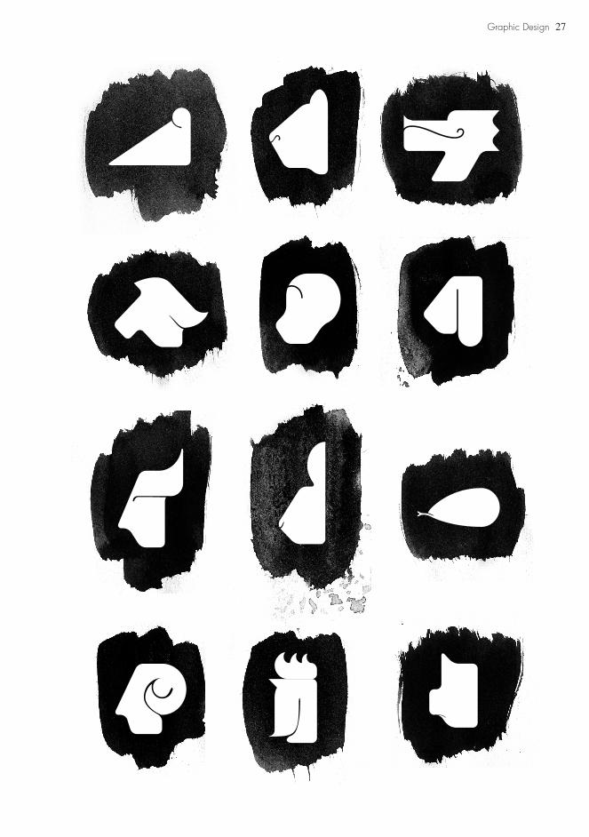
Chinese Zodiac
ProposalI was asked to create a new fresh design of a pictogram family for a chinese zodiac.
IdeaAs it was a chinese zodiac, I wanted these pictograms to have something that could refer to Oriental Art. After having made a big research on chinese history of art and good design examples (like the pictograms for Beijing 2008), I found the idea of taking the brush with chinese ink to create a blot, where the pictogram would appear, as if it were designed by a single and perfect gesture.
They were first designed geometrically and then rounded on corners, so they could have an free hand appearance.
Pictogram
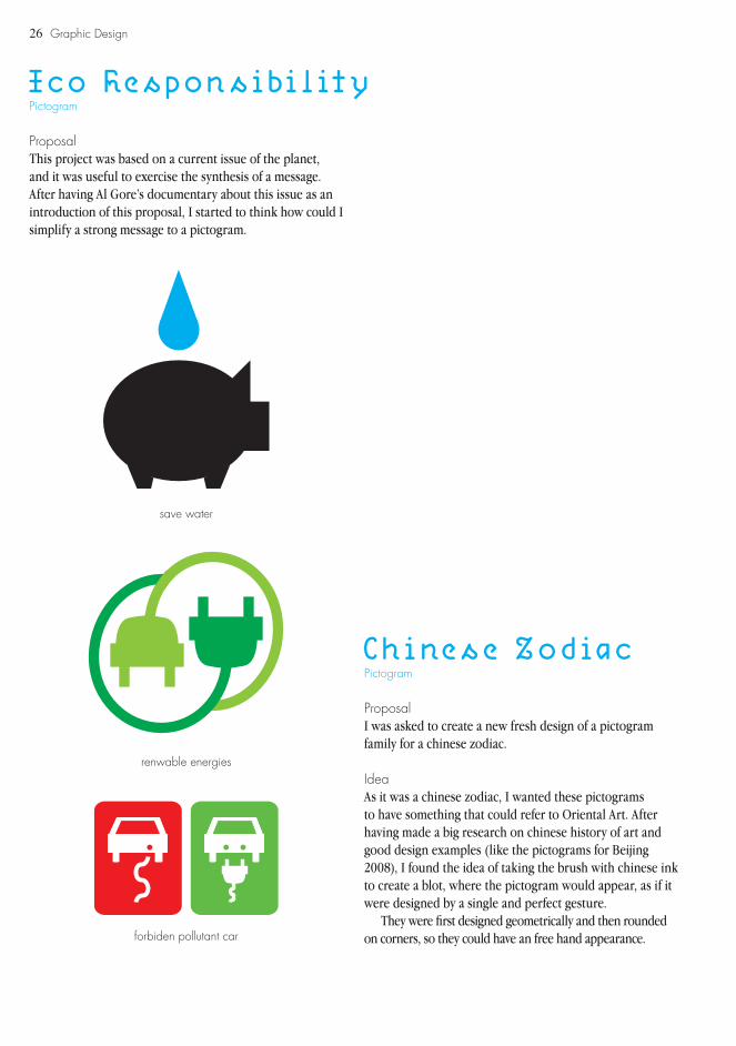
Eco Responsibility
ProposalThis project was based on a current issue of the planet, and it was useful to exercise the synthesis of a message. After having Al Gore’s documentary about this issue as an introduction of this proposal, I started to think how could I simplify a strong message to a pictogram.
Pictogram
save water
renwable energies
forbiden pollutant car
27Graphic Design
28 Graphic Design
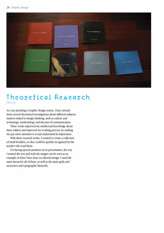
Theoretical Research
As I am attending a Graphic Design course, I have already done several theoretical investigations about different subjects-matters related to design thinking, such as culture and technology, methodology and theories of communication.
These works improved my intellectual knowledge about these subject and improved my working process, by making me pay more attention to it and understand its importance.
With these research works, I wanted to create a collection of small booklets, so they could be quickly recognized by the teacher who read them.
For having special attention on its presentation, the way I treated the text and/with the images can be seen as an example of what I have done in editorial design. I used the same layout for all of them, as well as the same grids and structures and typographic hierarchy.
Editorial
29Graphic Design

Graphic Design
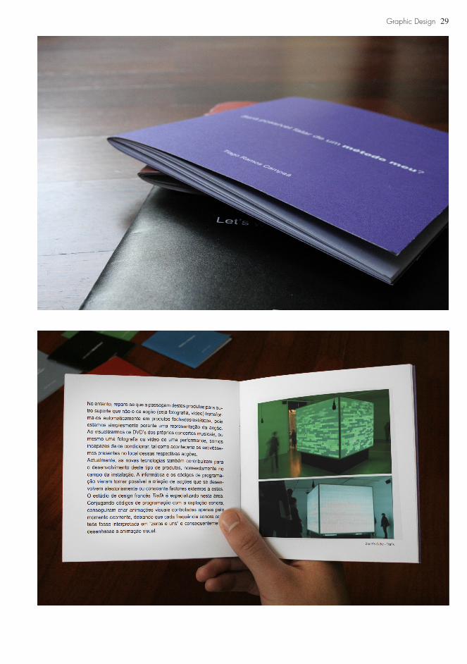
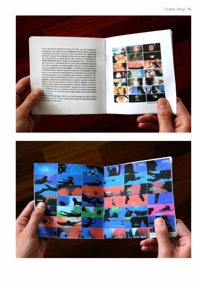
007: The Titles
This theoretical research was about the history of titles in the film industry. After having done a small research on Saul Bass, I decided to give the James Bond’s titles as good example of the evolution of this subject through 40 years and how Design adapted itself according to the several facts of History.
I really enjoyed having done all this work, since the research until its presentation. I took care of it with special attention, for the fact of this work being related with the most famous secret agent of the world: James Bond, the 007. For that reason, I played with this idea of top secret and created a packaging, as if it was an envelope of a top secret information.
Editorial
30
31Graphic Design

32 Graphic Design
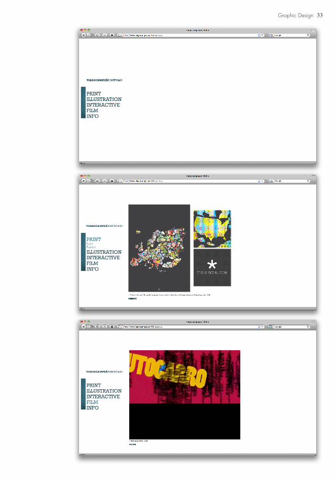
tiagocampeaportfolio.pt.vu
This is my current portfolio website, created as a college exercise of application of knowledge about Adobe Dreamweaver software.
Interactive
33Graphic Design
34 Graphic Design
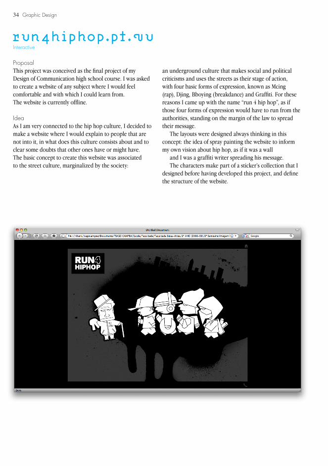
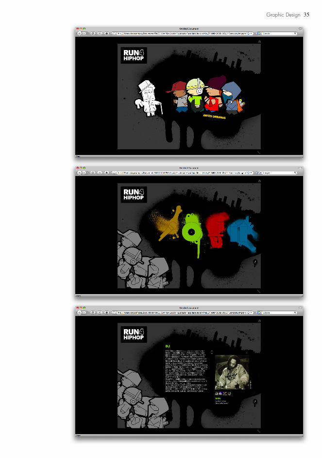
run4hiphop.pt.vu
ProposalThis project was conceived as the final project of my Design of Communication high school course. I was asked to create a website of any subject where I would feel comfortable and with which I could learn from.The website is currently offline.
IdeaAs I am very connected to the hip hop culture, I decided to make a website where I would explain to people that are not into it, in what does this culture consists about and to clear some doubts that other ones have or might have.The basic concept to create this website was associated to the street culture, marginalized by the society:
Interactive
an underground culture that makes social and political criticisms and uses the streets as their stage of action, with four basic forms of expression, known as Mcing (rap), Djing, Bboying (breakdance) and Graffiti. For these reasons I came up with the name “run 4 hip hop”, as if those four forms of expression would have to run from the authorities, standing on the margin of the law to spread their message.
The layouts were designed always thinking in this concept: the idea of spray painting the website to inform my own vision about hip hop, as if it was a wall
and I was a graffiti writer spreading his message.The characters make part of a sticker’s collection that I
designed before having developed this project, and define the structure of the website.
35Graphic Design
36 Graphic Design
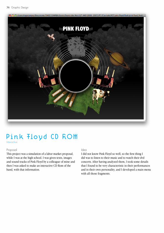
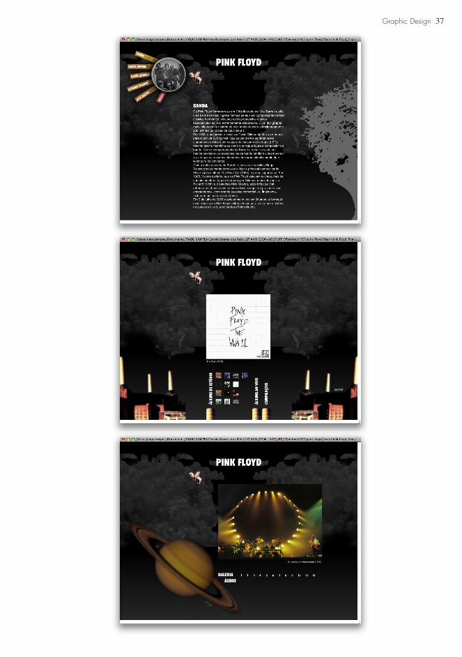
Pink Floyd CD ROM
ProposalThis project was a simulation of a labor market proposal, while I was at the high school. I was given texts, images and sound tracks of Pink Floyd by a colleague of mine and then I was asked to make an interactive CD Rom of the band, with that information.
Interactive
IdeaI did not know Pink Floyd so well, so the first thing I did was to listen to their music and to watch their dvd concerts. After having analyzed them, I took some details that I found to be very characteristic in their performances and in their own personality, and I developed a main menu with all those fragments.
37Graphic Design
38
39
VIDEO/ANIMATION
40
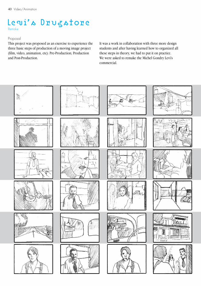
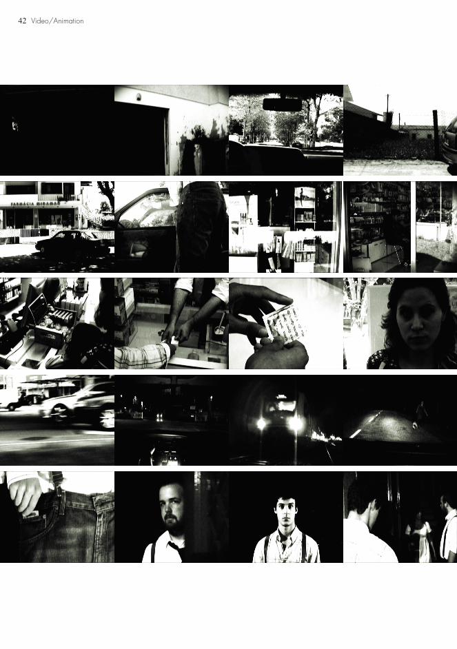
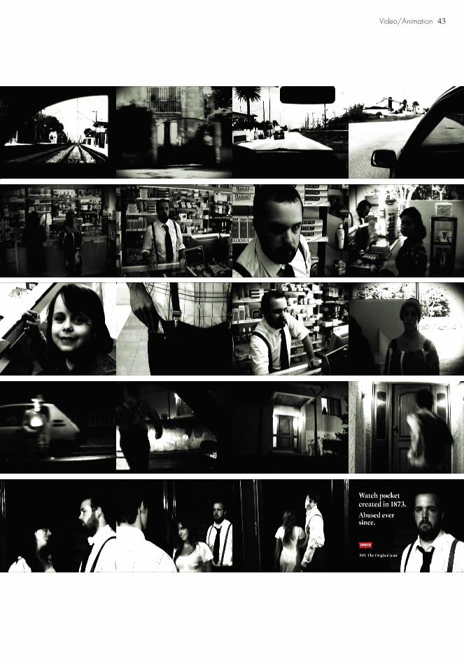
Levi’s Drugstore
ProposalThis project was proposed as an exercise to experience the three basic steps of production of a moving image project (film, video, animation, etc): Pre-Production; Production and Post-Production.
Remake
It was a work in collaboration with three more design students and after having learned how to organized all these steps in theory, we had to put it on practice.We were asked to remake the Michel Gondry Levi’s commercial.
Video/Animation

41
DevelopmentAs it was a remake, we did not have to make a script, even though we had to make a storyboard attached with a list of every important notes that were related to the actors and the production team, so all the material and information we needed could be registered and organized to proceed to the next step: the production.
We capture this remake only with a sony handy cam and a tripod. We had to take care of the directing, the acting, the lighting and all the other responsibilities in order to get a good result, even though with poor conditions.
The third step was the most exciting one, where we could edit the sequences and adjust them, leveling their contrasts, adding noise effects to give it an old video appearance and everything else, until making the final work.
Video/Animation
42 Video/Animation
43Video/Animation
44 Video/Animation
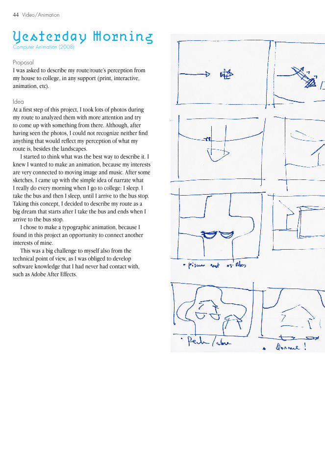
Yesterday Morning
ProposalI was asked to describe my route/route’s perception from my house to college, in any support (print, interactive, animation, etc).
IdeaAt a first step of this project, I took lots of photos during my route to analyzed them with more attention and try to come up with something from there. Although, after having seen the photos, I could not recognize neither find anything that would reflect my perception of what my route is, besides the landscapes.
I started to think what was the best way to describe it. I knew I wanted to make an animation, because my interests are very connected to moving image and music. After some sketches, I came up with the simple idea of narrate what I really do every morning when I go to college: I sleep. I take the bus and then I sleep, until I arrive to the bus stop. Taking this concept, I decided to describe my route as a big dream that starts after I take the bus and ends when I arrive to the bus stop.
I chose to make a typographic animation, because I found in this project an opportunity to connect another interests of mine.
This was a big challenge to myself also from the technical point of view, as I was obliged to develop software knowledge that I had never had contact with, such as Adobe After Effects.
Computer Animation (2008)

45Video/Animation
Storyboard

46
Video/Animation
Video/Animation
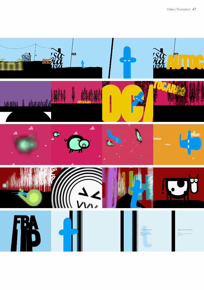
47Video/Animation

48 Video/Animation
Faharti
ProposalCreate a stop-motion animation, with one minute at least.This was my first stop-motion animation project, developed in collaboration with two more design students and illustrators.
Stop-Motion Animation (2008)
IdeaGiven this proposal, we firstly decided to create something that connected our different styles of illustration. We wanted to create a narrative, even thought the concept would not be very strong. We needed a story to animate our characters, so we decided to create a non-sense narrative, based in a constantly brainstorming, that only stopped when we found that it would be enough to make one minute of pure animation.
The animation is about a traveling that starts with a toilet and as it is going into it, it is also going into a deep ocean, where strange fishes exist and strange men blandish themselves. Strange things happen and the travel finally finishes once again outside the toiled, spitted from a stranger’s mouth.

49Video/Animation
Brainstorm Storyboard
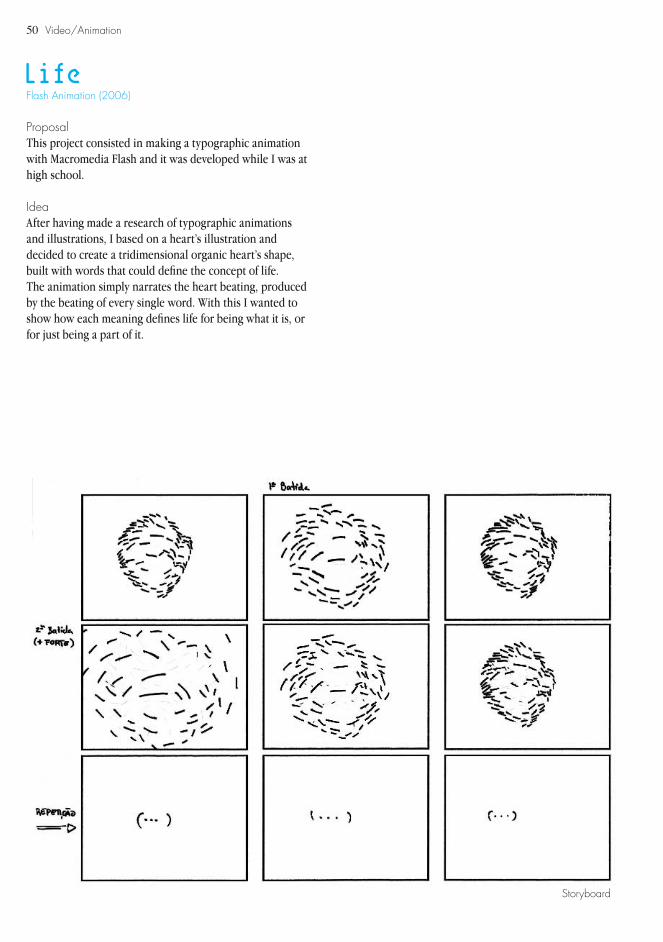
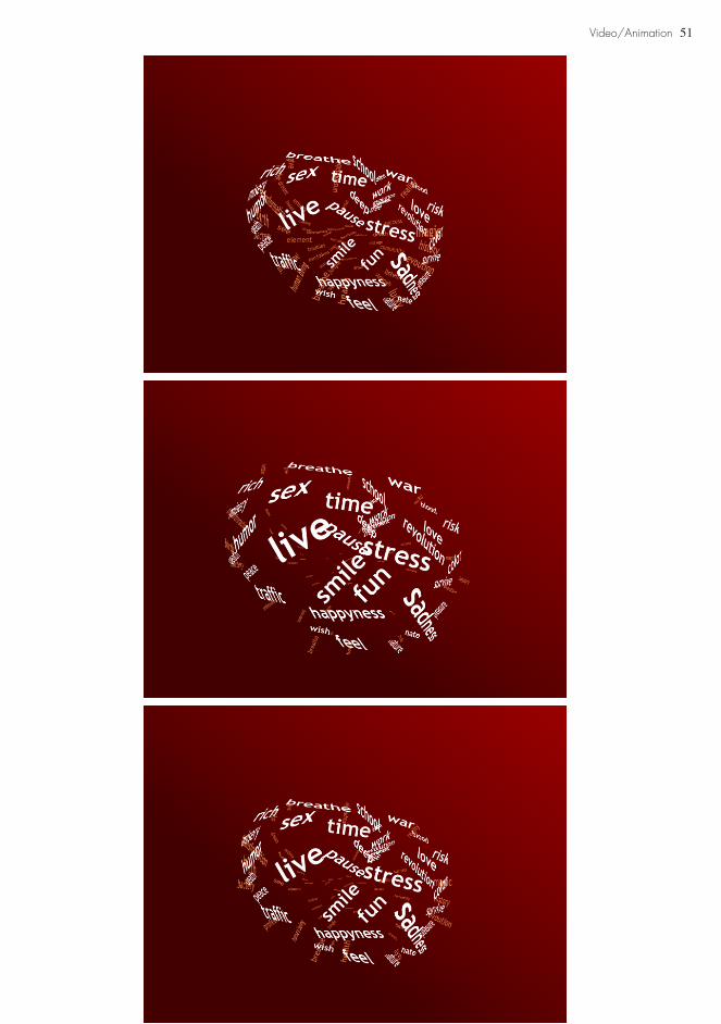
50 Video/Animation
Life
ProposalThis project consisted in making a typographic animation with Macromedia Flash and it was developed while I was at high school.
IdeaAfter having made a research of typographic animations and illustrations, I based on a heart’s illustration and decided to create a tridimensional organic heart’s shape, built with words that could define the concept of life.The animation simply narrates the heart beating, produced by the beating of every single word. With this I wanted to show how each meaning defines life for being what it is, or for just being a part of it.
Flash Animation (2006)
Storyboard
51Video/Animation
52

53
PHOTOGRAPHY
54
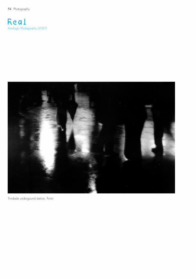
RealAnalogic Photography (2007)
Trindade undergound station, Porto
Photography
55
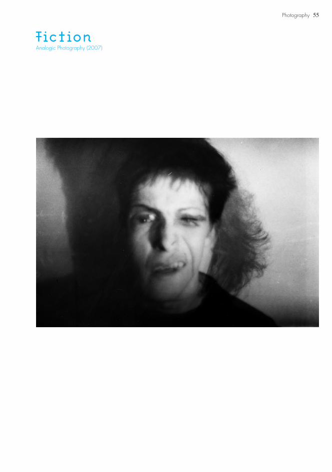
FictionAnalogic Photography (2007)
Photography
56 Photography
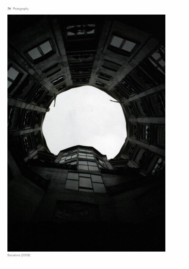
Barcelona (2008)
57Photography
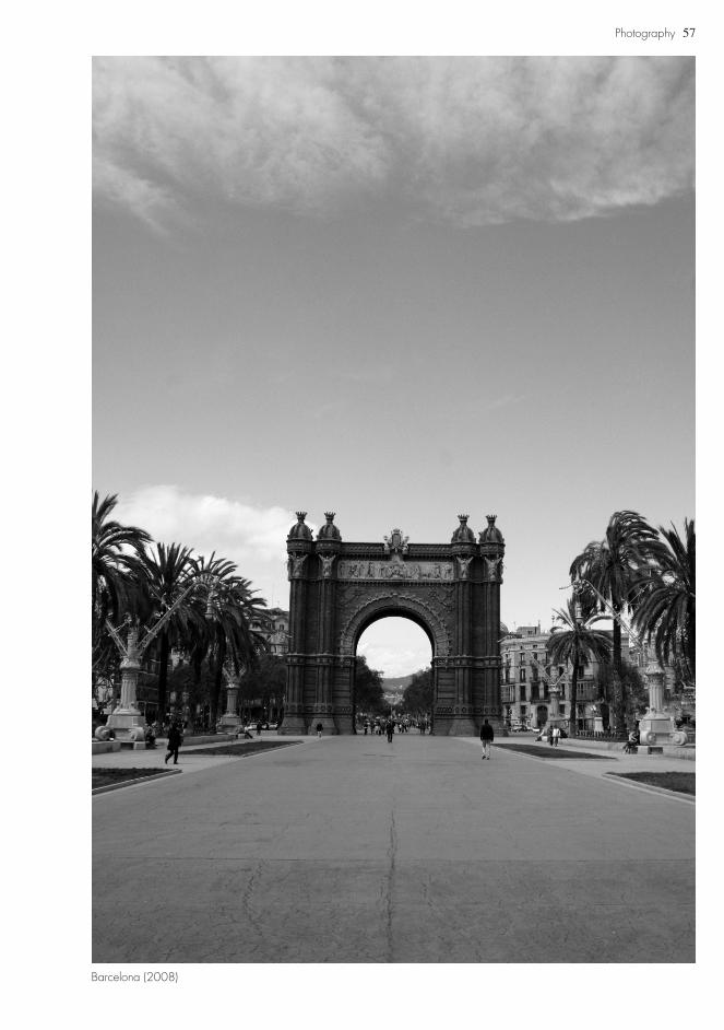
Barcelona (2008)

58

59
DRAWING
60 Drawing
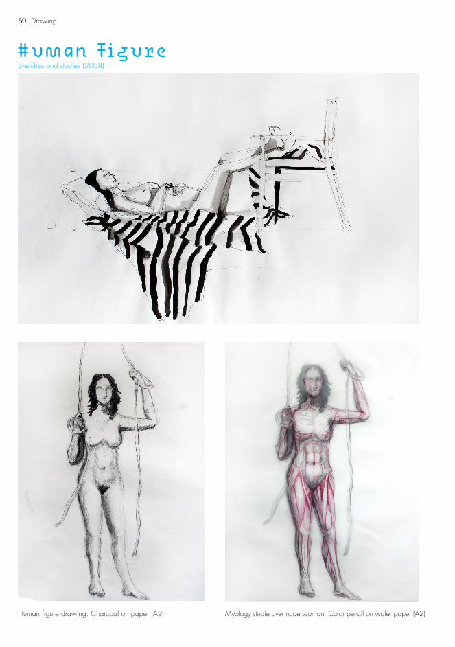
Human FigureSketches and studies (2008)
Human figure drawing. Charcoal on paper (A2) Myology studie over nude woman. Color pencil on wafer paper (A2)
61Drawing
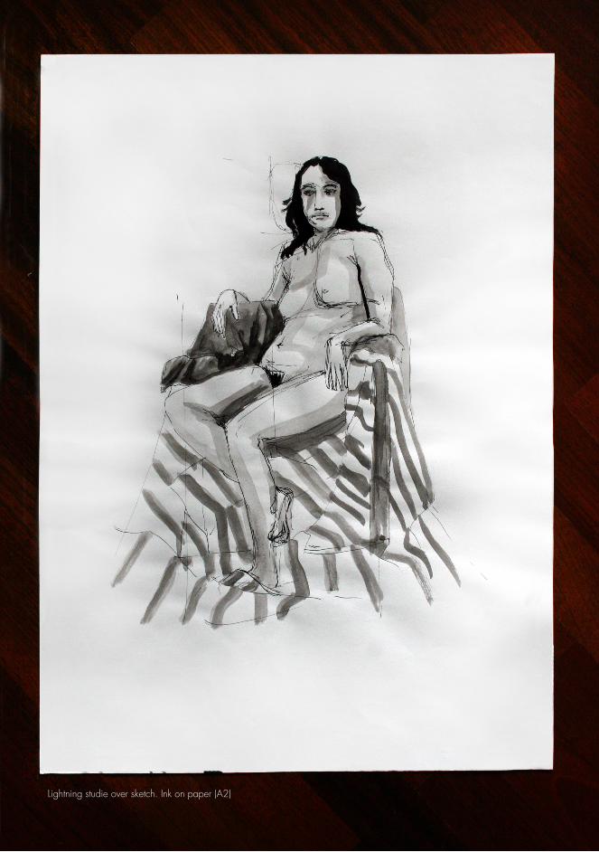
Lightning studie over sketch. Ink on paper (A2)
62
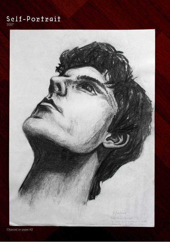
Self-Portrait2007
Charcoal on paper A2

63Drawing
Linear studies of hands’ volumetry. Graphite on paper
Sketch with lightning notes.Charcoal, sepia and sanguine on paper A2
Posing sketch. Charcoal on paper (A2)
64 Drawing
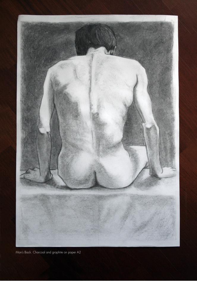
Man’s Back. Charcoal and graphite on paper A2
65Drawing
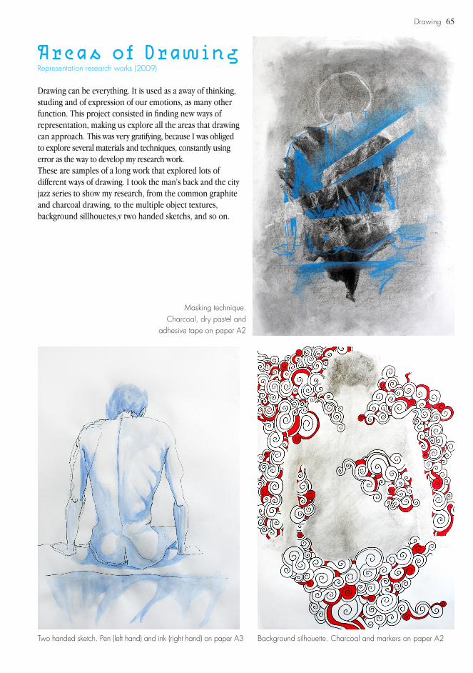
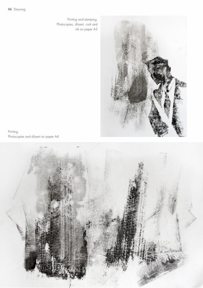
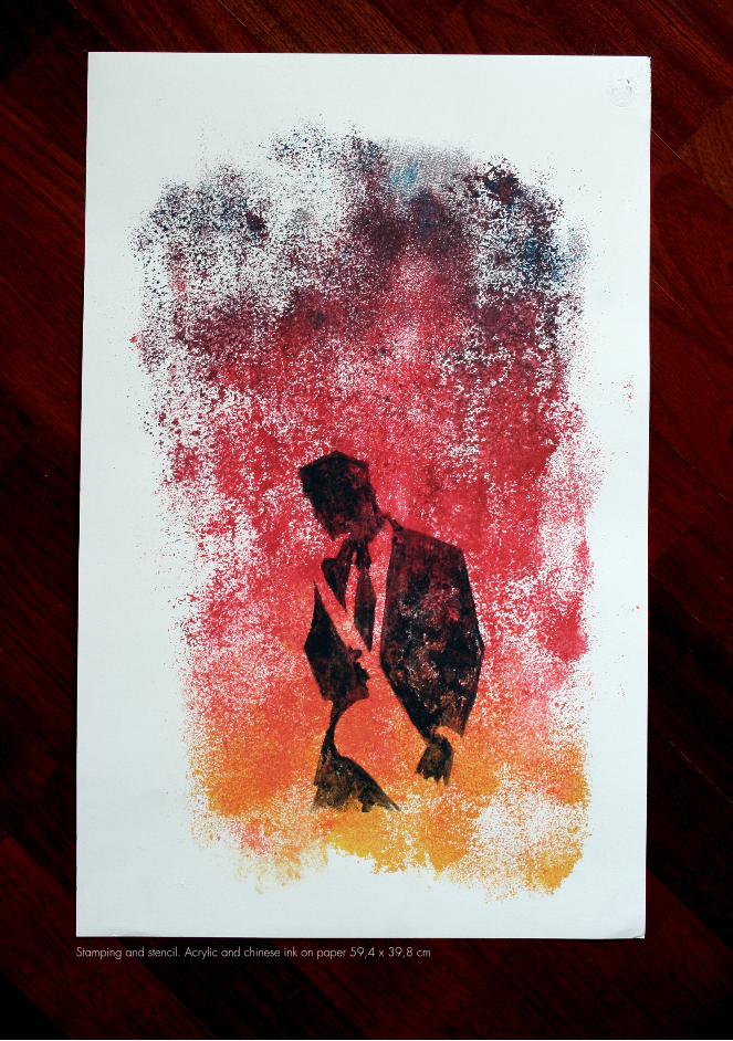
Areas of DrawingRepresentation research works (2009)
Drawing can be everything. It is used as a away of thinking, studing and of expression of our emotions, as many other function. This project consisted in finding new ways of representation, making us explore all the areas that drawing can approach. This was very gratifying, because I was obliged to explore several materials and techniques, constantly using error as the way to develop my research work.These are samples of a long work that explored lots of different ways of drawing. I took the man’s back and the city jazz series to show my research, from the common graphite and charcoal drawing, to the multiple object textures, background sillhouetes,v two handed sketchs, and so on.
Two handed sketch. Pen (left hand) and ink (right hand) on paper A3 Background silhouette. Charcoal and markers on paper A2
Masking technique.Charcoal, dry pastel and
adhesive tape on paper A2
66
Printing and stamping.Photocopies, diluent, cork and
ink on paper A3
Printing.Photocopies and diluent on paper A4
Drawing
67Drawing
Stamping and stencil. Acrylic and chinese ink on paper 59,4 x 39,8 cm

68

69
OTHERDESIGN
70
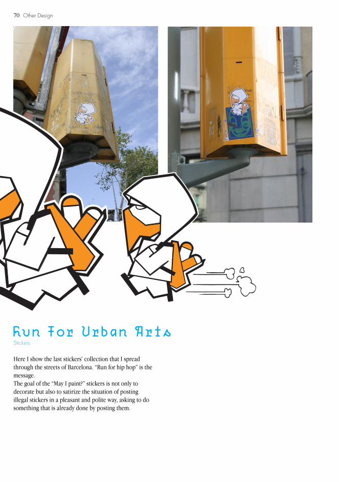
Run For Urban Arts
Here I show the last stickers’ collection that I spread through the streets of Barcelona. “Run for hip hop” is the message.The goal of the “May I paint?” stickers is not only to decorate but also to satirize the situation of posting illegal stickers in a pleasant and polite way, asking to do something that is already done by posting them.
Stickers
Other Design

71Other Design
Street of Barcelona (2008)

72 About Me
73About Me
About Me
I am Tiago Campeã, I am 19 years old and I live in Porto, Portugal. I am currently attending the second year of an higher education course of Graphic Design at the School of Fine Arts, University of Porto. I attended one of the best art schools in my country named Escola Secundária Artística Soares dos Reis, which gave me a lot of education in Arts, specially in the area of graphic design, as well as great life experience.
I am a hardworking person, used to set high goals for myself, in order to do not only a good work but also to feel comfortable with myself. I got that personality for having to manage my time well, since I was 8, when I started to play piano at the Conservatory of Music of Porto.
I consider myself a very active person! I like sports, graffiti, 123 Klan, Pat Metheney, Cypress Hill, Banksy, Non Format, Debussy, Dvein, Chopin, Toy Story, Chris Cunning-ham, James Brown, Rock Steady Crew and others.
I do also like to communicate, to express my emotions and I started to enjoy doing it through music and visual arts, most recently through graphic design. What I love about this area is that I find it as a way to combine all my interests and influences in any support, from print to screen, or even performance. I want to learn more about this area and to grow up, learn the rules to break them, so I can develop my work, while I am having fun with them.
74 Personal Details
75Personal Details
Personal Details
NameAge
OccupationLocation
Nationality
Education2007 - till now2004 - 2007
Experience200820062006
Contactsmob. number
UCAS IDBA (Hons) Graphic Design
Tiago Ramos Campeã19Student/freelancerPorto, PortugalPortuguese
School of Fine Arts, University of PortoSecondary Artistic School Soares dos Reis
Poster and program of a music concert1st place of the poster contest to “European Jewels” exhibitionCover for “Consenso” magazine
+351 91 208 09 [email protected]
103-788-5970