3d product rendering and image creation specialists visual tree porfolio 2015.pdf · brand: jonnie...
TRANSCRIPT

3D Product Rendering and Image Creation Specialists

Agency: The Key Branding and Clemenger BDDO
Client: CUB
Brand: Crown Goldne Ale
The BriefCreate hero images for Crowns new Golden Ale. To be used for POS and advertising.
The ApproachThe Bottles and labels are rendered. Crown is CUB’s flagship brand so it was vital that the bottles looked appealing. The spritzing was extremely important, it needed to have the right balance between cold and wet, if the drops are too big it looks wet, too small and it becomes cold, somewhere in the middle lies ‘refreshing’.
Oringinally the bottle was standing upright, but Clemenger BDDO needed a version that was horizontal for use on billboards, this meant the spritzing had to hang horizontally.

Agency: Design Bridge (Singapore)
Client: Diagio
Brand: Jonnie Walker Black Label
The BriefDesign Bridge had created a fantastic concept for the Jonnie Walker Black Label. The image would be exclusively used in duty free shop across Asia. The brief was to create a view of Delhi at night, from the air, with the Delhi Gate and the Johnnie Walker ‘walking man’ device worked into the streets.
The ApproachThis image had to be created from scratch, with no source material to work with. The entire image was hand illustrated in Photoshop. The challenging part of this job was how to create the overall texture of the thousands of buildings between the streets. Ironically this was created using hundreds of layers of skyscraper windows, which wer compressed, reduced, and then re layered over and over again, until it produced a kind of noisy pattern.
This pattern was in turn then layered and distibuted across the city, to create a sense of undulation and hills.This was a very enjoyable project. The deadline was extremly tight, but I found myself becoming drawn into the image the more it progressed, which made the long hours seem to float past effortlessly.

Agency: Hoyne Design
Client: Lend Lease
Brand: 889 Collins Street, Melbourne
The BriefCreate a gold logo for a new high rise development in Melbournes Central Business District.
The ApproachThe logo was originally a 3D render, but it needed to be blown up large for hording boards and building sized banners, so it had to be vector. The logo on this page is hand drawn entirely in Adobe Illustrator. I t was important to avoid using any of the Photoshop effects that Illustrator has available, as these do not scale well, so it had to be made from basic colour and gradients.

Agency: Fluid
Client: Fyna Foods
Brand: Pink Lady Chocolate
The BriefCreate a series of product images showing Pink Lady’s new chocolate mould and packaging.
The ApproachThe chocolate image here is comprised of rendered blocks and photgraphic Cacao pods and beans.

Agency: The Collaborative Agency
Client: Laminex
Brand: Laminex Masterbrand
The BriefCreate a masterbrand image depicting the logo being formed from energy waves.
The ApproachThe is entirly rendered in Cinema 4D. The background explosion was created using hair and volumetric back lighting.

Agency: Hoyne Design
Client: Lend Lease
Brand: 889 Victoria Harbour
The BriefThis was an interesting one. Hoyne were producing collaterol for the display suite and brochure. They had found a stock image of a bow wave on Loch Linnhe (above), but the shot was pre digital and had been scanned from a print, so they asked me to recreate it as a 3D render with some minor improvements.
The ApproachThe wave shape was the hardest thing to get right, the lighting is actually quite strong so the the smallest difference in the shape became really noticable in the shape of the reflections. The smaller ripples were actually quite simple, they were created using fractal noise.

Agency: The Key Branding
Client: CUB (Global)
Brand: Peroni Natstro Azzurro and Leggera
The BriefCreate hero bottle shots for both Nastro Azzurro and Leggera for use in POS and Advertising.
The ApproachThe bottles are 3D renders but the spritzing is photographic. The challenge on this project was to get the green bottle colour right and the back light vs environmental light balanced.

Agencies: The Key Branding (Melbourne) Clemenger BDDO (Melbourne)
Client: CUB
Brand: Carlton Cold
The BriefCreate Carlton Cold promotional images to be used on packaging, promotion and advertising.
The ApproachThe products needed to look like they were super cold, sitting on a floor of ice. The bottle and can were modeled and render in Cinema 4D.
The ice was created using various resins to get a range from slush to crisp.The frosting vapours and spritzing were added in photoshop.

Agency: DiDONATO Partners
Client: Lion Nathan
Brand: James Boag’s Masterbrand
The BriefCreate a James Boag’s masterbrand image, to encapsulate the brands essence and tell it’s story.The challenge was to link the brand to Tasmania, without placing it in Tasmania. Create some distance from ‘Cascade’, (who were already occupying the ‘Tasmania’ space heavily) and make it a more intriguing offer. Each of the 4 images in the series would need to feel mysterious, yet inviting, vast and epic in it’s scale.
ApproachThe approach was to focus on the gold mountain, (the existing brand icon), bring it to life and transform it into a mythical place. Lion Nathan were keen to tie the whole Boags portfolio more consistently with the masterbrand. To achieve this the mountain itself would become the connecting element across the portfolio. The images would be given a slight renaissance painting feel to add the epic element, whilst
photographic and rendered elements would be used for the water and some of the landscape, to add realism and believability.
In this particular image, the mountain and landscape were modelled in Maya , detailed in Z Brush, textured, lit and rendered in Vue. The waterfalls were added in Photoshop.

Agency: DiDONATO Partners
Client: Lion Nathan
Brand: James Boag’s Premium
The BriefCreate ‘James Boag’s Premium’ brand image for use in packaging and point of sale. The image must continue the story from the other sub brands in the portfolio.
ApproachIn the last round of Boag’s premium development we changed the muddy river scene into a waterfall with rapids and rocks. This was primarily to add a sense that the water was being cleaned and filtered by the rocks and the rapid flow. The treatment of that scene was an oil painting, which whilst achieving sense of story telling it wasn’t really helping with the refreshment cues that Lion Nathan wanted to promote, so for the whole portfolio we used a more photo realistic styling.
In this round we continued the story from Boag’s Draught. This time we are closer to the mountain. The mountain itself is actually no bigger than it is in Boag’s Draught, but we have made clever use of the scale of detail in the river and gorge to give the impression that the view is closer to it.
The river image here is a combination of 3D renders and photography. The mountain and canyon walls are created in 3D. The river is all photographic retouching.

Agency: DiDONATO Partners
Client: Lion Nathan
Brand: James Boag’s Draught
The BriefCreate a James Boag’s Draught image, to encapsulate the brands essence and tell it’s story. To be used on packaging and point of sale material.The challenge was to create a mysterious, yet inviting, vast landscape. Somewhere that felt almost undiscovered, inviting the viewer to explore it.
ApproachThe mountain would play the roll of the consistent brand element, as with the other members of the Boag’s family. The main message here was to push the clean, pure water used to make Boag’s beer. As with Boag’s Premium the water is shown as a fast flowing river. This river creates a path from the badge to the mountain, connecting the two elements. In this particular image, the mountain and landscape are created in 3D, whilst the water and foreground rocks are photographic. It was important that the foreground detail was as natural as could be and that the 3D background should blend seamlessly into it.

Agency: DiDONATO Partners
Client: Lion Nathan
Brand: James Boag’s Draught
The BriefCreate ‘James Boag’s Draught’ brand image for use in packaging and POS. Merging elements of ‘Boag’s St George’ and ‘Boag’s Draught’ to tell the story of St George and the Dragon.
ApproachThis was very much a collaboration with the art director (Andrew Christensen). The aim here was to create a golden illustration of the St. George and the Dragon characters. Lion Nathan had decided to end the Boag’s St George brand and roll it into Boag’s Draught. This meant that the St. George story had to be embedded into the Draught story, which was easy. We looked at the whole Boag’s portfolio as one island with different stories taking place at various points up the river towards the mountain. Boag’s Draught was the battle to cross the river, whilst Boag’s Premium was the view from the foot of the mountain. Working from a base outline illustration, the image was brought to life by hand in Photoshop.

Agency: Landor (Sydney)
Client: Pernod Ricard
Brand: Jacobs Creek
The BriefProduce a point of sale image for Jacobs Creek.
The ApproachThe idea was to make the logo look like a leaf had just fallen into water, that was coloured in the Jacobs Creek gun metal grey brand colour. The challenge here was to add a sense of freshness and atmosphere and prevent the image looking too grey. To over come this, some golden highlights were added to the water and icon.
The ripples needed to conform to the shape of the icon. To achieve this the ripples were sculpted in Mud-box and then textured, lit and render in Cinema 4D.

Agency: Landor (Sydney)
Client: Pernod Ricard
Brand: Jacobs Creek
The BriefProduce 3D renders of the Jacobs Creek Range.
The ApproachAlthough these may look simple there is actually a fair amount of work that goes into matching the print effects so that they look acurate to the final product. The Sparkling wine was the most indepth of the range, mainly due to the hood, which need to be UV mapped carefully and then sculpted to achieve a realistic shape. Once the modelling is done it’s then time to perfect the texturing and lighting, which generally go hand in hand in the process. Light has to pass through the glass acurately to achieve a photo realistic result. The lighting is basically no different to setting up a photo shoot. Softboxes are used to diffuse the direct light that hits the bottle, but there is also GI (global illumination) which simulates how light is reflected around the space to create ambient light.

Agency: Landor (Sydney)
Client: Pernod Ricard
Brand: Church Road (TOM)
The BriefRetouch a series of advertising and editorial shots for ‘Church Road’ ‘TOM’
The ApproachThe image on this page is really a straight retouch. The actual bottle is compiled from 4 different shots, with some further work done to ensure the label graphics were clear and materials well represented.
The challenge on this job was to straighten out the neck tag which was creased, rotated and off centre. Decreasing had to be done carefully to maintain the typography.
The Baeuty in this shot, for me, is the softness of the reflections, which give the bottle a ghostly presence.

Agency: Landor (Sydney)
Client: Pernod Ricard
Brand: Brancott Estate
The Brief1. Retouch a series of advertising and editorial shots for Brancott Estate.2. Create a photo realistic render of the Brancott estate label to present the paper sculpting effect that Landor were wanting to achieve. (Following page)
The ApproachThe image on this page is really a straight retouch. The actual bottle is compiled from 6 different shots, with some further work done to ensure the label graphics were clear and materials well represented.
The close up of the bottle on the following page was a little more challenging. The paper sculpting need to match exactly what the designers had in mind. The bottle itself needed to look like a photograph so the whole scene was lit exactly like a real photoshoot.


Agency: Landor (Sydney)
Client: Pernod Ricard
Brand: Church Road
The BriefRetouch a series of promotional and editorial images for Church Road.
The ApproachThe bulk of the work in this image and the wine rack image on the previous page, was in the labels. Multiple shots were taken using various lighting setups, then re-composed to ensure that the labels was evenly lit whilst still maintaining a sense of atmosphere and mood. The reflections were completely recreated to ensure that they followed the exact shape the design had in mind.
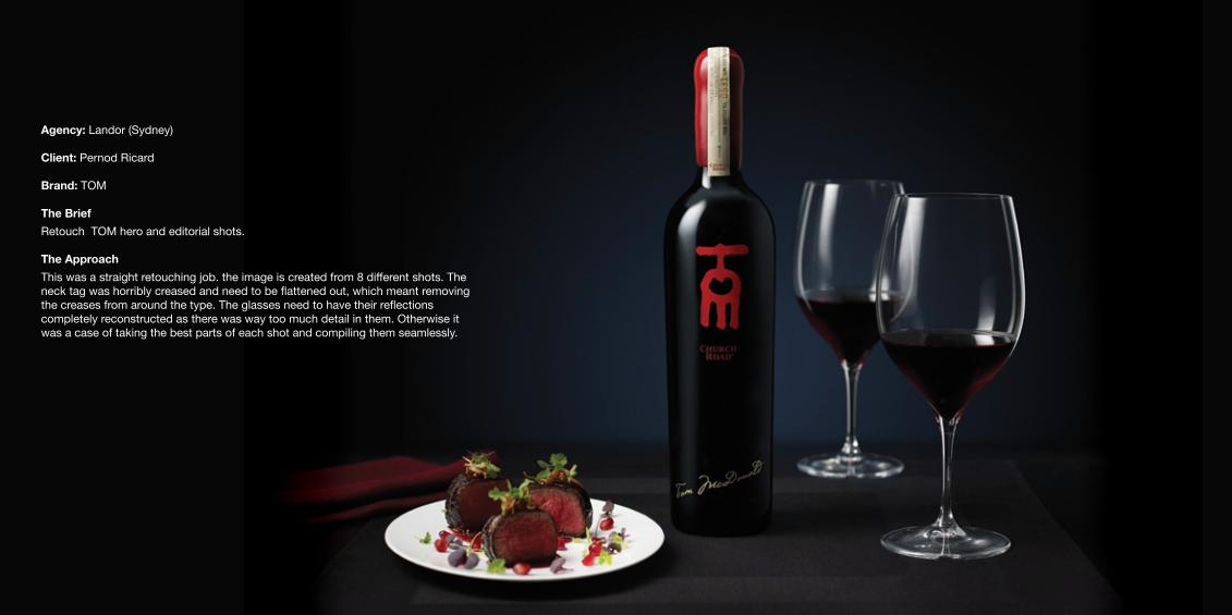
Agency: Landor (Sydney)
Client: Pernod Ricard
Brand: TOM
The BriefRetouch TOM hero and editorial shots.
The ApproachThis was a straight retouching job. the image is created from 8 different shots. The neck tag was horribly creased and need to be flattened out, which meant removing the creases from around the type. The glasses need to have their reflections completely reconstructed as there was way too much detail in them. Otherwise it was a case of taking the best parts of each shot and compiling them seamlessly.

A selection of 3D product renders for various clients

Agency: Elmwood
Client: Schweppes Australia
Brand: Solo
The BriefSchweppes wanted a new approach to their ‘Solo’ brand. The brand mark was to become a 3D object, then be wrapped around the can for use on packag-ing, advertising and point of sale material.
ApproachThe can was modeled and rendered in Cinema 4D, with additional touches in Photoshop, post render. The challenge here was to create a versatile can that looked like it was falling away from view, but without using any perspective. The can would need to be able to rotate vertically and be used on narrow fridge panels while maintaining parallel edges.

Agency: DiDONATO Partners
Client: Lion Nathan
Brand: Tooheys
The BriefCreate a chrome 3D version of the Tooheys Stag for use in Packaging and POS.
ApproachOriginally the idea was to model the stag in 3D, but Lion Nathan were keen that it should remain true to the original Illustration (below). The Stag would appear both as a head shot and full body, and become the primary masterbrand asset for, Toohey’s Extra Dry, Toohey’s New and Toohey’s Old. It needed to look both chrome and slightly illustrated.
TechniqueWorking from the original Chris Mitchell illustration the Stag was hand drawn in Photoshop.


Agency: Bonney Creative
Client: Independent Distillers
Brand: Vodka Cruiser Black
The BriefCreate hero images and product renders for the Vodka Cruiser Black range, for use in point of sale and promotion.
The ApproachAll of these images were created as 3D renders.
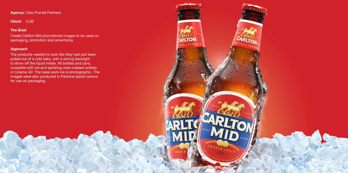
Agency: Cato Purnell Partners
Client: CUB
The BriefCreate Carlton Mid promotional images to be used on packaging, promotion and advertising.
ApproachThe products needed to look like they had just been pulled out of a cold esky, with a strong backlight to show off the liquid inside. All bottles and cans, complete with ice and spritzing were created entirely in Cinema 4D. The base pack ice is photographic. The images were also produced in Pantone (spot) colours for use on packaging.
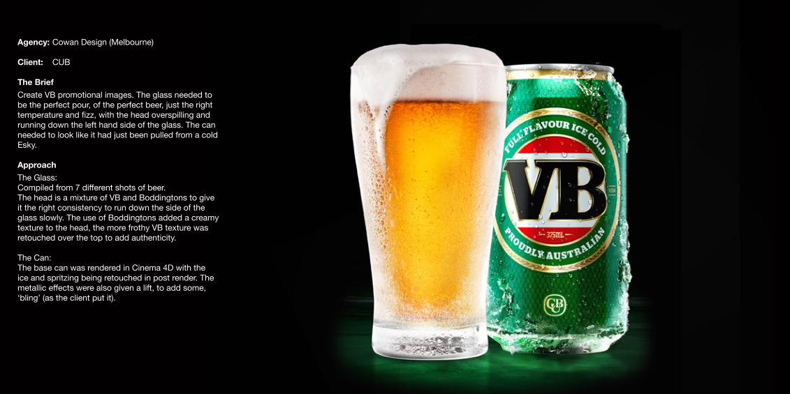
Agency: Cowan Design (Melbourne)
Client: CUB
The BriefCreate VB promotional images. The glass needed to be the perfect pour, of the perfect beer, just the right temperature and fizz, with the head overspilling and running down the left hand side of the glass. The can needed to look like it had just been pulled from a cold Esky.
ApproachThe Glass:Compiled from 7 different shots of beer. The head is a mixture of VB and Boddingtons to give it the right consistency to run down the side of the glass slowly. The use of Boddingtons added a creamy texture to the head, the more frothy VB texture was retouched over the top to add authenticity.
The Can:The base can was rendered in Cinema 4D with the ice and spritzing being retouched in post render. The metallic effects were also given a lift, to add some, ‘bling’ (as the client put it).

Agency: Bonney Creative
Client: Independent Distillers
Brand: Woodstock Bourbon & Cola
The BriefCreate hero images and product renders for the Woodstock Bour-bon & Cola range, for use in point of sale and promotion.
The ApproachAlmost all of these images were created as 3D renders, the only exception being the spritzing which was photographic

Agency: Bonney Creative
Client: Independent Distillers
Brand: Vodka Cruiser Mudshake
The BriefCreate hero images and product renders for the Vodka Cruiser Mud-shake range, for use in point of sale and promotion.
The ApproachAlmost all of these images were created as 3D renders, the only exception being the spritzing which was photographic

Agency: Bonney Creative
Client: Independent Distillers
Brand: Vodka Cruiser
The BriefCreate hero images and product renders for the Vodka Cruiser range, for use in point of sale and promotion.
The ApproachAlmost all of these images were created as 3D renders.

Agency: Bonney Creative
Client: Cerebos
Brand: Mighty Soft
The BriefCreate 3D Prodcuct renders for the ‘Mighty Soft’ Crumpet range.
The ApproachThe packs and product were modelled and rendered in 3D, using photgraphic textures wrapped around 3D shape for the crumpet. The fine detail was then sculpted in 3D to add for and depth to the texture.

Agency: Point 3
Client: Yoplait
Brand: Petit Miam
The BriefCreate final product rendersfor promotional use.
The ApproachAll products were modelled and rendered in Cinema 4D.
Agency: Point 3
Client: Yoplait
Brand: Petit Miam
The BriefCreate final product rendersfor promotional use.
The ApproachAll products were modelled and rendered in Cinema 4D.

Agency: The Key Branding
Client: CUB
Brand: Crown Golden Ale
The BriefCreate final product renders for promotional use.
The ApproachAll products were modelled and rendered in Cinema 4D.

Agency: Fluid
Client: Fyna Foods
Brand: Pink Lady
The BriefCreate final product renders for promotional use.
The ApproachAll products were modelled and rendered in Cinema 4D.

Agency: Asprey Creative
Client: Schweppes Australia
Brand: Cottees Fruit Crush
The BriefCreate final product renders for promotional use.
The ApproachAll products were modelled and rendered in Cinema 4D.

Agency: Bonney Creative
Client: Cerebos
Brand: Asian Home Gourmet
The BriefCreate 3D Prodcuct renders for the ‘Asian Home Gourmet’ range.
The ApproachThe packs were modelled and rendered in 3D.

Agency: Stone Design
Client: Bulla
The BriefCreate product images of Bulla ‘Mousse’ and ‘Cream’ range for use on packaging.
ApproachSometimes 3D renders just don’t cut it. These images needed to have a high level of taste appeal. A series of 4 images, of various cream products with inclusions. It was important that the creams and mousses looked as natural as possible. As the product existed there seemed no sense in trying to re-invent the wheel in 3D, so the product itself was shot along with the inclusion. The spoon was rendered as the client wanted a very specific type of spoon.

Agency: DiDONATO Partners
Client: Lion Nathan
Brand: Hahn
The BriefCreate the Hahn masterbrand and brand mark.
ApproachAfter a long design process Lion Nathan finally settled on this ‘Vanguard’ design. It had to look like a piece of metal was folding back on itself. The challenge was to keep the logo looking graphic, while still maintaining a material. It needed to be in vector format so that it could be used across many formats. Due to the gradients in the in the badge we needed to ensure that it conformed to printing tolerances, to avoid any drop off in tone.


Agency: DiDONATO Partners
Client: Lion Nathan
Brand: Tooheys
The BriefCreate a 3D version of the ‘Tooheys New White Stag’ brand marque and have it dropping into water.
ApproachThe Badge was first modelled in Lightwave, with the water being retouched in post render. It was then redraw by hand in illustrator to add a sharpness and clarity. Having the entire image in vector format allowed it to be infinitely scaled for use in large format POS and advertising.

Agency: DiDONATO Partners
Client: Lion Nathan
Brand: Tooheys Old
The BriefUpdate the ‘Tooheys Old’ branding to fall in line with ‘Tooheys New’
ApproachThe badge was almost entirely modelled and rendered in Lightwave, with the exception of the ‘Old’ type which was hand drawn in Illustrator to give it a sharp, crisp feel. The spritzing on the type was created using vector shapes. The overall look and feel was inspired by early fire engines.

Agency: DiDONATO Partners
Client: Lion Nathan
Brand: James Squire
The BriefCreate a series of promotional images for the ‘James Squire’ range.
ApproachThe tasting notes were creatively typeset in the shape of the glass. The glass was then modelled in Lightwave, the type was then used as a transparency map over the model.

Agency: DiDONATO Partners
Client: Lion Nathan
Brand: XXXX Gold
The BriefCreate a 3D ‘XXXX’ Gold Badge for use in packaging, point of sale, signage and advertising.
ApproachThe ‘XXXX Gold’ badge was modelled and rendered in Lightwave. As the shot was straight on, ambient occlusion was use to emphasise the dimension. The bottle shot was straight retouching, warping the flat label artwork around the bottle then adding the spritzing back over the top. This give a true representation of colour.
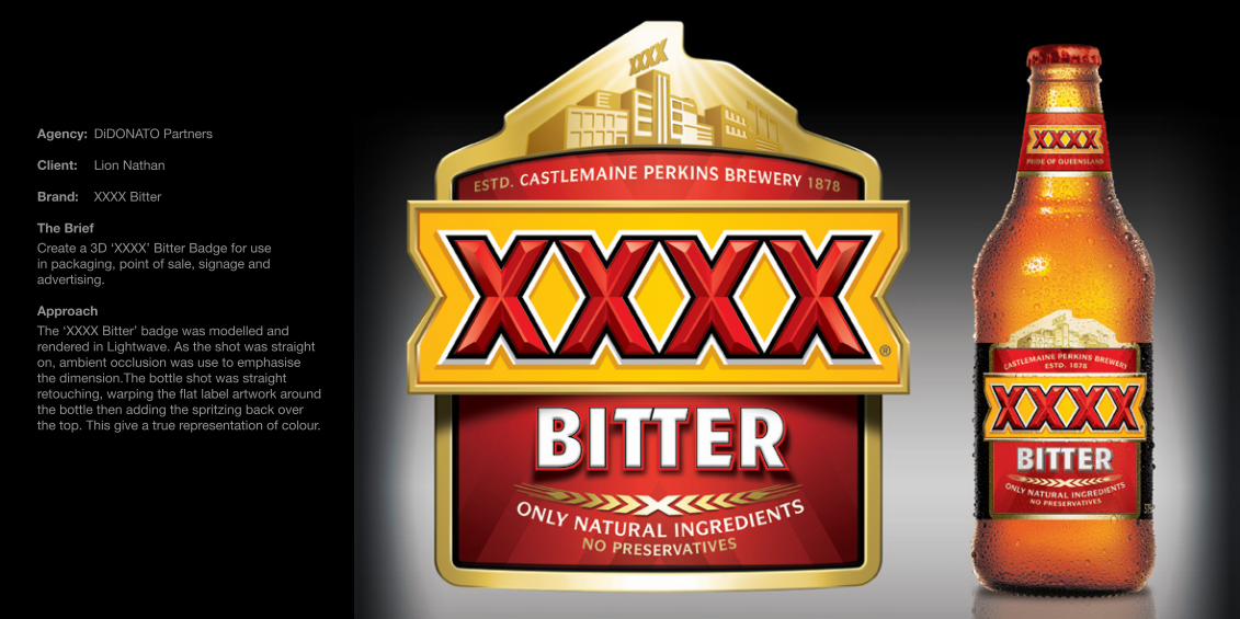
Agency: DiDONATO Partners
Client: Lion Nathan
Brand: XXXX Bitter
The BriefCreate a 3D ‘XXXX’ Bitter Badge for use in packaging, point of sale, signage and advertising.
ApproachThe ‘XXXX Bitter’ badge was modelled and rendered in Lightwave. As the shot was straight on, ambient occlusion was use to emphasise the dimension.The bottle shot was straight retouching, warping the flat label artwork around the bottle then adding the spritzing back over the top. This give a true representation of colour.

®
Agency: DiDONATO Partners
Client: Lion Nathan
Brand: XXXX Masterbrand
The BriefCreate a 3D ‘XXXX’ Master Brand for use in packaging, point of sale, signage and advertising..
ApproachThe ‘XXXX’ master brand was initially modelled and rendered in Lightwave, then redrawn in Illustrator, this was a logo that was going to get used in large formats so it needed to be vector.

Agency: DiDONATO Partners
Client: Schweppes Australia
Brand: Schweppes Masterbrand
The BriefCreate a 3D version of the ‘Schweppes’ masterbrand.
ApproachThis version was never actually requested by Schweppes, we felt it was an obvious evolution and put it forward. Schweppes loved it and now use it as their hero mastebrand image.The image is created entirely in vector, as a masterbrand hero it was going to need to scaled up big.

Agency: DiDONATO Partners
Client: Schweppes Australia
Brand: Schweppes Masterbrand
The Brief Create a ‘Schweppes’ masterbrand image for use in outdoor advertising.
ApproachThe image was originally meant for vehicle livery, but was also used for billboards. The idea was to make the water look like it was flowing out of the side of the Schweppes RAV4 as the car moved forwards. This was a straight retouching job. The water was shot using a high speed camera during the Schweppes water balloon campaign. The bottle and cap were shot separately and retouched in.

Agency: DiDONATO Partners
Client: Tribe & Origin
The BriefCreate a piece of ancient jewellery from the ‘&’ character in the logo
ApproachTo achieve the aged look, a rough metal texture was used, the detailing was drawn in Illustrator then used as a bump map in Lightwave. The final image was modelled and rendered in Lightwave.


The Micro Worlds: The Developed World
I create these miniature worlds for my own enjoyment. They let me play god for a while. They offer infinite possibilities to summarise almost anything, a place, a person, an event, an industry.... etc. I currently working towards developing a whole solar system of micro worlds.
The worlds are modelled in Maya, detailed in Z Brush then compiled and rendered in Vue, with additional finishing touches in Photoshop.

Contact: Mark Saunders
+61 (0) 400 036 203
Email: mark@thevisualtree
www.thevisualtree.com