a new breed of self-service bi title that both business ... white paper a new breed of self-service...
TRANSCRIPT

Title
WHITE PAPER
A New Breed of Self-Service BI That Both Business and IT Users Will Love
ii
ContentsThe Challenging, Fast-Paced World of Business Intelligence (BI) ............. 1
Recognizing the Barriers to Self-Service BI ..................................................... 2
How Should Self-Service BI Work? ................................................................... 2
Self-Service BI From SAS: No Expertise Required ........................................ 3
Giving Business Users What They Want .......................................................... 3
Interactive and Dynamic Reports and Dashboards ..............................................3
Data Exploration and Smart Visualizations ..............................................................4
Self-Service Analytics for Everyone ...........................................................................6
What About IT? ..................................................................................................... 8
Near and Dear to IT’s Heart: Governance ..............................................................8
Deployment Options ..................................................................................................9
Conclusion ............................................................................................................. 9
Try SAS® Visual Analytics ..................................................................................... 9
The Challenging, Fast-Paced World of Business Intelligence (BI)Constant market shifts and changing customer preferences add to the challenge of outperforming your competitors and surpassing stakeholder expectations. But what can be done to steer your organization down the path to greater success?
By now, we all know it’s not just historical reporting about the past that will provide the answers needed to drive a business forward. Everyone – from executives and analysts to frontline staff – must have access to insights about the future that will enable them to make the best decisions and take the actions needed to keep their organizations agile. This means the ability to peer into data, explore it, understand it, analyze it and produce insights that provide those aha moments and take actions on it. Such things cannot be done with multiple tools that are rigid, limiting and difficult to use. A new breed of business intelligence is required.
Gone are the days when reports looked at singular issues, took possibly days or weeks to create, and required advanced skills to build and even understand. It’s totally unreal-istic to think you can run a successful business today if your decision makers are only receiving traditional, static reports delivered to their office desk.
These days, huge amounts and varied types of structured and unstructured data pour in from every imaginable source. Users work from virtually everywhere. Because they’re so connected, they expect to get whatever information they need, when they need it, using any device and software they prefer.
In such a dynamic environment, today’s business users need access to all types of data, almost instantly. They need the ability to interactively prepare and explore data so they can discover new information and answer new questions – not just about what happened, but why it happened and what will happen next.
So sure, there are BI solutions that let you push a button and get some answer. But most likely, you won’t be able to explain how you got the answer or what it means. Which means that answer is of little use. Traditional BI solutions can only provide a picture of what has happened through reports or dashboards. And most have a predefined path of analysis that gives users very little creative freedom to explore new lines of thought.
To maintain competitive advantage, your BI solution should allow business users to quickly and easily investigate data to find out why something happened. And go even further to find out what will happen next and determine future outcomes. Only with interactive data exploration and easy-to-understand analytics that are relevant and simple to use can your business users get the fact-based answers needed to take action and create real advantage.
Why has this goal been so hard to achieve with traditional approaches and what can be done to improve that situation?
1
Gone are the days when reports looked at singular issues, took possibly days or weeks to create, and required advanced skills to build and even understand.

2
Recognizing the Barriers to Self-Service BITraditional methods used to access and combine data to solve business problems can be problematic. Why?
The exponential growth in volume and complexity of data, the democratization of discovery and analytics, and the increased need for agility have changed expectations for self-service BI. With traditional solutions, business users cannot test, integrate and query new data sources (e.g., social media streams, cloud-based applications) stored in different places – much less interactively explore them. As a result, only a small percentage of an organization’s data may actually be used to create business insights.
From IT’s point of view, structuring data models, gaining consensus on key metrics and defining data modeling requirements from different departments can take consider-able time and effort. And think about what happens when IT builds a data model that turns out not to be what the users really need. At that point, the process has to start all over as an IT expert rebuilds the data model. This delays answers to business questions and postpones decision-making cycles.
If BI and analytics projects take weeks or months to move through IT development cycles, business users may feel compelled to seek out their own solutions, which creates governance headaches for IT. At the same time, as more demands are placed on IT, the centralized IT-led BI model cannot scale efficiently.
Business users want to move beyond just consuming static reports or dashboards created by IT to actively interacting with up-to-date data. Frustration mounts if business users feel their IT-provided queries run too slowly, and if BI capabilities aren’t easy to use or not flexible enough to meet changing needs. That limits the broader adoption of business intelligence and analytics across the organization.
How Should Self-Service BI Work?It’s true that traditional IT-led BI projects support stability, centralization, control, etc. Without those things, there’s a huge risk of introducing data chaos as well as the possi-bility of regulatory and operational risks. On the other hand, today’s business users crave speed, agility and flexibility. Each approach has its positives and negatives. So where’s that sweet spot that gives both groups what they need? How can we balance the desire for flexibility and agility while avoiding data chaos and providing necessary governance?
Effective self-service business intelligence enables users to access relevant data so they can ask their own questions and produce their own insights. Business users feel empowered to work independently when it comes to accessing data, generating insights and sharing information. With true self-service BI, business analysts can access data from different sources and prepare it as they want for analysis and reporting. They can explore data analytically and use an intuitive interface to quickly build highly inter-active and visual reports and dashboards.
But just as important, true self-service BI lets IT professionals feel comfortable about giving business users the power to do more with added flexibility. That’s because it

3
limits the amount of IT involvement in routine tasks, yet lets IT provide appropriate guidance for accessing validated data sets and governance around creation and sharing of content.
So, IT’s role has changed from producer to enabler. IT enables the process of creating BI and analytics content from trusted data sets. They can feel confident about relin-quishing more control to business users – and everyone can work more effectively.
Self-Service BI From SAS: No Expertise RequiredSAS® Visual Analytics is a self-service business intelligence solution that includes inter-active reporting, data exploration and sophisticated, yet approachable, analytics. This easy-to-use visualization tool is a role-based solution geared to all types of users – including business users, business analysts and citizen data scientists.
With SAS Visual Analytics, your data warehouse or Hadoop-based data store can become the foundation for serving data to business users who can augment it with new data, explore it on their own and apply analytics using an interactive interface. Users from across your organization will be able to ask new questions of their data to expose unknown issues and uncover new opportunities.
With SAS, authorized business users can make minor changes to a sanctioned data set. They can join tables, apply data quality functions, create calculated columns, etc., which removes some of the strain on IT without creating much risk. And it improves produc-tivity for business users who get the self-service workflows they crave to produce and share insights.
Unlike traditional BI with summarized views and pre-aggregated data models and hier-archies, SAS Visual Analytics lets users create hierarchies on the fly so they can drill down through their preferred data path. This is possible due to in-memory computing technology, which can aggregate even large amounts of data in subseconds.
Giving Business Users What They WantInteractive and Dynamic Reports and DashboardsGetting the most value from your data requires giving users the power to create reports and dashboards that are easy to interact with, understand and share. The goal is to help decision makers understand past performance, monitor current perfor-mance from actions and alert them to changes that go beyond a defined threshold for taking an action.
An interactive interface allows users with business backgrounds to quickly query data and summarize key performance metrics without relying on IT too much. With SAS Visual Analytics, you can select variables and then drag and drop them to create a what-you-see-is-what-you-get type of report. You can combine things like pie charts, bar charts and line charts, along with crosstabs, tree maps and geographic data.
With SAS® Visual Analytics, data is not pre-aggregated – so changing the data structure or simply reloading large amounts of data is no big deal.
4
SAS provides a library of common graphical report elements – maps, text boxes, images, gauges, etc. – and control objects that filter data interactively like selection boxes, button bar lists and range sliders. So without any technical skills, you can create new calculations on the fly and build appealing, interactive flows within and across reports. This simplifies report building and reduces the strain on IT.
Report designers can create new reports by importing objects or visuals from other reports, or they can update reports that were created from visual explorations. They can also define interactions (e.g., filtering, brushing) for report objects, and then include SAS analytical results in a single report.
Content can be delivered in the way that makes the most sense for each particular need – whether it’s via spreadsheets, the web or through mobile devices. All of these options are fine, because SAS maintains only one version of each report. So regardless of the application or device, you’ll always see the same, up-to-date information. And, you can update SAS Visual Analytics reports and charts dynamically from within Microsoft PowerPoint to tell the story of your data, share insights gained and collectively take valuable actions.
Even better for spreadsheet and PowerPoint users, reports are dynamic. When someone looks at the reports or charts in Microsoft applications, they reflect what’s happening in your business right now.
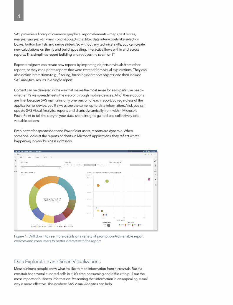
Data Exploration and Smart VisualizationsMost business people know what it’s like to read information from a crosstab. But if a crosstab has several hundred cells in it, it’s time-consuming and difficult to pull out the most important business information. Presenting that information in an appealing, visual way is more effective. This is where SAS Visual Analytics can help.
Figure 1: Drill down to see more details or a variety of prompt controls enable report creators and consumers to better interact with the report.

5
With smart visualizations, SAS Visual Analytics automatically presents data in the best chart type, color and format. The software looks at all of the data you wish to examine and based on the amount and type of data, it presents the most appropriate visualiza-tion. Third-party visualizations from open source libraries like D3, C3 and Google Charts are also supported, so you can build your own visualizations and add them to your SAS Visual Analytics reports.
If a simple bar chart is the best way to present information, that’s what SAS Visual Analytics will recommend. But with more complex concepts, it would suggest a tree map. If you need access to raw numbers, you can switch from a graphical visualization to a tabular report. If data contains geographical information, it’s more easily under-stood with geographical maps. SAS excels at transforming and presenting information in the most convenient, approachable way. Here are just a few examples.
Correlations
As you explore data, you’ll probably want to understand how the different variables affecting the problem you are trying to solve are related to each other. In the past, generating a correlation matrix to show those relationships meant submitting a request to an analytics expert who would run the analysis and return results. If you weren’t satis-fied, you’d have to seek help again. This process could take hours.
Instead of an analyst manually finding relevant correlations, outliers and relationships, SAS Visual Analytics automatically applies these capabilities to the data. So now, business users – even nontechnical users – can produce their own correlation matrix. Simply drag and drop two or more variables onto the workspace and the autocharting feature knows to draw a mosaic correlation graph. Results are visible in seconds – and the graph immediately shows how strong, moderate or weak the correlations are across all the variables. Drill into details by double-clicking on a rectangular block to see corre-lation values for selected variables. You can also view the trend by running various fit line models and looking at results.
The software makes it easy to see correlations in data so you don’t miss important insights. It also helps you narrow down the choices, so you can see which details (vari-ables) are worth further investigation.
Figure 2: You can drop and drag different variables onto a correlation matrix to easily see the relationships between them.
From hours to seconds
Imagine a correlation matrix with 28 different variables – a 28x28 matrix. On a standard machine running normal hardware, a process like that can take four hours. With SAS® Visual Analytics, it can run in a few seconds. That’s very exciting for people who have done these processes and had to wait. It’s hard to go back and do anything the old way when you can do it with SAS so quickly.

6
Box plots
Box plots are another exploratory technique used to show the distribution of data values, identify outliers and find skews in the data. They’re helpful because they show high or low levels of agreement among groups or segments or the differences between two groups or segments – to find out what needs deeper investigation.
A box plot is a graphical display of five statistics (the minimum, lower quartile, median, upper quartile and maximum) that summarize the distribution of a set of data. The lower quartile (25th percentile) is represented by the lower section of the box and the upper quartile (75th percentile) is represented by the upper section of the box. The median (50th percentile) is shown as a central line that divides the box into sections. Extreme values are represented by whiskers that extend out from the edges of the box. Usually, these display well when using big data.
Sankey diagrams
How do customers navigate your website? What is the customer journey through your support structure? Sankey diagrams use path analysis to show the dynamics of how transactions move through a system and how multiple groups relate to one another across variables. You can easily see flow patterns, recognize trends and locate dominant contributors to the overall flow through a system or process. You can identify successful flow patterns and isolate flows that failed to deliver the desired action. This type of visu-alization helps decision makers pinpoint opportunities for improvement.
Self-Service Analytics for Everyone
Forecasting
Understanding what’s likely to happen in the future is important to organizations of all sizes. SAS Visual Analytics includes automated time series forecasting capabilities that show the potential value business users can derive from predictive analytics. SAS Visual Analytics can automatically test multiple forecasting models and identify the best-fitting model based on the selected variables.
Figure 3: You can create a forecast for several different values by adding a time value and various metrics. SAS will pick the best forecast model automatically.

7
For example, with simple drag-and-drop actions, you can add your choice of variables to build out a time series. SAS then selects the best model and displays the results. You can run the forecast as many times as needed or increase the accuracy of forecasts using single or multiple variables across various intervals of forecast durations. SAS displays an estimated confidence interval, so you get a sense of the uncertainty associ-ated with the forecast. No one can forecast with 100 percent accuracy – and being able to manage the uncertainty is valuable.
Scenario analysis and goal seeking
In today’s environment, there’s not much time to react to business situations. So it’s essential to be able to simulate scenarios and quickly see the effects. SAS Visual Analytics lets business users run different scenarios and generate forecasted outputs. SAS Visual Analytics automatically calibrates which underlying factors contribute the most toward the forecast. Then you can modify the possible values of the underlying factors and update, or rerun, the forecast. When the visual is updated with new results, you can compare the existing and new forecasting results based on a scenario in a single view.
In addition to scenario analysis, you can perform goal seeking. Goal seeking enables you to specify a target value for your forecast measure and then determine the values of underlying factors that would be required to achieve the target value.
Text analysis
So much information is captured in unstructured data channels like emails, Twitter feeds, YouTube video comments, Google Analytics, Facebook posts and online user comments that you can’t afford to ignore them. Analyzing this text-based information provides insights into customer experiences and opinions. You can quickly find out what hot topics are being discussed and filter them further.
Figure 4: This word cloud shows a quick look at sentiments that were expressed about the NBA draft.
8
SAS Visual Analytics incorporates text analytics to analyze unstructured data in a highly visual, interactive manner. For example, it produces analytically generated word clouds that show what people are saying about you in social media and helps you determine whether sentiments are positive or negative, and why. You can find and understand the important factors in that data without having to read a thousand responses, tweets, posts or comments. And, you can do it all very quickly.
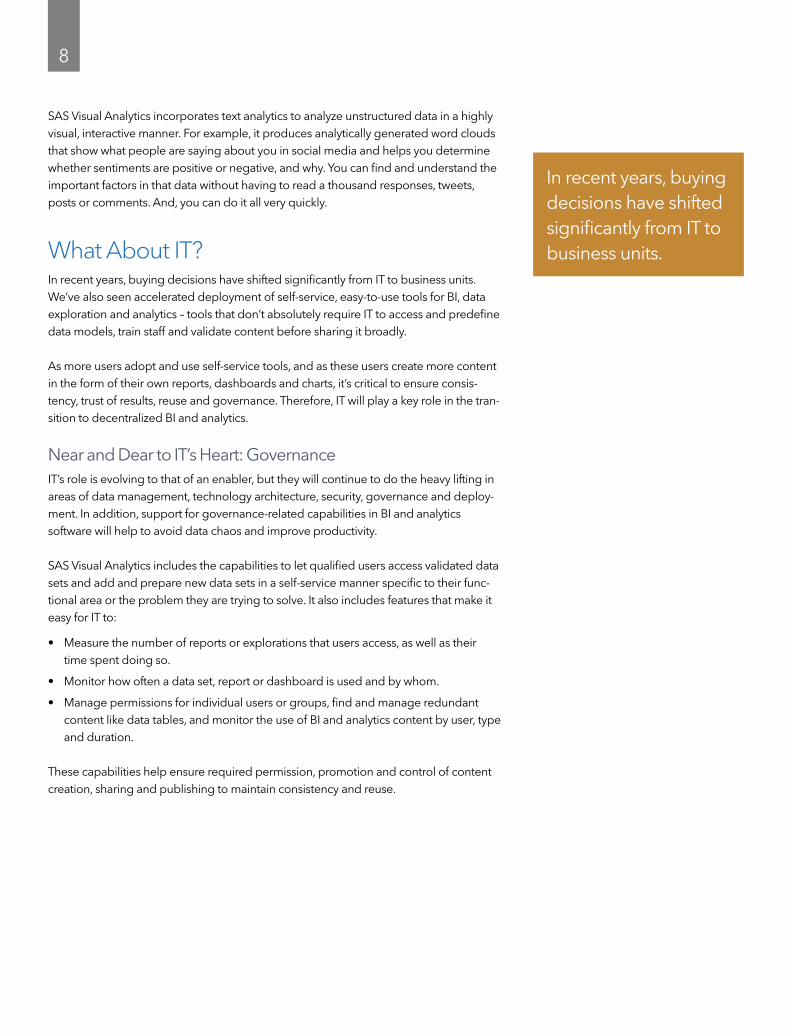
What About IT?In recent years, buying decisions have shifted significantly from IT to business units. We’ve also seen accelerated deployment of self-service, easy-to-use tools for BI, data exploration and analytics – tools that don’t absolutely require IT to access and predefine data models, train staff and validate content before sharing it broadly.
As more users adopt and use self-service tools, and as these users create more content in the form of their own reports, dashboards and charts, it’s critical to ensure consis-tency, trust of results, reuse and governance. Therefore, IT will play a key role in the tran-sition to decentralized BI and analytics.
Near and Dear to IT’s Heart: Governance IT’s role is evolving to that of an enabler, but they will continue to do the heavy lifting in areas of data management, technology architecture, security, governance and deploy-ment. In addition, support for governance-related capabilities in BI and analytics software will help to avoid data chaos and improve productivity.
SAS Visual Analytics includes the capabilities to let qualified users access validated data sets and add and prepare new data sets in a self-service manner specific to their func-tional area or the problem they are trying to solve. It also includes features that make it easy for IT to:
• Measure the number of reports or explorations that users access, as well as their time spent doing so.
• Monitor how often a data set, report or dashboard is used and by whom.
• Manage permissions for individual users or groups, find and manage redundant content like data tables, and monitor the use of BI and analytics content by user, type and duration.
These capabilities help ensure required permission, promotion and control of content creation, sharing and publishing to maintain consistency and reuse.
In recent years, buying decisions have shifted significantly from IT to business units.
9
Deployment Options SAS knows IT staffs are overworked and often asked to do more with less. You can deploy SAS Visual Analytics wherever makes the most sense for your organization: on-site, in a private cloud via technologies such as Cloud Foundry or in public clouds, including Amazon Web Services and Microsoft Azure. You can also access this software via the predeployed and preconfigured managed software-as-a-service offerings provided by SAS.
ConclusionKnown for its industry-leading analytics, data management and business intelligence solutions, SAS is focused on helping organizations use data and analytics to make better decisions, faster. The combination of self-service BI and analytics positions you for improved productivity and smarter business decisions. So you can become more competitive and agile as you use all your data to take better actions. Instead of depending on hunch-based choices, you can make decisions that are truly rooted in discovery and analytics. And you can do it through an interface that anyone can use.
Equally important, IT remains in control of data access and security by providing trusted data sets and defined processes that promote the valuable, user-generated content for reuse and consistency. But, they are no longer forced to respond to the constant barrage of business user requests for new views of data or one-off reports and analysis.
It’s a win-win situation for everyone.
Try SAS® Visual AnalyticsSee what SAS is doing with BI and analytics. Try SAS Visual Analytics at sas.com/tryva.

SAS and all other SAS Institute Inc. product or service names are registered trademarks or trademarks of SAS Institute Inc. in the USA and other countries. ® indicates USA registration. Other brand and product names are trademarks of their respective companies. Copyright © 2018, SAS Institute Inc. All rights reserved. 107246_G62752.0318
To contact your local SAS office, please visit: sas.com/offices