chapter 4 statistical quality kontrol
TRANSCRIPT

Chapter 4 Statistical Quality Kontrol
Statistical Process Control at Kurt Manufacturing
Kurt Manufacturing Company, based in Minneapolis, is a midsize supplier of precision machine parts. It operates six plants with approximately 1,100 employees. To remain competitive in international markets Kurt has adopted a commitment to continuous quality improvement through TQM. One key tool Kurt uses in its TQM program is statistical process control (SPC). All Kurt employees at all six plants--from janitors to top managers--received 30 hours of basic training in SPC from 20 employees within Kurt, who were taught SPC methods. Kurt wrote its own SPC manual using data from the plant floor for examples.
SPC is used by machine operators to monitor their process by measuring variability, reliability, repeatability, and predictability for their machines. Training stresses that SPC is a tool for operators to use in monitoring manufacturing processes and making quality improvement, not just for the sake of documentation. Operators control their own processes, and SPC charts are kept by the operator directly on the shop floor. When SPC charts show a process to be out of control, operators are taught to investigate the process to see what caused it to be out of control. If a process is out of control, operators have the right and responsibility to shut down and make corrections.

A number of Kurt's customers have reduced their suppliers from as many as 3,000 to around 150. In most cases Kurt Manufacturing has survived these cuts because of its commitment to TQM principles and continuous quality improvement.1
1 Total Quality Management, video produced by the Society of Manufacturing Engineers (SME) and distributed by Allyn and Bacon, 1993.
After World War II, W. E. Deming, the quality expert and consultant, was invited to Japan by the Japanese government to give a series of lectures on improving product reliability. This was probably the single most important event that started the Japanese toward a global quality revolution. These lectures were based on statistical quality control, and they became a cornerstone of the Japanese commitment to quality management.
A major topic in statistical quality control is statistical process control. Statistical process control (SPC) is a statistical procedure using control charts to see if any part of a production process is not functioning properly and could cause poor quality. In TQM operators use SPC to inspect and measure the production process to see if it is varying from what it is supposed to be doing. If there is unusual or undesirable variability, the process is corrected so that defects will not occur. In this way statistical process control is used to prevent poor quality before it occurs. It is such an important part of quality management in Japan that nearly all workers at all levels in Japanese companies are given extensive and continual training in SPC. Conversely, in the United States one reason cited for past failure to achieve high quality is the lack of comprehensive training for employees in SPC methods. U.S. companies that have been successful in adopting TQM train all their employees in SPC methods and make extensive use of SPC for continuous process improvement.
Another topic in statistical quality control, acceptance sampling, involves inspecting a sample of product input (i.e., raw materials or parts) and/or the final product and comparing it with a quality standard. If the sample fails the comparison, or test, then that implies poor quality, and the entire group of items from which the sample was taken is rejected. This traditional approach to quality control conflicts with the philosophy of TQM because it assumes that some degree of poor quality will occur and that it is acceptable. TQM seeks ultimately to have zero defects and 100 percent quality. Acceptance sampling identifies defective items after the product is already finished, whereas TQM preaches the prevention of defects altogether. To disciples of TQM, acceptance sampling is simply a means of identifying products to throw away or rework. It does nothing to prevent poor quality and to ensure good quality in the future. Nevertheless, acceptance sampling is still used by firms that have not adopted TQM. There may come a time when TQM becomes so pervasive that acceptance sampling will be used not at all or to a very limited extent. However, that time has not yet arrived, and until it does acceptance sampling still is a topic that requires some attention.

Statistical Process Control
Process control is achieved by taking periodic samples from the process and plotting these sample points on a chart, to see if the process is within statistical control limits. If a sample point is outside the limits, the process may be out of control, and the cause is sought so the problem can be corrected. If the sample is within the control limits, the process continues without interference but with continued monitoring. In this way, SPC prevents quality problems by correcting the process before it starts producing defects.
No production process produces exactly identical items, one after the other. All processes contain a certain amount of variability that makes some variation between units inevitable. There are two reasons why a production process might vary. The first is the inherent random variability of the process, which depends on the equipment and machinery, engineering, the operator, and the system used for measurement. This kind of variability is a result of natural occurrences. The other reason for variability is unique or special causes that are identifiable and can be corrected. These causes tend to be nonrandom and, if left unattended, will cause poor quality. These might include equipment that is out of adjustment, defective materials, changes in parts of materials, broken machinery or equipment, operator fatigue or poor work methods, or errors due to lack of training.
SPC in TQM
In TQM operators use SPC to see if their process is in control--working properly. This requires that companies provide SPC training on a continuing basis that stresses that SPC is a tool for operators to use to monitor their part of the production process for the purpose of making improvements. Through the use of statistical process control, employees are made responsible for quality in their area; to identify problems and either correct them or seek help in correcting them. By continually monitoring the production process and making improvements, the operator contributes to the TQM goal of continuous improvement and no defects.
The first step in correcting the problem is identifying the causes. In Chapter 3 we described several quality control tools used for identifying causes of problems, including brainstorming, Pareto charts, histograms, check sheets, quality circles, and fishbone (cause-and-effect) diagrams.
When an operator is unable to correct a problem, the supervisor is typically notified who might initiate group problem solving. This group may be a quality circle, or it may be less formal, including other operators, engineers, quality experts, and the supervisor. This group would brainstorm the problem to seek out possible causes. They might use a fishbone diagram to assist in identifying problem causes. Sometimes experiments are conducted under controlled conditions to isolate the cause of a problem.
Quality Measures: Attributes and Variables
The quality of a product can be evaluated using either an attribute of the product or a variable measure. An attribute is a product characteristic such as color, surface texture, or perhaps

smell or taste. Attributes can be evaluated quickly with a discrete response such as good or bad, acceptable or not, or yes or no. Even if quality specifications are complex and extensive, a simple attribute test might be used to determine if a product is or is not defective. For example, an operator might test a light bulb by simply turning it on and seeing if it lights. If it does not, it can be examined to find out the exact technical cause for failure, but for SPC purposes, the fact that it is defective has been determined.
A variable measure is a product characteristic that is measured on a continuous scale such as length, weight, temperature, or time. For example, the amount of liquid detergent in a plastic container can be measured to see if it conforms to the company's product specifications. Or the time it takes to serve a customer at McDonald's can be measured to see if it is quick enough. Since a variable evaluation is the result of some form of measurement, it is sometimes referred to as a quantitative classification method. An attribute evaluation is sometimes referred to as a qualitative classification, since the response is not measured. Because it is a measurement, a variable classification typically provides more information about the product--the weight of a product is more informative than simply saying the product is good or bad.
SPC Applied to Services
Control charts have historically been used to monitor the quality of manufacturing processes. However, SPC is just as useful for monitoring quality in services. The difference is the nature of the "defect" being measured and monitored. Using Motorola's definition--a failure to meet customer requirements in any product or service--a defect can be an empty soap dispenser in a restroom or an error with a phone catalog order, as well as a blemish on a piece of cloth or a faulty plug on a VCR. Control charts for service processes tend to use quality characteristics and measurements such as time and customer satisfaction (determined by surveys, questionnaires, or inspections). Following is a list of several different services and the quality characteristics for each that can be measured and monitored with control charts.

Hospitals: Timeliness and quickness of care, staff responses to requests, accuracy of lab tests, cleanliness, courtesy, accuracy of paperwork, speed of admittance and checkouts. Grocery stores: Waiting time to check out, frequency of out-of-stock items, quality of food items, cleanliness, customer complaints, check-out register errors. Airlines: Flight delays, lost luggage and luggage handling, waiting time at ticket counters and check-in, agent and flight attendant courtesy, passenger cabin cleanliness and maintenance. Fast-food restaurants: Waiting time for service, customer complaints, cleanliness, food quality, order accuracy, employee courtesy. Catalog-order companies: Order accuracy, operator knowledge and courtesy, packaging, delivery time, phone order waiting time. Insurance companies: Billing accuracy, timeliness of claims processing, agent availability and response time.
*4-1. Statistical quality control began with Walter Shewart in the research arm of Western Electric, known later as Bell Labs, and currently as Lucent Technologies. Read about the history of SQC from Bell Labs. Write a brief summary of what you learned.
*4-2. What statistical measures of quality are required of suppliers? How good should a supplier's quality be before they can become certified? Look for companies on the Internet that help certify suppliers (like Supplier Q, Xerox). Also, look for companies that have strict quality guidelines for their own suppliers (like Rank Xerox).The government (Department of Energy, Department of Defense) is very particular about supplier quality. Explore how they certify their suppliers.

*These exercises require a direct link to a specific Web site. Click Internet Exercises for the
list of internet links for these exercises.
Control Charts
Control charts are graphs that visually show if a sample is within statistical control limits. They have two basic purposes, to establish the control limits for a process and then to monitor the process to indicate when it is out of control. Control charts exist for attributes and variables; within each category there are several different types of control charts. We will present four commonly used control charts, two in each category: p-charts and c-charts for attributes and mean (x) and range (R) control charts for variables. Even though these control charts differ in how they measure process control, they all have certain similar characteristics. They all look alike, with a line through the center of a graph that indicates the process average and lines above and below the center line that represent the upper and lower limits of the process, as shown in Figure 4.1.
Assuring product quality and service at Lands' End
Service companies like Lands' End do not typically have the opportunity to use statistical process control charts directly, but they do employ other traditional quality control procedures to ensure product and service quality. As merchandise is received from vendors at the distribution center a certain percentage is inspected internally by quality-assurance inspectors. Each inspector is given a specific flaw or

problem to look for--for example, loose threads on a button or a turtleneck collar that is too tight to pull over someone's head. If inspectors begin to find problems they can inspect every item in the order or send the entire order back to the vendor. In all cases, inspectors chart their findings, which are then reported to both vendors and Lands' End quality-assurance specialists.
Quality-assurance specialists also perform indepth statistical analyses on a category basis of returns that come back. These specialists look for statistical trends that indicate a potential or existing problem with a particular category of merchandise or with a particular vendor. For example, customer comments about returned Rugby shirts indicated a problem with bleeding after washing. Analysis by a quality-assurance specialist and lab work found that customers were washing the shirts with cold water, which created the bleeding problem. This alerted Lands' End to the fact that cold water washing could result in a bleeding problem. They resolved the problem by attaching large hang tags with washing instructions to the shirts. In another instance, a customer returned a shirt because "it didn't look right after being sent to the laundry." The quality-assurance specialist logged this comment and sent the item on to the vendor with the customer's comment. In another case, a shirt was returned with a tiny hole in the sleeve, a flaw that the quality-assurance specialist identified as a defect in wearing, and this item was sent to the vendor for analysis.
On the customer service side, Lands' End supervisors monitor at least four phone calls for each customer-sales representative each month and complete monitoring forms related to those calls. Lands' End also employs a program called SOS--Strengthening Operator Skills--a peer monitoring process in which operators monitor each other. A group of six operators meets in a monitoring room and one volunteers to go out to a designated phone station and take calls. The operators in the monitoring room can hear both the operator and customer conducting business, and see on a large screen the computer screens the representative is accessing as the actual order is being input. General guidelines and a detailed checklist for phone orders are provided to the observers. After feedback is shared with volunteer number one, each of the other members of the peer group takes a turn and receives feedback.
Each time a sample is taken, the mathematical average of the sample is plotted as a point on the control chart as shown in Figure 4.1. A process is generally considered to be in control if, for example,
1. There are no sample points outside the control limits. 2. Most points are near the process average (i.e., the center line), without too many close
to the control limits. 3. Approximately equal numbers of sample points occur above and below the center line. 4. The points appear to be randomly distributed around the center line (i.e., no
discernible pattern).
If any of these conditions are violated, the process may be out of control. The reason must be determined, and if the cause is not random, the problem must be corrected.

Sample 9 in Figure 4.1 is above the upper control limit, suggesting the process is out of control. The cause is not likely to be random since the sample points have been moving toward the upper limit, so management should attempt to find out what is wrong with the process and bring it back in control. Although the other samples display some degree of variation from the process average, they are usually considered to be caused by normal, random variability in the process and are thus in control. However, it is possible for sample observations to be within the control limits and the process to be out of control anyway, if the observations display a discernible, abnormal pattern of movement. We discuss such patterns in a later section.
Theoretically, a process control chart should be based only on sample observations from when the process is in control so that the control chart reflects a true benchmark for an in-control process. However, it is not known whether the process is in control or not until the control chart is initially constructed. Therefore, when a control chart is first developed and the process is found to be out of control, if nonrandom causes are the reason the out-of-control observations (and any others influenced by the nonrandom causes) should be discarded. A new center line and control limits should then be determined from the remaining observations. This "corrected" control chart is then used to monitor the process. It may not be possible to discover the cause(s) for the out-of-control sample observations. In this case a new set of samples is taken, and a completely new control chart constructed. Or it may be decided to simply use the initial control chart assuming that it accurately reflects the process variation.
Control Charts for Attributes
The quality measures used in attribute control charts are discrete values reflecting a simple decision criterion such as good or bad. A p-chart uses the proportion of defective items in a sample as the sample statistic; a c-chart uses the actual number of defective items in a sample. A p-chart can be used when it is possible to distinguish between defective and nondefective items and to state the number of defectives as a percentage of the whole. In some processes, the proportion defective cannot be determined. For example, when counting the number of blemishes on a roll of upholstery material (at periodic intervals), it is not possible to compute a proportion. In this case a c-chart is required.
p-Chart
With a p-chart a sample is taken periodically from the production process, and the proportion of defective items in the sample is determined to see if the proportion falls within the control limits on the chart. Although a p-chart employs a discrete attribute measure (i.e., number of defective items) and thus is not continuous, it is assumed that as the sample size gets larger, the normal distribution can be used to approximate the distribution of the proportion defective. This enables us to use the following formulas based on the normal distribution to compute the upper control limit (UCL) and lower control limit (LCL) of a p-chart:

The sample standard deviation is computed as
where n is the sample size.
In the control limit formulas for p-charts (and other control charts), z is occasionally equal to 2.00 but most frequently is 3.00. A z value of 2.00 corresponds to an overall normal probability of 95 percent and z = 3.00 corresponds to a normal probability of 99.74 percent.
The normal distribution in Figure 4.2 shows the probabilities corresponding to z values equal
to 2.00 and 3.00 standard deviations (α).
The smaller the value of z, the more narrow the control limits are and the more sensitive the chart is to changes in the production process. Control charts using z = 2.00 are often referred
to as having "2-sigma" (2α) limits (referring to two standard deviations), whereas z = 3.00 means "3-sigma" (3α) limits.
Management usually selects z = 3.00 because if the process is in control it wants a high probability that the sample values will fall within the control limits. In other words, with wider limits management is less likely to (erroneously) conclude that the process is out of control when points outside the control limits are due to normal, random variations. Alternatively, wider limits make it harder to detect changes in the process that are not random and have an assignable cause. A process might change because of a nonrandom, assignable cause and be detectable with the narrower limits but not with the wider limits. However, companies traditionally use the wider control limits.
Example 4.1 demonstrates how a p-chart is constructed.

EXAMPLE
4.1 Construction of a p-chart
The Western Jeans Company produces denim jeans. The company wants to establish a p-chart to monitor the production process and maintain high quality. Western believes that approximately 99.74 percent of the variability in the production process (corresponding to 3-sigma limits, or z = 3.00) is random and thus should be within control limits, whereas .26 percent of the process variability is not random and suggests that the process is out of control.
The company has taken 20 samples (one per day for 20 days), each containing 100 pairs of jeans (n = 100), and inspected them for defects, the results of which are as follows.
The proportion defective for the population is not known. The company wants to construct a p-chart to determine when the production process might be out of control.
SOLUTION:
Since p is not known, it can be estimated from the total sample:
The control limits are computed as follows:

The p-chart, including sample points, is shown in the following figure:
The process was below the lower control limits for sample 2 (i.e., during day 2). Although this could be perceived as a "good" result since it means there were very few defects, it might also suggest that something was wrong with the inspection process during that week that should be checked out. If there is no problem with the inspection process, then management would want to know what caused the quality of the process to improve. Perhaps "better" denim material from a new supplier that week or a different operator was working.
The process was above the upper limit during day 19. This suggests that the process may not be in control and the cause should be investigated. The cause could be defective or maladjusted machinery, a problem with an operator, defective materials (i.e., denim cloth), or a number of other correctable problems. In fact, there is an upward trend in the number of defectives throughout the 20-day test period. The process was consistently moving toward an out-of-control situation. This trend represents a pattern in the observations, which suggests a nonrandom cause. If this was the actual control chart used to monitor the process (and not the initial chart), it

is likely this pattern would have indicated an out-of-control situation before day 19, which would have alerted the operator to make corrections. Patterns are discussed in a separate section later in this chapter.
This initial control chart shows two out-of-control observations and a distinct pattern of increasing defects. Management would probably want to discard this set of samples and develop a new center line and control limits from a different set of sample values after the process has been corrected. If the pattern had not existed and only the two out-of-control observations were present, these two observations could be discarded, and a control chart could be developed from the remaining sample values.
Once a control chart is established based solely on natural, random variation in the process, it is used to monitor the process. Samples are taken periodically, and the observations are checked on the control chart to see if the process is in control.
THE COMPETITIVE EDGE
Process Control Charts at P*I*E Nationwide
P*I*E Nationwide, formed by the merger of Ryder Truck Lines and Pacific Intermountain Express, is the nation's fourth-largest trucking company. Part of the company's "Blueprint for Quality" program is the extensive use of statistical process control charts. A p-chart was initially used to monitor the proportion of daily defective freight bills. This resulted in a reduction in the error rate in freight bills from 10 percent per day to 0.8 percent within one year, and the subsequent reduction in inspection time increased productivity by 30 percent. Although the freight bill-rating process was in control, the company continued to evaluate the causes of the remaining errors. Using a p-chart for the proportion of bill of lading defects, the company found that 63 percent of the bills of lading P*I*E received from its customers contained errors. Many of the errors were corrected by employees (at a rework cost of $1.83 per error); however, some errors were not corrected, causing eventual service problems. Eventual correction of the process dropped the error rate from 63 percent to 8 percent, and savings at a single trucking terminal were greater than $38,000.
Source: Based on C. Dondero, "SPC Hits the Road," Quality Progress 24, no. 1 (1991): 4344.
c-Chart
A c-chart is used when it is not possible to compute a proportion defective and the actual number of defects must be used. For example, when automobiles are inspected, the number of blemishes (i.e., defects) in the paint job can be counted for each car, but a proportion cannot be computed, since the total number of possible blemishes is not known.

Since the number of defects per sample is assumed to derive from some extremely large population, the probability of a single defect is very small. As with the p-chart, the normal distribution can be used to approximate the distribution of defects. The process average for the c-chart is the sample mean number of defects, c, computed by dividing the total number of
defects by the number of samples. The sample standard deviation, σc, is . The following formulas for the control limits are used:
EXAMPLE
4.2 Construction of a c-chart
The Ritz Hotel has 240 rooms. The hotel's housekeeping department is responsible for maintaining the quality of the rooms' appearance and cleanliness. Each individual housekeeper is responsible for an area encompassing 20 rooms. Every room in use is thoroughly cleaned and its supplies, toiletries, and so on are restocked each day. Any defects that the housekeeping staff notice that are not part of the normal housekeeping service are supposed to be reported to hotel maintenance. Every room is briefly inspected each day by a housekeeping supervisor. However, hotel management also conducts inspection tours at random for a detailed, thorough inspection for quality control purposes. The management inspectors not only check for normal housekeeping service defects like clean sheets, dust, room supplies, room literature, or towels, but also for defects like an inoperative or missing TV remote, poor TV picture quality or reception, defective lamps, a malfunctioning clock, tears or stains in the bedcovers or curtains, or a malfunctioning curtain pull. An inspection sample includes twelve rooms, i.e., one room selected at random from each of the twelve 20-room blocks serviced by a housekeeper. Following are the results from fifteen inspection samples conducted at random during a one-month period:
The hotel believes that approximately 99 percent of the defects (corresponding to 3-sigma limits) are caused by natural, random variations in the housekeeping and room maintenance service, with 1 percent caused by nonrandom variability. They want to construct a c-chart to monitor the housekeeping service.

SOLUTION:
Because c, the population process average, is not known, the sample estimate, c, can be used instead:
The control limits are computed using z = 3.00, as follows:
The resulting c-chart, with the sample points, is shown in the following figure:
All the sample observations are within the control limits, suggesting that the room quality is in control. This chart would be considered reliable to monitor the room quality in the future.
Control Charts for Variables
Variable control charts are for continuous variables that can be measured, such as weight or volume. Two commonly used variable control charts are the range chart, or R-chart, and the mean chart, or x-chart. A range (R-) chart reflects the amount of dispersion present in each

sample; a mean (x-) chart indicates how sample results relate to the process average or mean. These charts are normally used together to determine if a process is in control.
Range (R-) Chart
In an R-chart, the range is the difference between the smallest and largest values in a sample. This range reflects the process variability instead of the tendency toward a mean value. The formulas for determining control limits are,
R is the average range (and center line) for the samples,
where
R = range of each sample
k = number of samples
D3 and D4 are table values for determining control limits that have been developed based on range values rather than standard deviations. Table 4.1 includes values for D3 and D4 for sample sizes up to 25. These tables are available in many texts on operations management and quality control. They provide control limits comparable to three standard deviations for different sample sizes.

EXAMPLE
4.3 Constructing an R-Chart
The Goliath Tool Company produces slip-ring bearings which look like flat doughnuts or washers. They fit around shafts or rods, such as drive shafts in machinery or motors. In the production process for a particular slip-ring bearing the employees have taken 10 samples (during a 10-day period) of 5 slip-ring bearings (i.e., n = 5). The individual observations from each sample are shown as follows
The company wants to develop an R-chart to monitor the process variability.
SOLUTION:
R is computed by first determining the range for each sample by computing the difference between the highest and lowest values shown in the last column in our table of sample observations. These ranges are summed and then divided by the

number of samples, k, as follows:
D3 = 0 and D4 = 2.11 from Table 4.1 for n = 5. Thus, the control limits are,
These limits define the R-chart shown in the preceding figure. It indicates that the process seems to be in control; the variability observed is a result of natural random occurrences.
Mean (x-)Chart
For an x-chart, the mean of each sample is computed and plotted on the chart; the points are the sample means. Each sample mean is a value of x. The samples tend to be small, usually around 4 or 5. The center line of the chart is the overall process average, the average of the averages of k samples,
When an x-chart is used in conjunction with an R-chart, the following formulas for control limits are used:
where < is the average of the sample means and R is the average range value. A2 is a tabular value like D3 and D4 that is used to establish the control limits. Values of A2 are included in

Table 4.1. They were developed specifically for determining the control limits for x--charts
and are comparable to 3-standard deviation (3α) limits.
Since the formulas for the control limits of the x-chart use the average range values, R, the R-chart must be constructed before the x-chart.
EXAMPLE
4.4 An x-Chart and R-Chart Used Together
The Goliath Tool Company desires to develop an x-chart to be used in conjunction with the R-chart developed in Example 4.3.
SOLUTION:
The data provided in Example 4.3 for the samples allow us to compute < as follows:
Using the value of A2 = 0.58 for n = 5 from Table 4.1 and R = 0.115 from Example 4.3, the control limits are computed as
The x-chart defined by these control limits is shown in the following figure. Notice that the process is out of control for sample 9; in fact, samples 4 to 9 show an upward trend. This would suggest the process variability is subject to nonrandom causes and should be investigated.

This example illustrates the need to employ the R-chart and the x-chart together. The R-chart in Example 4.3 suggested that the process was in control, since none of the ranges for the samples were close to the control limits. However, the x-chart suggests that the process is not in control. In fact, the ranges for samples 8 and 10 were relatively narrow, whereas the means of both samples were relatively high. The use of both charts together provided a more complete picture of the overall process variability.
Using x- and R-Charts Together
The x-chart is used with the R-chart under the premise that both the process average and variability must be in control for the process to be in control. This is logical. The two charts measure the process differently. It is possible for samples to have very narrow ranges, suggesting little process variability, but the sample averages might be beyond the control limits.
For example, consider two samples: the first having low and high values of 4.95 and 5.05 centimeters, and the second having low and high values of 5.10 and 5.20 centimeters. The range of both is 0.10 cm but x for the first is 5.00 centimeters and x for the second is 5.15 centimeters. The two sample ranges might indicate the process is in control and x = 5.00 might be okay, but x = 5.15 could be outside the control limit.
Conversely, it is possible for the sample averages to be in control, but the ranges might be very large. For example, two samples could both have x = 5.00 centimeters, but sample 1 could have a range between 4.95 and 5.05 (R = 0.10 centimeter) and sample 2 could have a

range between 4.80 and 5.20 (R = 0.40 centimeter). Sample 2 suggests the process is out of control.
It is also possible for an R-chart to exhibit a distinct downward trend in the range values, indicating that the ranges are getting narrower and there is less variation. This would be reflected on the x-chart by mean values closer to the center line. Although this occurrence does not indicate that the process is out of control, it does suggest that some nonrandom cause is reducing process variation. This cause needs to be investigated to see if it is sustainable. If so, new control limits would need to be developed.
Sometimes an x-chart is used alone to see if a process is improving. For example, in the "Competitive Edge" box for Kentucky Fried Chicken, an x-chart-chart is used to see if average service times at a drive-through window are continuing to decline over time toward a specific goal.
In other situations a company may have studied and collected data for a process for a long period of time and already know what the mean and standard deviation of the process is; all they want to do is monitor the process average by taking periodic samples. In this case it would be appropriate to use just the mean chart.
THE COMPETITIVE EDGE
Using Control Charts at Kentucky Fried Chicken
Kentucky Fried Chicken (KFC) Corporation, USA, is a fast-food chain consisting of 2,000 company-owned restaurants and more than 3,000 franchised restaurants with annual sales of more than $3 billion. Quality of service and especially speed of service at its drive-through window operations are critical in retaining customers and increasing its market share in the very competitive fast-food industry. As part of a quality-improvement project in KFC's South Central (Texas and Oklahoma) division, a project team established a goal of reducing customer time at a drive-through window from more than two minutes down to 60 seconds. This reduction was to be achieved in 10-second increments until the overall goal was realized. Large, visible electronic timers were used at each of four test restaurants to time window service and identify problem areas. Each week tapes from these timers were sent to the project leader, who used this data to construct x- and R-control charts. Since the project goal was to gradually reduce service time (in 10-second increments), the system was not stable. The x-chart showed if the average weekly sample service times continued to go down toward to 60-second goal. The R-chart plotted the average of the range between the longest and shortest window times in a sample, and was used for the traditional purpose to ensure that the variability of the system was under control and not increasing.
Source: U. M. Apte and C. Reynolds, "Quality Management at Kentucky Fried Chicken," Interfaces, 25, no. 3 (1995): 621.

Control Chart Patterns
Even though a control chart may indicate that a process is in control, it is possible the sample variations within the control limits are not random. If the sample values display a consistent pattern, even within the control limits, it suggests that this pattern has a nonrandom cause that might warrant investigation. We expect the sample values to "bounce around" above and below the center line, reflecting the natural, random variation in the process that will be present. However, if the sample values are consistently above (or below) the center line for an extended number of samples or if they move consistently up or down, there is probably a reason for this behavior; that is, it is not random. Examples of nonrandom patterns are shown in Figure 4.3.
A pattern in a control chart is characterized by a sequence of sample observations that display the same characteristics--also called a run. One type of pattern is a sequence of observations either above or below the center line. For example, three values above the center line followed by two values below the line represent two runs of a pattern. Another type of pattern is a sequence of sample values that consistently go up or go down within the control limits. Several tests are available to determine if a pattern is nonrandom or random.
THE COMPETITIVE EDGE
Using x-Charts at Frito-Lay

Since the Frito-Lay Company implemented statistical process control, it has experienced a 50 percent improvement in the variability of bags of potato chips. As an example, the company uses x-charts to monitor and control salt content, an important taste feature in Ruffles potato chips. Three batches of finished Ruffles are obtained every 15 minutes. Each batch is ground up, weighed, dissolved in distilled water, and filtered into a beaker. The salt content of this liquid is determined using an electronic salt analyzer. The salt content of the three batches is averaged to get a sample mean, which is plotted on an x-chart with a center line (target) salt content of 1.6 percent.
Source: Based on "Against All Odds, Statistical Quality Control," COMAP Program 3, Annenberg/CPB Project, 1988. Allyn and Bacon.
One type of pattern test divides the control chart into three "zones" on each side of the center line, where each zone is one standard deviation wide. These are often referred to as 1-sigma, 2-sigma, and 3-sigma limits. The pattern of sample observations in these zones is then used to determine if any nonrandom patterns exist. Recall that the formula for computing an x-chart uses A2 from Table 4.1, which assumes 3-standard deviation control limits (or 3-sigma limits). Thus, to compute the dividing lines between each of the three zones for an x-chart, we use 1/3A2.
There are several general guidelines associated with the zones for identifying patterns in a control chart, where none of the observations are beyond the control limits:
1. Eight consecutive points on one side of the center line 2. Eight consecutive points up or down across zones 3. Fourteen points alternating up or down 4. Two out of three consecutive points in zone A but still inside the control limits 5. Four out of five consecutive points in zone B or beyond the 1-sigma limits
If any of these guidelines apply to the sample observations in a control chart, it would imply that a nonrandom pattern exists and the cause should be investigated. In Figure 4.4 rules 1, 4, and 5 are violated.
EXAMPLE
4.5 Performing a Pattern Test
The Goliath Tool Company x-chart shown in Example 4.4 indicates that the process might not be in control. The company wants to perform a pattern test to see if there is a pattern of nonrandomness exhibited within the control limits.
SOLUTION:
In order to perform the pattern test, we must identify the runs that exist in the sample data for Example 4.4, as follows. Recall that < = 5.01 cm.

No pattern rules appear to be violated.
Sample Size Determination
In our examples of control charts, sample sizes varied significantly. For p-charts and c-charts, we used sample sizes in the hundreds, whereas for x- and R-charts we used samples of four or five. In general, larger sample sizes are needed for attribute charts because more observations are required to develop a usable quality measure. A population proportion defective of only 5 percent requires 5 defective items from a sample of 100. But, a sample of 10 does not even permit a result with 5 percent defective items. Variable control charts require smaller sample sizes because each sample observation provides usable information--for example, weight, length, or volume. After only a few sample observations (as few as two), it is possible to compute a range or a sample average that reflects the sample characteristics. It is desirable to take as few sample observations as possible, because they require the operator's time to take them.
Some companies use sample sizes of just two. They inspect only the first and last items in a production lot under the premise that if neither is out of control, then the process is in control. This requires the production of small lots (which are characteristic of some Japanese companies), so that the process will not be out of control for too long before a problem is discovered.
Size may not be the only consideration in sampling. It may also be important that the samples come from a homogeneous source so that if the process is out of control, the cause can be accurately determined. If production takes place on either one of two machines (or two sets of machines), mixing the sample observations between them makes it difficult to ascertain which operator or machine caused the problem. If the production process encompasses more than one shift, mixing the sample observation between shifts may make it more difficult to discover which shift caused the process to move out of control.
Design Tolerances and Process Capability
Control limits are occasionally mistaken for tolerances; however, they are quite different things. Control limits provide a means for determining natural variation in a production process. They are statistical results based on sampling. Tolerances are design or engineering specifications reflecting customer requirements for a product. They are not statistically determined and are not a direct result of the production process. Tolerances are externally imposed; control limits are determined internally. It is possible for a process to be in control according to control charts yet not meet product tolerances. To avoid such a situation, the process must be evaluated to see if it can meet product specifications before the process is

initiated and control charts are established. This is one of the principles of TQM (Chapter 3)--products must be designed so that they will meet reasonable and cost-effective standards.
Another use of control charts not mentioned is to determine process capability. Process capability is the range of natural variation in a process, essentially what we have been measuring with control charts. It is sometimes also referred to as the natural tolerances of a process. It is used by product designers and engineers to determine how well a process will fall within design specifications. In other words, charts can be used for process capability to determine if an existing process is capable of meeting the specifications for a newly designed product. Design specifications, sometimes referred to as specification limits, or design tolerances, have no statistical relationship to the natural limits of the control chart.
THE COMPETITIVE EDGE
Design Tolerances at Harley-Davidson Company
Harley-Davidson is the only manufacturer of motorcycles in the United States. Once at the brink of going out of business, it is now a successful company known for high quality. It has achieved this comeback by combining the classic styling and traditional features of its motorcycles with advanced engineering technology and a commitment to continuous improvement. Harley-Davidson's manufacturing process incorporates computer-integrated manufacturing (CIM) techniques with state-of-the-art computerized numerical control (CNC) machining stations. These CNC stations are capable of performing dozens of machining operations and provide the operator with computerized data for statistical process control.
Harley-Davidson uses a statistical operator control (SOC) quality-improvement program to reduce parts variability to only a fraction of design tolerances. SOC ensures precise tolerances during each manufacturing step and predicts out-of-control components before they occur. Statistical operator control is especially important when dealing with complex components such as transmission gears.
The tolerances for Harley-Davidson cam gears are extremely close, and the machinery is especially complex. CNC machinery allows the manufacturing of gear centers time after time with tolerances as close as 0.0005 inch. Statistical operator control ensures the quality necessary to turn the famous Harley-Davidson Evolution engine shift after shift, mile after mile, year after year.
Source: Based on Harley-Davidson, Building Better Motorcycles the American Way, video, Allyn and Bacon, 1991.
If the natural variation of an existing process is greater than the specification limits of a newly designed product, the process is not capable of meeting these specification limits. This situation will result in a large proportion of defective parts or products. If the limits of a control chart measuring natural variation exceed the specification limits or designed tolerances of a product, the process cannot produce the product according to specifications.

The variation that will occur naturally, at random, is greater than the designed variation. This situation is depicted graphically in Figure 4.5 (a).
Parts that are within the control limits but outside the design specification must be scrapped or reworked. This can be very costly and wasteful, and it conflicts with the basic principles of TQM. Alternatives include developing a new process or redesigning the product. However, these solutions can also be costly. As such it is important that process capability studies be done during product design, and before contracts for new parts or products are entered into.
Figure 4.5(b) shows the situation in which the natural control limits and specification limits are the same. This will result in a small number of defective items, the few that will fall outside the natural control limits due to random causes. For many companies, this is a

reasonable quality goal. If the process distribution is normally distributed and the natural control limits are three standard deviations from the process average--that is, they are 3-sigma limits--then the probability between the limits is 0.9973. This is the probability of a good item. This means the area, or probability, outside the limits is 0.0027, which translates to 2.7 defects per thousand or 2,700 defects out of one million items. According to strict TQM philosophy, this is not an appropriate quality goal. As Evans and Lindsay point out in the book The Management and Control of Quality, this level of quality corresponding to 3-sigma limits is comparable to "at least 20,000 wrong drug prescriptions each year, more than 15,000 babies accidentally dropped by nurses and doctors each year, 500 incorrect surgical operations each week, and 2,000 lost pieces of mail each hour."2
As a result, a number of companies have adopted "6-sigma" quality. This represents product design specifications that are twice as large as the natural variations reflected in 3-sigma control limits. This type of situation, where the design specifications exceed the natural control limits, is shown graphically in Figure 4.5(c). Six-sigma limits correspond to 3.4 defective parts per million (very close to zero defects) instead of the 2.7 defective parts per thousand with 3-sigma limits. In fact, under Japanese leadership, the number of defective parts per million, or PPM, has become the international measure of quality, supplementing the old measure of a percentage of defective items.
4-3. What is the difference between tolerances and control limits?
4-4. Under what circumstances should a c-chart be used instead of a p-chart?
4-5. Explain the difference between attribute control charts and variable control charts.
4-6. How are mean (x) and range (R) charts used together?
4-7. What determines the width of the control limits in a process chart?
4-8. Select three service companies or organizations you are familiar with and indicate how process control charts could be used in each.
4-9. Visit a local fast-food restaurant, retail store, grocery store, or bank, and identify the different processes which control charts could be used to monitor.
4-10. What is the purpose of a pattern test?
4-11. Why are sample sizes for attributes necessarily larger than sample sizes for variables?
*4-12. Motorola's quality system is based on the concept of six sigma quality. Describe the concept in your own words and apply it to a process at your university or place of work.
*4-13. There are many companies accessible on the Internet that market SPC software. Link to one of the following sites: Qualitran , American Quality Systems, SAS, or find one on your own. Explore their software product (download demos if you like). Print out examples that
show the variety of charts that can be created and explain what they are used for. What types of services are offered by these companies to help implement SPC?
4-14. Why have companies traditionally used control charts with 3-sigma limits instead of 2-sigma limits?
*These exercises require a direct link to a specific Web site. Click Internet Exercises for the
list of internet links for these exercises.
2 J. R. Evans, and W. M. Lindsay, The Management and Control of Quality, 3d ed. (Minneapolis, Minn.: West, 1993), p. 602.
SPC with Excel, Excel OM and POM for Windows
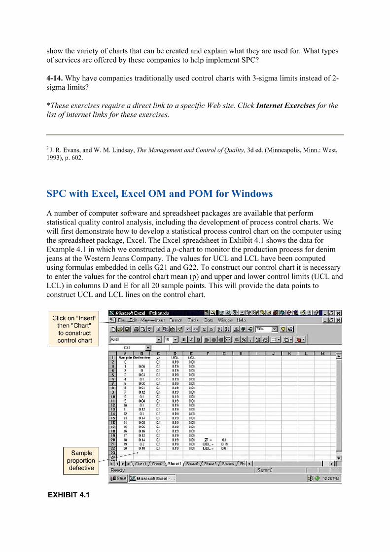
A number of computer software and spreadsheet packages are available that perform statistical quality control analysis, including the development of process control charts. We will first demonstrate how to develop a statistical process control chart on the computer using the spreadsheet package, Excel. The Excel spreadsheet in Exhibit 4.1 shows the data for Example 4.1 in which we constructed a p-chart to monitor the production process for denim jeans at the Western Jeans Company. The values for UCL and LCL have been computed using formulas embedded in cells G21 and G22. To construct our control chart it is necessary to enter the values for the control chart mean (p) and upper and lower control limits (UCL and LCL) in columns D and E for all 20 sample points. This will provide the data points to construct UCL and LCL lines on the control chart.

First, cover all cell values in columns A through E with the mouse and then click on "Insert" on the toolbar at the top of the worksheet. From the Insert window, click on "Chart," which will invoke a window for constructing a chart. Select the range of cells to include in constructing the chart (in this case, all the cells shown in Exhibit 4.1). Click on "Next," which provides a menu of different chart types. Select "line" chart and go to the next window, which provides a menu for selecting the chart format. Select the format that connects the data points with a line and go to the next window, which shows the chart. Make sure you set the columns for the x-axis on "1," which should provide you with a facsimile of the control chart. The next window allows the axis to be labeled, and clicking on "Finish" brings up a full-screen version of the control chart. To clean up the chart, you can double click on the upper and lower control limit lines and the center line to invoke a window in which you can change the line intensity and color, and remove the data markers. To label the control limit lines, you can invoke the "Text Box" window from the toolbar. The resulting p-chart for Example 4.1 is shown in Exhibit 4.2.
Excel OM3 by Howard J. Weiss, published by Prentice Hall, also has macros for computing the control charts developed in this chapter. Recall (from Supplement 2) that after Excel OM is loaded, the various spreadsheet macros are accessed by clicking on "OM" on the toolbar at the top of the spreadsheet. In this case you would next select "Quality Control" from the menu of macros. Exhibit 4.3 shows the Excel OM spreadsheet for the development of a c-chart in our Example 4.2.

POM for Windows4 by Howard J. Weiss, published by Prentice Hall, is a software package for operations management. It has modules for different quantitative techniques used in operations management including statistical quality control. POM for Windows is used throughout this text.
POM for Windows has the capability to develop statistical process control charts for p, c, x, and R. Exhibit 4.4 shows the solution output screen for the R-chart and x-chart developed in Examples 4.3 and 4.4. Exhibit 4.5 shows the graph of the x-chart.

3Howard J. Weiss, Excel OM (Upper Saddle River, N.J.: Prentice Hall, 1998).

4Howard J. Weiss, POM for Windows (Upper Saddle River, N.J.: Prentice Hall, 1996).
Acceptance Sampling
In acceptance sampling, a random sample of the units produced is inspected, and the quality of this sample is assumed to reflect the overall quality of all items or a particular group of items, called a lot. Acceptance sampling is a statistical method, so if a sample is random, it ensures that each item has an equal chance of being selected and inspected. This enables statistical inferences to be made about the population--the lot--as a whole. If a sample has an acceptable number of percentage of defective items, the lot is accepted, but if it has an unacceptable number of defects, it is rejected.
Acceptance sampling is a historical approach to quality control based on the premise that some acceptable number of defective items will result from the production process. The producer and customer agree on the number of acceptable defects, normally measured as a percentage. However, the notion of a producer or customer agreeing to any defects at all is anathema to the adherents of TQM. The goal of companies that have adopted TQM is to achieve zero defects.
TQM companies do not even report the number of defective parts in terms of a percentage because the fraction of defective items they expect to produce is so small that a percentage is meaningless. As we noted previously, the international measure for reporting defects has become defective parts per million, or PPM.5 For example, a defect rate of 2 percent, used in acceptance sampling, was once considered a high-quality standard: 20,000 defective parts per million! This is a totally unacceptable level of quality for TQM companies continuously trying to achieve zero defects. Three or four defects per million would be a more acceptable level of quality for these companies.
Nevertheless, acceptance sampling is still used as a statistical quality control method by many companies who either have not yet adopted TQM or are required by customer demands or government regulations to use acceptance sampling. Since this method still has wide application, it is necessary for it to be studied.
When a sample is taken and inspected for quality, the items in the sample are being checked to see if they conform to some predetermined specification. A sampling plan establishes the guidelines for taking a sample and the criteria for making a decision regarding the quality of the lot from which was taken. The simplest form of sampling plan is a single-sample attribute plan.
Single-Sample Attribute Plan
A single-sample attribute plan has as its basis an attribute that can be evaluated with a simple, discrete decision, such as defective or not defective or good or bad. The plan includes the following elements:

A single sample of size n is selected randomly from a larger lot, and each of the n items is
inspected. If the sample contains d ≤ c defective items, the entire lot is accepted; if d > c, the lot is rejected.
Management must decide the values of these components that will result in the most effective sampling plan, as well as determine what constitutes an effective plan. These are design considerations. The design of a sampling plan includes both the structural components (n, the decision criteria, and so on) and performance measures. These performance measures include the producer's and consumer's risks, the acceptable quality level, and the lot tolerance percent defective.
Producer's and Consumer's Risks. When a sample is drawn from a production lot and the items in the sample are inspected, management hopes that if the actual number of defective items exceeds the predetermined acceptable number of defective items (d > c) and the entire lot is rejected, then the sample results have accurately portrayed the quality of the entire lot. Management would hate to think that the sample results were not indicative of the overall quality of the lot and a lot that was actually acceptable was erroneously rejected and wasted. Conversely, management hopes that an actual bad lot of items is not erroneously accepted if d
≤ c. An effective sampling plan attempts to minimize the possibility of wrongly rejecting good items or wrongly accepting bad items.
When an acceptance-sampling plan is designed, management specifies a quality standard commonly referred to as the acceptable quality level, or AQL. The AQL reflects the consumer's willingness to accept lots with a small proportion of defective items. The AQL is the fraction of defective items in a lot that is deemed acceptable. For example, the AQL might be two defective items in a lot of 500, or 0.004. The AQL may be determined by management to be the level that is generally acceptable in the marketplace and will not result in a loss of customers. Or, it may be dictated by an individual customer as the quality level it will accept. In other words, the AQL is negotiated.
The probability of rejecting a production lot that has an acceptable quality level is referred to
as the producer's risk, commonly designated by the Greek symbol α. In statistical jargon, α is the probability of committing a type I error.
There will be instances in which the sample will not accurately reflect the quality of a lot and a lot that does not meet the AQL will pass on to the customer. Although the customer expects to receive some of these lots, there is a limit to the number of defective items the customer will accept. This upper limit is known as the lot tolerance percent defective, or LTPD (LTPD is also generally negotiated between the producer and consumer). The probability of accepting a lot in which the fraction of defective items exceeds the LTPD is referred to as the
consumer's risk, designated by the Greek symbol β. In statistical jargon, β is the probability of committing a type II error.
In general, the customer would like the quality of a lot to be as good or better than the AQL but is willing to accept some lots with quality levels no worse than the LTPD. Frequently,
sampling plans are designed with the producer's risk (α) about 5 percent and the consumer's risk (β) around 10 percent. Be careful not to confuse α with the AQL or β with the LTPD. If α equals 5 percent and β equals 10 percent, then management expects to reject lots that are as good or better than the AQL about 5 percent of the time, whereas the customer expects to accept lots that exceed the LTPD about 10 percent of the time.

The Operating Characteristic Curve
The performance measures we described in the previous section for a sampling plan can be represented graphically with an operating characteristic (OC) curve. The OC curve measures the probability of accepting a lot for different quality (proportion defective) levels given a specific sample size (n) and acceptance level (c). Management can use such a graph to determine if their sampling plan meets the performance measures they have established for
AQL, LTPD, α, and β. Thus, the OC curve indicates to management how effective the sampling plan is in distinguishing (more commonly known as discriminating) between good and bad lots. The shape of a typical OC curve for a single-sample plan is shown in Figure 4.6.
In Figure 4.6 the percentage defective in a lot is shown along the horizontal axis, whereas the probability of accepting a lot is measured along the vertical axis. The exact shape and location of the curve is defined by the sample size (n) and acceptance level (c) for the sampling plan.
In Figure 4.6, if a lot has 3 percent defective items, the probability of accepting the lot (based on the sampling plan defined by the OC curve) is 0.95. If management defines the AQL as 3
percent, then the probability that an acceptable lot will be rejected (α) is 1 minus the probability of accepting a lot or 1 − 0.95 = 0.05. If management is willing to accept lots with a percentage defective up to 15 percent (i.e., the LTPD), this corresponds to a probability that
the lot will be accepted (β) of 0.10. A frequently used set of performance measures is α = 0.05 and β = 0.10.
Developing a Sampling Plan with POM for Windows
Developing a sampling plan manually requires a tedious trial-and-error approach using statistical analysis. n and c are progressively changed until an approximate sampling plan is obtained that meets the specified performance measures. A more practical alternative is to use a computer software package like POM for Windows, that includes a module for acceptance sampling and the development of an OC curve. Example 4.6 demonstrates the use of POM for Windows to develop a sampling plan.

EXAMPLE
4.6
Developing a Sampling Plan and Operating Characteristic Curve
The Anderson Bottle and China (ABC) Company produces a style of solid-colored blue china exclusively for a large department store chain. The china includes a number of different items that are sold in open stock in the stores, including coffee mugs. Mugs are produced in lots of 10,000. Performance measures for the quality of mugs sent to the stores call for a producer's
risk (α) of 0.05 with an AQL of 1 percent defective and a consumer's risk (β) of 0.10 with a LTPD of 5 percent defective. The ABC Company wants to know what size sample, n, to take and what the acceptance number, c, should be to achieve the performance measures called for in the sampling plan.
SOLUTION:
The POM for Windows solution screens showing the sample plan and operating characteristic curve are as follows in Exhibit 4.6 and Exhibit 4.7.

Sampling plans generally are estimates, and it is not always possible to develop a sampling plan with the exact parameters that were specified in advance. For example, notice in the
solution screen that the actual consumer's risk (β) is .2164 instead of 0.10 as specified.
This sampling plan means the ABC Company will inspect samples of 82 mugs before they are sent to the store. If there are 2 or fewer defective mugs in the sample, the company will accept the production lot and send it on to the customer, but if the number of defects is greater than 2 the entire lot will be rejected. With this sampling plan either the company or the customer or both have decided that a proportion of 1 percent defective mugs (AQL) is acceptable. However, the customer has agreed to accept lots with up to 5 percent defects (LTPD). In other words, the customer would like the quality of a lot to contain no worse than 1 percent defects, but it is willing to accept some lots with no worse than 5 percent defects. The probability that a lot might be rejected given that it actually has an acceptable quality level of 1 percent or less is .0495, the actual producer's risk. The probability that a lot may be accepted given that it has more than 5 percent defects (the LTPD) is .2164, the actual consumer's risk.
Average Outgoing Quality
The shape of the operating characteristic curve shows that lots with a low percentage of defects have a high probability of being accepted, and lots with a high percentage of defects have a low probability of being accepted, as one would expect. For example, using the OC
curve for the sampling plan developed using POM for Windows in Exhibit 4.6 (n = 82, c ≤ 2) for a percentage of defects = 0.01, the probability the lot will be accepted is approximately 0.95, whereas for 0.05, the probability of accepting a lot is relatively small. However, all lots,

whether they are accepted or not, will pass on some defective items to the customer. The average outgoing quality (AOQ) is a measure of the expected number of defective items that will pass on to the customer with the sampling plan selected.
When a lot is rejected as a result of the sampling plan, it is assumed that it will be subjected to a complete inspection, and all defective items will be replaced with good ones. Also, even when a lot is accepted, the defective items found in the sample will be replaced. Thus, some portion of all the defective items contained in all the lots produced will be replaced before they are passed on to the customer. The remaining defective items that make their way to the customer are contained in lots that are accepted.
POM for Windows will also display the AOQ curve. The computer-generated curve corresponding to Exhibits 4.6 and Exhibit 4.7 is shown in Exhibit 4.8.
The maximum point on the curve is referred to as the average outgoing quality limit (AOQL). For our example, the AOQL is 1.67 percent defective when the actual proportion defective of the lot is 2 percent. This is the worst level of outgoing quality that management can expect on average, and if this level is acceptable, then the sampling plan is deemed acceptable. Notice that as the percentage of defects increases and the quality of the lots deteriorate, the AOQ improves. This occurs because as the quality of the lots becomes poorer, it is more likely that bad lots will be identified and rejected, and any defective items in these lots will be replaced with good ones.
Double- and Multiple-Sampling Plans
In a double-sampling plan, a small sample is taken first; if the quality is very good, the lot is accepted, and if the sample is very poor, the lot is rejected. However, if the initial sample is

inconclusive, a second sample is taken and the lot is either accepted or rejected based on the combined results of the two samples. The objective of such a sampling procedure is to save costs relative to a single-sampling plan. For very good or very bad lots, the smaller, less expensive sample will suffice and a larger, more expensive sample is avoided.
A multiple-sampling plan, also referred to as a sequential-sampling plan, generally employs the smallest sample size of any of the sampling plans we have discussed. In its most extreme form, individual items are inspected sequentially, and the decision to accept or reject a lot is based on the cumulative number of defective items. A multiple-sampling plan can result in small samples and, consequently, can be the least expensive of the sampling plans.
The steps of a multiple-sampling plan are similar to those for a double-sampling plan. An initial sample (which can be as small as one unit) is taken. If the number of defective items is less than or equal to a lower limit, the lot is accepted, whereas if it exceeds a specified upper limit, the lot is rejected. If the number of defective items falls between the two limits, a second sample is obtained. The cumulative number of defects is then compared with an increased set of upper and lower limits, and the decision rule used in the first sample is applied. If the lot is neither accepted or rejected with the second sample, a third sample is taken, with the acceptance/rejection limits revised upward. These steps are repeated for subsequent samples until the lot is either accepted or rejected.
Choosing among single-, double-, or multiple-sampling plans is an economic decision. When the cost of obtaining a sample is very high compared with the inspection cost, a single-sampling plan is preferred. For example, if a petroleum company is analyzing soil samples from various locales around the globe, it is probably more economical to take a single, large sample in Brazil than to return for additional samples if the initial sample is inconclusive. Alternatively, if the cost of sampling is low relative to inspection costs, a double- or multiple-sampling play may be preferred. For example, if a winery is sampling bottles of wine, it may be more economical to use a sequential sampling plan, tasting individual bottles, than to test a large single sample containing a number of bottles, since each bottle sampled is, in effect, destroyed. In most cases in which quality control requires destructive testing, the inspection costs are high compared with sampling costs.
4-15. How is the sample size determined in a single-sample attribute plan?
4-16. How does the AQL relate to producer's risk (α) and the LTPD relate to consumer's risk (β)?
4-17. Why is the traditional view of quality control reflected in the use of acceptance sampling unacceptable to adherents of TQM?
4-18. Under what circumstances is the total inspection of final products necessary?
4-19. What is the difference between acceptance sampling and process control?
4-20. Explain the difference between single-, double-, and multiple-sampling plans.

5B. B. Flynn, "Managing for Quality in the U.S. and in Japan," Interfaces 22, no. 5 (1992): 6980.
Summary
Statistical process control is the main quantitative tool used in TQM. Companies that have adopted TQM provide extensive training in SPC methods for all employees at all levels. Japanese companies have provided such training for many years, whereas U.S. companies have only recently embraced the need for this type of comprehensive training. One of the reasons U.S. companies have cited for not training their workers in SPC methods was their general lack of mathematical knowledge and skills. However, U.S. companies are now beginning to follow the Japanese trend in upgrading hiring standards for employees and giving them more responsibility for controlling their own work activity. In this environment employees recognize the need for SPC for accomplishing a major part of their job, product quality. It is not surprising that when workers are provided with adequate training and understand what is expected of them, they have little difficulty using statistical process control methods.
Key Formulas
Control Limits for p-Charts
Control Limits for c-Charts
Control Limits for R-Charts
Control Limits for x-Charts
Case Problems
CASE PROBLEM 4.1
Quality Control at Rainwater Brewery
Bob Raines and Megan Waters own and operate the Rainwater Brewery, a micro-brewery that grew out of their shared hobby of making home-brew. The brewery is located in Whitesville, the home of State University where Bob and Megan went to college.
Whitesville has a number of bars and restaurants that are patronized by students at State and the local resident population. In fact, Whitesville has the highest per capita beer consumption in the state. In setting up their small brewery, Bob and Megan decided that they would target their sales toward individuals who would pick up their orders directly from the brewery and toward restaurants and bars, where they would deliver orders on a daily or weekly basis.
The brewery process essentially occurs in three stages. First, the mixture is cooked in a vat according to a recipe; then it is placed in a stainless-steel container, where it is fermented for several weeks. During the fermentation process the specific gravity, temperature, and pH need to be monitored on a daily basis. The specific gravity starts out at about 1.006 to 1.008 and decreases to around 1.002, and the temperature must be between 50 and 60 degrees Fahrenheit. After the brew ferments, it is filtered into another stainless-steel pressurized container, where it is carbonated and the beer ages for about a week (with the temperature monitored), after which it is bottled and is ready for distribution. Megan and Bob brew a batch of beer each day, which will result in about 1,000 bottles for distribution after the approximately three-week fermentation and aging process.
In the process of setting up their brewery, Megan and Bob agreed they had already developed a proven product with a taste that was appealing, so the most important factor in the success of their new venture would be maintaining high quality. Thus, they spent a lot of time discussing what kind of quality control techniques they should employ. They agreed that the chance of brewing a "bad," or "spoiled," batch of beer was extremely remote, plus they could not financially afford to reject a whole batch of 1,000 bottles of beer if the taste or color was a little "off" the norm. So they felt as if they needed to focus more on process control methods to identify quality problems that would enable them to adjust their equipment, recipe, or process parameters rather than to use some type of acceptance sampling plan.
Describe the different quality control methods that Rainwater Brewery might use to ensure good-quality beer and how these methods might fit into an overall TQM program.
CASE PROBLEM 4.2

Quality Control at Grass, Unlimited
Mark Sumansky owns and manages the Grass, Unlimited, lawn-care service in Middleton. His customers include individual homeowners and businesses that subscribe to his service during the winter months for lawn care beginning in the spring and ending in the fall with leaf raking and disposal. Thus, when he begins his service in April he generally has a full list of customers and does not take on additional customers unless he has an opening. However, if he loses a customer any time after the first of June, it is difficult to find new customers, since most people make lawn-service arrangements for the entire summer.
Mark employs five crews, with between three to five workers each, to cut grass during the spring and summer months. A crew normally works 10-hour days and can average cutting about 25 normal-size lawns of less than a half-acre each day. A crew will normally have one heavy-duty, wide-cut riding mower, a regular power mower, and trimming equipment. When a crew descends on a lawn, the normal procedure is for one person to mow the main part of the lawn with the riding mower, one or two people to trim, and one person to use the smaller mower to cut areas the riding mower cannot reach. Crews move very fast, and they can often cut a lawn in 15 minutes.
Unfortunately, although speed is an essential component in the profitability of Grass, Unlimited, it can also contribute to quality problems. In his or her haste, a mower might cut flowers, shrubs, or border plants, nick and scrape trees, "skin" spots on the lawn creating bare spots, trim too close, scrape house paint, cut or disfigure house trim, and destroy toys and lawn furniture, among other things. When these problems occur on a too-frequent basis, a customer cancels service, and Mark has a difficult time getting a replacement customer. In addition, he gets most of his subscriptions based on word-of-mouth recommendations and retention of previous customers who are satisfied with his service. As such, quality is a very important factor in his business.
In order to improve the quality of his lawn-care service, Mark has decided to use a process control chart to monitor defects. He has hired Lisa Anderson to follow the teams and check lawns for defects after the mowers have left. A defect is any abnormal or abusive condition created by the crew, including those items just mentioned. It is not possible for Lisa to inspect the more than 100 lawns the service cuts daily, so she randomly picks a sample of 20 lawns each day and counts the number of defects she sees at each lawn. She also makes a note of each defect, so that if there is a problem, the cause can easily be determined. In most cases the defects are caused by haste, but some defects can be caused by faulty equipment or by a crew member using a poor technique or not being attentive.
Over a three-day period Lisa accumulated the following data on defects:

Develop a process control chart for Grass, Unlimited, to monitor the quality of its lawn
service using 2α limits. Describe any other quality control or quality management procedures you think Grass, Unlimited, might employ to improve the quality of its service.
CASE PROBLEM 4.3
Improving Service Time at Dave's Burgers
Dave's Burgers is a fast-food restaurant franchise in Georgia, South Carolina, and North Carolina. Recently Dave's Burgers has followed the lead of larger franchise restaurants like Burger King, McDonald's, and Wendy's and constructed drive-through windows at all its locations. However, instead of making Dave's Burgers more competitive, the drive-through windows have been a source of continual problems, and it has lost market share to its larger competitors in almost all locations. To identify and correct the problems top management has selected three of its restaurants (one in each state) as test sites and has implemented a TQM program at each of them. A quality team made up of employees, managers, and quality specialists from company headquarters, at the Charlotte, North Carolina, test restaurant using traditional TQM methods like Pareto charts, check sheets, fishbone diagrams, and process flowcharts, have determined that the primary problem is slow, erratic service at the drive-through window. Studies showed that from the time a customer arrived at the window to the time the order is received averages 2.6 minutes. To be competitive management believes service time should be reduced to at least 2.0 minutes and ideally 1.5 minutes.
The Charlotte Dave's Burgers franchise implemented a number of production process changes to improve service time at the drive-through window. It provided all employees with more training across all restaurant functions, improved the headset system, improved the equipment layout, developed clearer signs for customers, streamlined the menu, and initiated even-dollar (tax inclusive) pricing to speed the payment process. Most importantly the restaurant installed large, visible electronic timers that showed how long a customer was at the window. This not

only allowed the quality team to measure service speed but also provided employees with a constant reminder that a customer was waiting.
These quality improvements were implemented over several months and their effect was immediate. Service speed was obviously reduced and market share at the Charlotte restaurant increased by 5 percent. To maintain quality service, make sure the service time remained fast, and continue to improve service, the quality team decided to use a statistical process control chart on a continuing basis. They collected six service time observations daily over a fifteen-day period, as follows:
Construct a control chart to monitor the service at the drive-through window. Determine if your control chart can be implemented on a continuing basis or if additional observations need to be collected. Explain why the chart you developed can or cannot be used. Also discuss what other statistical process control charts might be used by Dave's Burgers in its overall quality management program.
References
Charbonneau, H. C., and G. L. Webster. Industrial Quality Control. Englewood Cliffs, N.J.: Prentice Hall, 1978.
Dodge, H. F., and H. G. Romig. Sampling Inspection Tables--Single and Double Sampling, 2d ed. New York: John Wiley & Sons.
Duncan, A. J. Quality Control and Industrial Statistics, 4th ed. Homewood, Ill.: Irwin, 1974.
Evans, James R., and William M. Lindsay. The Management and Control of Quality, 3d ed. St. Paul, Minn.: West, 1993.
Fetter, R. B. The Quality Control System. Homewood, Ill.: Irwin, 1967.
Grant, E. L., and R. S. Leavenworth. Statistical Quality Control, 5th ed. New York: McGraw-Hill, 1980.
Montgomery, D. C. Introduction to Statistical Quality Control, 2d ed. New York: John Wiley & Sons, 1991.