mapping social relationships - psychnology3)/psychnology_journal_6_3_s… · a design framework for...
TRANSCRIPT
PsychNology Journal, 2008Volume 6, Number 3, 225 – 246
225
A Design Framework for Mapping Social Relationships
Alistair Sutcliffe *¨
¨ Manchester Business School(United Kingdom)
ABSTRACTThis paper describes a design framework for representing social-spatial data on maps anddiagrams and then illustrates the design approaches for representing social data in twoapplications. One derives from a project which compared social relationships,organisational structures and social networks of organisational members. The secondproject produced visualisation tools to support epidemiological investigations of obesity.The mapping approaches for different types of social data are illustrated with case studies.
Keywords: visualization, social data, representational design.
Paper Received 12/06/2008; received in revised form 23/09/2008; accepted 03/11/2008.
1. Introduction
Mapping social data poses new challenges in representing data in visual formats.
While data visualisation has been extensively researched and several set of
guidelines exist for designing and choosing appropriate representations in charts,
diagrams and maps (Bertin, 1983; Spence, 2001; Tufte, 1997; Ware, 2000), social
phenomena have grown in importance in recent years and design of socio-spatial
representations has not been explicitly addressed in the literature. Representations
have been oriented towards social network analysis (Martino & Spoto 2006), where
diagrams are automatically generated to show relationship connections between
individuals (Freeman, 2006). Alternatively, cartographers have represented social and
economic data in maps and geographic information systems for many years.
However, the complexity of social data, particularly when relationships, social
Cite as:Sutcliffe, A. (2008). A design framework for mapping social relationships. PsychNology Journal,6(3), 225 –246. Retrieved [month] [day], [year], from www.psychnology.org.
* Corresponding Author: Alistair SutcliffeManchester Business School, University of ManchesterManchester M60 1QD, [email protected]
A. Sutcliffe
226
networks and groups are considered in a spatial context, challenges existing designs.
This paper explores the design space for representing socio-spatial data, proposes a
design framework and illustrates its use in two projects.
The first project, TESS (Theory for Evolving Socio-technical Systems) project** is
investigating the relationships between people in social networks and the role of inter-
personal relationships within groups. The motivation is to analyse how social
networks contribute towards group effectiveness and how people identify with groups
and collective aims. Small Group Theory (Arrow, McGrath & Berdahl, 2000) predicts
that one of the desiderata of effective groups is a well developed social network,
which can help coordinate individual action as well as developing trust between
members to work collaboratively (Fukuyama, 1995). However, there is little firm data
on the contribution of individual relationships to group success. This paper reports a
preliminary analysis supported by visualisation of social networks and group working
in charities.
The second project, ADVISES (Sutcliffe et al., 2007) is developing software to
facilitate geographical visualisation in epidemiology and public health decision-
making. Epidemiologists investigate the distribution and determinants of diseases and
other health-related states in defined populations. Within epidemiology, many of the
simpler causes of disease have been identified, leaving today’s epidemiologists the
difficult task of finding more subtle causal associations, which may involve complex,
interacting networks of factors that determine health and disease. The interactions
may operate across different scales of organisation, for example: molecular/genetic;
environmental; and social lifestyle factors. One approach to investigating complex
conditions is to use data-driven hypothesis discovery methods as a complement to
hypothesis-driven experimentation (Wilkinson, 2005). Since much data is social and
spatial in nature, visualisation and map-based representations are a key to discovery-
based methods.
The aims of this paper are twofold: first to propose and illustrate a visual mapping
approach for the analysis of inter-organisational as well as interpersonal relationships;
and secondly to report experience in developing and applying a design approach to
socio-spatial data visualisation in research on social relationships and epidemiology
of social influences on obesity.
** http://informat.web.man.ac.uk/research/groups/isd/projects/dtess/
A design framework for mapping social relationships
227
2. Mapping Social Information
Many guidelines have been produced for designing cartographic representations
(Bertin, 1983; Tufte, 1997); however, most data which has been represented in
geographic information systems has not involved social relationships. The first
question concerns defining the types of information involved in social data. The prime
distinction is between data relating to socio-economic attributes of the individual,
social relationships between individuals, relationships between individuals and large
entities, i.e. groups, organisational units, and finally population-level data describing
attributes of groups, tribes or whole societies.
Examples of data at each level are:
· Individual social attributes: socio-economic class, social attitudes.
· Social relationships: individuals involved, relationship strength, type.
· Group relationships: membership, role in group, measures of identity with the
group.
· Group attributes: average age of members, gender distribution, group goal,
performance.
Social data is therefore either attributional or relational at both individual and group
levels and can be reduced to the basic form:
· Individual entity <attributes>
· Relationship <entity 1..n, type, attributes>
2.1 Mapping Social Data to Visual Forms
Visual coding of such data can be realised either by network diagrams to show
relationships by charts with distributions of individuals according to one or more
attributes, e.g. frequencies of people in an area by socio-economic status. When
spatial data is added, representation in a geographic area is necessary. This
increases the complexity of the design problem, since graphics have to be overlaid on
a map. In the case of entity-attribute data either the data has to be coded as points or
areas on the map, or graphic elements have to be added to maps; for instance,
histogram bars can be placed in map areas to show frequencies of people in different
socio-economic classes. The disadvantage of graphical overlays is that the scales in
the graph are difficult to add to the map without distortion or obscuring cartographic
detail, hence understanding the representation can become error prone. The
alternative of coding data directly on the map is increasing the learning burden on the

A. Sutcliffe
228
reader who has to understand new coding conventions, and secondly the limitation in
the number of variables that can be represented. Possible choices for representing
social data standalone and associated with maps are summarised in Table 1.
When relationship data is mapped, the design problem is confounded by possible
clashes between the topography of the network and the topology of the map, so if
people are related within one area or in adjacent areas it is simple to overlay a
diagram on top of the map, but when relationships are separated by distance then
there is an inevitable compromise between scale of the map and representing the
network diagram faithfully. A small scale map (zoom out) is a partial solution as it can
show people who are related in distant areas.
Data type Non-geographic representation Representation on mapsIndividual social attributes graphs, histograms, scatterplots data points, icons,
area coding for meansSocial relationships hierarchy or network diagrams networks overlaid on map
areasSocial group attributes graphs, histograms, scatterplots data points, icons,
area coding for means
Table 1. Cartographic and non-cartographic representation choices
Social data representation is determined partly by the data type, and partly by the
task. For individual data points (see Table 2) the choice is use of colour, shape, and
size to code up to three attributes. Shape can be used as a symbol set to denote
categories (e.g. squares, triangles, circles) or icons for more mnemonic
representations. More detailed design guidelines for visual coding can be found in
Spence (2001), Ware (2000) or Wilkinson (2005). Relationships represented by arcs
can be code attributes by line thickness, line type (dotted, etc.), or colour. Group area
coding is limited to colour and texture, hence only two attributes can be shown at
once. More might be represented, for example by 3D effects (area thickness or
histogram bar overlays), but this increases visual complexity and reading accurate
values in 3D representations in not easy (Ware, 2000).
Data type Visual representationsIndividual data points size, shape (icons), colourRelationships size (width), texture (shading, line thickness), colourGroups (area/means) colour, texture, overlays, 3D bars, etc.
Table 2. Visual representation of data types on maps
A design framework for mapping social relationships
229
2.2 Design Space
The broader perspective of design for social maps needs to be assessed using
cognitive criteria to judge trade-offs when matching design options to users’ needs.
The cognitive criteria for judging the effectiveness of maps and any complex visual
displays are:
· Learning costs: if information is coded visually using colour, symbols, etc.,
then the user has to learn the coding convention to understand which
variables and values have been shown. More complexity in coding
increases the learning burden, so this criterion favours simple displays.
· Information volume and complexity: this will be determined by the domain
and task. For complex analyses the connection between many different
datasets may need to be made. This presents a trade-off between
displaying a large quantity of information concurrently, or spreading the
information across several screens and thereby reducing complexity.
· Working memory: given the limited capacity of working memory (Baddeley,
1986), spreading information across many screens increases the
probability of losing the thread of the argument while paging between
windows. Taking notes is one remedy but this takes time. In contrast,
concurrent representation of different types of information on one screen
allows rapid scanning to see associations between different datasets;
however, crowding more information on one screen increases complexity
and this can also lead to working memory loss.
· Interaction costs: if complexity is reduced by spreading information across
more screens, this increases interaction costs as users page between
screens. This cost also applies to dynamically configurable displays in
which the information display is under user control by invoking filters to
determine which sub-set of data is displayed or overlaid on a map.
The criteria pose conflicting demands so there is no optimal design for all contexts.
The design space is summarised in Figure 1. Tiled displays minimise learning and
working memory problems, but they are prone to information crowding, which can
mitigate any gains as complexity rises. Sequential displays impose more interaction
costs and possible forgetting due to working memory burdens. Overlays increase
complexity, but may be unavoidable for complex datasets and tasks. These design
choices need to be driven by a sound analysis of the users and their tasks to assess
trade-offs between learning and interaction costs with the objective of reducing
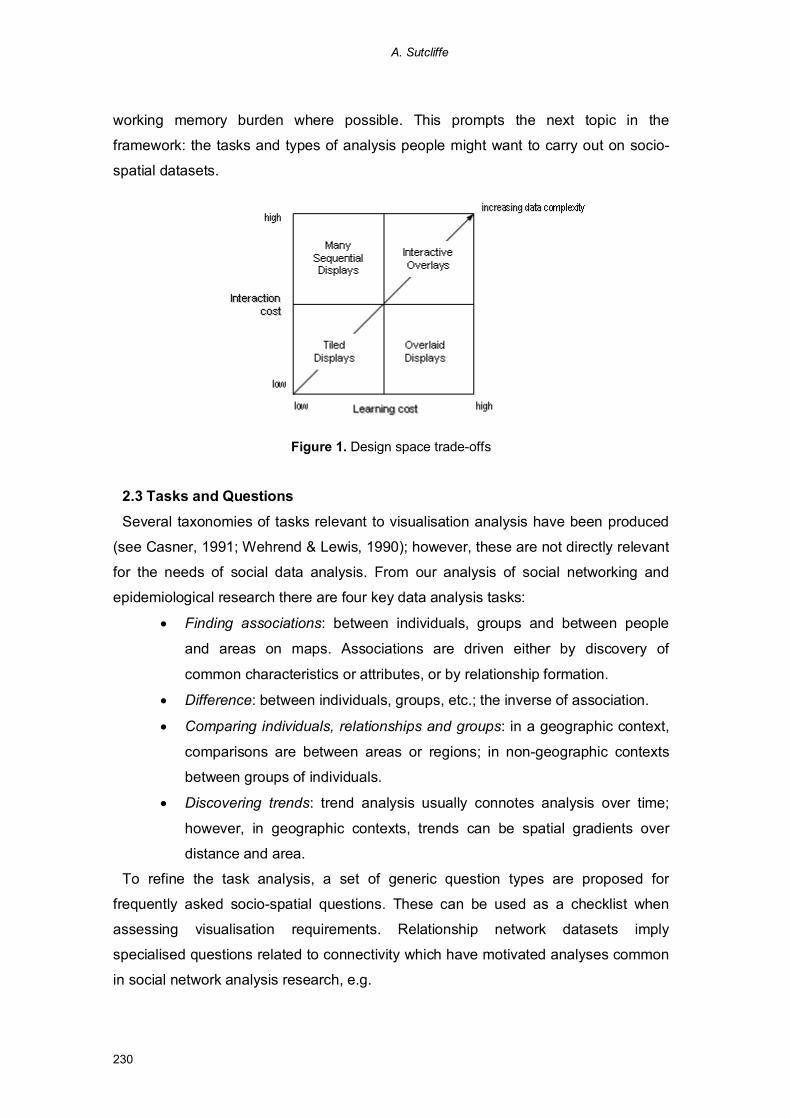
A. Sutcliffe
230
working memory burden where possible. This prompts the next topic in the
framework: the tasks and types of analysis people might want to carry out on socio-
spatial datasets.
Figure 1. Design space trade-offs
2.3 Tasks and Questions
Several taxonomies of tasks relevant to visualisation analysis have been produced
(see Casner, 1991; Wehrend & Lewis, 1990); however, these are not directly relevant
for the needs of social data analysis. From our analysis of social networking and
epidemiological research there are four key data analysis tasks:
· Finding associations: between individuals, groups and between people
and areas on maps. Associations are driven either by discovery of
common characteristics or attributes, or by relationship formation.
· Difference: between individuals, groups, etc.; the inverse of association.
· Comparing individuals, relationships and groups: in a geographic context,
comparisons are between areas or regions; in non-geographic contexts
between groups of individuals.
· Discovering trends: trend analysis usually connotes analysis over time;
however, in geographic contexts, trends can be spatial gradients over
distance and area.
To refine the task analysis, a set of generic question types are proposed for
frequently asked socio-spatial questions. These can be used as a checklist when
assessing visualisation requirements. Relationship network datasets imply
specialised questions related to connectivity which have motivated analyses common
in social network analysis research, e.g.

A design framework for mapping social relationships
231
· Connectivity: degree to which one individual is connected to others in the
network. This may be calculated by the number of relationships per
individual or the overall link density for the whole network.
· Centrality: degree to which one individual is connected to others in the
network compared to other individuals; a measure of how much one
person is the hub of a network.
· Distance: between two individuals by counting the shortest relationship
path between them
· Bridging: the degree to which one individual connects other networks. This
question is usually answered by visual inspection rather than calculating
metrics.
When geography is considered, social data can be analysed with the following
generic questions:
· Where: in terms of location of an individual, group or set of relationships.
· Proximity: of individuals, etc. to a location; area which depends on
interpretation of what proximity means in terms of distance.
· Distance: questions about proximity which expect a distance value as the
answer.
· Adjacency: of individuals or groups to a location or area, assuming the
location of the individuals is known.
· Pathway: are individuals, groups, or relationships linked in a spatial
contiguous pathway; as well as for relationships, a network pathway.
· Spatial trend: do individuals, groups, etc. form a continuous gradient
across an area.
· Clustering: do individuals, groups etc show an uneven distribution with
clumps in certain areas. The inverse of this question is sparseness.
The question types and tasks are used to analyse users’ requirements for socio-
spatial mapping and the interactive support in terms of filters and controls for querying
social map representations. The design process progresses from task/questions
analysis to consider the high-level design trade-offs using Table 1, and the
dimensions in Figure 1 before planning the visual data coding using Table 2 and
specifying interactive controls for data display and querying. The following sections
illustrate how the design framework was applied to design interactive visualisations of
social map data in two projects: the TESS project which researched social networking
and group relationships, and the ADVISES project which is producing visualisation

A. Sutcliffe
232
tools to support epidemiological research into social factors influencing childhood
obesity, and other topics.
3. Social Networking Case Study
The data comes from two studies: one on not-for-profit organisations in State
College, Pennsylvania, USA in May-June 2007; and the other taken from analysis of
social relationships in an inter-organisational collaboration in UK charities. Not-for-
profits, or charities in the UK, are good test cases for studying the intersection of
social and organisational relationships. People tend to work for charities because of a
deep personal commitment to society, a community or a cause, so their work
becomes more than a commercial job. Individuals who work for charities tend to
share similar interests and world views, hence there is a good chance that they will be
members of the same social networks.
Data was collected from five organisations via interviews with 12 key personnel in
those organisations, by attending meetings, and by documentation analysis from
websites and other public sources of information on the charities and their personnel.
3.1 Organisational Mapping
CASE (Community for Arts, Society and Education) is an umbrella charity which
aims to create a multi-tenant not-for-profit facility, so several charities can share the
building, office staff, IT support facilities and business functions. Approximately 120
such shared facilities exist in the USA and Canada. The organisation map for CASE
is illustrated in figure 2.
Figure 2. Organisation map of CASE showing organisation structure and memberorganisations. Four individuals were members of both the board and the executive team
A design framework for mapping social relationships
233
This representation uses network diagrams to show social relationships with contour
boundaries to delineate different layers in the organisation. This enables social and
working relationships in a peer-peer community to be compared with the
organisations which they represent. Colour coding is used to show which individuals
participated in different layers of the organisation. The organisation structure of CASE
is more complex than a standalone charity since it aims to serve many charities. In
common with other charities it has a board which is responsible for policy and
strategic management; however, in CASE the board is also composed of
representatives from the client organisations as well as the prime organisers of CASE
itself. The executive is composed of five individuals who are the main contributors to
and organisers of CASE itself. Four of the executive team are also board members.
As all members of the CASE board and executive are also members of client
charities, there is a potential conflict of interest between CASE and its clients.
However, personal relationships within the board membership could also reduce the
need for governance between CASE and its client charities, and hence save money
by reducing transaction costs, e.g. legal fees for contracts.
3.2 Relationship Mapping
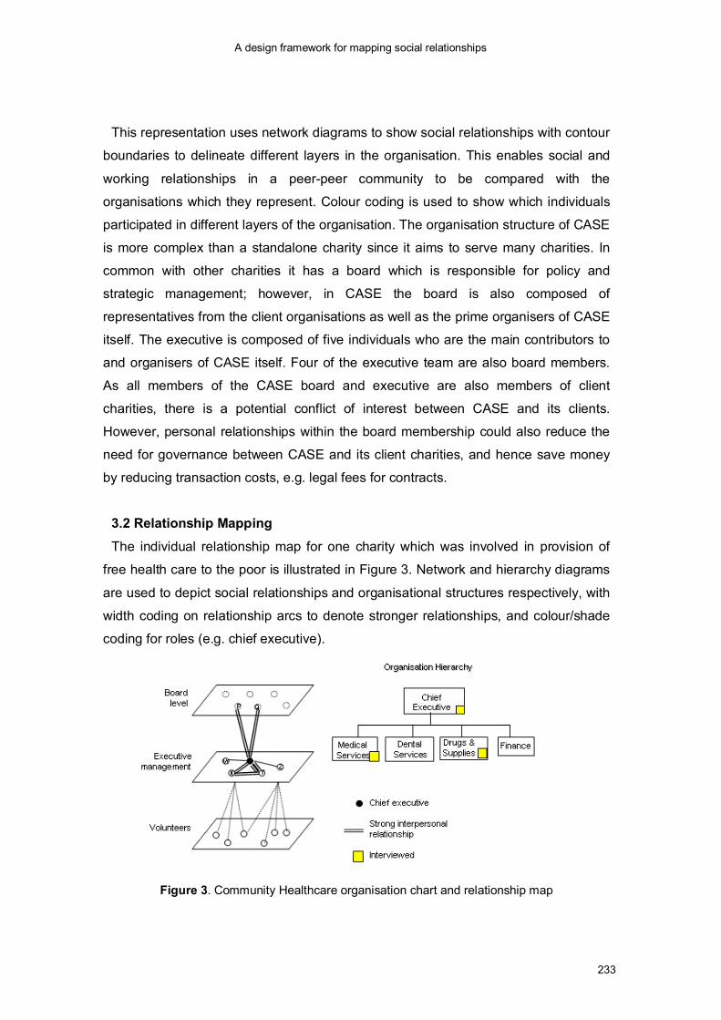
The individual relationship map for one charity which was involved in provision of
free health care to the poor is illustrated in Figure 3. Network and hierarchy diagrams
are used to depict social relationships and organisational structures respectively, with
width coding on relationship arcs to denote stronger relationships, and colour/shade
coding for roles (e.g. chief executive).
Figure 3. Community Healthcare organisation chart and relationship map
A. Sutcliffe
234
Individuals and relationships are set in the perspective of areas to depict layers in the
organisational hierarchy. Analysis tasks are to discover associations between
individuals and their connections between organisational layers.
The relationship map of the chief executive is illustrated. She interacted with two
colleagues, X, Y, who also held managerial positions coordinating volunteer doctors
and provision of medicines and supplies. She also had close relationships with the
chair of the board and another key board member. All these relationships were
characterised as mixed social and professional, with the relationships between the
two colleagues at the executive level being rated as very close. The chief executive
and her colleagues also knew many of the volunteers personally. Hence the chief
executive’s relationships provided a social and organisational glue not only to ensure
smooth functioning in the core business but also between the executive team and
members of the board. The close relationships spanned only part of the
organisational hierarchy; however, medical supplies and drug suppliers were the most
important business functions, and these were underpinned by personal relationships.
These relationships helped the Community Healthcare organisations to function
effectively without formal monitoring and line-management control procedures,
because problems were anticipated and solved by frequent interpersonal
communication. While most communication was face to face, frequent e-mail contact
also played a part, especially between the executive members and the board as well
as the volunteers.
The individual relationship map for the CASE charity, at the executive level, is
shown in Figure 4.
Figure 4. Individual relations and organisation affiliation for CASE: executive level
A design framework for mapping social relationships
235
Network diagrams were the natural choice for social relationships with coding on the
arcs for strength. Organisational memberships of the individuals was added to the
diagram so the connections between individuals and different organisations could be
traced, Four executive team members had close individual relationships which were
mixed social and professional (shown with shading in Figure 4), although the one
member of the executive team who was not interviewed, did not appear to be
included in this social network. For two executive board members their relationship
also appeared in the client charity in which they were both board members. Inter-
individual networking was common among board members in most of the charities as
the same individuals appeared on several boards, and this became more apparent
when the history of board membership was considered.
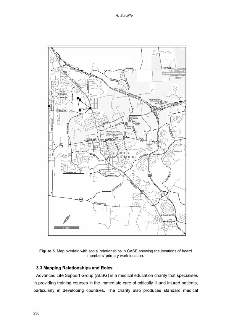
When geography is added to the analysis (see Figure 5), is can been seen that the
social relationships might be correlated with spatial distribution.
Although several CASE board members were also on the boards of two or more
charities, the relationships between CASE board members, apart from the inner
executive team, was less clear. One client organisation board member did not appear
to work closely with any members of the CASE team and no particular relationship
was reported. In this case, membership was seen as a simple business proposition
for lower costs in the parent organisation. This dissonance between the individual
relationship network and organisation may pose problems for CASE in the future. The
inner executive team all work closely together and have developed trust, which bodes
well for delivering their objectives. However, some of the client organisations may
have a more tenuous link with CASE. The network diagram was overlaid on the map
to facilitate analysis of social relationships and spatial distribution; and the spatial
isolation of one board member (E in figure 4) suggests a possible cause for his poor
integration: distance matters. Figure 5 illustrates some of the problems inherent in
integrating representations. Network links on the map cause distortion of the original
network diagram in figure 4, and some relationship arcs have been omitted to reduce
clutter on the map. Furthermore, the organisational membership of the board
members has been omitted for a similar reason. While the location of the
organisations could be shown in a separate view, figure 5 illustrates a general design
problem in map overlays. Adding more information aids the interpretation of a spatial
context, but at the penalty of obscuring some detail on the map and making dense
images such as maps even more complex.
A. Sutcliffe
236
Figure 5. Map overlaid with social relationships in CASE showing the locations of boardmembers’ primary work location.
3.3 Mapping Relationships and Roles
Advanced Life Support Group (ALSG) is a medical education charity that specialises
in providing training courses in the immediate care of critically ill and injured patients,
particularly in developing countries. The charity also produces standard medical
A design framework for mapping social relationships
237
textbooks in the area of trauma medicine, which have earned them a worldwide
reputation as an authority for research and expertise in this field. As a result, ALSG is
concerned to maintain the high standard of their courses and medical texts, and
exercises a stringent quality control procedure. The charity has numerous
relationships with other organisations, including NHS Trusts and other charities. The
actor and goal dependencies between members of the charity-based alliance are
illustrated in Figure 6.
Figure 6. Strategic dependency model for the ALSG alliance using the i* modelling language
In the previous examples, simple diagram formats which have intuitive or easily
learned meanings were used. While this lowers the learning cost for these
representations, it limits the sophistication of the information that can be represented.
In Figure 6 a formal diagram notation is used which requires more learning. Shape is
used to code types of nodes. Circles represent actors who may be individual people,
or groups or organisations as in this case (Doctors, Health Authorities). Squares
represent resources or materials, while rounded boxes denote intentions or goals
owned by the actors. Finally the cloud symbol is used for quality criteria, called soft
goals in the i* star notation (Yu 1994). To read the diagram you have to know that the
ALSGCharity
BritishMedicalJournal
HealthAuthorities
UKDoctors
ThirdWorld
Doctors
Improvemedical
care
Publishedmaterial
Preparematerial
s
Undertaketraining
Publishmaterials
Provideresource
s

A. Sutcliffe
238
arcs denote dependency between actors to deliver a goal, so Third World Doctors
depend on the ALSG charity to provide training (not exclusively of course, but in this
modelled world) and UK doctors to prepare training material. The direction of the
relationship Dependee (recipient), Depends on (provider) is denoted by the direction
of the Ds on the arc. The notation is complex, but the payoff is the ability to represent
several complex associations on one diagram, i.e. social and work relationships
between actors, goals and intent, as well as how resources and activities (not shown)
fit into the model.
Four organisation-level actors in the alliance were the doctors in the Third World
who were recipients of the medical training material donated by the ALSG charity.
The charity depends on UK medical professionals to donate their time in creating
training material and to give courses. However, most of the training material is
already subject to copyright agreement with medical journals, hence the charity also
depends on the good will of the British Medical Journal which publishes the material.
Furthermore, it depends on health authorities who employ doctors to give them leave
so they can undertake training in the Third World. These dependencies are reflected
in the goals “provide resources”, “undertake training” and “prepare materials”, which
contribute to the soft goal of improved quality of medial care. While the dependency
analysis gives some understanding of the inter-organisational relationship it does not
uncover the tensions between the partners.
The association has not been without its problems. An examination of one incident
illustrates an interesting aspect of the relationship between a prestigious international
journal and a comparatively small not-for-profit organisation. The Director of ALSG
described a “supply chain” problem that directly affected the quality of the works. In
order to cope with the increasing demand for publishing services by ALSG, the BMJ
employed a new printer who did not have sufficient resources to do a quality job. The
result was that the newest medical textbook emerged from the printers full of textual
errors. This created the frustration of extra work for the Director and her staff, in
proof-reading the text and correcting errors. However, the greater potential for
damage was to the relationship of trust that has built up between the charity and the
BMJ, and to ALSG’s much valued reputation as a fund of medical expertise.
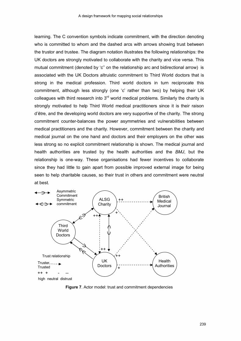
Analysis of commitments and trust shows how the power asymmetries in the
relationships are counter-balanced (see Figure 7). Further symbols (shape coding)
have been introduced to represent the type (trust and commitment) and strength of
the relationships. This refines the notation of dependency, albeit at the cost of
A design framework for mapping social relationships
239
learning. The C convention symbols indicate commitment, with the direction denoting
who is committed to whom and the dashed arcs with arrows showing trust between
the trustor and trustee. The diagram notation illustrates the following relationships: the
UK doctors are strongly motivated to collaborate with the charity and vice versa. This
mutual commitment (denoted by ‘c’’ on the relationship arc and bidirectional arrow) is
associated with the UK Doctors altruistic commitment to Third World doctors that is
strong in the medical profession. Third world doctors in turn reciprocate this
commitment, although less strongly (one ‘c’ rather than two) by helping their UK
colleagues with third research into 3rd world medical problems. Similarly the charity is
strongly motivated to help Third World medical practitioners since it is their raison
d’être, and the developing world doctors are very supportive of the charity. The strong
commitment counter-balances the power asymmetries and vulnerabilities between
medical practitioners and the charity. However, commitment between the charity and
medical journal on the one hand and doctors and their employers on the other was
less strong so no explicit commitment relationship is shown. The medical journal and
health authorities are trusted by the health authorities and the BMJ, but the
relationship is one-way. These organisations had fewer incentives to collaborate
since they had little to gain apart from possible improved external image for being
seen to help charitable causes, so their trust in others and commitment were neutral
at best.
Figure 7. Actor model: trust and commitment dependencies
ALSGCharity
BritishMedicalJournal
HealthAuthorities
UKDoctors
ThirdWorld
Doctors
Trust relationship
++ + - --
++
++
++
+
++
+TrusterTrusted
high neutral distrust
AsymmetricCommitmentSymmetriccommitment
A. Sutcliffe
240
The two representations can be viewed in juxtaposition to compare inter-actor
dependencies, commitment and trust. While it is possible to include all the
relationships in one diagram, this make the resulting representation very complex,
leading to increased learning and working memory burdens. Following the principle of
separation of concerns, we believe is it more effective to keep the representations
separate but view them concurrently to reduce working memory loss.
4. Mapping Social Causations in Epidemiology
The representations reviewed in previous sections have been paper-based
illustrations for scientific analysis using conventional software tools. In this section the
design of computer-based interactive visualisations is reviewed. The ADVISES
(ADaptive VISualisation of E-Science) project is developing tools to support the use of
geographic visualisation in epidemiology and public health decision making.
Epidemiologists investigate the distribution and determinants of diseases and other
health-related states. Geography is often a factor in epidemiological investigations,
whether comparing the distribution of a disease within two populations, or considering
ease of access to health services across a Primary Care Trust. Despite this, GIS tools
are underused in epidemiology due to their complexity for non-GIS expert users.
We used scenarios to explore ways the system could support users’ research
questions. Scenarios were based on research questions, and we imagined how the
system could support investigation and exploration of data, for example:
· What are the characteristics of the GP Registered Population in the North-
West? A scenario describing how a user could explore a map of patients
registered to Primary Care Trusts in the North West, stratifying the
population by location, gender and ethnicity.
· Is there an association between the number of people reporting runny
noses versus weather conditions and levels of electrostatically charged
particles? A complex question, requiring the system to support mapping of
cases of runny noses, weather conditions, wind direction and power line
locations, over a six-month period.
Scenario creation was not a technique that came naturally to our users; they initially
constrained themselves to simple research questions and found it hard to think of
questions that would stretch the requirements for the new system; however, as the

A design framework for mapping social relationships
241
technique became more familiar we were able to develop increasingly complex
scenarios.
During the ADVISES requirements process we used several pictorial approaches for
requirements exploration, ranging from simple storyboards for exploring initial ideas,
through paper prototypes, up to web-based prototype implementations. The various
prototypes encouraged users’ involvement in the decision-making processes. They
were able to imagine the steps they would work through and the accompanying
statistics they would need to interpret the map. Figure 8 shows the progression of a
storyboard from a sketch to a PowerPoint slide and then to a functioning prototype.
The first pencil drawing shows a distribution graph split into quintile fractions of the
range, with the geographic regions coloured according to which quintile the regional
mean corresponds to. This feature was originally suggested by a user, who then
responded to this storyboard by elaborating on the original idea, requesting movable
quintile boundaries, with the map colours updating as the boundaries change. The
storyboards support the development of requirements by providing realistic
illustrations, and easy modification and development of ideas.
Figure 8. Progression of the interface design
The design adopted a tiled layout to facilitate scanning multiple datasets and avoid
working memory problems and the interaction costs of paging between different
representations. Colour and texture coding was used to represent value ranges for
two attributes by area (e.g. age and obesity, socio-economic status and obesity) with
histrogram and line graphs to show the data distributions in more detail.
The task and question types analysis indicated that the number of high-level
question types in epidemiology is limited, essentially to pattern identification (e.g.
what is the distribution of diabetes in population X), association-causation (e.g. is
there a link between asthma and obesity?) and comparison between populations,
over time and spatial distribution. Hence the query interface was designed with menu

A. Sutcliffe
242
picking-lists of terms, (<association, asthma, obesity> for the above example), driven
from the variables in the chosen dataset. However, complexity arises in a large space
of possible associative combinations between variables, in exposing population
structure variation and in eliminating confounding effects; for instance, “Is there a link
between smoking and obesity once the variation in age, exercise and other illnesses
have been eliminated?”. The answer to this question is not a simple database query;
it requires complex statistical analyses to be invoked. The requirement for processing
complex questions came from the knowledge management workshops and led to
developing interpreters for high-level concept keywords in queries. An example from
our ontological analysis was “deprivation”. In population datasets this might be
measured as income range, socio-economic class from census data, or status of
housing and the local environment in a GIS. Our query processor needed to read the
metadata from the selected datasets and then interpret the best fit to “deprivation” to
execute the query. Alternatively, if several measures were available the system
needed to ask the user to select their choice.
Another visualisation illustrates association between different variables on a map,
combining wind direction with area distributions, to answer the association-style
questions “what is the link between wind direction, the spread of pollution and the
incidence of asthma in children?”. The storyboard illustrated in Figure 9 shows use of
arrow symbols to show wind direction that enables the spatial relationship of factories
(and implicitly pollution) and location of asthmatic patients to be interpreted. This
illustration could be overlaid by diffusion models for the spread of pollutants
Figure 9. Map prototype for analysing the association between pollution and asthma given thedirection of the prevailing wind
A design framework for mapping social relationships
243
Experience of representing socio-spatial data in ADVISES did not concern social
relationship data as this was rarely available; however, representing group and
individual attributes posed considerable challenges for deciding which data to code
explicitly on maps, how to code the data for areas and individual data points and then
design query controls to allow multiple variables to be analysed, even though this
imposed a penalty of sequential analysis. Annotation facilities provided a partial
remedy for working memory problems.
5. Conclusions
There are three main contributions following from this paper. First is a visualisation
design and evaluation framework which explicitly considers cognitive criteria to
assess which design should be more effective. The second contribution is to apply
the criteria, such as reducing working memory burden by increasing the role of
representations as external memory. This criterion was applied in the juxtaposed
diagrams and map overlays enabling more information to be gained from one display.
The visualisation design framework helped design in different applications by focusing
attention on the trade-offs that needed to be made. This extends previous
visualisation design frameworks (Card, Mackinlay & Shneiderman, 1999;
Shneiderman, 1996; Wilkinson, 2005) with explicit consideration of socio-spatial data.
The overlay of social networks on maps facilitated understanding about how distance
may influence relationships, but it also showed inherent limitations. The combination
of maps and diagram representations illustrated the problem of increasing complexity
and the topographic clash with networks and spatial distributions are shown
concurrently.
Social networks analysis also needs to be linked to algorithms for centrality and
connectivity of individuals as well as providing diagrams for inspection; however, such
single viewpoints do not illuminate the associations or potential clashes between
organisational structures and inter-personal relationships (Moody & White, 2003).
While network representations can afford inspection of central or peripheral
membership of groups, network diagrams need to be juxtaposed with organisational
hierarchies to understand how organisational design helps or hinders working
relationships. Then social relationships are overlaid on geographic maps to locate
where individuals live, and thus investigate how distance may affect relationship
A. Sutcliffe
244
formation and maintenance. Multiple-view mapping as illustrated in this paper can
provide further insights into the links between organisational structures and social
relationships. The diagram notations we chose were either intuitive networks and
hierarchies or built upon established conventions for representing socio-technical
systems such as i* (Yu, 1994; Sutcliffe, in press). These provide more sophisticate
means of coding social relationships than more limited notations such as Entity
Relationship diagrams, which are also prone to many notational variants.
The lessons learned from the ADVISES project showed that task question part of
the framework was invaluable in focusing attention on design trade-offs for visualising
socio-spatial data. Considering the representation in tandem with the types of
questions that might be asked by the user can reduce the worldview and rationale
gaps (Amar & Stasko 2004), when users have difficulty in relating the representation
to properties of the underlying dataset, and the meaning coded in the representation
design (e.g. the denotation of colours, texture, symbols, etc). The design framework
provides some guidance which was useful for human-computer interaction experts
who could use it in conjunction with source references to produce effective designs.
However, for novice end-user developers, the framework provided insufficient
guidance. In our future work we are developing design rules for an automated
visualisation expert. The system has to select appropriate ways to code data in maps
and graphical displays, according to the user’s research questions and metadata; for
example, using texture, shading and colour coding so a map can be scanned to
detect patterns of association between obesity and social deprivation by postcode
area.
Experience so far has only started to address the problem of designing tools for
effective analysis of socio-spatial data. The framework needs to be elaborated with
design rules and guidelines, which we have started to address in the visualisation
expert in the ADVISES project. More fundamentally, many of the trade-offs in the
visualisation design space are based on intuitions drawn from cognitive psychology
and limited experimental evidence. Systematic investigation into the limits of effective
human information processing in multi-view displays has yet to be carried out.
Furthermore, understanding social data analysis from a task perspective to inform
design also requires considerable further research.

A design framework for mapping social relationships
245
6. References
Amar, R., & Stasko, J. (2004, October). A knowledge task-based framework for design
and evaluation of information visualisations. Presented at the IEEE Symposium on
Information Visualization 2004, InfoVis’04, Austin, Texas, USA.
Arrow, H., McGrath, J.E., & Berdahl, J.L. (2000). Small groups as complex systems:
Formation, coordination, development and adaptation. Thousand Oaks, CA: Sage
Publications.
Baddeley, A.D. (1986). Working memory. London: Oxford University Press.
Bertin, J. (1983). Semiology of graphics: Diagrams, networks, maps. Madison:
University of Wisconsin Press.
Card, S.K., Mackinlay, J.D., & Shneiderman, B. (1999). Information visualization. In
Card, S.K., Mackinlay, J.D., & Shneiderman, B. (Eds.), Readings in information
visualization: Using vision to think (pp. 1-34). San Francisco: Morgan Kaufmann
Publishers.
Casner, S. (1991). A task-analytic approach to the automated design of graphic
presentations. ACM Transactions on Graphics, 10(2), 111-151.
Freeman, L. (2006) The Development of Social Network Analysis. Vancouver:
Empirical Press.
Fukuyama, F. (1995). Trust: The social virtues and the creation of prosperity. New
York: Free Press.
Martino, F., & Spoto, A. (2006). Social Network Analysis: A brief theoretical review and
further perspectives in the study of Information Technology. PsychNology Journal,
4(1), 53 – 86.
Moody, J., & White, D.R. (2003). Structural cohesion and embeddedness: A
hierarchical concept of social groups. American Sociological Review, 68, 103-127.
Shneiderman, B. (1996). The eyes have it: A task by data type taxonomy for
information visualization. In Proceedings of IEEE Symposium on Visual Languages,
96 (pp. 336-343). Los Alamitos CA: IEEE Computer Society Press.
Spence, R. (2001). Information visualisation. Reading MA: Addison Wesley.
Sutcliffe, A.G., Thew, S., Venters, C., de Bruijn, O., McNaught, J., Procter, R., &
Buchan, I. (2007). ADVISES Project: Scenario-based Requirements Analysis for e-
Science Applications. In Proceedings of UK e-Science All Hands Meeting 2007.
Nottingham, UK.
Sutcliffe, A.G. (in press). Modelling Human Activity Systems with i*. In E. Yu, J.

A. Sutcliffe
246
Mylopoulos, P. Giorgini, & N.A.M. Maiden (Eds.), Social Modeling for Requirements
Engineering. Cambridge, MA: MIT Press.
Tufte, E. (1997). Visual explanations: Images and quantities, evidence and narrative.
Cheshire, CN: Graphics Press.
Ware, C. (2000). Information visualization: Perception for design. San Francisco:
Morgan Kaufmann.
Wehrend, R., & Lewis, C. (1990). A problem-oriented classification of visualization
techniques. In Proceedings of First IEEE Conference on Visualization (pp.139-143).
Los Alamitos, CA: IEEE Computer Society Press.
Wilkinson, L. (2005). The grammar of graphics. 2nd ed. New York: Springer.
Yu, E. (1995). Modelling strategic relationships for process reengineering. Unpublished
doctoral dissertation, University of Toronto, Department of Computer Science.