variables control charts - support - minitab control charts 2 amount of data correlated data in this...
TRANSCRIPT
WWW.MINITAB.COM
MINITAB ASSISTANT WHITE PAPER
This paper explains the research conducted by Minitab statisticians to develop the methods and
data checks used in the Assistant in Minitab Statistical Software.
Variables Control Charts
Overview Control charts are used to regularly monitor a process to determine whether it is in control. The
Minitab Assistant includes two of the most widely used control charts for continuous data:
Xbar-R or Xbar-S charts. These charts are used when data are collected in subgroups.
Minitab uses the pooled standard deviation to estimate within-subgroup standard
deviation. The R chart provides an effective estimate of variation for subgroups of size up
to approximately 10 (AIAG, 1995; Montgomery, 2001). For larger subgroup sizes, an S
chart provides a better estimate of individual within-subgroup standard deviation. To
follow Minitab past conventions and to be conservative, we recommend an S chart when
the subgroup size is greater than 8. For subgroup sizes less than or equal to 8, the R and
S chart provide similar results.
Individuals and Moving Range (I-MR) chart. This chart is used when there are no
subgroups. Minitab uses an average moving range method of length 2 to estimate the
standard deviation.
The control limits for a control chart are typically established in the control phase of a Six Sigma
project. A good control chart should be sensitive enough to quickly signal when a special cause
exists. This sensitivity can be assessed by calculating the average number of subgroups needed
to signal a special cause. Also, a good control chart rarely signals a “false alarm” when the
process is in control. The false alarm rate can be assessed by calculating the percentage of
subgroups that are deemed “out-of-control” when the process is in control.
In general, control charts are optimized when each observation comes from a normal
distribution, each observation is independent, and only common cause variability exists within
subgroups. Therefore, the Assistant Report Card automatically performs the following data
checks to evaluate these conditions:
Normality
Stability
VARIABLES CONTROL CHARTS 2
Amount of data
Correlated data
In this paper, we investigate how a variables control chart behaves when these conditions vary,
and we describe how we established a set of guidelines to evaluate requirements for these
conditions.
VARIABLES CONTROL CHARTS 3
Data checks
Normality Control charts are not based on the assumption that the process data are normally distributed,
but the criteria used in the tests for special causes are based on this assumption. If the data are
severely skewed, or if the data fall too heavily at the ends of the distribution (“heavy-tailed”), the
test results may not be accurate. For example, the chart may signal false alarms at a higher rate
than expected.
Objective
We investigated the effect of nonnormal data on the Xbar chart and I chart. We wanted to
determine how nonnormality affects the false alarm rate. Specifically, we wanted to determine
whether nonnormal data significantly increases the rate that a chart indicates that points are out
of control when the process is actually in control (false alarms).
Method
We performed simulations with 10,000 subgroups and different levels of nonnormality and
recorded the percentage of false alarms. Simulations allow us to test various conditions to
determine the effects of nonnormality. We chose the right-skewed distribution and symmetric
distributions with heavy tails because these are common cases of nonnormal distributions in
practice. See Appendix A for more details.
Results
XBAR CHART (SUBGROUP
Our simulation showed that the false alarm rate does not increase significantly when the data
are nonnormal if the subgroup size is 2 or more. Based on this result, we do not check normality
for the Xbar-R or Xbar-S charts. Even when the data are highly skewed or extremely heavy tailed,
the false alarm rate for test 1 and test 2 is less than 2%, which is not markedly higher than false
alarm rate of 0.7% for the normal distribution.
I CHART (SUBGROUP SIZE = 1)
Our simulation showed that the I chart is sensitive to nonnormal data. When the data are
nonnormal, the I chart produces a false alarm rate that is 4 to 5 times higher than when the data
are normal. To address the sensitivity of the I chart to nonnormal data, the Assistant does the
following:
Performs an Anderson-Darling test if the data could be highly nonnormal, as indicated
by a greater than expected number of points outside the control limits (that is, 2 or more
points and 2% or more of the points are outside of the control limits).
VARIABLES CONTROL CHARTS 4
If the Anderson-Darling test suggests that the data are nonnormal, the Assistant
transforms the data using the optimal Box-Cox lambda. An Anderson-Darling test is
performed on the transformed data. If the test fails to reject the null (that the data are
normal), the Assistant suggests using the transformed data if the process naturally
produces nonnormal data.
The Box-Cox transformation is effective only for nonnormal data that are right-skewed. If the
transformation is not effective for your nonnormal data, you may need to consider other
options. In addition, because the Anderson-Darling test and Box-Cox transformation are
affected by extreme observations, you should omit points with known special causes before you
transform your data.
When checking for normality, the Assistant Report Card for the I chart displays the following
status indicators:
Status Condition
If < 2 points or < 2% of the points are outside the control limits on the I chart
or
The Anderson-Darling normality test for either the data or the Box-Cox transformed data fails to reject the null hypothesis (that the data are normal) at alpha = 0.01.
If the above conditions do not hold.
Stability For variables control charts, eight tests can be performed to evaluate the stability of the process.
Using these tests simultaneously increases the sensitivity of the control chart. However, it is
important to determine the purpose and added value of each test because the false alarm rate
increases as more tests are added to the control chart.
Objective
We wanted to determine which of the eight tests for stability to include with the variables
control charts in the Assistant. Our first goal was to identify the tests that significantly increase
sensitivity to out-of-control conditions without significantly increasing the false alarm rate. Our
second goal was to ensure the simplicity and practicality of the chart. Our research focused on
the tests for the Xbar chart and the I chart. For the R, S, and MR charts, we use only Test 1, which
signals when a point falls outside of the control limits.
Method
We performed simulations and reviewed the literature to evaluate how using a combination of
tests for stability affects the sensitivity and the false alarm rate of the control charts. In addition,
VARIABLES CONTROL CHARTS 5
we evaluated the prevalence of special causes associated with the test. For details on the
methods used for each test, see the Results section below and Appendix B.
Results
We found that Tests 1, 2, and 7 were the most useful for evaluating the stability of the Xbar
chart and the I chart:
TEST 1: IDENTIFIES POINTS OUTSIDE OF THE CONTROL LIMITS
Test 1 identifies points > 3 standard deviations from the center line. Test 1 is universally
recognized as necessary for detecting out-of-control situations. It has a false alarm rate of only
0.27%.
TEST 2: IDENTIFIES SHIFTS IN THE MEANS
Test 2 signals when 9 points in a row fall on the same side of the center line. We performed a
simulation using 4 different means, set to multiples of the standard deviation, and determined
the number of subgroups needed to detect a signal. We set the control limits based on the
normal distribution. We found that adding Test 2 significantly increases the sensitivity of the
chart to detect small shifts in the mean. When test 1 and test 2 are used together, significantly
fewer subgroups are needed to detect a small shift in the mean than are needed when test 1 is
used alone. Therefore, adding test 2 helps to detect common out-of-control situations and
increases sensitivity enough to warrant a slight increase in the false alarm rate.
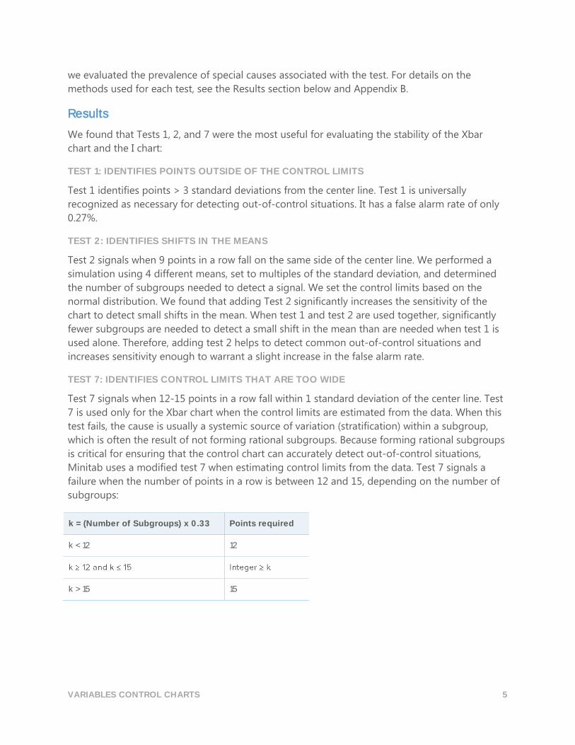
TEST 7: IDENTIFIES CONTROL LIMITS THAT ARE TOO WIDE
Test 7 signals when 12-15 points in a row fall within 1 standard deviation of the center line. Test
7 is used only for the Xbar chart when the control limits are estimated from the data. When this
test fails, the cause is usually a systemic source of variation (stratification) within a subgroup,
which is often the result of not forming rational subgroups. Because forming rational subgroups
is critical for ensuring that the control chart can accurately detect out-of-control situations,
Minitab uses a modified test 7 when estimating control limits from the data. Test 7 signals a
failure when the number of points in a row is between 12 and 15, depending on the number of
subgroups:
k = (Number of Subgroups) x 0.33 Points required
k < 12 12
k > 15 15
VARIABLES CONTROL CHARTS 6
Tests not included in the Assistant
TEST 3: K POINTS IN A ROW, ALL INCREASING OR ALL DECREASING
Test 3 is designed to detect drifts in the process mean (Davis and Woodall, 1988). However,
when test 3 is used in addition to test 1 and test 2, it does not significantly increase the
sensitivity of the chart to detect drifts in the process mean. Because we already decided to use
tests 1 and 2 based on our simulation results, including test 3 would not add any significant
value to the chart.
TEST 4: K POINTS IN A ROW, ALTERNATING UP AND DOWN
Although this pattern can occur in practice, we recommend that you look for any unusual trends
or patterns rather than test for one specific pattern.
TEST 5: K OUT OF K=1 POINTS > 2 STANDARD DEVIATIONS FROM CENTER LINE
To ensure the simplicity of the chart, we excluded this test because it did not uniquely identify
special cause situations that are common in practice.
TEST 6: K OUT OF K+1 POINTS > 1 STANDARD DEVIATION FROM THE CENTER LINE
To ensure the simplicity of the chart, we excluded this test because it did not uniquely identify
special cause situations that are common in practice.
TEST 8: K POINTS IN A ROW > 1 STANDARD DEVIATION FROM CENTER LINE (EITHER SIDE)
To ensure the simplicity of the chart, we excluded this test because it did not uniquely identify
special cause situations that are common in practice.
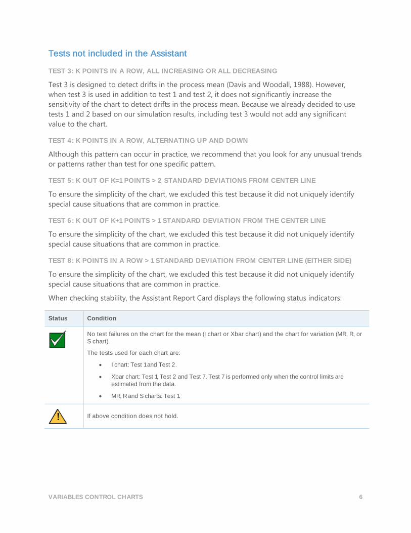
When checking stability, the Assistant Report Card displays the following status indicators:
Status Condition
No test failures on the chart for the mean (I chart or Xbar chart) and the chart for variation (MR, R, or S chart).
The tests used for each chart are:
I chart: Test 1 and Test 2.
Xbar chart: Test 1, Test 2 and Test 7. Test 7 is performed only when the control limits are estimated from the data.
MR, R and S charts: Test 1.
If above condition does not hold.
VARIABLES CONTROL CHARTS 7
Amount of data If you do not have known values for the control limits, they must be estimated from the data. To
obtain precise estimates of the limits, you must have enough data. If the amount of data is
insufficient, the control limits may be far from the “true” limits due to sampling variability. To
improve precision of the limits, you can increase the number of observations.
Objective
We investigated the number of observations that are needed to obtain precise control limits.
Our objective was to determine the amount of data required to ensure that false alarms due to
test 1 are no more than 1%, with 95% confidence.
Method
When the data are normally distributed and there is no error due to sampling variability, the
percent of points above the upper control limit is 0.135%. To determine whether the number of
observations is adequate, we followed the method outlined by Bischak (2007) to ensure that the
false alarm rate due to points above the upper control limit is no more than 0.5% with 95%
confidence. Due to the symmetry of the control limits, this method results in a total false alarm
rate of 1% due to test 1. See Appendix C for more details.
Results
We determined that, for nearly all subgroup sizes, 100 total observations are adequate to obtain
precise control limits. Although subgroup sizes of 1 and 2 required slightly more observations,
the false alarm rate was still reasonably low (1.1%) with 100 observations. Therefore, for
simplicity, we use the cutoff of 100 total observations for all subgroup sizes.
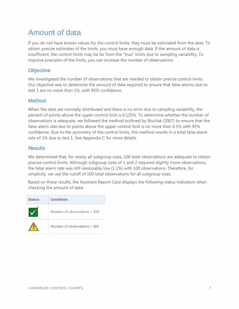
Based on these results, the Assistant Report Card displays the following status indicators when
checking the amount of data:
Status Condition
Number of observations < 100.
VARIABLES CONTROL CHARTS 8
Correlated data Autocorrelation is a measure of the dependence between data points that are collected over
time. Most process data exhibit at least a small degree of autocorrelation. If the autocorrelation
is moderate or high, it can lead to incorrect test results. Typically, autocorrelated data exhibit
positive autocorrelation, which can reduce the within-subgroup variation and lead to a higher
false alarm rate.
Objective
We investigated the relationship between autocorrelation and the false alarm rate. Our objective
was to determine the level of autocorrelation that generates an unacceptable false alarm rate.
For simplicity, we considered autocorrelation for lag 1 because the autocorrelation for lag 1 is
likely to be greater than autocorrelation for lags ≥ 2.
Method
Using a standard model for an autocorrelated process, we performed simulations with 𝜙 = 0.2,
0.4, 0.5, 0.6, and 0.8 (𝜙 is the lag 1 autocorrelation) for three subgroup sizes (n = 1, 3, and 5). We
used an initial set of 10,000 subgroups to establish the control limits. Then, we recorded the
percentage of false alarms for an additional 2,500 subgroups. We performed 10,000 iterations
and recorded the average percentage of false alarms. See Appendix D for more details.
Results
Our simulations showed that even moderate levels of autocorrelation significantly increase the
false alarm rate. When the autocorrelation ≥ 0.4, the false alarm rate is very high and the control
chart becomes meaningless. To address this, the Assistant performs an autocorrelation test if the
data could be autocorrelated, as indicated by a greater than expected number of points outside
the control limits (when 2 or more points and 2% or more of the points are outside of the
control limits). In that case, the Assistant first tests whether the autocorrelation between
successive data points (lag = 1) is significantly greater than 0.2. If the autocorrelation is
significantly greater than 0.2, the Assistant then tests whether the autocorrelation between
successive data points (lag = 1) is significantly greater than 0.4.
VARIABLES CONTROL CHARTS 9
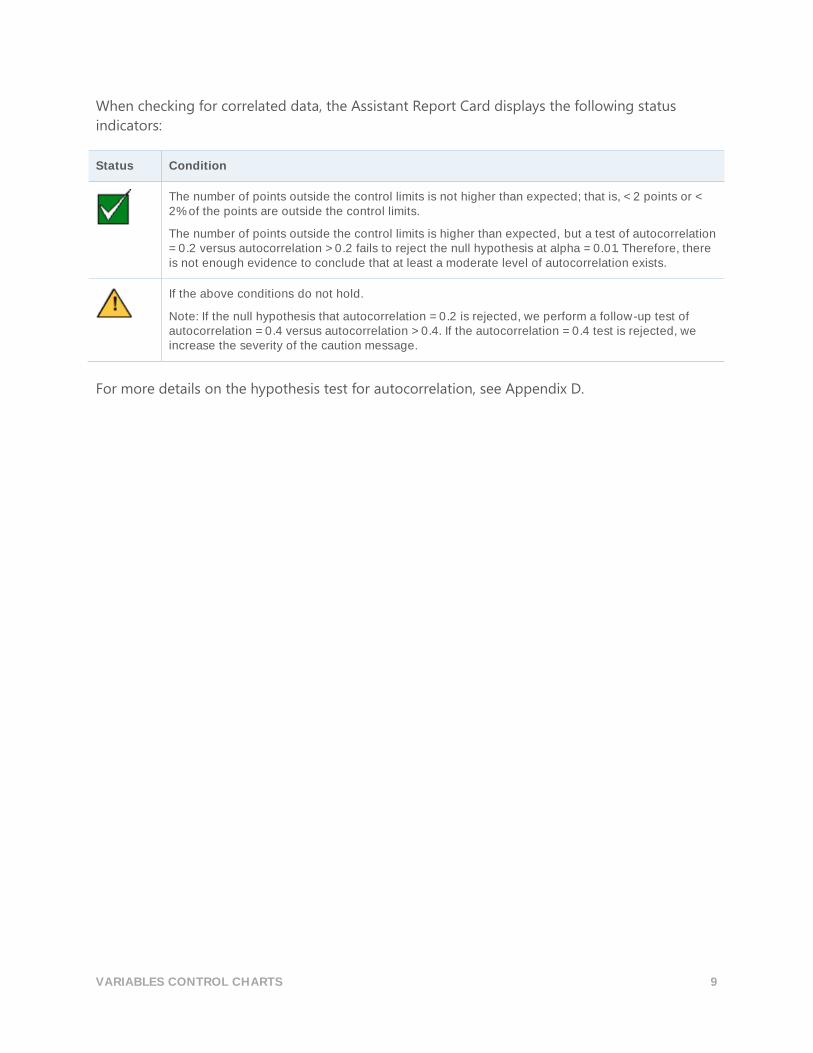
When checking for correlated data, the Assistant Report Card displays the following status
indicators:
Status Condition
The number of points outside the control limits is not higher than expected; that is, < 2 points or < 2% of the points are outside the control limits.
The number of points outside the control limits is higher than expected, but a test of autocorrelation = 0.2 versus autocorrelation > 0.2 fails to reject the null hypothesis at alpha = 0.01. Therefore, there is not enough evidence to conclude that at least a moderate level of autocorrelation exists.
If the above conditions do not hold.
Note: If the null hypothesis that autocorrelation = 0.2 is rejected, we perform a follow-up test of autocorrelation = 0.4 versus autocorrelation > 0.4. If the autocorrelation = 0.4 test is rejected, we increase the severity of the caution message.
For more details on the hypothesis test for autocorrelation, see Appendix D.
VARIABLES CONTROL CHARTS 10
References AIAG (1995). Statistical process control (SPC) reference manual. Automotive Industry Action
Group.
Bischak, D.P., & Trietsch, D. (2007). The rate of false signals in X̅ control charts with estimated
limits. Journal of Quality Technology, 39, 55–65.
Bowerman, B.L., & O' Connell, R.T. (1979). Forecasting and time series: An applied approach.
Belmont, CA: Duxbury Press.
Chan, L. K., Hapuarachchi K. P., & Macpherson, B.D. (1988). Robustness of 𝑋 ̅and R charts. IEEE
Transactions on Reliability, 37, 117–123.
Davis, R.B., & Woodall, W.H. (1988). Performance of the control chart trend rule under linear
shift. Journal of Quality Technology, 20, 260–262.
Montgomery, D. (2001). Introduction to statistical quality control, 4th edition. John Wiley & Sons.
Schilling, E.G., & Nelson, P.R. (1976). The effect of non-normality on the control limits of �̅�
charts. Journal of Quality Technology, 8, 183–188.
Trietsch, D. (1999). Statistical quality control: A loss minimization approach. Singapore: World
Scientific Publishing Company.
Wheeler, D.J. (2004). Advanced topics in statistical process control. The power of Shewhart’s charts,
2nd edition. Knoxville, TN: SPC Press.
Yourstone, S.A., & Zimmer, W.J. (1992). Non-normality and the design of control charts for
averages. Decision Sciences, 23, 1099–1113.
VARIABLES CONTROL CHARTS 11
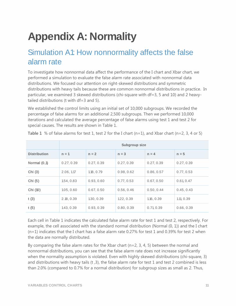
Appendix A: Normality
Simulation A1: How nonnormality affects the false alarm rate To investigate how nonnormal data affect the performance of the I chart and Xbar chart, we
performed a simulation to evaluate the false alarm rate associated with nonnormal data
distributions. We focused our attention on right-skewed distributions and symmetric
distributions with heavy tails because these are common nonnormal distributions in practice. In
particular, we examined 3 skewed distributions (chi-square with df=3, 5 and 10) and 2 heavy-
tailed distributions (t with df=3 and 5).
We established the control limits using an initial set of 10,000 subgroups. We recorded the
percentage of false alarms for an additional 2,500 subgroups. Then we performed 10,000
iterations and calculated the average percentage of false alarms using test 1 and test 2 for
special causes. The results are shown in Table 1.
Table 1 % of false alarms for test 1, test 2 for the I chart (n=1), and Xbar chart (n=2, 3, 4 or 5)
Subgroup size
Distribution n = 1 n = 2 n = 3 n = 4 n = 5
Normal (0,1) 0.27, 0.39 0.27, 0.39 0.27, 0.39 0.27, 0.39 0.27, 0.39
Chi (3) 2.06, 1.17 1.18, 0.79 0.98, 0.62 0.86, 0.57 0.77, 0.53
Chi (5) 1.54, 0.83 0.93, 0.60 0.77, 0.53 0.67, 0.50 0.61, 0.47
Chi (10) 1.05, 0.60 0.67, 0.50 0.56, 0.46 0.50, 0.44 0.45, 0.43
t (3) 2.18, 0.39 1.30, 0.39 1.22, 0.39 1.16, 0.39 1.11, 0.39
t (5) 1.43, 0.39 0.93, 0.39 0.80, 0.39 0.71, 0.39 0.66, 0.39
Each cell in Table 1 indicates the calculated false alarm rate for test 1 and test 2, respectively. For
example, the cell associated with the standard normal distribution (Normal (0, 1)) and the I chart
(n=1) indicates that the I chart has a false alarm rate 0.27% for test 1 and 0.39% for test 2 when
the data are normally distributed.
By comparing the false alarm rates for the Xbar chart (n=2, 3, 4, 5) between the normal and
nonnormal distributions, you can see that the false alarm rate does not increase significantly
when the normality assumption is violated. Even with highly skewed distributions (chi-square, 3)
and distributions with heavy tails (t ,3), the false alarm rate for test 1 and test 2 combined is less
than 2.0% (compared to 0.7% for a normal distribution) for subgroup sizes as small as 2. Thus,
VARIABLES CONTROL CHARTS 12
we conclude for practical purposes that the Xbar chart is robust to violations of the normality
assumption.
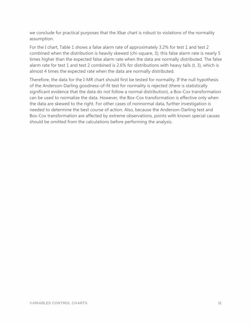
For the I chart, Table 1 shows a false alarm rate of approximately 3.2% for test 1 and test 2
combined when the distribution is heavily skewed (chi-square, 3); this false alarm rate is nearly 5
times higher than the expected false alarm rate when the data are normally distributed. The false
alarm rate for test 1 and test 2 combined is 2.6% for distributions with heavy tails (t, 3), which is
almost 4 times the expected rate when the data are normally distributed.
Therefore, the data for the I-MR chart should first be tested for normality. If the null hypothesis
of the Anderson-Darling goodness-of-fit test for normality is rejected (there is statistically
significant evidence that the data do not follow a normal distribution), a Box-Cox transformation
can be used to normalize the data. However, the Box-Cox transformation is effective only when
the data are skewed to the right. For other cases of nonnormal data, further investigation is
needed to determine the best course of action. Also, because the Anderson-Darling test and
Box-Cox transformation are affected by extreme observations, points with known special causes
should be omitted from the calculations before performing the analysis.
VARIABLES CONTROL CHARTS 13
Appendix B: Stability
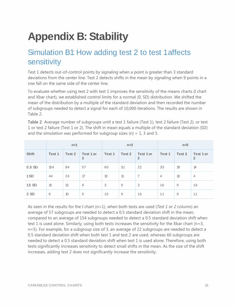
Simulation B1: How adding test 2 to test 1 affects sensitivity Test 1 detects out-of-control points by signaling when a point is greater than 3 standard
deviations from the center line. Test 2 detects shifts in the mean by signaling when 9 points in a
row fall on the same side of the center line.
To evaluate whether using test 2 with test 1 improves the sensitivity of the means charts (I chart
and Xbar chart), we established control limits for a normal (0, SD) distribution. We shifted the
mean of the distribution by a multiple of the standard deviation and then recorded the number
of subgroups needed to detect a signal for each of 10,000 iterations. The results are shown in
Table 2.
Table 2 Average number of subgroups until a test 1 failure (Test 1), test 2 failure (Test 2), or test
1 or test 2 failure (Test 1 or 2). The shift in mean equals a multiple of the standard deviation (SD)
and the simulation was performed for subgroup sizes (n) = 1, 3 and 5.
n=1 n=3 n=5
Shift Test 1 Test 2 Test 1 or 2
Test 1 Test 2 Test 1 or 2
Test 1 Test 2 Test 1 or 2
0.5 SD 154 84 57 60 31 22 33 19 14
1 SD 44 24 17 10 11 7 4 10 4
1.5 SD 15 13 9 3 9 3 1.6 9 1.6
2 SD 6 10 5 1.5 9 1.5 1.1 9 1.1
As seen in the results for the I chart (n=1), when both tests are used (Test 1 or 2 column) an
average of 57 subgroups are needed to detect a 0.5 standard deviation shift in the mean,
compared to an average of 154 subgroups needed to detect a 0.5 standard deviation shift when
test 1 is used alone. Similarly, using both tests increases the sensitivity for the Xbar chart (n=3,
n=5). For example, for a subgroup size of 3, an average of 22 subgroups are needed to detect a
0.5 standard deviation shift when both test 1 and test 2 are used, whereas 60 subgroups are
needed to detect a 0.5 standard deviation shift when test 1 is used alone. Therefore, using both
tests significantly increases sensitivity to detect small shifts in the mean. As the size of the shift
increases, adding test 2 does not significantly increase the sensitivity.
VARIABLES CONTROL CHARTS 14
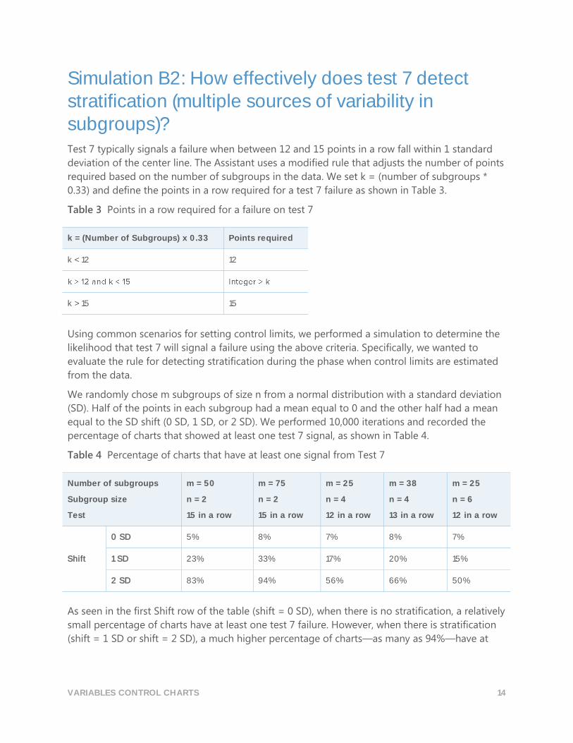
Simulation B2: How effectively does test 7 detect stratification (multiple sources of variability in subgroups)? Test 7 typically signals a failure when between 12 and 15 points in a row fall within 1 standard
deviation of the center line. The Assistant uses a modified rule that adjusts the number of points
required based on the number of subgroups in the data. We set k = (number of subgroups *
0.33) and define the points in a row required for a test 7 failure as shown in Table 3.
Table 3 Points in a row required for a failure on test 7
k = (Number of Subgroups) x 0.33 Points required
k < 12 12
k > 15 15
Using common scenarios for setting control limits, we performed a simulation to determine the
likelihood that test 7 will signal a failure using the above criteria. Specifically, we wanted to
evaluate the rule for detecting stratification during the phase when control limits are estimated
from the data.
We randomly chose m subgroups of size n from a normal distribution with a standard deviation
(SD). Half of the points in each subgroup had a mean equal to 0 and the other half had a mean
equal to the SD shift (0 SD, 1 SD, or 2 SD). We performed 10,000 iterations and recorded the
percentage of charts that showed at least one test 7 signal, as shown in Table 4.
Table 4 Percentage of charts that have at least one signal from Test 7
Number of subgroups
Subgroup size
Test
m = 50
n = 2
15 in a row
m = 75
n = 2
15 in a row
m = 25
n = 4
12 in a row
m = 38
n = 4
13 in a row
m = 25
n = 6
12 in a row
Shift
0 SD 5% 8% 7% 8% 7%
1 SD 23% 33% 17% 20% 15%
2 SD 83% 94% 56% 66% 50%
As seen in the first Shift row of the table (shift = 0 SD), when there is no stratification, a relatively
small percentage of charts have at least one test 7 failure. However, when there is stratification
(shift = 1 SD or shift = 2 SD), a much higher percentage of charts—as many as 94%—have at

VARIABLES CONTROL CHARTS 15
least one test 7 failure. In this way, test 7 can identify stratification in the phase when the control
limits are estimated.
VARIABLES CONTROL CHARTS 16
Appendix C: Amount of data
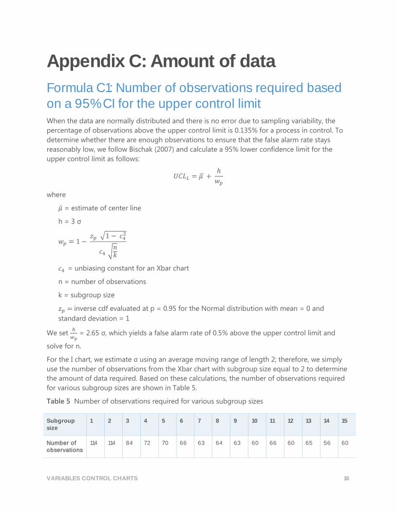
Formula C1: Number of observations required based on a 95% CI for the upper control limit When the data are normally distributed and there is no error due to sampling variability, the
percentage of observations above the upper control limit is 0.135% for a process in control. To
determine whether there are enough observations to ensure that the false alarm rate stays
reasonably low, we follow Bischak (2007) and calculate a 95% lower confidence limit for the
upper control limit as follows:
𝑈𝐶𝐿𝐿 = 𝜇 ̂ + ℎ
𝑤𝑝
where
�̂� = estimate of center line
h = 3 σ
𝑤𝑝 = 1 − 𝑧𝑝 √1 − 𝑐4
2
𝑐4 √𝑛𝑘
𝑐4 = unbiasing constant for an Xbar chart
n = number of observations
k = subgroup size
𝑧𝑝 = inverse cdf evaluated at p = 0.95 for the Normal distribution with mean = 0 and
standard deviation = 1
We set ℎ
𝑤𝑝 = 2.65 σ, which yields a false alarm rate of 0.5% above the upper control limit and
solve for n.
For the I chart, we estimate σ using an average moving range of length 2; therefore, we simply
use the number of observations from the Xbar chart with subgroup size equal to 2 to determine
the amount of data required. Based on these calculations, the number of observations required
for various subgroup sizes are shown in Table 5.
Table 5 Number of observations required for various subgroup sizes
Subgroup size
1 2 3 4 5 6 7 8 9 10 11 12 13 14 15
Number of observations
114 114 84 72 70 66 63 64 63 60 66 60 65 56 60
VARIABLES CONTROL CHARTS 17
Note The number of observations should decrease as the subgroup size increases. However,
exceptions to this rule appear in Table 8. These exceptions occur because the number of
subgroups was rounded to the next integer before being multiplied by the number of
observations in each subgroup, in order to calculate the total number of observations required.
The results in Table 5 show that the total number of observations required is less than or equal
to 100 for all subgroup sizes, except when the subgroup size is 1 or 2. However, even when the
subgroup size is 1 or 2, the false alarm rate is only approximately 1.1% with 100 observations.
Therefore, 100 observations is an effective cutoff value for all subgroup sizes.
The above analysis assumes that each subgroup will have the same amount of common cause
variation. In practice, data collected at different points in time may have different amounts of
common cause variability. Therefore, you may want to sample the process at more points in
time than required to increase the chances of having a representative estimate of the process
variation.
VARIABLES CONTROL CHARTS 18
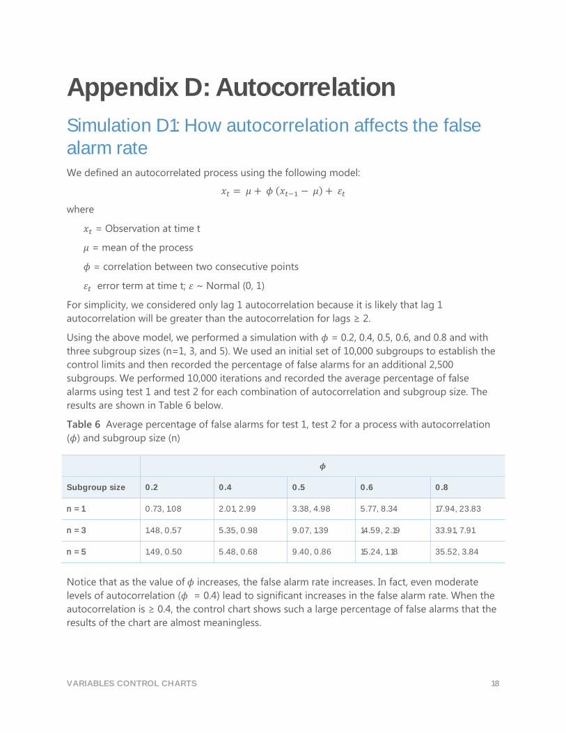
Appendix D: Autocorrelation
Simulation D1: How autocorrelation affects the false alarm rate We defined an autocorrelated process using the following model:
𝑥𝑡 = 𝜇 + 𝜙 (𝑥𝑡−1 − 𝜇) + 𝜀𝑡
where
𝑥𝑡 = Observation at time t
𝜇 = mean of the process
𝜙 = correlation between two consecutive points
𝜀𝑡 error term at time t; 𝜀 ~ Normal (0, 1)
For simplicity, we considered only lag 1 autocorrelation because it is likely that lag 1
autocorrelation will be greater than the autocorrelation for lags ≥ 2.
Using the above model, we performed a simulation with 𝜙 = 0.2, 0.4, 0.5, 0.6, and 0.8 and with
three subgroup sizes (n=1, 3, and 5). We used an initial set of 10,000 subgroups to establish the
control limits and then recorded the percentage of false alarms for an additional 2,500
subgroups. We performed 10,000 iterations and recorded the average percentage of false
alarms using test 1 and test 2 for each combination of autocorrelation and subgroup size. The
results are shown in Table 6 below.
Table 6 Average percentage of false alarms for test 1, test 2 for a process with autocorrelation
(𝜙) and subgroup size (n)
𝝓
Subgroup size 0.2 0.4 0.5 0.6 0.8
n = 1 0.73, 1.08 2.01, 2.99 3.38, 4.98 5.77, 8.34 17.94, 23.83
n = 3 1.48, 0.57 5.35, 0.98 9.07, 1.39 14.59, 2.19 33.91, 7.91
n = 5 1.49, 0.50 5.48, 0.68 9.40, 0.86 15.24, 1.18 35.52, 3.84
Notice that as the value of 𝜙 increases, the false alarm rate increases. In fact, even moderate
levels of autocorrelation (𝜙 = 0.4) lead to significant increases in the false alarm rate. When the
autocorrelation is ≥ 0.4, the control chart shows such a large percentage of false alarms that the
results of the chart are almost meaningless.
VARIABLES CONTROL CHARTS 19
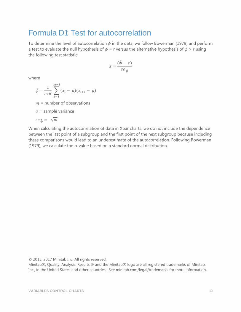
Formula D1: Test for autocorrelation To determine the level of autocorrelation 𝜙 in the data, we follow Bowerman (1979) and perform
a test to evaluate the null hypothesis of 𝜙 = r versus the alternative hypothesis of 𝜙 > r using
the following test statistic:
𝑧 =(�̂� − 𝑟)
𝑠𝑒 �̂�
where
�̂� =1
𝑚 �̂� ∑ (𝑥𝑖 − 𝜇)(𝑥𝑖+1 − 𝜇)
𝑚−1
𝑖=1
𝑚 = number of observations
�̂� = sample variance
𝑠𝑒 �̂� = √𝑚
When calculating the autocorrelation of data in Xbar charts, we do not include the dependence
between the last point of a subgroup and the first point of the next subgroup because including
these comparisons would lead to an underestimate of the autocorrelation. Following Bowerman
(1979), we calculate the p-value based on a standard normal distribution.
© 2015, 2017 Minitab Inc. All rights reserved.
Minitab®, Quality. Analysis. Results.® and the Minitab® logo are all registered trademarks of Minitab,
Inc., in the United States and other countries. See minitab.com/legal/trademarks for more information.