you suck at powerpoint 2
TRANSCRIPT
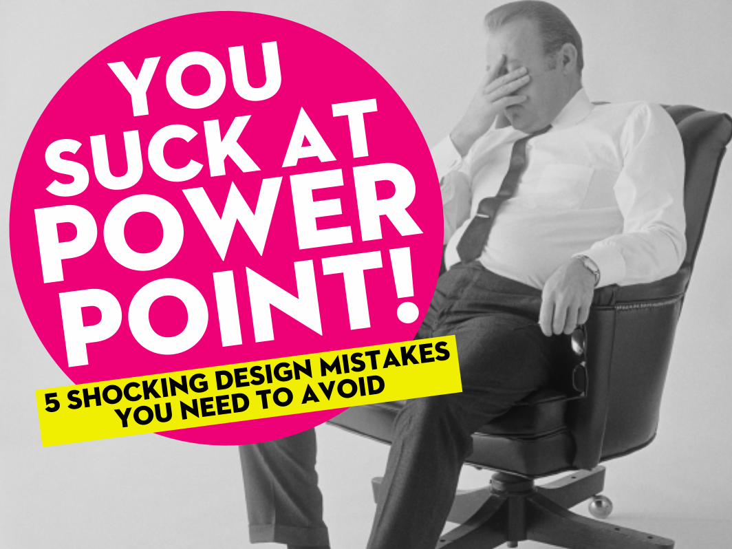
Suck atPowerPoint!
You
5 shocking design Mistakes
you need to avoid
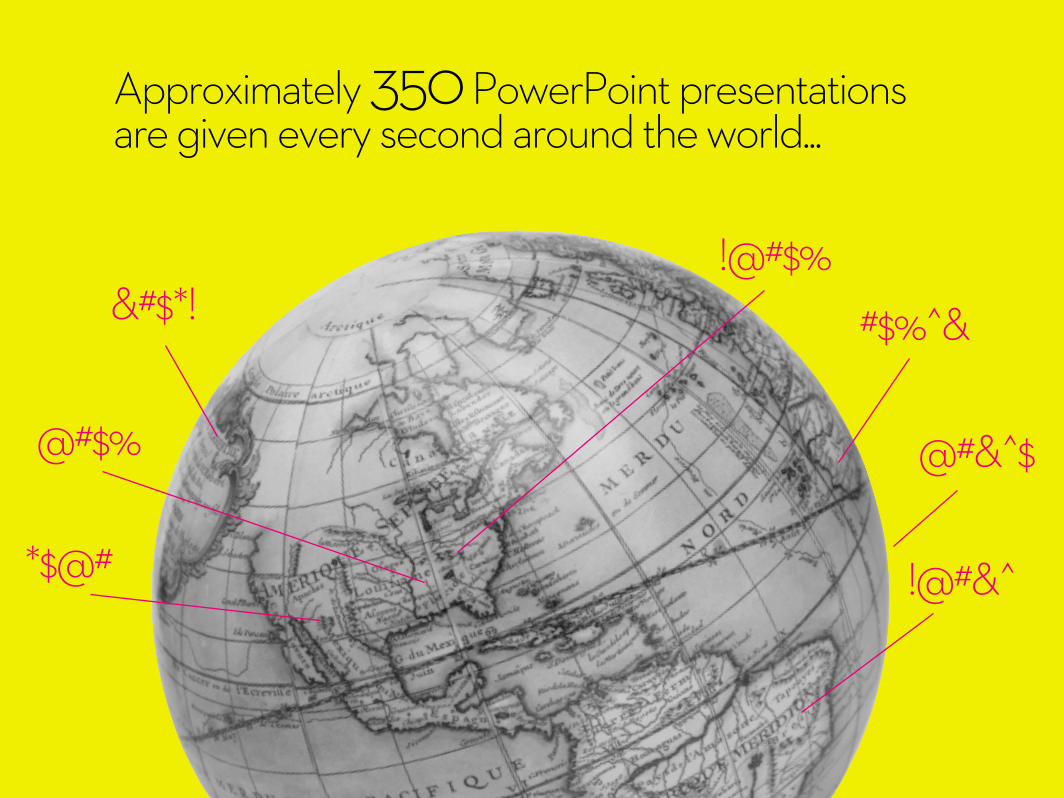
Approximately 350 PowerPoint presentations are given every second around the world...
#$%^&&#$*!
@#$%
!@#&^
!@#$%
*$@#
@#&^$

and approximately 99% suck.

and approximately 99% suck.
But it’s not PowerPoint which sucks.

It’s the speaker (you) who needs to use it properly.
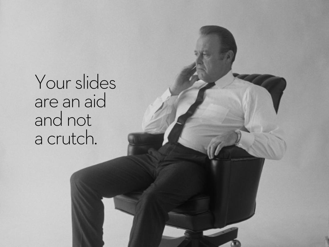
Your slides are an aid and not a crutch.
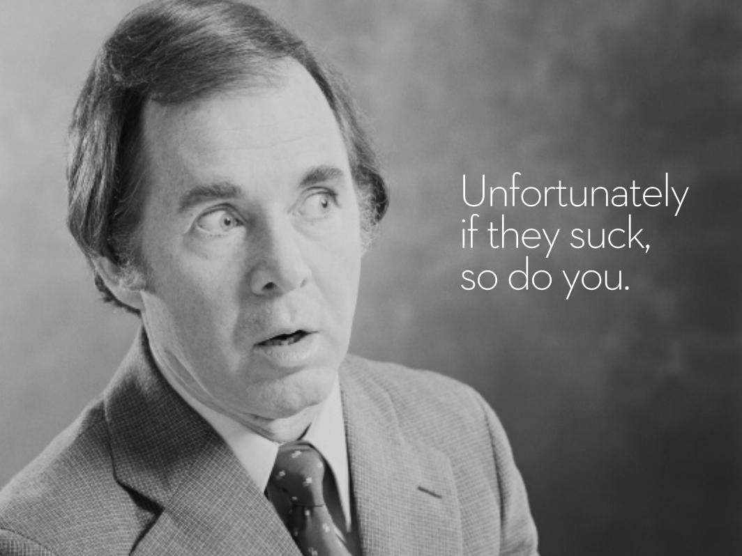
Unfortunately if they suck, so do you.
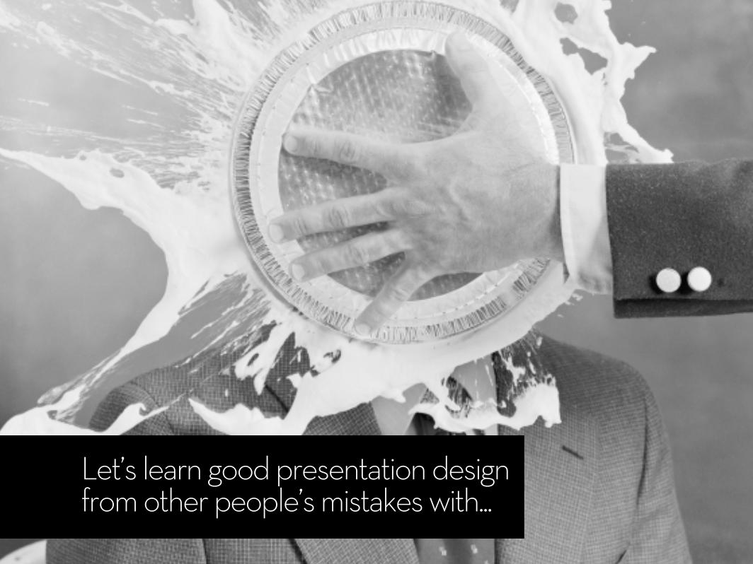
Let’s learn good presentation design from other people’s mistakes with...

SHOCKING DESIGN
MISTAKESYOU NEEDTO AVOID
5

TOO MUCH
INFO
1MISTAKE

Don’t vomit every piece of information on your slides.
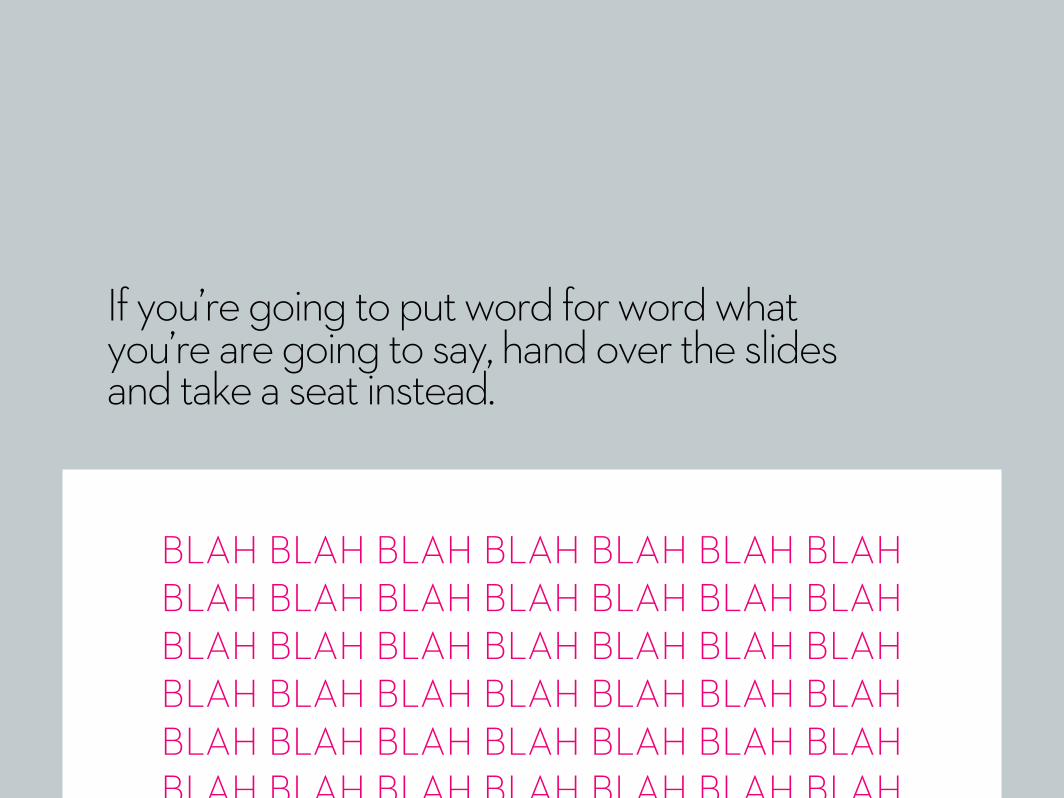
If you’re going to put word for word what you’re are going to say, hand over the slides and take a seat instead.
BLAH BLAH BLAH BLAH BLAH BLAH BLAH BLAH BLAH BLAH BLAH BLAH BLAH BLAH BLAH BLAH BLAH BLAH BLAH BLAH BLAH BLAH BLAH BLAH BLAH BLAH BLAH BLAH BLAH BLAH BLAH BLAH BLAH BLAH BLAH BLAH BLAH BLAH BLAH BLAH BLAH BLAH BLAH BLAH BLAH BLAH BLAH BLAH BLAH BLAH BLAH BLAH BLAH BLAH BLAH BLAH BLAH BLAH BLAH BLAH BLAH BLAH BLAH
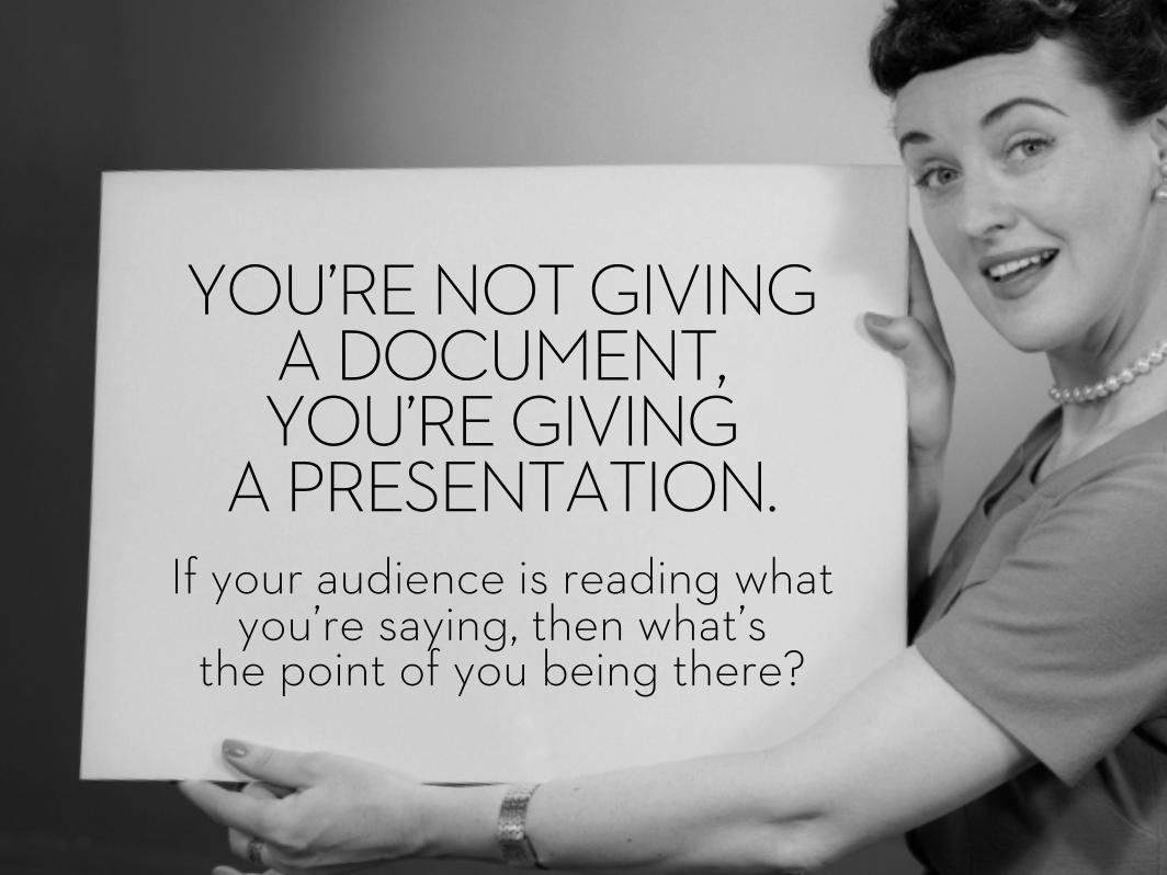
If your audience is reading what you’re saying, then what’s
the point of you being there?
YOU’RE NOT GIVING A DOCUMENT, YOU’RE GIVING
A PRESENTATION.
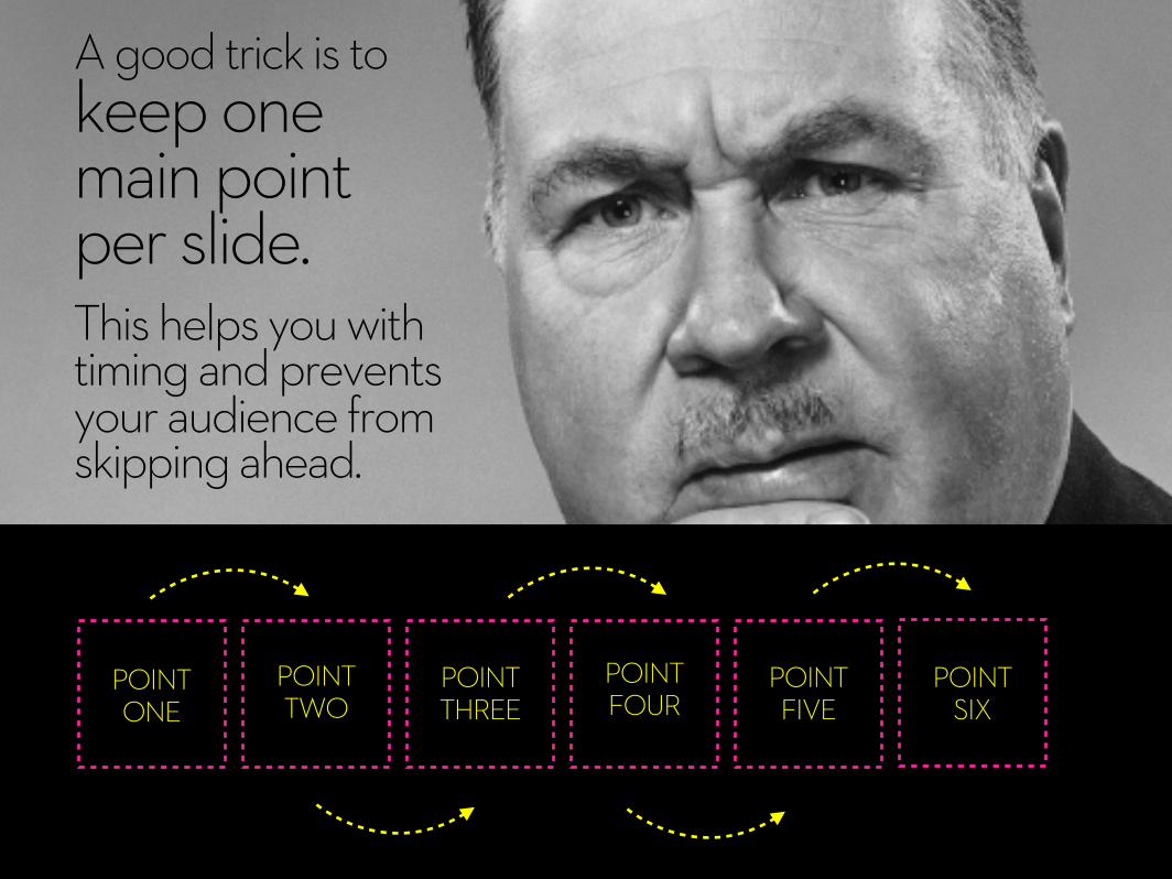
A good trick is to keep one main point per slide. This helps you with timing and prevents your audience from skipping ahead.
POINTONE
POINTTWO
POINTTHREE
POINTFOUR
POINTFIVE
POINTSIX

Keep it relevant.Effective communication is knowing what to cut out, so be a merciless editor.
Less slides means more time for interaction.
POINTONE X POINT
THREE X X POINTSIX
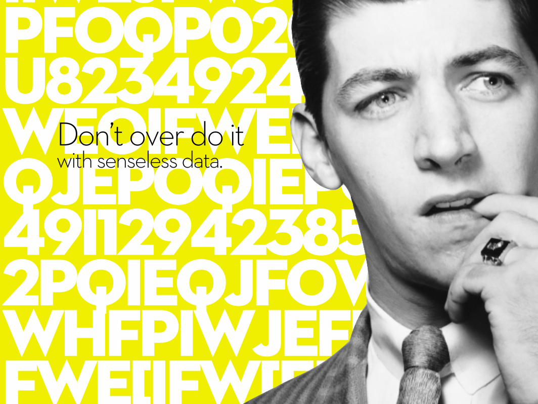
iiwejfwjoiwijfopwpfoqp020r9723494u823492492asdsklfweoifweiojwioejriqjepoqiepour93u349i1294238573498752pqieqjfowiehjpowhfpiwjef[weif[weifwe[ifw[eif[wef342234923923i4923902e
Don’t over do it with senseless data.

Do the hard work for your audience and turn that data into something which is meaningful.

NOT ENOUGH VISUALS
2 MISTAKE

Deliver a bigger punch with strong visuals.

There are endless sources of visuals you can use to bring your presentation to life.
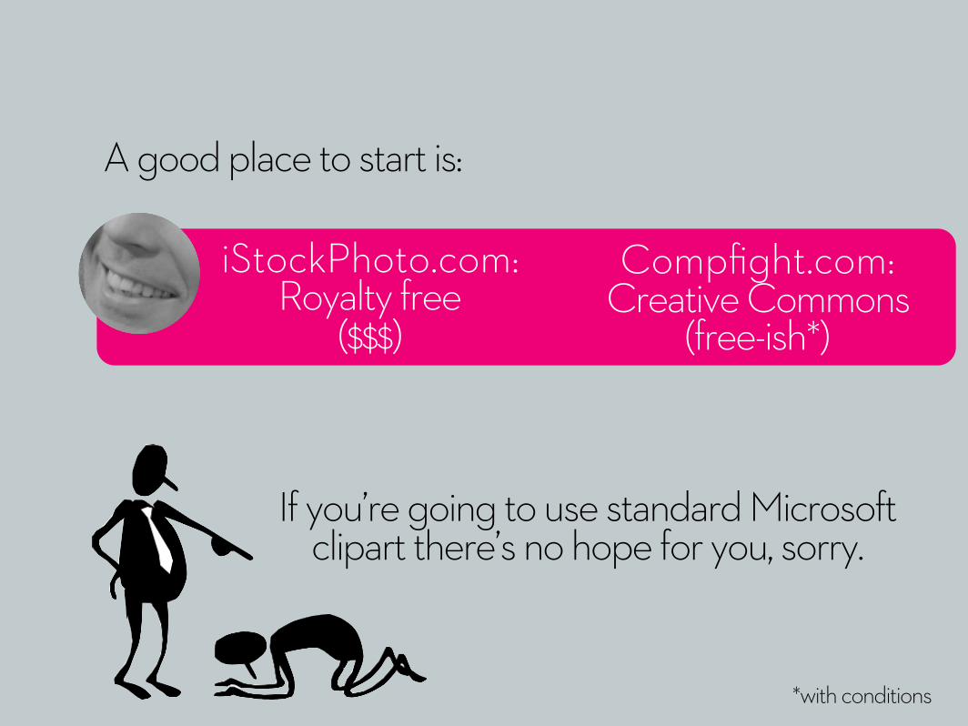
If you’re going to use standard Microsoft clipart there’s no hope for you, sorry.
*with conditions
A good place to start is:
iStockPhoto.com: Royalty free
($$$)
Compfight.com: Creative Commons
(free-ish*)

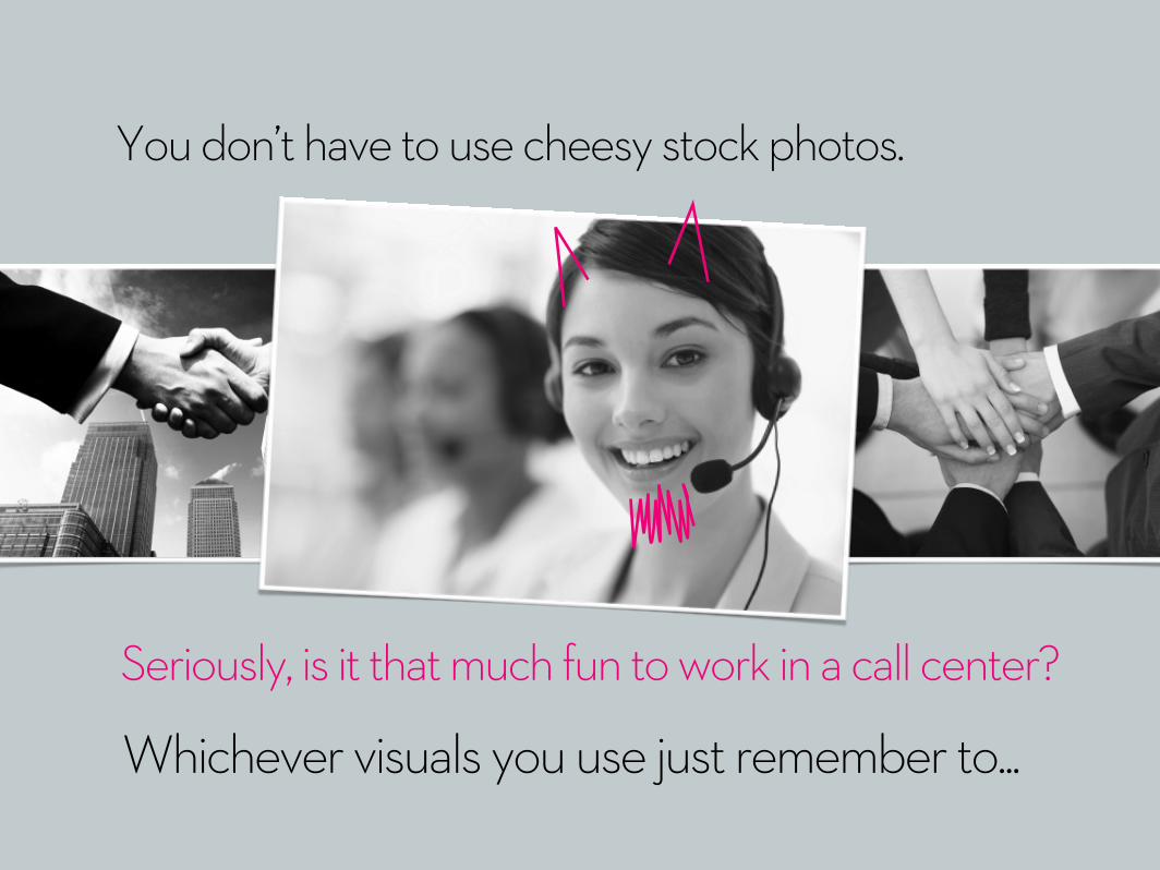
You don’t have to use cheesy stock photos.

You don’t have to use cheesy stock photos.
Seriously, is it that much fun to work in a call center?
You don’t have to use cheesy stock photos.
Whichever visuals you use just remember to...
Seriously, is it that much fun to work in a call center?

Design for this guy.
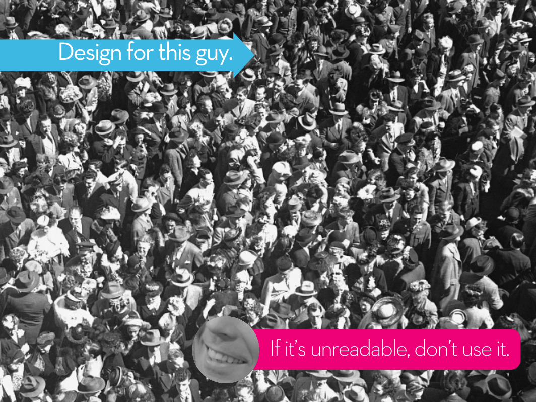
Design for this guy.
If it’s unreadable, don’t use it.

CRAPQUALITY
3 MISTAKE

Don’t bore your audience with childish visuals.Invest time in learning great design.

There are two shortcuts to great design

Buy it: Good design costs money.Invest in professional images and typeface. A little $$$ can give you significant advantage.
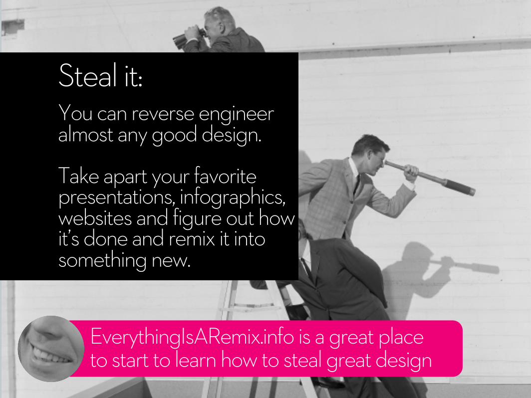
EverythingIsARemix.info is a great place to start to learn how to steal great design
Steal it:You can reverse engineer almost any good design.
Take apart your favorite presentations, infographics, websites and figure out how it’s done and remix it into something new.
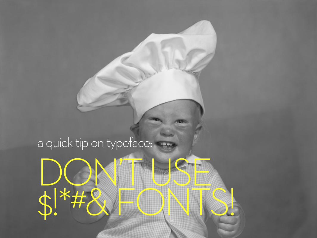
a quick tip on typeface:
DON’T USE $!*#& FONTS!

Tahoma Microsoft Sans Serif Arial Verdana Courier New Times New RomanTrebuchet MSLucida Console
Comic Sans MS...
are $!*#& fonts
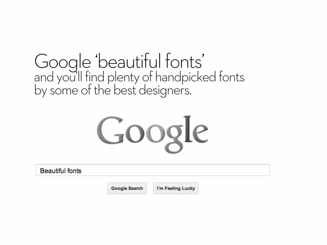
Google ‘beautiful fonts’ and you’ll find plenty of handpicked fonts by some of the best designers.
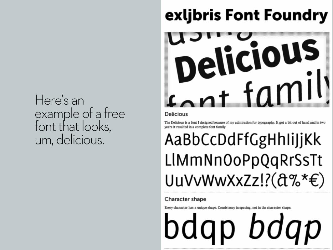
Here’s an example of a free font that looks, um, delicious.
While 95% of your colleagues use PowerPoint, it doesn’t need to be your only option. For 22 years PowerPoint has been the standard for delivering presentation. But not anymore. Experiment with different presentations tools and see which one produces the best results
visualvomit
4MISTAKE

Whitespace is a good thing.
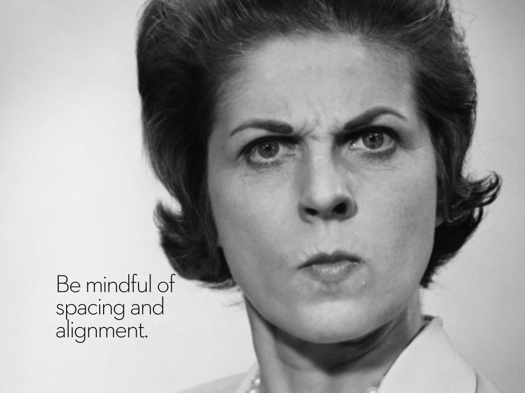
Be mindful of spacing and alignment.
POINT 1
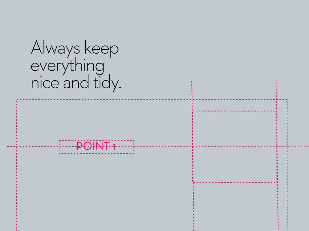
Always keep everything nice and tidy.
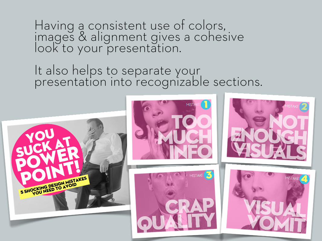
Having a consistent use of colors, images & alignment gives a cohesive look to your presentation.It also helps to separate your presentation into recognizable sections.

Use a collection of visual assets that belong together...
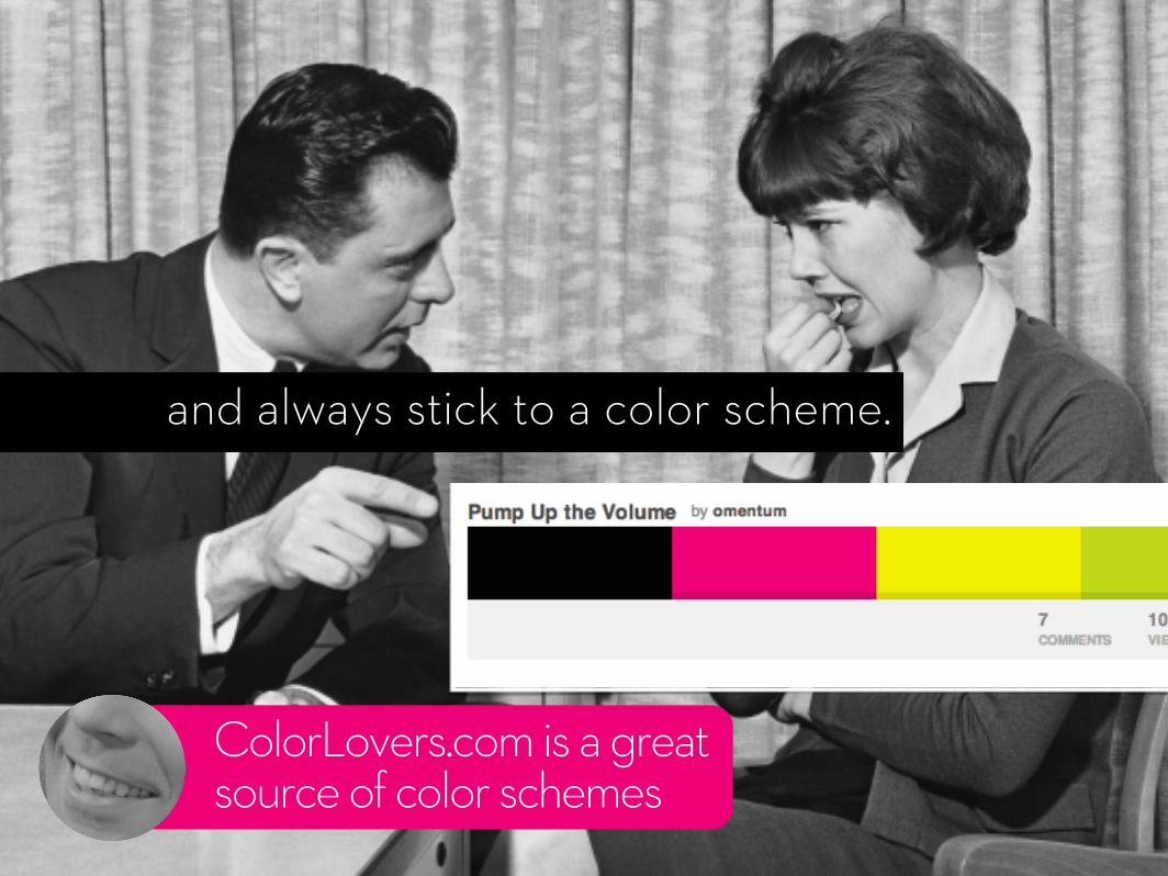
ColorLovers.com is a great source of color schemes
and always stick to a color scheme.

And the most shocking design mistake...
LACK OF
PREP
5MISTAKE

Most presentations suck because not enough time went into making them. Period.
You need to craft the perfect story, create beautiful looking slides to support itand then rehearse, rehearse, rehearse.
... and not the night before.
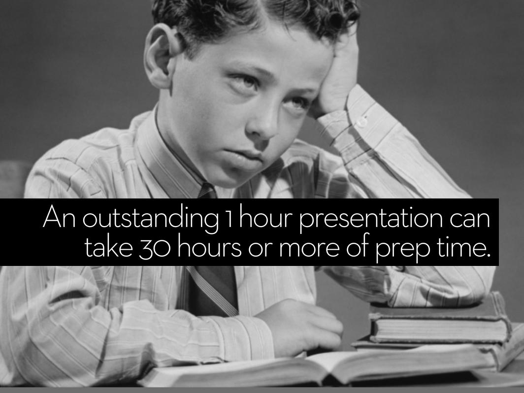
An outstanding 1 hour presentation can take 30 hours or more of prep time.

Ya, exactly.
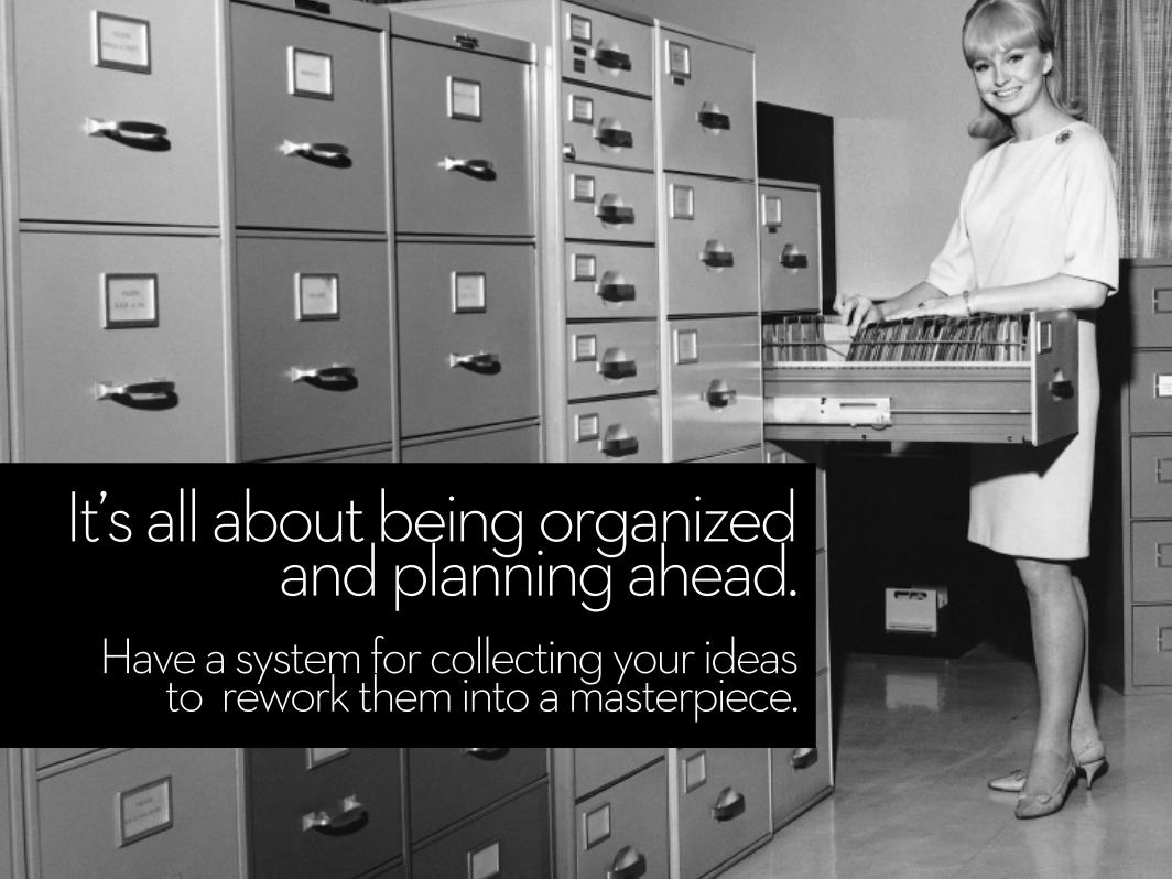
It’s all about being organized and planning ahead.
Have a system for collecting your ideas to rework them into a masterpiece.

86%of top executives say that communicating with clarity directly impacts their career and income.
Source: www.distinction-services.com

Source: www.distinction-services.com
Yet only 25%Spend more than 2 hours on ‘high-stakes’ presentations

Design, don’t just slap something together.
If your presentation sucks, don’t blame PowerPoint.

Let’s recap... MISTAKES TO!AVOID:
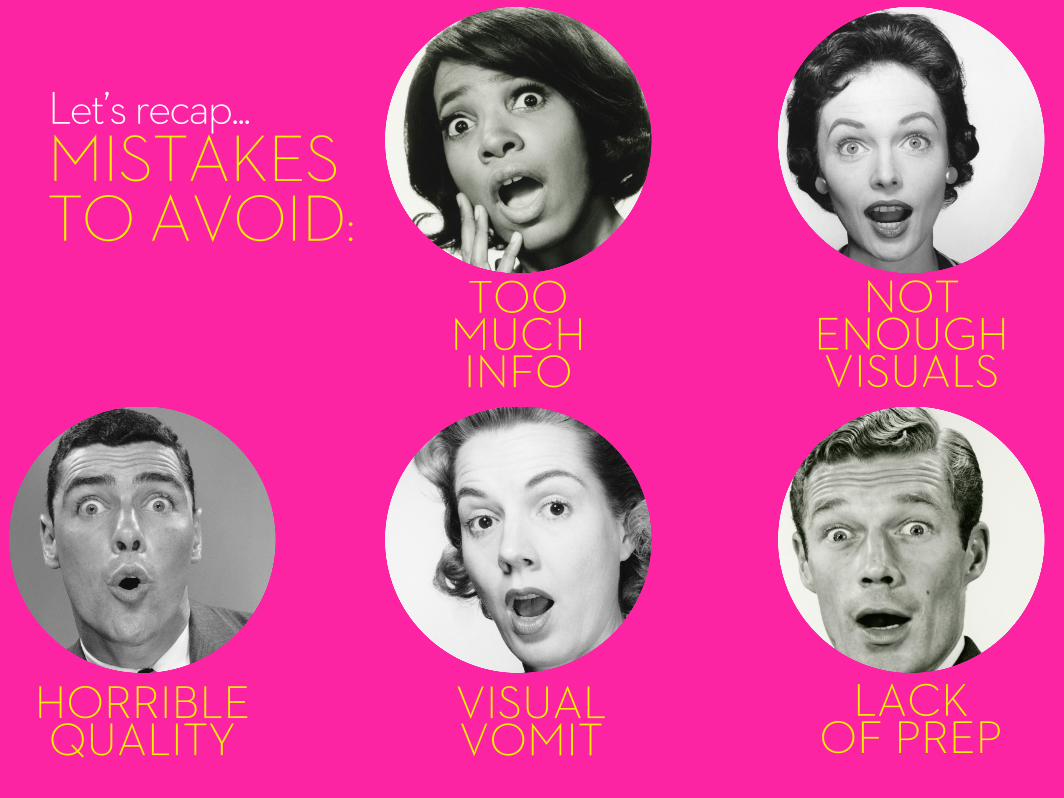
TOO MUCH INFO
NOT ENOUGHVISUALS
HORRIBLEQUALITY
VISUALVOMIT
LACK OF PREP
Let’s recap... MISTAKES TO!AVOID:

A nicely designed presentation is not the most important part.
But wait!
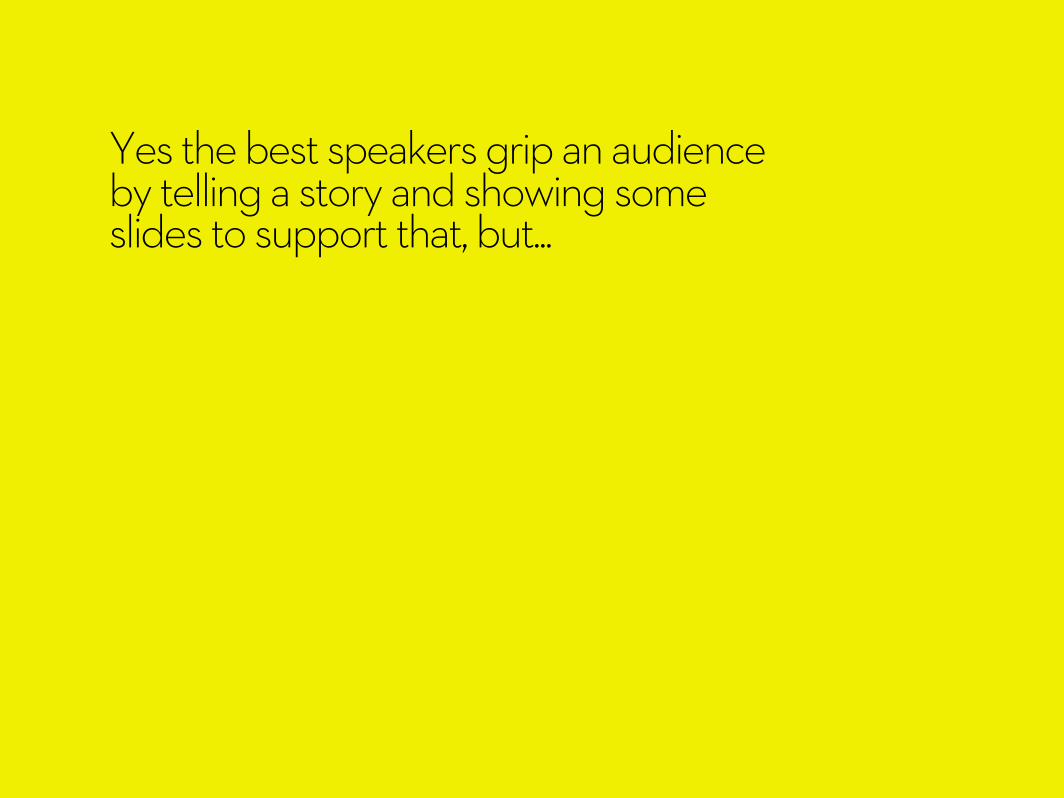
Yes the best speakers grip an audience by telling a story and showing some slides to support that, but...
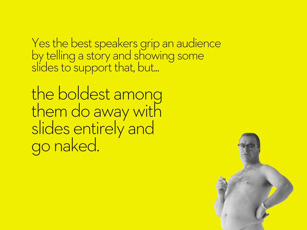
the boldest among them do away with slides entirely and go naked.
Yes the best speakers grip an audience by telling a story and showing some slides to support that, but...
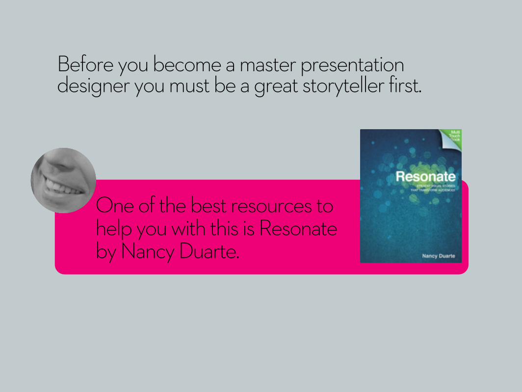
Before you become a master presentation designer you must be a great storyteller first.
One of the best resources to help you with this is Resonate by Nancy Duarte.
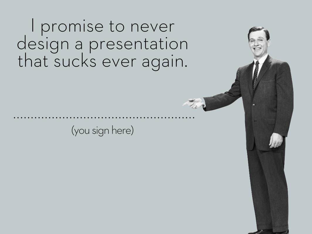
(you sign here)
I promise to never design a presentation that sucks ever again.

Now go on tiger, we need you to not suck.
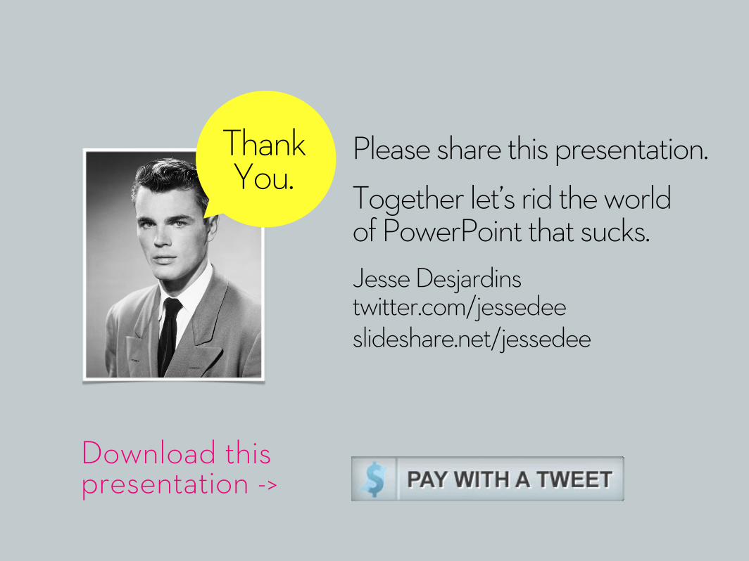
Please share this presentation.Together let’s rid the world of PowerPoint that sucks.Jesse Desjardinstwitter.com/jessedeeslideshare.net/jessedee
Thank You.
Download this presentation ->