it's all about typography
TRANSCRIPT

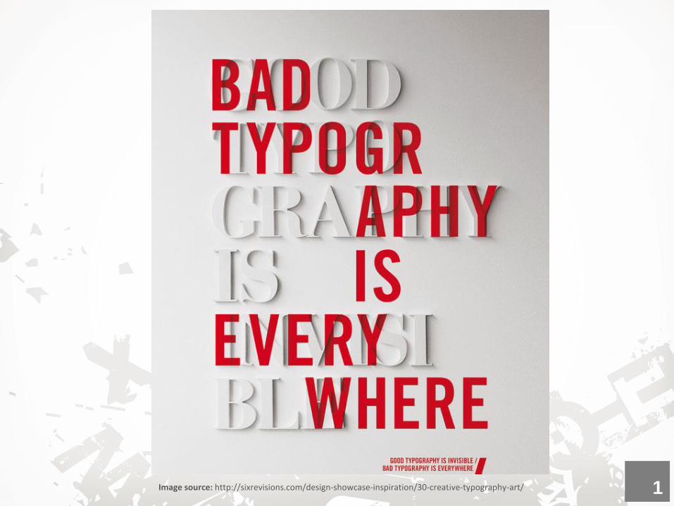
Image source: http://sixrevisions.com/design-showcase-inspiration/30-creative-typography-art/ 1

What is
Typography? The art and technique of arranging type to
make written language readable and appealing.
It involves selecting typefaces, point size, line
length, line-spacing (leading), letter-spacing
(tracking), and adjusting the space within letters
pairs (kerning).
2

Typography Is Everywhere
Type is a component of design that’s ever-present in
the world around us. Road signs, magazine covers,
posters, TV ads, film, etc.
3
The Basics
4

Is it a font or a typeface?
Typeface
“Font” and “typeface” are not interchangeable.
Is a set of typographical symbols and
characters. It’s the letters, numbers,
and other characters that let us put
words on paper (or screen)
A typeface is a family of fonts
(e.g. Helvetica Regular, Helvetica
Italic, Helvetica Bold, Helvetica
Black)
5
Font
Is basically a complete character set
within a typeface, often of a particular
size and style
A font is one weight or style
within a typeface family
(e.g. Helvetica Regular)

Classifications:
Source: http://www.urbanfonts.com/blog/2013/02/serif-vs-sans-the-final-battle/ 6
There are different ways to classify typefaces and type families.
Serif typefaces have small strokes/stems attached to the main strokes
of characters. Serif typefaces are most often used for body copy in print
documents, as well as for both body text and headlines online.
Sans Serifs typefaces on the other hand, lack serif details on
characters. They are often more modern in appearance than serifs.

SERIF Old Style / Humanist: Times New Roman, Garamond Transitional: Baskerville
Modern: Bodoni
Slab Serif: Rockwell, Blackoak std
SAN SERIF Grotesque: Franklin Gothic
Transitional/ Neo Grotesque: Helvetica
Humanist: Tahoma, Gill Sans
Geometric: Futura
SCRIPT (formal & Casual): Edwardian Script , Brush Script BT
DECORATIVE Rosewood,
ORNAMENT Symbol, Wingdings
7
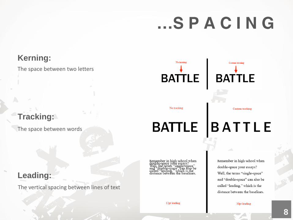
…S P A C I N G
Kerning:
Tracking:
Leading:
The space between two letters
The space between words
The vertical spacing between lines of text
8
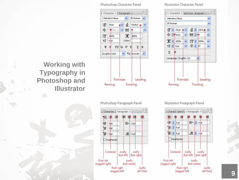
Working with
Typography in
Photoshop and
Illustrator
9
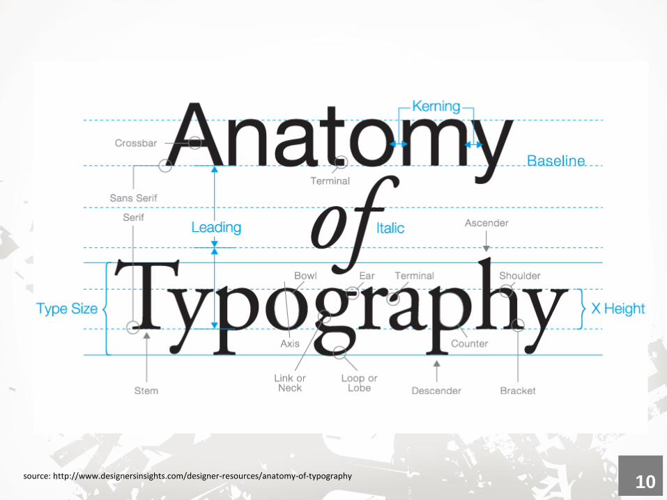
source: http://www.designersinsights.com/designer-resources/anatomy-of-typography 10
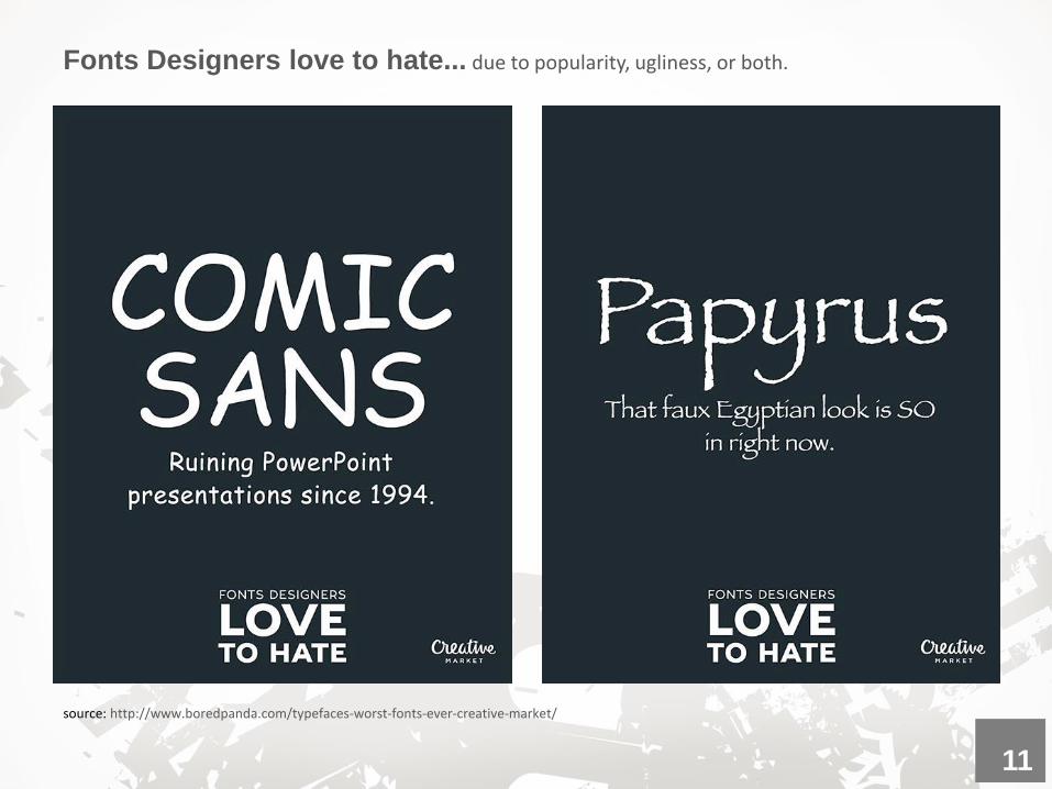
source: http://www.boredpanda.com/typefaces-worst-fonts-ever-creative-market/
Fonts Designers love to hate... due to popularity, ugliness, or both.
11

curlz
Brush Script
Vivaldi Courier
12

source: http://www.boredpanda.com/typefaces-worst-fonts-ever-creative-market/ 13

source: http://www.boredpanda.com/typefaces-worst-fonts-ever-creative-market/
14

source: http://www.creativebloq.com/typography/5-embarrassing-examples-bad-kerning-91412894 15
source: http://www.buzzfeed.com/sludgepunkslimeharpy/things-that-make-graphic-designers-cringe-82dk#.cbbvMnL9
Quick Note:
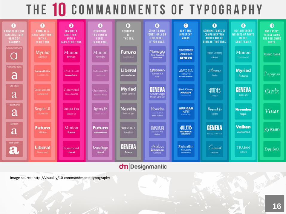
Image source: http://visual.ly/10-commandments-typography
16
Quick Tips:
Pay attention to tiny details: This can make the difference
between graphic design work that is just acceptable or really
good.
Make it legible: There is more to it than just choosing fonts
and making copy look good It also makes layouts look good in
an aesthetic way.
Keep learning more: Once you have these basics You can
find lots of good quality typographic material online to help you
learn more and improve your typography skills.
Explore typography as Art: Never feel you have to be
confined by the structure of existing fonts. Expand on the font
shapes to suit your needs. Try adding swirls, texture, blotches,
spats, and anything else you can think of to spice up the look
of the type.
17
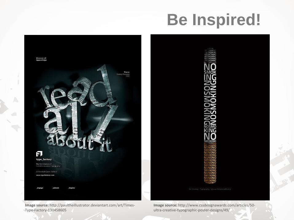
Image source: http://paultheillustrator.deviantart.com/art/Times-Type-Factory-130458605
Image source: http://www.cssdesignawards.com/articles/50-ultra-creative-typographic-poster-designs/49/
Be Inspired!
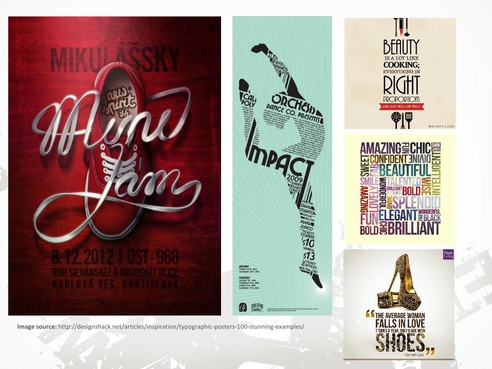
Image source: http://designshack.net/articles/inspiration/typographic-posters-100-stunning-examples/

Image source: http://www.fromupnorth.com/best-typography-of-2014/
Image source: http://blog.kidrobot.com/may-the-force-of-typography-be-with-you/

Image source: http://gcore.deviantart.com/art/Death-by-Typography-46884415
21
So
urc
es:
http
://desig
n.tu
tsplu
s.c
om
/artic
les/a
-20-m
inute
-intro
-to-ty
pogra
phy-b
asic
s--p
sd-3
326
http
://ww
w.n
oupe.c
om
/essentia
ls/ic
ons-fo
nts
/a-c
rash
-cours
e-in
-typogra
phy-th
e-b
asic
s-o
f-type.h
tml
http
://desig
nshack.n
et/a
rticle
s/ty
pogra
phy/8
-rule
s-fo
r-cre
atin
g-e
ffectiv
e-ty
pogra
phy/
http
://desig
nin
stru
ct.c
om
/tools
-basic
s/th
e-b
asic
s-o
f-typogra
phy/
http
://ww
w.u
rbanfo
nts
.com
/blo
g/2
013/0
2/s
erif-v
s-s
ans-th
e-fin
al-b
attle
/